Stop Matching Everything: How to Choose Artwork That Flows
A framework for curating prints that feel intentional, not interior-designed by committee.

Matching artwork is the fastest way to make a living room feel like a hotel lobby. What you actually want is cohesion, which is a much more interesting problem to solve. This guide gives you a working framework for choosing prints that belong together without looking like they came as a set.
Matching isn't the goal: cohesion is
Matching means sameness. Same palette, same subject, same vibe repeated across the wall. It's safe, and it reads as safe, which is to say slightly boring. Cohesion is different. Cohesion is when several distinct pieces share one quiet quality that ties them together, while everything else about them is allowed to be its own thing.
Think of it like a dinner party. You don't want everyone wearing the same outfit. You want a room of people who clearly belong at the same event. That's the difference, and it's the entire point of this article.
The reason most living room walls go wrong is that people either match too hard (three prints in identical tones, identical frames, identical subjects, all hung in a tidy row) or they don't match at all (a botanical print next to a moody abstract next to a vintage map, with no shared thread between them). Both fail. The first looks unconfident. The second looks accidental.

The single-thread rule: connect prints through one shared element
Here is the framework. When you're choosing more than one print for the same wall, every piece needs to share at least one of these four threads with the others:
- Colour. A common hue runs through each piece, even if it's used in different ways.
- Tone. The pieces share a mood: all calm, all bold, all soft, all graphic.
- Subject. A loose category links them: figures, landscapes, botanicals, geometric forms.
- Frame. Identical frames can pull together prints that have nothing else in common.
That's it. One thread. Not all four, not even two if you don't want. The trick is that the thread needs to be deliberate and identifiable, which leads to the most useful self-check question in this entire piece:
Can you describe the connecting thread in one sentence?
If you can ("they're all warm-toned figurative pieces", "they all share that burnt orange", "they're all in black frames"), you have cohesion. If you can't, the wall isn't ready yet.
This is the part most guides skip. They tell you to "find a common colour", which is unhelpful when every print has five colours in it. The answer is that you choose the thread first, then choose the prints. Decide what's going to connect them before you start shopping. It's an editing decision, not a discovery process.
Colour palette pairing: warm tones, cool tones, and monochrome
Colour is the most obvious thread, but it's also the easiest to get wrong. Here's how to think about it.
Warm palettes
Terracotta, ochre, rust, burnt sienna, cream, soft browns, dusty pinks. A warm palette feels grounded and lived-in. If you're committing to warm, commit fully. One cool-toned print in a warm collection (say, a navy abstract) will pull the eye and break the spell. Either lean in or rework the grouping.
Cool palettes
Slate blue, sage, soft grey, off-white, deep teal, charcoal. Cool palettes feel composed and quiet. They work beautifully in north-facing rooms where the natural light is already cool. Again, don't drop a single warm piece into the mix unless it's a deliberate accent (more on that below).
Monochrome with one accent
A black-and-white scheme with a single accent colour running through each piece is one of the most reliable cohesion strategies there is. The black and white does the heavy lifting, and the accent (a thread of red, a flash of mustard, a smudge of cobalt) becomes the connector. This works because the eye sees the consistency first and the accent second.
The temperature rule
Don't mix a warm-heavy wall with a cool-heavy wall and call it eclectic. It reads as confused. If you want temperature contrast, do it within a single piece (a print that already balances warm and cool), or use neutrals as a bridge between the two groups.
You'll find a lot of these palettes already worked out in our contemporary art prints collection, which is a useful place to see how colour relationships behave across different styles.
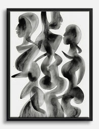
Mixing abstract with representational art (and making it work)
This is where most people freeze up. Can a loose, gestural abstract sit next to a detailed botanical illustration? Yes, easily, but only if you give the pairing a thread.
The technique is to let the abstract and the representational piece share a palette or a tone, so the eye reads them as part of the same conversation. The subject matter is allowed to differ wildly. What can't differ is the temperature, the saturation, and the energy level.
Energy matching
Every piece of art has an energy. A dense, busy abstract with aggressive brushwork has high energy. A quiet line drawing has low energy. A pair of high-energy pieces hung together fights for attention and exhausts the room. A pair of low-energy pieces can drift into dullness.
The sweet spot is usually one bold piece anchored by one calmer piece. The abstract provides movement, the representational piece provides a place for the eye to rest. Or flip it: a busy figurative scene paired with a serene colour-field abstract.
A practical example
A loose abstract in dusty pinks, cream, and a thread of charcoal will sit happily next to a botanical print featuring soft pink peonies on a cream ground. They share the palette. The subjects are completely different. The wall reads as intentional because the connecting thread is obvious even if you can't articulate it consciously.
What doesn't work: a saturated, primary-colour abstract next to a muted vintage-style figurative piece. No shared thread, no shared energy, no cohesion. They just happen to be near each other.

Why frame consistency matters more than you think
Frames are the most underrated tool in the entire process. If you're feeling overwhelmed by colour, subject, and tone decisions, here is the shortcut: put everything in the same frame.
Uniform frames can rescue a wall of mismatched prints. They impose order on chaos. A wall of seven completely different pieces in identical black frames will look like a curated gallery. The same seven pieces in seven different frames will look like a charity shop.
This is why the framing on art prints matters so much. A frame that arrives warped, or one that's shipped separately and doesn't quite fit, undoes all the visual work you've done. Our framed prints arrive ready to hang, fitted properly in solid FSC-certified wood frames with UV-protective acrylic glaze rather than glass. The acrylic matters more than people realise: no glare across the room, no reflections fighting your living room lighting, and no fading even in direct sunlight.
When to use uniform frames
- Gallery walls of five or more pieces.
- Mixed-subject collections where the prints have little else in common.
- Rooms where the architecture is already busy (lots of mouldings, patterned wallpaper, strong furniture).
When to mix frames
- Pairs or trios where the prints already share a strong colour or tonal thread.
- Rooms that are otherwise visually quiet, where a little frame variety adds texture.
- When you're using frames themselves as design elements (a thick natural oak next to a slim black frame can work beautifully if the prints are doing the rest of the cohesion work).
The principle: the more variety in the prints, the more consistency you need in the frames. The more consistency in the prints, the more freedom you have with frames.
Two prints, three prints, or a full gallery wall: when to stop
Almost no one talks about this, and it's where most living room walls go wrong. Here's a working decision tree.
Two prints (a diptych)
Best for narrow walls, above a console table, flanking a window, or above a bed. Two prints want to be in conversation, so they need a strong shared thread. They also benefit from being the same size and orientation, because asymmetry between two pieces reads as a mistake rather than a choice.
Three prints
The reliable workhorse. Three prints work above almost any sofa from 180cm upwards. You can hang them in a tidy horizontal row (formal), at varied heights (relaxed), or as a triptych in identical sizes (graphic). Three is the format where the wall art sets approach earns its keep, because the pieces are already designed to talk to each other.
Full gallery wall (five plus)
A gallery wall needs more planning, not less. Your single-thread rule becomes essential here. Without it, you have a wall of clutter rather than a wall of art.
When the wall is full
Two practical rules. First, your art should cover roughly two-thirds of the width of the furniture below it (sofa, sideboard, console). Wider than that looks oversized, narrower looks marooned. Second, leave breathing room above and below. Art that crowds the ceiling or sinks into the sofa back has no room to be looked at.
The hardest discipline is knowing when to stop adding pieces. A good test: walk into the room, glance at the wall, and look away. If your eye doesn't know where to settle, the wall is overcrowded. If a single piece is doing all the work and the others are filler, you've added too many. Remove one, live with it for a week, and see.

Real examples: pairings we love from our modern art collection
Here are three groupings that follow the single-thread rule, drawn from the pieces in our modern art for living room edit.
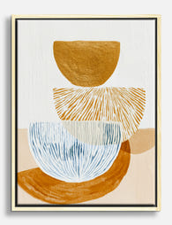
The warm trio
A muted figurative print in terracotta and cream, paired with a soft geometric abstract in burnt orange and ochre, paired with a single-line botanical study on a warm off-white ground. Thread: warm palette and shared tonal softness. All three in 50x70cm natural oak frames. Hangs beautifully above a 220cm sofa with about 15cm between each frame.
The cool diptych
A large gestural abstract in slate blue, sage, and charcoal at 70x100cm, paired with a smaller landscape print at 50x70cm in matching tones. Thread: cool palette. The size difference creates rhythm. Both in slim black frames. Works above a console or a low sideboard.
The mixed gallery wall
Seven pieces ranging from a graphic geometric abstract to a soft watercolour figure to a detailed botanical line drawing. Subjects all different, palettes all different. Thread: every single frame is identical (slim black with white mount). The uniform framing pulls the whole wall into a cohesive piece of curation, and the variety becomes a feature rather than a flaw.
If you want to start from the abstract end, our abstract art prints collection has pieces that pair well with both other abstracts and with representational work, depending on the thread you choose.

A final note on rule-breaking
Once you understand the single-thread rule, you can break it. The intentional mismatch (a wildly different piece dropped into an otherwise cohesive wall) only works when everything else is so clearly unified that the outlier reads as a deliberate statement. If the rest of your wall is already loose, an outlier just looks like another loose piece.
Start by choosing your thread. Build the wall around it. Stop when the eye can rest. That's the whole job.

Fab-produkter som visas i denna blogg
-

Poster organiskt flöde i neutrala toner
Translation missing: sv.products.product.sale_price Från £11.95£19.95 -

Poster abstrakt färgspel
Translation missing: sv.products.product.sale_price Från £11.95£19.95 -

Poster flödande enhet – svart fiskstim på mjukt grått
Translation missing: sv.products.product.sale_price Från £11.95£19.95 -

Poster geometriska former i balans – jordnära toner
Translation missing: sv.products.product.sale_price Från £11.95£19.95 -

Poster harmoniskt färgflöde – färgglad abstrakt konst
Translation missing: sv.products.product.sale_price Från £11.95£19.95 -

Poster abstrakt färgflöde
Translation missing: sv.products.product.sale_price Från £11.95£19.95 -

Canvastavlor abstrakt organiskt flöde i neutrala toner
Translation missing: sv.products.product.sale_price Från £49.95£74.95 -

Poster abstrakta färgvågor – harmoni i regnbågens toner
Translation missing: sv.products.product.sale_price Från £11.95£19.95 -

Poster flödande silhuetter
Translation missing: sv.products.product.sale_price Från £11.95£19.95 -
Canvastavlor studie i modern balans
Translation missing: sv.products.product.sale_price Från £49.95£74.95 -

Poster flödande botaniska linjer
Translation missing: sv.products.product.sale_price Från £11.95£19.95 -

Poster abstrakt organiskt flöde
Translation missing: sv.products.product.sale_price Från £11.95£19.95 -

Poster neutralt flöde – skandinavisk minimalism
Translation missing: sv.products.product.sale_price Från £11.95£19.95 -

Poster stilla balans – minimalistisk svartvit linjeteckning
Translation missing: sv.products.product.sale_price Från £11.95£19.95 -
Canvastavlor svartvita flödande silhuetter
Translation missing: sv.products.product.sale_price Från £49.95£74.95 -

Poster abstrakt grön och beige med svarta penseldrag
Translation missing: sv.products.product.sale_price Från £11.95£19.95 -

Poster Neutral Flow i skandinavisk stil
Translation missing: sv.products.product.sale_price Från £11.95£19.95 -

Poster abstrakt med organiska former – beige och svart
Translation missing: sv.products.product.sale_price Från £11.95£19.95 -

Poster organiskt flöde – skandinavisk i svart och beige
Translation missing: sv.products.product.sale_price Från £11.95£19.95 -

Poster abstrakt komposition med kurvor
Translation missing: sv.products.product.sale_price Från £11.95£19.95


Mer från The Frame

The Strawberry Thief: Everything You Need to Kn...
Strawberry Thief is the William Morris design people search for by name. It's also the one most often bought badly: wrong size, wrong colourway for the room, wrong print quality...

Our Favourite Jungle Prints for Every Room: The...
Jungle prints have a reputation problem. Done badly, they tip a room into themed-restaurant territory faster than almost any other trend. Done well, they add depth, movement and a sense...

Thrushes, Hares, and Peacocks: The Animals in W...
Why Morris put animals at the centre of his designs William Morris wasn't decorating walls with cute creatures. He was making a quiet argument. While Victorian factories churned out cheap,...