Why Graphic Prints Work Better in Pairs Than Solo
The integration guide for anyone who's fallen for a bold graphic print but isn't sure what to do with it.

Graphic prints have a reputation for being the difficult guests of the art world: loud, opinionated, hard to seat next to anyone else. That reputation is mostly wrong. With one good anchor and a couple of considered companions, a bold graphic print becomes the most flexible piece on your wall.
This is the integration guide for anyone who has just bought (or is about to buy) their first statement graphic piece and wants to know what happens next.
Why graphic prints are the easiest bold art to live with
A graphic print is any artwork built from clear shapes, defined edges, and intentional use of flat colour. Think Bauhaus geometry, mid-century cut-outs, bold typography, Memphis-style abstracts, retro travel posters, or any modern composition where form does the heavy lifting and texture takes a back seat. They are not the same as painterly abstracts (which rely on gesture and mark-making) or photography (which captures light and surface).
Here is the counterintuitive bit: graphic prints are actually the easiest bold art to live with. They have clean visual logic. You can extract two or three colours, identify a dominant shape language, and use those as a styling brief for everything else on the wall. A moody oil painting gives you almost nothing to work with. A graphic print hands you a palette and a vocabulary on a plate.
That predictability is what makes them so pair-friendly. They tell you what they need.

The one-anchor rule: building a wall around a single graphic piece
The most common mistake with bold graphic prints is treating every piece on the wall as equal. They are not equal. One of them is the anchor, and the rest exist to support it.
The one-anchor rule is simple: choose one graphic print to do the talking, size it up, and let everything around it be quieter. If your anchor is a 70x100cm geometric piece in primary colours, the companion prints should be smaller (40x50cm or 50x70cm), softer in palette, and less assertive in composition. A line drawing, a muted abstract, a black and white photograph. Anything that lets the anchor stay in charge.
This is the difference between a wall that feels curated and a wall that feels like a shouting match. Two graphic prints of equal weight will fight each other every time. One graphic print supported by three calmer pieces feels like a considered room.
How to pick your anchor
The anchor should be the piece you genuinely love most, not the largest one by default. Scale follows commitment, not the other way around. Once you have chosen it, pull two or three colours from the print and use those as your brief for everything else, including frames, mounts, and the art beside it.
Pairing graphic art with photography, abstracts, and botanicals
Here is where most styling guides shrug and tell you to "follow your instincts." Instincts are great if you have them. If you don't, use these pairings instead.
Graphic + black and white photography. This is the most forgiving combination in the book. Photography in black and white reads as neutral, so it gives the graphic piece room to perform without competing. Architectural shots, portraits, and quiet landscapes all work. Avoid colour photography unless the palette directly echoes the graphic.
Graphic + painterly abstract. This one needs a rule. The abstract should share at least one colour with the graphic and should be lower in contrast. A soft ochre and cream abstract next to a bold black-and-mustard graphic works because the ochre bridges them. Two high-contrast pieces next to each other will feel chaotic. Browse abstract art prints with muted palettes if you need a calming counterweight.
Graphic + botanical. Botanicals soften graphic prints beautifully, especially organic, hand-drawn botanicals rather than highly photographic ones. The contrast between hard-edged geometry and flowing leaf forms is one of the most satisfying pairings in interior styling. Just make sure the botanical isn't trying to be a second statement piece. Calm, monochrome, or single-colour botanicals work best.
Graphic + typography. Risky. Two pieces of typography on the same wall will always read as competing. If you must, keep the type piece small, in a single colour, and physically distant from the main graphic.
Graphic + another graphic. Only works if they are clearly from the same family: same artist, same series, or same compositional logic. Two unrelated graphic prints on one wall almost always look accidental. Wall art sets solve this by giving you pieces designed to live together.
Frame choices that unify a mixed gallery wall
Frames do more styling work than people realise. With a mixed gallery wall, the frame is the connective tissue. Get this right and a wildly varied set of prints reads as one composition.
The principle is simple: vary the art, unify the frames. Or, less commonly, unify the art style and vary the frames. Doing both at once produces visual chaos.
Three frame strategies that actually work
All-black, all the time. Black frames are the safest unifier for graphic prints. They echo the bold lines in most graphic work and give every piece on the wall a consistent visual edge. Best for modern, urban, or high-contrast interiors.
Natural oak across the board. Oak frames soften graphic prints without dulling them. They work in warmer, calmer interiors and pair particularly well with botanicals and earth-tone graphics. If your home leans Scandinavian or Japandi, this is your default.
White frames for white walls. White frames disappear into white walls, letting the art do everything. This works brilliantly when your graphic print is doing the heavy lifting and you want the surrounding pieces to feel almost wallpapered into the room.
What to avoid: mixing finishes within a single wall. Two oak frames, one black, and a white one will look like a mistake. If you want frame variety, restrict it to two finishes maximum, and repeat each at least twice for visual rhythm.
A word on frame quality, because it matters more with graphic prints than almost any other style. Bold prints are unforgiving of bad framing. Warped MDF, flimsy plastic, and prints that slip behind the mount will all sabotage a graphic piece, because there is nowhere for the eye to forgive an imperfection. Solid wood frames with UV-protective acrylic glazing keep the lines crisp and the colours unfaded, even in rooms with direct sunlight. Our framed prints arrive fully fitted and ready to hang, which removes the single biggest failure point in the category.

Room-by-room: where graphic prints work hardest (and where to go easy)
Generic "works in any room" advice is useless. Graphic prints behave differently in different spaces, and the trick is matching intensity to function.
Living room
The living room is where graphic prints earn their keep. You spend hours here, but you also move around, talk, and rarely stare at one wall for long. That makes it the right place for your biggest, boldest piece. The focal wall (usually behind the sofa or above a sideboard) is the natural home for a 70x100cm or 100x150cm graphic anchor. Secondary walls should stay calmer to avoid visual fatigue.
Bedroom
Go softer. Bedrooms are for winding down, and a high-contrast graphic above the bed will work against that. If you love graphic prints in the bedroom, choose ones with a muted palette: dusty pinks, sage greens, warm neutrals, terracottas. Save the primary colours for other rooms. Geometric shapes in soft tones are a sweet spot here, and geometric prints offer plenty of options that lean calming rather than energising.
Hallways and home offices
These are the bravest rooms in the house. Hallways are short experiences, so a punchy graphic print rewards the moment you walk past it without overstaying its welcome. Home offices benefit from the focused energy graphic prints bring, particularly typography and geometric abstracts. This is also the safest place to start if you are nervous about committing to large graphic art in your main living space.
Kitchen and dining room
Graphic prints work well in dining rooms because meals are social and energising. Kitchens are trickier because of humidity and grease. Canvas prints, hand-stretched over solid wood, handle kitchen environments better than framed glazed prints in some cases. They are lighter, less reflective, and shrug off the occasional steam cloud.
Bathroom
Go easy. Smaller scale, simpler composition, and ideally something framed with UV-protective glazing if there is any direct light.
Sizing your graphic print to the wall, not the room
The most common sizing mistake is choosing a print based on the size of the room rather than the size of the wall it will live on. A large room with small walls still needs medium prints. A small room with one big uninterrupted wall can take a large piece.
The working rule from professional consensus: your art should occupy roughly two-thirds to three-quarters of the width of the furniture beneath it, or two-thirds of the wall space if there is no furniture. Above a 200cm sofa, that means art (or a gallery wall) spanning around 140cm to 150cm. Above a 120cm sideboard, you are looking at art around 80cm to 90cm wide.
Hang the centre of the piece at roughly 145cm to 150cm from the floor, which approximates eye level for most viewers. If you are hanging above furniture, leave 15cm to 25cm between the top of the furniture and the bottom of the frame. Closer than that feels crowded. Further than that, and the art floats untethered from the room.
For gallery walls, the same rule applies to the overall cluster. Measure the full footprint of all the frames together and treat that as a single piece.

Common styling mistakes with bold graphic art
A short list of things that go wrong, and what to do instead.
Too many anchors. Two or more pieces of equal visual weight on the same wall. Fix: demote everything except your favourite, and replace the competitors with quieter art.
Underscaling. A 30x40cm graphic print above a three-seater sofa. It looks lost. Fix: go larger than feels comfortable, or build a gallery wall around it to bulk up the footprint.
Frame finish mismatch. Mixing four different frame finishes on one wall. Fix: pick two finishes maximum, and repeat each at least twice.
Colour conflict. A graphic print with a palette that argues with everything else in the room. Fix: extract two or three colours from the print and repeat them somewhere else in the space (a cushion, a throw, a vase) to make the print feel like it belongs.
Skipping the mount. Going matless on a print that needs breathing room. A white mount around an aggressive graphic print softens it considerably and makes it easier to live with day to day. Worth considering if your anchor feels too intense in situ.
Wrong lighting. Treating graphic prints like delicate watercolours. They can handle (and benefit from) direct lighting that would wash out softer art. A picture light, a directional spot, or just good natural daylight will sharpen the colours rather than damage them, especially with UV-protective glazing in place.
Buying for the room you wish you had. Choosing a primary-colour Memphis print for a calm, muted home because it looks great on Instagram. Fix: buy for your actual interior. If your home is warm and quiet, choose graphic prints in warm, quiet palettes. They exist.
Where to land
Start with one piece you genuinely love, size it generously, and build the rest of the wall as supporting cast. Pull two or three colours from your anchor and repeat them across the frames, mounts, and adjacent art. Pick one frame finish and stick to it. Match intensity to room function: bold in the living room and hallway, softer in the bedroom. And resist the urge to add a second statement piece to the same wall. Graphic prints work better with company, but only if the company knows its place.


Fab-produkter som visas i denna blogg
-

Poster tigrar i pop art-stil – djärva koralltoner
Translation missing: sv.products.product.sale_price Från £11.95£19.95 -

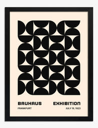
Poster geometrisk grafik i Bauhaus-stil
Translation missing: sv.products.product.sale_price Från £11.95£19.95 -

Poster grafisk blomsterbukett i rosa och grönt
Translation missing: sv.products.product.sale_price Från £11.95£19.95 -

Poster randig elegans med grön klänning
Translation missing: sv.products.product.sale_price Från £11.95£19.95 -

Poster pariserhjul – färgstark och lekfull
Translation missing: sv.products.product.sale_price Från £11.95£19.95 -

Canvastavlor grafisk minimalism i svartvitt
Translation missing: sv.products.product.sale_price Från £44.95£74.95 -
Poster bauhaus-rutnät
Translation missing: sv.products.product.sale_price Från £11.95£19.95 -

Poster stilla balans – minimalistisk svartvit linjeteckning
Translation missing: sv.products.product.sale_price Från £11.95£19.95 -

Poster grafisk skandinavisk blomsterduo
Translation missing: sv.products.product.sale_price Från £11.95£19.95 -

Poster randigt porträtt i blå och persikatoner
Translation missing: sv.products.product.sale_price Från £13.99£19.99 -

Poster randig elegans med rosa blomma
Translation missing: sv.products.product.sale_price Från £11.95£19.95 -

Poster siffra 9 i typografi
Translation missing: sv.products.product.sale_price Från £11.95£19.95 -
Poster randigt porträtt
Translation missing: sv.products.product.sale_price Från £11.95£19.95 -

Canvastavlor röda penseldrag på marinblå bakgrund med grafiska linjer
Translation missing: sv.products.product.sale_price Från £44.95£74.95 -

Poster popkultur-duo
Translation missing: sv.products.product.sale_price Från £11.95£19.95 -

Poster randigt porträtt i mintgrönt med röd accent
Translation missing: sv.products.product.sale_price Från £11.95£19.95 -

Poster randigt porträtt i rött, grönt och orange
Translation missing: sv.products.product.sale_price Från £11.95£19.95 -

Poster färgstarka färgblock i harmoni
Translation missing: sv.products.product.sale_price Från £13.99£19.99 -
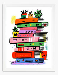
Poster färgglad boktrave med växter
Translation missing: sv.products.product.sale_price Från £11.95£19.95


Mer från The Frame

Why Do Most Travel Gallery Walls Look So Clutte...
Most travel gallery walls fail for the same reason: they try to show everything. Every trip, every favourite shot, every poster picked up at a museum gift shop, all crammed...

The Only Motivational Wall Art Guide You Need f...
Most motivational wall art goes wrong for the same reason: people choose the quote first and worry about how it looks second. The result is a hot pink "BOSS BABE"...

Why Chic Gallery Walls Work Better With Fewer F...
Most gallery walls fail for the same reason: too many frames, in too many finishes, hung too close to the sofa. The chic ones look effortless because they follow a...