Strawberry Thief, Acanthus, and Beyond: The William Morris Designs Worth Knowing
A friendly guide to choosing between Morris's most famous patterns and his quieter masterpieces, and which ones actually belong on your walls.

If you've ever searched for William Morris prints, you've met Strawberry Thief within about ten seconds. It's the pattern everyone knows, the one museums put on tote bags, the one your friend has on her tea towels. But Morris designed dozens of patterns across his career, and a few of the quieter ones might suit your wall better than the famous bird.
A quick word on Morris and why his patterns aren't just wallpaper
William Morris (1834-1896) was a designer, poet, textile printer and committed socialist who believed beautiful objects should be part of everyday life, not locked away in galleries. His patterns were originally created for wallpaper and fabric, which is why they tile so seamlessly. Look at any Morris design and you'll see it loops back on itself perfectly.
That repeating logic is also what makes some Morris patterns translate beautifully to framed prints and others fall flat. A pattern designed to cover an entire wall behaves differently when you crop it to 50x70cm and hang it above a sideboard. We'll get to which ones survive the transition.
Morris drew almost everything from direct observation. The strawberries came from his garden at Kelmscott Manor in Oxfordshire. The acanthus leaves came from classical architecture he loved. The willow came from the trees along the Thames. His patterns aren't decorative in a generic sense, they're specific portraits of specific plants. That's why our William Morris nature art prints still feel alive over a century later.
One quick note before we go further. Morris's own designs are in the public domain, but not every "Morris" pattern was designed by Morris. Golden Lily, hugely popular and often attributed to him, was actually designed by his apprentice John Henry Dearle in 1897, the year after Morris died. Worth knowing if authenticity matters to you.
Strawberry Thief: the backstory and why it's still the most requested
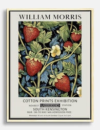
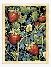
Strawberry Thief (1883) is Morris's most commercially successful design and probably the most reproduced textile pattern in British history. The story is genuinely charming. Morris kept a kitchen garden at Kelmscott Manor and was endlessly frustrated by thrushes stealing his strawberries. Rather than net the fruit, he watched the birds and turned them into a pattern.
What you're looking at is a textile design built around symmetry. Two thrushes face each other, each with a strawberry in its beak, surrounded by flowering stems and fruit. The original was printed using the indigo discharge method, a notoriously difficult technique where fabric is dyed deep blue, then bleached selectively to create the pattern, then over-printed with other colours. It took Morris years to perfect and it's why the original has such extraordinary depth in the blues.

Why is it the most requested? Honestly, because it's gentle. The thrushes give it a story. The colour palette (deep indigo, soft red, cream, muted green) sits comfortably in almost any room. And the scale of the repeat is small enough that even a 50x70cm framed print contains the full motif without feeling cropped or chaotic.
If you want a William Morris Strawberry Thief print, look for one that preserves the depth of the indigo. Cheaper reproductions tend to flatten the blue into a single tone, which strips out the very thing that makes the design beautiful. Museum-grade giclée printing on matte paper keeps that tonal range intact.
Acanthus: the boldest leaf design Morris ever made
If Strawberry Thief is the gentle one, Acanthus (1875) is the showstopper. It was Morris's most technically ambitious wallpaper, requiring 30 separate woodblocks and 15 colours to print a single repeat. Nothing he made before or after was this complex.
Acanthus is built around large, curling acanthus leaves layered on top of each other in greens, ochres, and muted browns. There are no flowers, no birds, no fruit. Just leaves, scaled up enormously. Morris was drawing on classical architectural ornament here, the same acanthus leaves you see on Corinthian columns, but he made them feel like a real plant turning in real light.
This is the design that proved Morris could do drama. And it's the one that translates most powerfully to a framed print, because the scale is already huge. A William Morris Acanthus print at 70x100cm above a fireplace or at the top of a staircase reads as a single composition, not a fragment of a pattern. The leaves are big enough to anchor a whole wall.
A small note on Morris's own theory of scale: he believed large patterns actually worked best in small rooms, because they create a sense of enclosure and intimacy. Counterintuitive, but if you have a tight hallway or a small study, a bold Acanthus print can make it feel considered rather than cramped.
Bird prints: Dove and Rose, Strawberry Thief, and the aviary thread in Morris's work
Birds appear across Morris's work more than people realise. Strawberry Thief has the thrushes. Bird and Anemone (1882) features small songbirds tucked between flowers. Dove and Rose (1879), originally designed for woven silk and wool, pairs doves with climbing roses in a vertical composition that feels almost heraldic.
Morris included birds for the same reason he included specific plants: he saw them. Kelmscott Manor had thrushes in the orchard, doves in the dovecote, and Morris was the kind of person who paid attention. The birds aren't decorative filler, they're observations.

For framed prints, bird-based Morris designs have an advantage: the birds give your eye something to land on. Pure leaf or flower patterns can feel like wallpaper offcuts when framed, but when there's a creature in the composition, your brain reads it as a picture, not a fragment. That's why Strawberry Thief works so well at smaller sizes.
If you're drawn to this side of Morris's work, our wider bird art prints collection is worth a browse alongside the Morris pieces. There's a lineage there, from Morris through to modern botanical illustrators.
The quieter classics: Pimpernel, Willow Bough, and when subtlety wins
Strawberry Thief gets the headlines, but some of Morris's best designs are the ones almost nobody mentions.
Pimpernel (1876) is one of his most underappreciated. It pairs scarlet pimpernel flowers with tulips and curling leaves in a denser, more layered composition than Strawberry Thief. Pimpernel hung in the dining room at Kelmscott House, Morris's London home. It's richer and more shadowed than most of his designs, with deeper greens and a sense of evening light. If you want Morris but you find Strawberry Thief too gentle, this is your pattern.
Willow Bough (1887) is the opposite. It's almost monochrome, just willow leaves on curving stems in soft green on cream. Morris designed it after watching willows along the Thames near Kelmscott. It's the pattern people choose when they want Morris without committing to a strong statement. The catch: Willow Bough has a very small repeat, which means as a framed print it can feel slightly monotonous. It was designed to cover a wall, and when you crop it down, you lose the rhythm that makes it work.
Compton (1896) was one of Morris's last designs, completed in the final months of his life. It's enormous in scale, with sprawling flowers and leaves in deep blues, terracottas and golds. Compton suits tall walls, stairwells, and rooms with high ceilings. It's drama without the formality of Acanthus.
Snakeshead (1876) is named after the snake's head fritillary, a wildflower with chequered drooping petals. It's strange, slightly gothic, and feels more like an Arts and Crafts illustration than a wallpaper. Worth knowing if you find the more famous patterns too sweet.
Which designs work best as framed art prints (not all of them do)
Here's the honest answer no one else gives you: Morris designed for walls, not frames. Some patterns survive the transition brilliantly. Others lose their magic the moment you put a border around them.
Patterns that work as framed prints:
- Strawberry Thief. The symmetrical pair of thrushes gives it a natural compositional centre. Works at any size from 30x40cm upward.
- Acanthus. Large-scale leaves read as a single image. Best at 70x100cm or larger.
- Compton. Same logic as Acanthus, made for big walls.
- Pimpernel. Dense and layered, holds together even at smaller sizes.
- Bird and Anemone, Dove and Rose. The birds give your eye a focal point.
Patterns that struggle as framed prints:
- Willow Bough. Too repetitive at frame scale. Lovely as wallpaper, monotonous as a print.
- Trellis. Morris's first pattern (1862), inspired by the rose trellis at Red House. The grid logic only works at wall scale.
- Larkspur, Marigold. Small all-over repeats that look like fabric swatches when framed.

Format matters too. Morris's designs are dense and detailed, which means matte paper is almost always the right call. Glossy finishes create reflections that compete with the pattern. Acrylic glaze (lighter than glass and shatter-resistant) protects the print from UV fading, which matters because Morris designs have so much subtle tonal range. You want those indigos and madders to stay true for decades, not yellow in the sun.
Framed vs unframed canvas is a judgement call. Canvas suits Acanthus and Compton because the matte canvas surface mirrors the way the original wallpapers absorb light. A framed paper print suits Strawberry Thief and the bird designs because the frame mimics the formal, contained feel of a botanical illustration. There's no wrong choice, just different effects.
How to choose between the famous and the underappreciated
If you've read this far, you're probably trying to decide whether to go with the obvious choice or the one nobody else has. A few honest principles:
Choose Strawberry Thief if you want something instantly recognisable, you have warm or neutral tones in your room, and you want a piece that quietly invites conversation. It's famous for a reason. Don't dismiss it just because it's popular.
Choose Acanthus or Compton if you have a tall wall, high ceilings, or a room that needs a single anchoring piece. These are the most dramatic Morris designs and they reward scale.
Choose Pimpernel if you find Strawberry Thief too soft, you like dining rooms with character, and you want a Morris pattern that feels less reproduced.
Choose Dove and Rose or Bird and Anemone if you want birds without the Strawberry Thief saturation, or you're building a small gallery wall of botanical and bird imagery.
Choose Snakeshead or one of the less-printed designs if you genuinely don't want what everyone else has. There are some lovely entries in the wider botanical art prints world that share Morris's sensibility, but if you want actual Morris, the lesser-known patterns are where to look.
One last thought. Morris cared more about how patterns made people feel in their daily lives than about which one was technically his masterpiece. A print on your wall isn't a museum object. It's the thing you'll glance at while making coffee for the next ten years. Pick the one you actually want to live with, not the one you think you should choose.

If the answer is still Strawberry Thief, that's a perfectly good answer. If it's Pimpernel or Compton, even better. Morris would have been pleased either way.

Fab-produkter som visas i denna blogg
-

Poster William Morris Strawberry Thief
Translation missing: sv.products.product.sale_price Från £11.95£19.95 -

Poster William Morris Strawberry Thief
Translation missing: sv.products.product.sale_price Från £11.95£19.95 -

Poster Strawberry Thief av William Morris
Translation missing: sv.products.product.sale_price Från £11.95£19.95 -

Canvastavlor William Morris Strawberry Thief
Translation missing: sv.products.product.sale_price Från £44.95£74.95 -

Canvastavlor William Morris Strawberry Thief
Translation missing: sv.products.product.sale_price Från £44.95£74.95 -

Canvastavlor Strawberry Thief av William Morris
Translation missing: sv.products.product.sale_price Från £44.95£74.95 -

Poster William Morris jordgubbar i vintage-stil
Translation missing: sv.products.product.sale_price Från £11.95£19.95 -

Poster Strawberry Fields av William Morris
Translation missing: sv.products.product.sale_price Från £11.95£19.95 -

Canvastavlor William Morris botaniska jordgubbar
Translation missing: sv.products.product.sale_price Från £44.95£74.95 -
Canvastavlor William Morris jordgubbar och botaniska blad
Translation missing: sv.products.product.sale_price Från £44.95£74.95 -
Poster William Morris jordgubbar vintage
Translation missing: sv.products.product.sale_price Från £11.95£19.95 -

Poster William Morris fruktmönster (Fruit Pattern)
Translation missing: sv.products.product.sale_price Från £11.95£19.95 -

Canvastavlor fågel bland jordgubbar – inspirerad av William Morris
Translation missing: sv.products.product.sale_price Från £44.95£74.95 -

Canvastavlor William Morris jordgubbsträdgård
Translation missing: sv.products.product.sale_price Från £44.95£74.95 -

Poster William Morris Fruit Garden
Translation missing: sv.products.product.sale_price Från £11.95£19.95 -

Poster fåglar och blommor inspirerad av William Morris
Translation missing: sv.products.product.sale_price Från £11.95£19.95 -

Poster i William Morris-stil med fåglar, frukt och blommor
Translation missing: sv.products.product.sale_price Från £11.95£19.95 -

Poster William Morris-inspirerat botaniskt mönster
Translation missing: sv.products.product.sale_price Från £11.95£19.95 -

Poster botanisk fågel och bär – inspirerad av William Morris
Translation missing: sv.products.product.sale_price Från £11.95£19.95 -

Canvastavlor William Morris – botanisk rödhake bland pioner
Translation missing: sv.products.product.sale_price Från £44.95£74.95


Mer från The Frame

Hosting at Christmas: Three Small Changes That ...
Most Christmas hosting advice asks you to do too much. You don't need a complete seasonal overhaul, you need your rooms to feel finished. The difference between a space that's...

You Bought the Sofa. Now What?
The sofa arrived. It looks great. And now you're staring at the empty wall above it wondering if you've made a terrible mistake, because nothing else in the room seems...

You've Finished the Renovation. The Walls Are S...
The dust has settled. The skip is gone. You've made roughly 4,000 decisions about grout colour and socket placement, and now you're standing in a beautifully painted room staring at...