What Is Colour Theory and How It Applies to Wall Art
Fab's simple guide to how colour works — and how to use it to create harmony, contrast, and impact on your walls.
You've probably experienced this. You see a room that just feels right. The colours work together in a way that's pleasing but not boring, harmonious but not flat. You can't quite put your finger on why it works, but it does.
That's colour theory in action. And while it might sound complicated, the basics are actually pretty simple. Understanding how colours interact can help you choose wall art that enhances your space instead of fighting with it.
Here's what you need to know about colour theory and how to use it to make better art choices.
What Colour Theory Actually Is
Colour theory is just a way of understanding how different colours relate to each other. Some colours feel warm, others feel cool. Some create harmony when placed together, others create contrast. Some advance toward you, others recede into the background.
It's not about rigid rules you have to follow. It's more like a toolkit for understanding why certain combinations feel good and others feel off.
The goal isn't to become a colour expert. It's to develop an eye for what works and the confidence to trust your choices.
The Warm and Cool Divide
Every colour has a temperature. Warm colours include reds, oranges, yellows, and anything with undertones of these hues. Cool colours include blues, greens, purples, and anything that leans toward these families.
Warm colours feel energizing, cozy, and advancing. They make spaces feel more intimate and can make walls appear closer. Cool colours feel calming, refreshing, and receding. They can make spaces feel larger and more serene.
This matters for wall art because the temperature of your art affects the mood of your room. A warm abstract in oranges and reds will energize a space. A cool landscape in blues and greens will calm it down.

How Temperature Affects Your Space
In a room with cool walls like soft grays or pale blues, warm art creates beautiful contrast. The warmth draws the eye and adds energy without overwhelming the peaceful base.
In a room with warm walls like cream or soft beiges, cool art provides visual relief. It prevents the space from feeling too intense while adding sophistication.
You can also go tonal within one temperature. All warm colours together create coziness. All cool colours together feel serene and spacious.

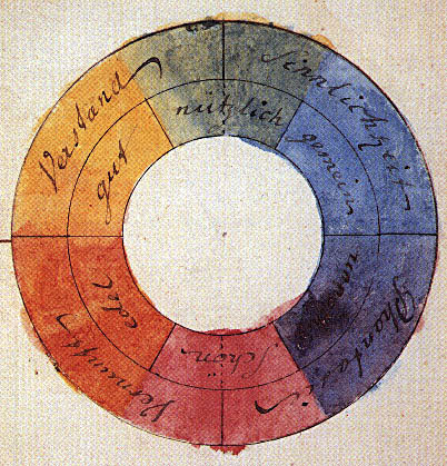
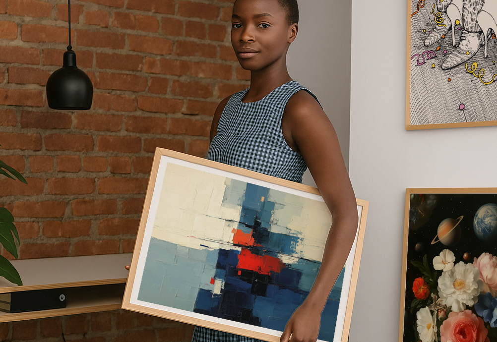
Complementary Colours and Bold Contrast
Complementary colours sit opposite each other on the colour wheel. Blue and orange. Red and green. Purple and yellow. When you put them together, they make each other look more vibrant.
This doesn't mean you need bright, saturated versions. A dusty blue print against terracotta walls uses the same complementary relationship but in a softer way.
Complementary contrasts work especially well when you want your art to pop. A navy blue abstract against cream walls with warm orange undertones creates sophisticated drama.
Subtle Harmony with Analogous Colours
Analogous colours sit next to each other on the colour wheel. Blue, blue-green, and green. Red, red-orange, and orange. These combinations feel naturally harmonious because they share common undertones.
Using analogous colours creates gentle, flowing relationships. A sage green print in a room with blue-gray walls feels seamless and calming. The colours support each other instead of competing.
This approach works well when you want art that integrates smoothly with your existing palette. It's less dramatic than complementary contrast but often more livable day to day.

Tonal Palettes for Sophisticated Looks
Tonal palettes use different shades and tints of the same colour family. Think a charcoal print on light gray walls, or a dusty rose piece in a room with blush accents.
These combinations feel sophisticated and cohesive. They're also forgiving because everything naturally works together. You can mix different textures and patterns without worrying about colour clashes.
Tonal approaches work especially well for people who love colour but want a calm, unified feeling in their space.

Using Art to Balance Your Room
How to choose the right art for your home often comes down to understanding what your room needs colourwise. Does it need more energy or more calm? More warmth or more coolness?
If your room feels too cool and stark, warm art can add coziness. If it feels too intense or busy, cool art can provide visual rest.
Art can also echo colours that appear elsewhere in your room. If you have throw pillows in a certain blue, art with similar blues creates intentional connection throughout the space.
When to Blend In vs Stand Out
Sometimes you want art that harmonizes seamlessly with your space. Other times you want it to be the star. Colour theory helps you achieve either goal intentionally.
For art that blends in, choose pieces within your existing colour family. They'll feel integrated and sophisticated without demanding attention.
For art that stands out, use contrast. Complementary colours, different temperatures, or dramatically different intensities. The art becomes a focal point that anchors and energizes the room.

Real-World Applications
A neutral room with beige walls and brown furniture can handle bold art in almost any colour. The neutral base lets the art be the colour story.
A room with existing colour, like blue walls or a colorful sofa, needs more careful art choices. You can echo the existing colours, complement them, or provide neutral relief.
Wall art by style often correlates with colour approaches. Minimalist styles tend toward limited, tonal palettes. Maximalist styles embrace contrast and variety.

Working with What You Have
Most people aren't starting with blank slate rooms. You probably have furniture, rugs, and other elements with their own colours. The key is working with these existing elements rather than against them.
Look at what colours already exist in your space. Are they mostly warm or cool? Bright or muted? Your art choices can echo these qualities or provide gentle contrast.
Matching art to your furniture and when not to becomes easier when you understand colour relationships. Sometimes exact matching feels forced. Related colours often work better.
The 60-30-10 Rule
Interior designers often use the 60-30-10 rule for colour distribution. 60% neutral or dominant colour, 30% secondary colour, 10% accent colour.
Your art can play any of these roles. It might provide the accent pop in an otherwise neutral room. Or it might echo the secondary colour that appears in your curtains and cushions.
Understanding this proportion helps you decide how bold or subtle your art should be in the context of your overall colour scheme.
Experimenting with Colour Collections
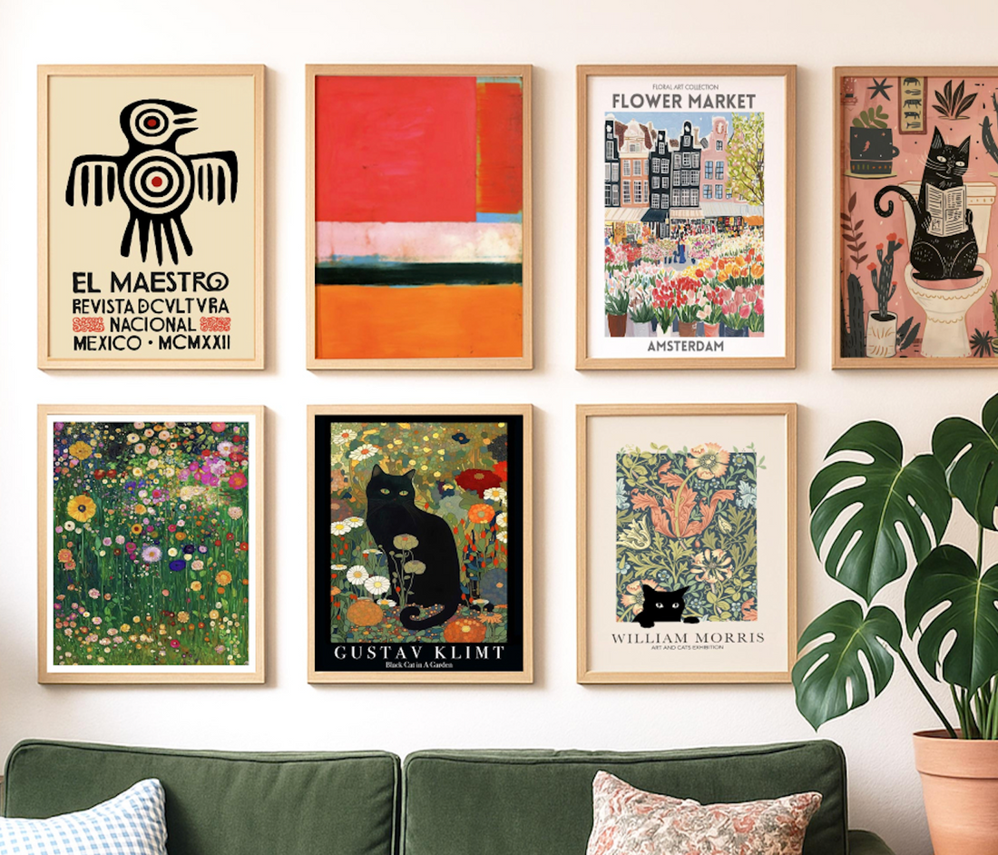
One way to explore colour theory is to browse art by colour families. Bold colour prints let you see how different subjects and styles work within the same hue family.
Neutral collections show how much variety you can achieve even within a restrained palette. Earth tone options demonstrate how warm, natural colours work together.
Looking at curated colour groupings helps train your eye to see relationships and possibilities you might not have considered.
Beyond Basic Combinations
As you get more comfortable with colour, you can experiment with more complex relationships. Triadic colours use three evenly spaced hues. Split-complementary uses one colour plus the two colours adjacent to its complement.
But these advanced concepts are icing on the cake. Understanding warm versus cool and harmony versus contrast will take you far in making confident art choices.
Trusting Your Response
Colour theory provides useful guidelines, but your personal response to colour matters more than any rule. Some people are energized by high contrast. Others find it overwhelming.
Pay attention to how different colour combinations make you feel. Do warm colours make you happy or restless? Do cool colours feel calming or cold? Your responses guide better choices than rigid theory.

Lighting Changes Everything
Remember that colour looks different under different lighting. Natural light, warm LED bulbs, and cool fluorescents all affect how colours appear in your room.
Consider when you spend most of your time in the space and what lighting you'll typically have. Art that looks perfect in afternoon sunlight might feel wrong under evening lamplight.

Building Confidence Through Practice
The more you pay attention to colour relationships, the better your instincts become. Notice combinations that appeal to you in magazines, restaurants, or other people's homes.
Start with safe choices and gradually experiment with bolder combinations as your confidence grows. Colour theory gives you vocabulary for understanding what works and why.
Making It Personal
The best colour choices reflect your personality and lifestyle. Some people thrive with bold contrasts and saturated hues. Others prefer subtle harmonies and muted tones.
Use colour theory as a tool for achieving the feeling you want, not as rules you have to follow. The goal is creating spaces that make you happy to be in them.
Ready to explore how colour can transform your space? Browse our collections by hue and discover how the right colours can make your walls come alive with personality and style.
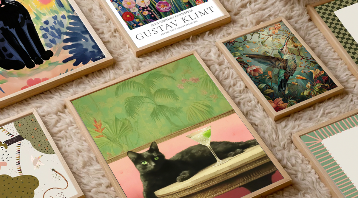
Fab products featured in this blog
-

LEER (Kopie) (Kopie)
Ab €16,95 -

LEER (Kopie) (Kopie)
Ab €16,95 -

Schicke Katze & Cocktail Kunstdruck
Ab €16,95 -

LEER (Kopie) (Kopie)
Ab €16,95 -

(Kopie) LEER
Ab €16,95 -

Poster Gemütliche Leseecke
Ab €16,95 -

Poster Gemütliches Leseritual
Ab €16,95 -

LEER (Kopie) (Kopie)
Ab €16,95 -

LEER (Kopie) (Kopie)
Ab €16,95 -

LEER (Kopie) (Kopie)
Ab €16,95 -

LEER (Kopie) (Kopie)
Ab €16,95 -

LEER (Kopie) (Kopie)
Ab €16,95 -

LEER (Kopie) (Kopie)
Ab €16,95 -

LEER (Kopie) (Kopie)
Ab €16,95 -

Amsterdam Floral Vibes Kunstdruck
Ab €16,95 -

LEER (Kopie) (Kopie)
Ab €16,95


More from The Frame
More stories, insights, and behind-the-scenes looks at the art that transforms your space.
Top Wall Art Trends for 2025: What's In, What's...
Trends aren't rules to follow blindly. They're signals about where our collective taste is heading, what's capturing our imagination, and what feels fresh right now. The wall art trending in...
Art for Gifting: How to Choose a Print for Some...
Giving someone art is either incredibly thoughtful or slightly terrifying. There's no middle ground. On one hand, you're giving them something beautiful that will live in their home for years....
9 Art Prints That Instantly Elevate Any Living ...
You know that feeling when you walk into a beautifully styled living room and everything just feels right? It's not the expensive sofa or the perfect rug. It's usually the...