How to Arrange Art Above Furniture
Simple principles for making art look right above sofas, beds, sideboards and more
You've got the perfect piece picked out, but now you're staring at your sofa wondering exactly where it should go. Too high and it floats awkwardly. Too low and it crowds the furniture. Too small and it looks lost. Too big and it overwhelms everything.
Here's what I've learned from years of helping people hang art. The rules aren't complicated, but getting the balance right makes all the difference between a room that feels thoughtfully put together and one that feels slightly off.
Why Placement Actually Matters

When art placement is wrong, you feel it even if you can't name what's bothering you. The room looks unfinished or chaotic. Your eye doesn't know where to land comfortably.
Good placement creates harmony between your art and furniture. They support each other instead of competing. Your sofa looks more substantial when it has the right art above it. Your art looks more intentional when it's properly anchored to something below.
This relationship between art and furniture is what makes a room feel complete rather than just furnished.
The Two-Thirds Rule That Works

Start with this: your art should be roughly two-thirds the width of the furniture below it. A 180cm sofa works well with art that's about 120cm wide. A 90cm sideboard looks balanced with a 60cm piece above it.
This isn't a rigid law, but it's a reliable starting point. The proportion feels natural because the art is substantial enough to relate to the furniture without overwhelming it.
Above a 3-seater sofa, a 70cm wide print can feel lost. The same print above a narrow console table might be perfect. Scale matters, and it's all about the relationship between the pieces.
Height That Feels Right

Forget the standard "57 inches from the floor" rule when you're hanging art above furniture. That measurement assumes empty walls, not real rooms with actual furniture.
Instead, aim for 15 to 25cm above your furniture. This creates visual connection without crowding. Any closer and the art feels like it's sitting on the furniture. Much higher and it starts floating away.
For sofas and beds, this usually puts the bottom of your frame at about eye level when you're sitting. That's perfect for actually enjoying your art in daily life.
When to Centre and When Not To
Centring art above furniture usually works, but it's not always the most interesting choice. If your sofa is perfectly centred on a wall, centred art reinforces that symmetry.
But if your furniture is off-centre, or if you have other elements like a floor lamp or side table creating visual weight, you might want to adjust accordingly.
The goal is visual balance, not mathematical precision. Sometimes that means centring. Sometimes it means shifting slightly left or right to account for other elements in the room.
Working with Multiple Pieces

How to create a gallery wall without overthinking it becomes relevant when you want multiple pieces above one piece of furniture. The same principles apply, just with more complexity.
Treat multiple pieces as one unit when thinking about the two-thirds rule. Three small prints spaced across 120cm of wall should collectively relate to the 180cm sofa below, not each piece separately.
Keep consistent spacing between pieces. Usually 5 to 10cm apart works well. Closer spacing makes the group feel cohesive. Wider spacing lets each piece stand alone while still being part of the arrangement.
Mixing Shapes for Interest
A horizontal piece above a long sofa is safe but predictable. Sometimes a tall, vertical piece creates more visual interest, especially if you have high ceilings or want to draw the eye up.
Two vertical pieces flanking a horizontal one can work beautifully above a long sideboard. The varied shapes create rhythm while the consistent placement creates unity.
Mixing abstract and figurative prints in a group above furniture can add personality, as long as you maintain some connecting element like similar frames or a consistent color palette.
Different Furniture, Different Approaches

Above sofas, you want art that can be enjoyed from multiple angles and distances. People will see it from across the room and up close. Medium to large scale usually works best, with subjects that remain interesting at different viewing distances.
Bedroom art above the bed should feel calming and personal. You'll see it first thing in the morning and last thing at night. Horizontal pieces often work well here, echoing the horizontal line of the bed.
Sideboards and console tables offer opportunities for layering. You can combine wall-hung art with objects placed on the furniture surface. This creates depth and visual interest.
The Frame Connection

Framed vs unframed affects how art relates to furniture. Frames create visual weight that can balance substantial furniture pieces. A large sofa might need the structure of a frame to feel properly anchored.
Unframed pieces can feel more casual and modern, which works well with contemporary furniture. But they need to be substantial enough to hold their own without the frame's visual support.
The frame color and style should complement your furniture without being too matchy. A wood frame doesn't have to match your wood furniture exactly, but they should feel harmonious.
Creating Visual Grounding
Art shouldn't float in space. It needs to feel connected to the furniture below it. This happens through proper height, appropriate scale, and sometimes through visual elements that bridge the gap.
A table lamp on a side table can help connect wall art to the seating group below. Plants or decorative objects can create visual stepping stones between the horizontal furniture line and the art above.
The goal is creating a cohesive vignette where everything feels intentionally related.
Common Mistakes to Avoid
Hanging art too high is the most common error. When in doubt, go lower rather than higher. Art that feels too low can be adjusted up, but most people don't realize when their art is floating too high.
Choosing art that's too small is another frequent mistake. Large furniture needs art with enough presence to balance it. Don't be afraid to go bigger than your first instinct suggests.
Ignoring the room's other visual elements leads to placement that looks off. That large mirror across the room, the tall bookshelf, the architectural features. They all affect how your art placement feels.
When to Break the Guidelines

Rules are starting points, not requirements. If you have unusually high ceilings, you might need to hang art higher to maintain proper proportion with the room.
If your furniture has a tall back or distinctive shape, you might need to adjust your approach. A high-backed dining chair or an ornate headboard changes the visual equation.
Trust what looks right in your specific space with your specific furniture. The principles help you get close, but your eye makes the final decision.
Room-Specific Considerations
Living rooms usually benefit from larger-scale art because the viewing distances are greater. You're looking at the art from across the room as well as up close.
Dining rooms offer interesting opportunities because people spend extended time seated at one height. Art can be slightly lower here because you'll be viewing it from a seated position for long periods.
Entryways need art that makes an immediate impression. These pieces are often seen briefly but from multiple angles as people move through the space.
Building Confidence Through Practice

The more you pay attention to art placement in spaces you admire, the better your eye becomes. Notice what works in restaurants, hotels, friends' homes. Start recognizing the patterns.
Practice with temporary arrangements before committing. Lean pieces against the wall or use removable adhesive hooks to test positions. Live with the arrangement for a few days before making permanent holes.
Making It Work for Your Life
The best art placement isn't just visually correct, it's right for how you actually use your space. Art above a reading chair should be positioned for someone who'll be looking up from a book. Art in a busy family room needs to handle more visual competition.
Consider your daily routines and sight lines. The art that looks perfect when the room is empty might not work as well when it's full of people and activity.
Your furniture and your life should guide your choices more than any rigid rule about measurements or proportions.
Ready to hang with confidence? Trust these principles as your starting point, but let your space and your eye guide the final decisions. Find prints that fit your furniture beautifully — and your life even better.
Fab products featured in this blog
-

El Maestro Magazine Mexican Cacti Retreat Art Print
Translation missing: en.products.product.sale_price From £11.95£19.95 -

El Maestro Magazine Mexican Cactus Flower Art Print
Translation missing: en.products.product.sale_price From £11.95£19.95 -

Matisse The Large Blue Robe And Mimosas Woman Art Print
Translation missing: en.products.product.sale_price From £11.95£19.95 -

Modern Folk Face Portrait Art Print
Translation missing: en.products.product.sale_price From £11.95£19.95 -

Bold Blue Minimal Curve Art Print
Translation missing: en.products.product.sale_price From £11.95£19.95 -

Vintage Tiger Gallery Wall Art Print Set
Translation missing: en.products.product.sale_price From £49.95£82.95 -

Serene Pastel Escape Art Print
Translation missing: en.products.product.sale_price From £11.95£19.95 -

Summer Elegance Art Print
Translation missing: en.products.product.sale_price From £11.95£19.95 -

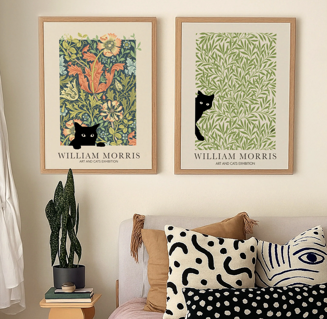
William Morris Peekaboo Botanical Cats Gallery Wall Art Print Set
Translation missing: en.products.product.sale_price From £49.95£82.95 -

William Morris Floral Cat Art Print
Translation missing: en.products.product.sale_price From £11.95£19.95 -

Mid-Century Desert House Art Print
Translation missing: en.products.product.sale_price From £11.95£19.95


More from The Frame

Cycling Art: Vintage Posters to Minimalist Prints
Cycling Art for Every Space: Vintage Posters to Modern Minimalist Prints There's something about cycling art that captures more than just a sport. It's movement, freedom, and the romance of...

Teen Bedroom Wall Art Ideas: Trendy Modern Styles
Teen Bedroom Wall Art Ideas: Trending Styles for Girls and Boys A teenager's bedroom walls tell a story—or at least they should. Blank walls feel temporary, like a hotel room,...

What to Hang Above Bed: Wall Art Size & Spacing...
The Complete Guide to Hanging Framed Art Above Your Bed That blank wall above your bed is probably the most-looked-at spot in your entire home. You see it every morning...