Solid wood. Professionally framed. Arrives ready to hang.
Make your print ready to hang.
Pink Art Prints
4.8
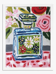
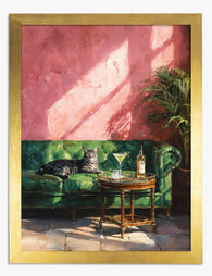
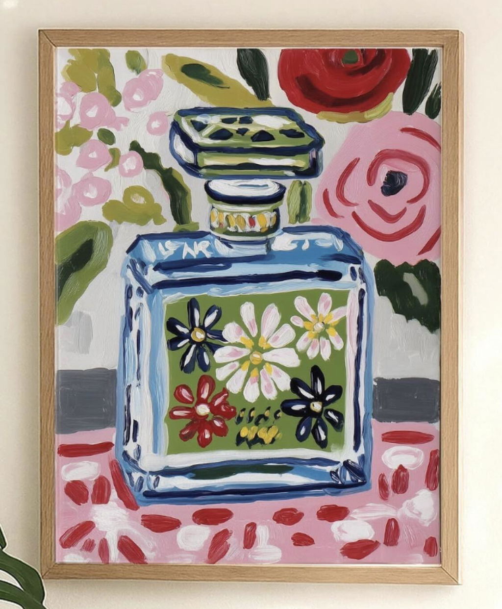
Pink swings from barely-there blush to loud fuchsia, and the shade you land on sets the mood of the whole room. Softer tones sit quietly next to neutrals and wood; brighter ones do the job of a statement piece on their own. Start with Pink Floral Art Prints for something classic, Pink Abstract Art Prints if you want shape and colour alone, or drift toward Soft Pastel Art Prints for a gentler wall.
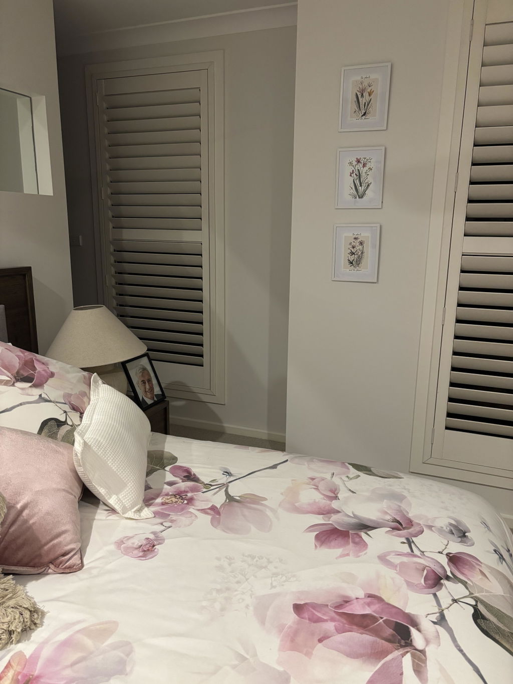
I purchased three botanical sketches and displayed them in white frames. I positioned them one under the other and they look wonderful. Really pleased with the effect.
Beautiful print on nice paper. Standard sizes, so you can get it framed by Fab or do it yourself. I've now bought 4 prints from Fab and love them all. Also, I accidentally ordered the wrong size once and was easily able to cancel and reorder.
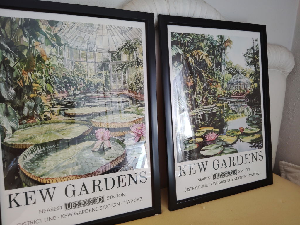
I am overjoyed with this beautiful poster print and it's companion of the Kew gardens
I am overjoyed with this beautiful poster print and it's companion of the Kew gardens. It is a masterpiece and the colors are more vibrant than online. I couldn't be happier.
The William Morris art piece was fabulous! The colors were vibrant and bold. The website color description was accurate. It fit my room exactly as I envisioned it. I couldn’t be happier. The black frame really made the whole picture pop.
This city print (a Chicago neighborhood) is beautiful! The colors are vibrant! The only downside
This city print (a Chicago neighborhood) is beautiful! The colors are vibrant! The only downside is that it took over 2 months to reach me, but that was the fault of the USPS, which has become less than reliable in the last couple of years. But the Fab print will look wonderful in our home!
Pink is one of the trickiest colours to gallery-wall well. Get it wrong and the whole thing reads juvenile or chaotic, like a teenager's mood board. Get it right and...
Blossom prints have a reputation problem. People assume they belong in a teenager's bedroom or a country B&B, when in fact they sit beautifully in stripped-back Scandi flats, moody panelled...
Most colour guides assume you're building a room from scratch. You're probably not. You've fallen for a specific petal print, and now you need your existing lounge, bedroom or hallway...
How do you pick the right pink
Short answers on shades, framing, where pink tends to work and what to do if a print isn't right
What's the difference between blush, dusty rose, and hot pink art prints?
The difference is saturation and undertone. Blush is the palest of the three, a soft pinkish tint with peachy warmth that behaves almost like a warm neutral, so blush prints keep a room airy and read as barely-there color. Dusty rose is deeper and muted by gray, mauve or taupe undertones, giving vintage, grounded warmth that suits bedrooms and pairs well with sage, cream and navy. Hot pink is highly saturated and vivid, best used as a bold focal point balanced by white walls and plenty of open space.
How does room lighting change the way a pink art print looks on the wall?
Lighting can shift a pink print noticeably, so the same artwork reads differently from morning to evening. Cool, north-facing daylight tends to drain warmth and can push blush and pastel pinks toward lilac or gray, while bright south and west sun deepens and intensifies coral, fuchsia and terracotta tones. Warm bulbs around 2700K flatter dusty rose and peachy pinks; daylight-toned bulbs near 5000K look crisper and reveal cooler blue undertones. In dim rooms, choose pinks with red, apricot or clay warmth, and view the print in both daylight and lamplight before settling on placement.
Is millennial pink still in style for wall art in 2026?
Yes, pink is very much in style for wall art in 2026, though the shade has evolved. Designers report that the sugary 2010s millennial pink has shifted toward warmer, earthier versions: plaster pink, dusty rose, clay and blush tones now treated as warm neutrals, alongside a parallel interest in frosted, milky pastels. For a current look, choose prints where pink reads soft and grounded, then pair them with cream, camel, chocolate brown or deep green in the room. Framed or unframed both work, and 99-day returns make trying a color low risk.
Which shade of pink art print works best in a bedroom?
For bedrooms, we'd steer you firmly toward blush pink wall art or dusty pink prints rather than anything too vibrant. A soft, muted pink feels calming and warm without overpowering the room, especially against white, warm gray, or sage green walls. If your bedding and textiles are neutral, a large 20x28" or 28x40" dusty pink print above the headboard gives the room a finished, intentional feel without needing to redecorate anything else. Our framed prints arrive ready to hang with UV-protective glazing, so you won't get fading even if your bed sits near a window.
How do I stop pink wall art from looking too 'sweet' or juvenile?
The trick is context. Pair pink art prints with grounding elements like a black or natural oak frame, dark-toned furniture, or textured materials such as linen or concrete. A pink abstract art print in a black frame on a warm white wall reads sophisticated, not saccharine. We'd also recommend choosing prints with tonal depth (think dusty rose, terracotta-pink, or prints that blend pink with ochre or charcoal) rather than flat candy pink. If you're decorating a living room or hallway, this approach keeps things grown-up and deliberately styled.
Can I create a gallery wall using different shades of pink?
Absolutely, and it looks brilliant when you commit to it. The key is sticking to a consistent frame color across all prints (we'd recommend black or natural oak) and varying the shade of pink across pieces, from pale pink poster prints through to richer blush and terracotta tones. A set of three to five framed prints in mixed sizes, arranged above a sofa or along a hallway, gives you a collected look without the chaos. Because our framed art prints arrive properly fitted and ready to hang, you can get the whole wall up in under an hour rather than wrestling with separate frames and prints.
What's a good pink art print for a nursery that won't look dated in two years?
Skip the cartoon animals and go for something with staying power. A soft pink abstract print or a botanical illustration with blush tones will look just as good when your toddler is five as it does on day one. Pink nursery art prints in gentle, muted palettes work beautifully in a white or natural wood frame at around 12x16" or 16x20". Our giclée prints are made with museum-grade inks that won't fade over time, so the colors stay true long after the nursery has become a 'big kid' room.
What colors go well with pink art prints in a room scheme?
Pink is far more versatile than people give it credit for. For a warm, grounded scheme, pair blush or dusty pink prints with sage green, warm terracotta, and natural wood tones. For something more contemporary, pink and gold prints work beautifully alongside deep navy or charcoal gray walls. If you've just moved in and your walls are standard white or off-white, a bold hot pink artwork in a black frame makes a confident statement without needing to repaint a thing. We'd avoid pairing pink with cool-toned grays, which can make both colors look flat.
Choosing a selection results in a full page refresh.