


 Order today for delivery by
 Blossom Art Ideas That Feel Sophisticated, Not Saccharine
How to style cherry blossom and floral prints with the kind of restraint that turns pretty into properly grown-up.


Blossom prints have a reputation problem. People assume they belong in a teenager's bedroom or a country B&B, when in fact they sit beautifully in stripped-back Scandi flats, moody panelled lounges and gallery-style hallways. The trick is in the framing, the scale, and what you put next to them.
Why blossom prints work in more interiors than you'd think
Blossoms have been a serious subject in art for centuries. Japanese woodblock printmakers treated them as studies in composition. Dutch still-life painters used them to explore light and decay. Contemporary photographers shoot them in stark monochrome. The flower itself is not the problem. The problem is when blossom imagery gets paired with pastel everything, twee fonts and pink furniture, which is when a room starts to feel like a greetings card.
A blossom print can read soft and romantic, or it can read sculptural and graphic. The difference is almost entirely down to context. A close-up of magnolia petals against a deep charcoal wall reads moody and considered. The same print floating on a pale pink wall with a cream sofa reads like a nursery. Same image, opposite outcome.
This is the foundation of how to style blossom prints well. You are not styling the flower. You are styling the contrast around it.

The colour palette cheat sheet
The fastest way to make a blossom print feel grown-up is to surround it with colours that are not also pink. Pink-on-pink is what tips a space into saccharine territory. You need a counterweight.
For pink and white blossoms, the most sophisticated wall colours are:
- Warm off-whites with a touch of clay (think bone, plaster, oat)
- Deep charcoal or near-black for high drama
- Sage or olive green for a botanical, gallery feel
- Terracotta or rust for warmth without sweetness
- Inky navy if your light is good enough to take it
Avoid baby pink, lilac, mint and butter yellow walls behind blossom prints. These tonal pairings flatten the image and create the exact effect you are trying to avoid.
For fabrics and textiles, lean into texture over colour. A nubby oatmeal linen sofa, a chunky wool throw in burnt umber, a velvet cushion in forest green. These ground a blossom print and give it something to push against. If you want to echo the pink in the print, do it once and do it small. A single ceramic vase, a piped edge on a cushion, the spine of a coffee table book.
For wood tones, mid-to-dark woods (walnut, smoked oak, stained ash) flatter blossom prints far more than pale pine or limed oak. Pale woods plus pink florals tip Scandi into sugary very quickly. If your furniture is pale, balance it with darker frames and richer wall colours.
The third colour rule is useful here. Pull one accent shade from your blossom print, not the dominant pink, and let it appear two or three times around the room. Often this is a green from the stems, a soft brown from the branches, or a creamy off-white from the petal edges. This creates cohesion without theming.
Choosing the right frame finish for your blossom print
This is where most blossom prints succeed or fail. The frame does more work than the image itself in terms of how sophisticated the final piece reads.
Black frames are the safest sophistication move. A slim black frame around a soft pink blossom print creates immediate gallery energy. The hard graphic edge cancels out any sweetness in the image. Black frames work in almost every interior style, from industrial to traditional, and they are particularly good for close-up botanical photography or single-stem compositions.
Natural wood frames in oak or ash are the right call for Scandi, Japandi and warm minimalist spaces. They feel organic and let the print sit quietly. Avoid orange-toned pine, which can fight with pink tones. Look for frames with a slight grey or smoked finish if your space is cool, and warmer honey oak if it is warm.
White frames are the trickiest and usually the weakest choice for blossom prints. White on a white wall disappears, and white framing pink blossoms on a pale wall pushes the whole thing toward bridal. Use white frames only when you have a strongly coloured wall behind them (deep green, navy, terracotta) where the white acts as a crisp border.
Dark walnut or stained wood is underused and excellent. It adds gravitas and reads as collected and antique, especially with traditional botanical illustrations or Japanese woodblock-style blossom prints.
A wide mat (the paper border between the image and the frame) does a lot of heavy lifting. A generous 5 to 8cm cream or off-white mat around a blossom print instantly makes it feel like a museum piece rather than a poster. Thin mats or no mat at all can work for contemporary photography but tend to feel cheaper on illustrative or painted blossoms.
One thing worth flagging: poor framing is what ruins most affordable art prints. Frames that arrive separately and warp, prints that bubble inside the frame, fixtures that fall off the back. If you are spending money on the print, the framing needs to match. Our framed prints ship in one box with the print fitted, FSC wood frames, and UV acrylic glaze so colours stay true even in sunny rooms.
Living room styling: placement, sizing, and what to avoid
The living room is where blossom prints have the most to gain or lose. Get it right and the room feels considered and alive. Get it wrong and the whole space tips feminine.
Sizing. Above a standard three-seater sofa (roughly 200cm wide), you want either one large print at 70x100cm, or two prints at 50x70cm hung side by side with about 8 to 10cm between them. Anything smaller than 50x70cm above a full-sized sofa will look stranded. The art should take up roughly two-thirds of the sofa's width.
Placement. Hang the centre of the artwork at 145 to 150cm from the floor. Above a sofa, this usually means the bottom of the frame sits about 20 to 25cm above the sofa back. Lower than this and it feels cramped. Higher and it floats.
What to avoid. Do not centre a blossom print over a pink or peach sofa. Do not flank it with matching pink cushions, a pink throw and a pink rug. Do not pair it with floral wallpaper or floral curtains in the same room. Pick one pattern and let it lead.
A blossom print works hardest in a living room when the rest of the space is fairly neutral and textural. Think a tan leather armchair, a sisal rug, a black metal floor lamp, a stack of art books. The blossoms become the soft element in a room full of stronger materials, which is exactly where they look best.
If you want to mix blossom prints with other art, do it. A canvas blossom alongside an abstract charcoal sketch and a black-and-white architectural photograph creates a collected look rather than a themed one. Stick to similar frame finishes to tie the wall together.

Bedroom styling: creating calm without going overly feminine
Most readers' biggest fear with blossom prints is the bedroom becoming overly feminine, especially in shared rooms. The solution is restraint and counterweight.
Hang one large blossom print above the bed rather than a matching pair. A single 70x100cm portrait print centred above a king bed reads architectural and calm. Two smaller matching prints can tip twee. If you want a pair, choose two different blossom images (a close-up and a wider branch composition, for instance) so it feels curated rather than symmetrical.
For shared bedrooms, balance the blossom print with strong, masculine-leaning textiles. A charcoal linen headboard, deep moss-green bedding, a chocolate leather bench at the foot of the bed. The print becomes one soft note in a grounded room rather than the visual signature.
Frame choice matters here too. Black frames or dark walnut work best in shared bedrooms. They read as serious and lift the print into art territory. Avoid white frames above a white bed against a white wall: everything blurs.
Lighting affects how the print reads at different times of day. A wall light or picture light angled at the print stops it disappearing in the evening, when bedrooms usually have low ambient light. Without dedicated lighting, blossom prints with paler tones can vanish after sunset.
Canvas works particularly well in bedrooms because the matte finish has no glare from bedside lamps. A hand-stretched canvas blossom at 80x120cm above the bed gives you presence without the formality of a frame, which can suit a more relaxed bedroom feel.
Small spaces: hallways, bathrooms, and nooks
Small spaces are where blossom prints get to be playful without taking over.
Hallways are ideal for a vertical run of three smaller prints, hung in portrait at 30x40cm or 40x50cm, with around 6cm between them. This draws the eye along the corridor and makes the space feel taller. Mix one blossom with two other botanical prints for a collected garden feel rather than a single-theme moment.
Bathrooms can absolutely take blossom art, with a caveat. Humid bathrooms are kinder to canvas than to framed paper, because paper can warp over time in steam. A stretched canvas blossom in a small bathroom, hung opposite the mirror so it reflects, makes the room feel like a proper space rather than a utility. Stick to smaller sizes (40x60cm or 50x70cm) so the print doesn't overwhelm.
Nooks, by which we mean awkward corners, the wall above a desk, the space at the top of stairs, are perfect for a single mid-sized blossom print. These are the spots where a beautifully framed botanical image makes you stop. Don't undersell them with something too small. A 50x70cm print in a nook reads intentional. A 21x30cm print in the same space reads like an afterthought.
For small spaces generally, lighter blossom prints with plenty of negative space (a single branch on a pale background) make rooms feel larger. Densely packed, dark blossom compositions can close a small space down.

One print vs. a grouping: when each approach works best
The single print versus gallery wall question comes down to the room's job.
Go with one statement print when: the room already has a lot going on (patterned rug, textured sofa, layered cushions), the wall is a focal point (above a fireplace, above a bed, at the end of a sightline), or you want the space to feel calm and resolved. A single large blossom print, well framed, is almost always the more sophisticated choice for a living room.
Go with a grouping when: you have a long blank wall that needs broken up, you want to mix art styles to avoid a themed look, or you're working in a hallway or stairwell where the eye moves along. Groupings work best when you mix subject matter. One blossom, one abstract, one photograph, one piece of typography, all in similar frame finishes. This is far more sophisticated than three matching blossom prints in a row, which can feel like a set bought together (because it usually was).
For groupings that include blossom prints, vary the orientation. Mix portrait and landscape. Vary the sizes. Keep the spacing tight (5 to 8cm) so the grouping reads as one piece. And anchor with darker or more graphic art so the blossoms aren't carrying the whole emotional weight of the wall.
A good rule for pink-toned art in a grouping: it should make up no more than a third of the total wall. The rest needs visual contrast or the wall becomes a pink moment rather than a gallery.

A final word
The sophistication of a blossom print comes from what surrounds it, not the print itself. Frame it properly, hang it at the right height, give it darker or more textural neighbours, and resist the urge to match anything pink. Done well, blossom art is one of the few subjects that brings genuine softness into a room without sacrificing seriousness. If you find yourself reaching for a second pink cushion to "tie it together," put it down. The print is already doing the work.

Fab products featured in this blog
-

Blossom Harmony in Blue Art Print
Sale price From £11.95£19.95 -

Liberty London Cherry Blossom Poster Art Print
Sale price From £11.95£19.95 -

Liberty London Cherry Blossom Poster Art Print
Sale price From £11.95£19.95 -

Cherry Blossom Flight Art Print
Sale price From £11.95£19.95 -

Liberty London Cherry Blossom Exhibition Art Print
Sale price From £11.95£19.95 -

Cherry Blossom Flight Art Print
Sale price From £11.95£19.95 -

Sage Garden Bloom Art Print
Sale price From £11.95£19.95 -

Soft Modern Blossom Art Print
Sale price From £11.95£19.95 -

Cherry Blossom Reverie Art Print
Sale price From £11.95£19.95 -

Blossom & Songbirds Art Print
Sale price From £11.95£19.95 -
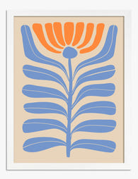
Modern Boho Blossom Art Print
Sale price From £11.95£19.95 -

Cherry Blossom Flight Art Print
Sale price From £11.95£19.95 -

Modern Blue Blossom Art Print
Sale price From £11.95£19.95 -

Cherry Blossom Orchard by Hiroshige Art Print
Sale price From £11.95£19.95 -

Plum Garden at Kamata by Hiroshige Art Print
Sale price From £11.95£19.95 -
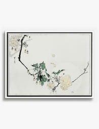
Cherry Blossom by Bijutsu Sekai Canvas Print
Sale price From £49.95£74.95 -

Spring Blossom Branches Art Print
Sale price From £11.95£19.95 -

Liberty London Cherry Blossom Poster Canvas Print
Sale price From £49.95£74.95 -

Lilac Blossom Harmony Art Print
Sale price From £11.95£19.95 -

Soft Blossom Bouquet Art Print
Sale price From £11.95£19.95


More from The Frame

Beatrix Potter Prints Beyond the Nursery: 5 Roo...
Beatrix Potter was a trained mycologist whose scientific fungi illustrations are held in the Armitt Museum, and whose original watercolours sell for six-figure sums at auction. Treating her work as...

You're Overthinking Parrot Wall Decor: A Style-...
Parrots have a reputation problem. Most people assume a parrot print means committing to banana leaves, rattan furniture and a full tropical fantasy. That's a shame, because parrot art is...

Vintage Botanical Prints: A No-Nonsense Guide t...
Vintage botanical prints are having a moment, and the internet is flooded with them. Most are terrible. Here's how to tell the real craftsmanship from the glossy, over-filtered reproductions, and...