Solid wood. Professionally framed. Arrives ready to hang.
Make your print ready to hang.
Choose your free prints.
Choose free prints
Make your prints ready to hang.
Add a solid wood frame and professional framing.
Typography Art Prints
4.8
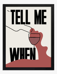
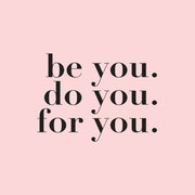
Letters doing the heavy lifting. This is everything from a single bold word to full quotes, hand-drawn script, vintage typography and stripped-back minimalist lettering. Start with what you want it to say, a mood, a joke, a place name, then choose a tone: heavy slab serifs hold a big blank hallway wall, quieter black and white suits a bedroom or a desk. Framed pieces turn up finished and ready to hang.
Typography prints are the most overdone, undervalued category in wall art. Most are mass-produced rubbish destined for a charity shop within a year. A few are genuinely brilliant. This guide...
Typography prints break the rules of normal art display. Text demands to be read, not just glanced at, which means the standard gallery wall advice you've absorbed from interiors content...
Most motivational wall art goes wrong for the same reason: people choose the quote first and worry about how it looks second. The result is a hot pink "BOSS BABE"...
We’re serious about art, ask away
From sizing to framing and print quality, Fab's art experts break it all down—so you can find the right art for your space.
What is typography art, and which styles does it include?
Typography art is wall art where letters, words and phrases are the main subject, arranged for visual impact as much as for meaning. Common styles include minimalist black and white quote prints, geometric Bauhaus and mid-century modern type, vintage letterpress and advertising posters, flowing Art Nouveau and Art Deco lettering, hand-lettered script and calligraphy, and bolder graffiti or street-art influenced designs. Some pieces pair text with illustration, while others treat letterforms as pure abstract shape. Prints come framed or unframed, so you can match an existing scheme. You may also like our Typography Canvas Prints.
Can I mix different fonts in one room without it looking messy?
Yes, as long as you keep it deliberate. A useful guideline borrowed from design is to limit one room to about two or three type styles, letting a single bold print lead while the others support it. Contrast reads better than near-sameness, so pair a classic serif with a clean sans, or a flowing script with simple block letters, and skip two lookalike fonts that compete for attention. Then unify the group with a shared thread: the same ink color, similar print sizes, or matching frames, framed or unframed, so it looks curated rather than random. Mixing script with block type is easier when you start from lettering prints.
What design movements shaped the typographic poster look, from Bauhaus to Swiss style?
The typographic poster look grew out of 1920s modernism: Russian Constructivism, Dutch De Stijl and the Bauhaus stripped away ornament in favor of geometry, sans serif letterforms and asymmetric layouts, ideas codified by Jan Tschichold's New Typography. Swiss schools in Zurich and Basel refined this into the International Typographic Style of the 1940s to 1960s, with strict grids, clear hierarchy, restrained color and faces like Helvetica. Later Pop, punk and New Wave loosened the rules. That heritage explains why type-led prints read as calm, clean and easy to mix with modern rooms. That same modernist lineage runs through many modern art prints.
Which typography prints work best for a bedroom?
For bedrooms, we'd steer you toward minimalist typography prints with a softer tone. Think single-word pieces like 'breathe' or 'rest' in a clean serif font, framed in natural oak, hung centered above your headboard. A 20x28 inch framed print sits perfectly above a standard full or queen bed without overwhelming the space. Black and white typography posters are the safe bet here, but a warm cream or soft sage palette can bring a quieter, more restful energy to the room.
How do I display typography prints without the wall looking cluttered?
The key rule with typography wall art is restraint. If you're hanging a single statement piece (say, a bold 28x40 inch word art print above the sofa), keep the surrounding wall completely clear. If you want a gallery wall, limit yourself to three or four prints maximum and stick to one font style across all of them. Mix sizes but keep frames consistent, either all black or all natural wood. Our framed prints arrive ready to hang with fixtures fitted, so you can lay them out on the floor first, finalize the arrangement, and have everything up in under an hour.
Are word art prints a good gift idea?
They're one of the best art gifts going, honestly. A beautifully framed typography art print feels personal without being risky. You're not guessing someone's taste in landscapes or abstract art. A motivational typography print in a classic black frame works in practically any home, and our prints are made to order on museum-grade paper with solid wood framing, so it arrives looking and feeling like a proper, considered gift. Pair it with one of our larger sizes (20x28 inches or above) and it genuinely looks like you spent far more than you did.
Do typography prints fade over time, especially near a window?
Not ours. Our framed art prints use UV-protective acrylic glazing that prevents fading even in direct sunlight, and the giclée inks we use are rated to last hundreds of years. So if you've got a blank wall next to a south-facing window that's crying out for a letter print, go ahead and hang it there. Plenty of our shoppers tell us the prints look even better in person than on screen, and they stay that way.
How does typography art differ from calligraphy prints?
Typography art uses designed typefaces, often with careful attention to layout, spacing, and hierarchy. It tends to feel more graphic and contemporary. Calligraphy prints lean on hand-drawn letterforms and flowing strokes, so they carry a more organic, traditional character. For a modern living room or home office, typography prints almost always land better because their clean lines sit comfortably alongside minimalist furniture and simple color palettes. If you want something that feels structured and intentional on your wall, typography is the way to go.
Choosing a selection results in a full page refresh.