


 Order today for delivery by
Beatrix Potter Prints Beyond the Nursery: 5 Rooms They Actually Work In
It's time to rescue Peter Rabbit and friends from the nursery and give them the walls they deserve.


Beatrix Potter was a trained mycologist whose scientific fungi illustrations are held in the Armitt Museum, and whose original watercolours sell for six-figure sums at auction. Treating her work as nothing more than baby shower décor is a disservice to one of Britain's most accomplished naturalist illustrators. Here is where her prints actually belong.
Why Beatrix Potter's illustrations belong in the fine art conversation
Before she published The Tale of Peter Rabbit, Potter spent years producing meticulous botanical and mycological watercolours. She studied fungi at the Natural History Museum, submitted a scientific paper to the Linnean Society (which, being a woman in 1897, she was not permitted to present herself), and produced hundreds of studies of lichens, mosses and spores that are still consulted by naturalists today.
Her children's book illustrations carry that same discipline. The hedgerows in Peter Rabbit are botanically accurate. The waistcoats, teapots and farmhouse interiors are observed from life in the Lake District, where she farmed Herdwick sheep and bought up thousands of acres for the National Trust. Her originals are held by the V&A, the British Museum and the Tate.
None of this is to say you need to justify liking Peter Rabbit. It is to say that if you want to hang her work on the wall of a reading room or a country kitchen, you are hanging real art. The muted watercolour palette, the pastoral subject matter, the botanical precision: this is closer to a 19th century natural history plate than to anything in the modern children's décor aisle.

Country kitchens: the natural home for her pastoral scenes
If you have a kitchen with any kind of rural lean, cream Shaker cabinets, a butler's sink, an Aga, exposed brick, or just a general softness, Potter's pastoral scenes slot in better than almost any other type of art.
The reason is colour. Her watercolours sit in a palette of soft greens, warm browns, buttery yellows and dusty terracottas. These are the exact tones that already live in a country kitchen: oak, linen, stoneware, copper. A print of Peter among the lettuces or Jemima Puddle-Duck crossing a farmyard reads as a continuation of the room, not a decoration layered on top of it.
We would hang two or three medium prints (around 40x50cm) in a horizontal row above a dresser or along a run of wall between windows. Keep the frames quiet. A slim black wooden frame with a generous white mount is our preference here, because it treats the image as a botanical plate rather than a storybook page. Avoid anything gilded or fussy in a kitchen context, it tips the whole thing into tearoom territory.
For inspiration on how to build around food-focused rooms, our kitchen wall art collection has examples of how pastoral and still life prints can anchor a cooking space without feeling kitsch.
What to pair them with
Botanical prints work beautifully alongside Potter. The visual language is the same: observed nature, watercolour technique, soft palette. A mixed grouping of two Potter scenes and one or two botanical art prints of ferns or herbs reads as a considered naturalist's wall rather than a themed display.
Hallways and landings: using smaller prints to add character
Hallways are the most under-used wall real estate in most homes, and they are perfect for Potter. The reason is practical: hallways are narrow, so you tend to view the art up close rather than from across a room. Potter's work rewards close inspection. The fine brushwork on a rabbit's ear, the texture of a mossy wall, the printed pattern on Mrs Tiggy-Winkle's apron. These details disappear on a sofa wall but sing in a corridor.
Our recommendation is a gallery wall of six to nine smaller prints, each around 30x40cm, hung in a tight grid or a loose salon-style cluster. A grid feels more architectural and modern. A cluster feels more collected and lived-in. Both work. Pick based on the age of the house.
For a Victorian or Edwardian hallway with picture rails and deep skirting, a loose cluster of mixed-size prints looks right. For a cleaner, more contemporary space, run a strict 3x3 grid at eye level with uniform frames and equal spacing between each piece.

Frame colour matters more than you think
Dark hallways benefit from black frames, which define the prints against the wall. Pale hallways look better with natural oak or warm walnut frames, which bring warmth to otherwise cool spaces. White frames tend to disappear and leave the prints looking unsupported, so we tend to avoid them unless the wall itself is a strong colour.
A quick note on hanging: in a hallway, centre your gallery wall at around 150cm from the floor to the middle of the arrangement, not to the middle of each print. This keeps the overall composition at eye level even if individual prints sit higher or lower.
The reading nook or home library: literary art done right
This is where Potter arguably belongs more than anywhere else. A room built around books should carry visual references to literature, and few British writers are as internationally beloved as Potter. Hanging her illustrations in a reading room is the same instinct as hanging a framed Shepard sketch or a Rackham fairy tale plate. It is literary art, in a literary space.
We would go for one larger statement piece here, up to 70x100cm, rather than many smaller ones. A single ambitious framed print of a detailed interior scene (Mr McGregor's garden, the interior of a burrow with its scrubbed pine furniture) gives the room an anchor. Pair it with an armchair, a reading lamp, and a stack of actual Potter first editions on the shelf behind if you are feeling committed.
The scientific illustration angle is worth playing with in a study or library too. If you can source prints of her fungi watercolours or botanical studies rather than the storybook scenes, you create a reading room that reads as naturalist's cabinet rather than children's library. Browse the full Beatrix Potter art prints collection to see which images lean more scientific and which lean more narrative.
Framing for a library context
Here you can get away with more traditional framing. A warm wood frame with a cream (not white) mount feels appropriate against bookshelves. If the room has existing antique furniture, a thin gilt frame on one or two pieces can work, but we would not do a whole wall of gilt. One gilded accent among plainer frames reads as considered. A whole wall of them reads as a gift shop.
Period living rooms: vintage prints with modern framing
If you live in a Victorian terrace, an Edwardian semi, a Georgian cottage or any genuinely old house, Potter's work has a historical register that matches the architecture. She was born in 1866 and did most of her best-known work between 1900 and 1920. Her illustrations belong to the same moment as the rooms you are hanging them in.
The trick to keeping this out of chintz territory is to frame vintage imagery in modern frames. A heavy ornate gilt frame on a Potter print, in a Victorian living room with floral wallpaper and a chesterfield, is too much agreement. Everything is pulling in the same direction and the result is overwhelming.
Instead, use a slim matte black frame or a plain oak frame with a wide white mount. The frame contradicts the image, which lets the image breathe. The same principle applies to any vintage art prints: modern framing is what stops old imagery feeling like a jumble sale.

Scale for a living room
In a period living room, go bigger than you think. A 60x80cm or 70x100cm framed print above a fireplace or sofa is the right scale. Two or three smaller prints scattered around tend to look nervous in a formal reception room. One confident, well-framed statement piece looks like a decision rather than a decoration.
Sizing and framing tips for non-nursery spaces
A few rules we would stick to across all of the above.
On size: the single biggest mistake with Potter prints is going too small. A 20x30cm print on a dining room wall looks apologetic. Scale the print to the wall, not to the subject matter. Just because it is a small rabbit does not mean the print has to be small.
On mounts: a generous white or cream mount around the image does more to lift Potter out of nursery territory than almost anything else. It frames the image as an artefact rather than a page. We would aim for at least a 5cm mount on prints up to 40x50cm, and 7cm or more on anything larger.
On frames: our order of preference for adult spaces is slim matte black, then natural oak, then warm walnut, then (sparingly) thin gilt. We would avoid chunky painted frames, distressed shabby chic frames, and anything with a decorative moulding. The image has enough character of its own.
On glazing and finish: matte paper beats glossy every time for watercolour reproductions. The whole appeal of Potter's work is the softness of the wash and the texture of the paper she painted on. A high-gloss finish flattens that and makes the print look like a laminated poster. Giclée printing on thick matte paper reproduces the original watercolour texture properly.
On arrival condition: this is where a lot of online print buying falls apart. Frames shipped separately from prints, warped mounts, bubbled surfaces, fixtures missing. If you are buying framed, you want everything fitted, ready to hang, and arriving in one piece. Nothing undermines a sophisticated styling decision faster than a frame that arrives in a flat pack.
What to avoid: keeping it sophisticated, not saccharine
A short list of things that will push even the best Potter print back into nursery territory.
Pastel backgrounds. Baby blue, nursery pink, buttercup yellow. Potter's own palette is muted and earthy. If the wall behind the print is a sugary pastel, the print absorbs that reading. Hang her work on deep greens, warm clay, chalky white, soft charcoal, or wood-panelled walls.
Character merchandise. We are talking about Potter's actual illustrations, not the modern cartoon adaptations, the plush toys, or the licensed character art drawn by other people decades after her death. The original watercolours have a specific loose, observed quality that the modern versions lack entirely. Stick to her hand.
Themed overload. One or two Potter pieces in a room reads as a considered choice. Twelve of them, plus the matching cushions, plus the tea towel, plus the ornamental figurines, reads as a theme park. Treat these prints the same way you would treat any art: a few strong pieces, placed with care.
Overly cute framing. Pastel frames, frames with carved rabbits on them, frames shaped like houses. If the frame is doing the character work, the art is not being allowed to speak for itself.
Hanging too low. Nursery art is often hung at child height. If you are hanging Potter in an adult space, hang it at adult eye level (around 145-150cm to the centre of the image). Low hanging is the single clearest visual signal that a room is for children.
The point of all of this is simple. Potter's work is good enough to stand on its own in any room you care about. Treat it like the fine art it is, frame it accordingly, and give it the wall space it deserves.


Fab products featured in this blog
-

Peter Rabbit in the Garden by Beatrix Potter Art Print
Sale price From £11.95£19.95 -

Rabbit and Geraniums by Beatrix Potter Art Print
Sale price From £11.95£19.95 -

Rabbit and Geraniums by Beatrix Potter Canvas Print
Sale price From £49.95£74.95 -

Flopsy, Mopsy and Cottontail by Beatrix Potter Art Print
Sale price From £11.95£19.95 -

Flopsy, Mopsy and Cottontail by Beatrix Potter Canvas Print
Sale price From £49.95£74.95 -
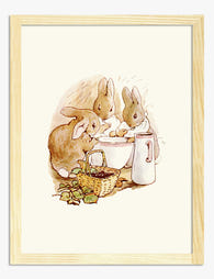
Flopsy, Mopsy and Cotton-tail by Beatrix Potter Art Print
Sale price From £11.95£19.95 -

Peter Rabbit in the Garden by Beatrix Potter Canvas Print
Sale price From £49.95£74.95 -

Peter Rabbit and Friends by Beatrix Potter Art Print
Sale price From £11.95£19.95 -

Rabbit in the Watering Can by Beatrix Potter Art Print
Sale price From £11.95£19.95 -

Ginger and Pickles by Beatrix Potter Art Print
Sale price From £11.95£19.95 -

Flopsy, Mopsy and Cotton-tail by Beatrix Potter Canvas Print
Sale price From £49.95£74.95 -

Rabbit in the Watering Can by Beatrix Potter Canvas Print
Sale price From £49.95£74.95 -

Peter Rabbit and Friends by Beatrix Potter Canvas Print
Sale price From £49.95£74.95 -

Ginger and Pickles by Beatrix Potter Canvas Print
Sale price From £49.95£74.95 -

Rabbit and Mouse by Beatrix Potter Art Print
Sale price From £11.95£19.95 -

Rabbit and Mouse by Beatrix Potter Canvas Print
Sale price From £49.95£74.95 -

Mrs. Rabbit by Beatrix Potter Art Print
Sale price From £11.95£19.95 -

Peter Rabbit by Beatrix Potter Canvas Print
Sale price From £49.95£74.95 -

Peter Rabbit and the Robin by Beatrix Potter Art Print
Sale price From £11.95£19.95 -

Mrs. Rabbit by Beatrix Potter Canvas Print
Sale price From £49.95£74.95


More from The Frame

Why Botanical Art Works Better in Small Living ...
Botanical art does something strange to small rooms: it softens them without crowding them. In large rooms, it often gets lost, floating on a wall that needs more weight. This...

Blending Vintage and Modern Décor? Start With Y...
Your furniture is already a mix. A mid-century sideboard here, a modern bouclé chair there, maybe your grandmother's wingback holding court in the corner. The walls are where you make...

7 Steps to Style a Woodland Gallery Wall with F...
A fox print is one of the most forgiving anchors you can build a gallery wall around. The silhouette is distinctive, the colour palette (rust, cream, charcoal, forest green) plays...