Art for Cool Neutral Walls: Greys and Off-Whites
How to choose art that celebrates cool greys and off-whites instead of trying to warm them into submission.

Cool neutrals aren't a design problem to solve. They're a deliberate, considered backdrop that deserves art chosen with the same care that went into picking the paint. Most advice treats grey walls as something to "fix" with warmth, but if you chose cool tones for their modern, architectural calm, you don't need to undo that with terracotta everything.
Read your wall before you choose anything
Before you look at a single print, work out what kind of cool neutral you're living with. Hold a sheet of pure white paper against your wall in daylight. If your wall reads blue, violet, or green next to the paper, you have a true cool neutral. If it leans yellow or pink, it's actually a warm neutral pretending, and the rules below need adjusting.
Cool greys split into three families worth knowing. Blue-greys (think soft pigeon, slate, gunmetal) feel crisp and architectural. Green-greys (sage-tinged, sometimes called French grey) feel softer and more organic. Then there are the near-blacks: charcoal, deep slate, anthracite, which behave more like a colour than a neutral.
Off-whites are the same story in a higher key. A cool off-white has hints of grey, blue, or green and reads bright and gallery-like. A warm off-white leans cream, almond, or putty. Get this wrong and your art will look like it belongs in a different room.

Why cool-on-cool is the more interesting choice
Designers spent a decade telling everyone to "warm up" cool greys with mustard cushions and burnt orange throws. It's a safe move, and we'll get to when it works. But there's a more sophisticated approach that most guides skip entirely: leaning into the coolness with tonal layering.
A charcoal abstract on a soft grey wall, with a slate-blue sofa and a single brass lamp, looks like a considered piece of architecture. Replace that abstract with a warm sunset print and you've just turned a calm room into a confused one. Cool-on-cool is harder to get wrong than people think, as long as you vary the values.
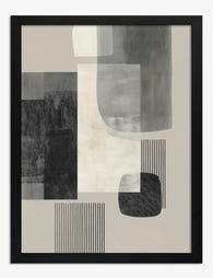
The trick is contrast within the cool family. Don't put a mid-grey print on a mid-grey wall. Go darker (charcoal, ink, deep slate) or lighter (chalk, bone, soft white) so the art holds its own. Pieces with strong tonal range, like high-contrast black and white photography or moody abstracts with deep blacks and bright whites, are made for this.
Art styles that genuinely suit cool neutrals
Black and white photography
The most reliable choice, and we'd argue the most underused. Architectural photography, figurative studies, moody landscapes, all of these sit perfectly on cool walls because they share the same tonal vocabulary. A high-contrast image with deep blacks anchors a pale grey wall; a softer, foggy print extends the calm of a darker slate wall.
Browse our black and white prints if you want a starting point. The thick matte paper we print on has no glare, which matters more in cool rooms where any reflection breaks the mood.
Abstract expressionism and gestural work
Cool walls are the natural habitat for abstract work with confident brushwork. Look for pieces with visible mark-making, where you can see the gesture of the artist's hand. The texture in the image compensates for the flatness people fear in cool rooms, without resorting to warm colour as a crutch.
Pieces with deep ink blues, soft greys, blacks, and crisp whites read as one continuous design conversation with the wall. Add a single unexpected note (a slash of ochre, a quiet rust) and you've got tension without warmth taking over.
Minimalist line drawings
Single-line figure drawings, botanical outlines, and minimal architectural studies feel right at home on off-whites and pale greys. They keep the gallery quality of the wall intact. The danger is going too small and too sparse, which we'll come back to in sizing.
Cool-toned landscapes and seascapes
Misty mountains, Nordic coastlines, foggy fields. These do the warming-up work without abandoning the palette. The eye reads them as atmospheric rather than cold, which is the sweet spot for anyone worried their room feels clinical.
Botanicals, but choose carefully
Forget brown-toned vintage botanicals. For cool walls, look for pressed-flower style prints with sage, eucalyptus, olive, or simple black ink drawings on cream. Our botanical prints collection has plenty that lean into the cooler, herbaceous end of the spectrum.

When to bring in warmth (and how to do it properly)
The "add burnt orange" advice exists for a reason. It works. But the way most guides apply it is heavy-handed, treating warmth as a corrective rather than a counterpoint.
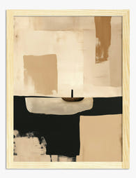
If your cool room genuinely feels stark, and you've ruled out lighting and texture as the real culprits, warmth in art is best added as a quiet accent rather than the main event. Look for predominantly cool prints with a small warm focal point: a single rust-coloured shape in an otherwise blue abstract, a figure in a saffron jumper in an otherwise grey street scene, a sunset where the sky is mostly slate.
Avoid prints where warm colour dominates the composition. A wall-to-wall terracotta abstract on a cool grey wall fights the room instead of complementing it. You'll feel the discord every time you walk in, even if you can't name it.
The other moment warmth works without question is in dark cool rooms (charcoal walls, deep slate). Here, a print with golden, amber, or candle-warm tones reads as glow against shadow, which is one of the oldest and most satisfying visual moves in interior design.
Size: stop guessing
Cool neutral rooms tend to be minimalist, which means undersized art shows up immediately. The proportions matter more here than they do on a busy gallery wall.
Above a sofa: your art (or arrangement) should span two-thirds to three-quarters of the sofa's width. For a standard 220cm sofa, that's roughly 145 to 165cm of art. A single 100x150cm canvas hits this beautifully. Two 60x80cm prints side by side also work.
Above a sideboard or console: same rule, two-thirds to three-quarters of the furniture width, and hang the art 15 to 25cm above the surface so it reads as connected rather than floating.
Eye level: the centre of your artwork should sit around 145cm from the floor, which is gallery standard. In rooms with very high ceilings, you can go higher, but resist the urge to hang art too high because you have the wall space. Art hung too high is the single most common mistake in modern interiors.
Stairwells and corridors: here you can go vertical and tall. A 70x100cm portrait orientation print works hard in narrow spaces where horizontal arrangements feel cramped.
If you're hanging a large statement piece, our large wall art selection goes up to 100x150cm on canvas and 70x100cm framed, which covers most generous wall situations without looking apologetic.
Frames: the decision people overthink
Three frame choices cover almost every cool neutral situation.
Matte black is the most versatile, full stop. It echoes the dark values in cool rooms without competing, and it works equally well on charcoal walls and chalky off-whites. If you're buying one frame and want it to behave, choose black.
Natural oak or ash introduces a touch of warmth without crossing into rustic. We particularly like pale oak frames against blue-grey walls, where the wood reads as a gentle contrast rather than a clash. Avoid orangey pine or dark walnut, both of which can look heavy on cool walls.
White frames work best on darker cool walls (deep slate, charcoal) where they create breathing room around the art. On pale grey or off-white walls, white frames can disappear into the wall and lose definition unless the print itself is high contrast.
Whatever you choose, the frame needs to be properly fitted to the print. Warped backing, prints shifting in the mount, frames arriving separately from the print so you have to assemble them yourself, all of this ruins the polished look that cool neutral rooms depend on. Our framed prints arrive in one box, ready to hang, with the print mounted and fitted properly behind UV-protective acrylic glaze. The acrylic matters in cool rooms with lots of daylight, because traditional glass adds reflections that flatten the image.

Texture: the secret weapon
The fear with cool walls is flatness. The solution isn't always more colour, it's more texture, and that includes the texture of your art.
Canvas prints, with their woven surface and matte finish, add tactile depth that a smooth paper print can't match. On a flat cool wall, a canvas piece introduces dimension that catches light differently throughout the day. The mirrored edge wrapping on our canvas prints means the image wraps cleanly around the sides without cropping, which matters when you're hanging it unframed for a minimal look.
Beyond the art itself, layer texture in the room around it: a chunky knit throw in stone, a linen cushion in soft grey, a ceramic vase with visible making marks. The art doesn't have to do all the warming work alone.
For art with built-in textural interest, look for pieces with visible brushwork, paper collage, photography of textured subjects (concrete, weathered wood, fabric), and any print where the surface of the depicted object is part of the appeal.
Monochromatic schemes: the most underrated approach
A fully tonal cool scheme, where art, walls, furniture, and accessories all sit within the same family of greys, blues, and whites, looks expensive in a way that's hard to fake. It's the approach you see in Scandinavian interiors, in Belgian design, in the better hotels.
The rule is simple: vary the values dramatically, keep the hues close. So a soft grey wall, a charcoal sofa, a chalk white rug, and a print that contains all three values in some abstract arrangement. Nothing fights, but nothing's flat either, because the range from light to dark is doing the heavy lifting.
This is where abstract art really earns its place. Abstract pieces with confident tonal range are essentially custom-mixed to suit cool monochromatic rooms, because they contain the same value variations the room itself uses.
Use neutral walls as a seasonal canvas
One advantage of cool neutrals that almost nobody mentions: they're the easiest backdrop to refresh seasonally. Swap a moody winter abstract for a brighter spring landscape and the room transforms without repainting a thing.
This is where investing in good art pays off. A high-quality framed print with archival inks (ours are rated to last hundreds of years even in direct sunlight) becomes a piece you keep and rotate, not something that fades in two summers. Two or three core pieces, swapped seasonally, give you four different rooms a year.

Modern vs traditional cool neutrals
Not all cool neutral rooms are minimalist. A traditional space with cool grey walls, panelling, and softer furniture asks for different art than a clean-lined contemporary room with the same paint.
For traditional cool rooms, look at moody portraiture, classical etchings, soft botanical studies, and atmospheric landscapes. The art can be smaller and more numerous, hung gallery-style, with ornate or simple wooden frames.
For contemporary cool rooms, go bigger and bolder with fewer pieces. One large abstract or photograph carries more weight than several small prints. Frames should be thin and uniform, with matte black or pale wood being the safest bets.
The short version
Choose art that respects the wall instead of fighting it. High-contrast black and white work, cool-toned abstracts, atmospheric landscapes, and minimal line drawings all sit naturally on grey and off-white walls. Size generously (two-thirds of the furniture below), hang at eye level (145cm to centre), and pick a frame that introduces either dark depth (matte black) or quiet warmth (pale oak). Cool walls aren't cold. They're calm, and the right art makes that calmness feel intentional.

In diesem Blog vorgestellte Fab-Produkte
-

Poster Sanfte Formen in Monochrom
Translation missing: de.products.product.sale_price Ab £11.95£19.95 -

Poster moderne geometrische Formen in neutralen Erdtönen
Translation missing: de.products.product.sale_price Ab £11.95£19.95 -

Poster moderne monochrome Geometrie in Beige, Anthrazit und Taupe
Translation missing: de.products.product.sale_price Ab £11.95£19.95 -
Poster Urbane geometrische Formen in Schwarz, Grau und Beige
Translation missing: de.products.product.sale_price Ab £11.95£19.95 -

Poster Abstrakter Organischer Fluss in Beigetönen
Translation missing: de.products.product.sale_price Ab £11.95£19.95 -

Poster Harmonie in Erdtönen – modern
Translation missing: de.products.product.sale_price Ab £11.95£19.95 -

Poster Muse in Monochrom – weibliche Silhouette in schwarz-weiß-grau
Translation missing: de.products.product.sale_price Ab £11.95£19.95 -

Poster Abstrakte moderne Pinselstriche in Schwarz und Beige
Translation missing: de.products.product.sale_price Ab £11.95£19.95 -

Leinwandbild Neutrale Harmonie in Pinselstrichen
Translation missing: de.products.product.sale_price Ab £44.95£74.95 -

Poster Minimalistische Linien auf beigem Grund
Translation missing: de.products.product.sale_price Ab £13.99£19.99 -
Poster Minimalistische Dämmerung in warmen Tönen
Translation missing: de.products.product.sale_price Ab £11.95£19.95 -

Poster neutrale botanische Silhouette in Erdtönen
Translation missing: de.products.product.sale_price Ab £13.99£19.99 -

Leinwandbild in urbanen Erdtönen
Translation missing: de.products.product.sale_price Ab £44.95£74.95 -

Poster Winterwanderer
Translation missing: de.products.product.sale_price Ab £11.95£19.95 -

Poster Abstrakte organische Formen in neutralen Tönen
Translation missing: de.products.product.sale_price Ab £11.95£19.95 -

Leinwandbild Neutrale Geometrie in warmen Erdtönen
Translation missing: de.products.product.sale_price Ab £44.95£74.95 -

Leinwandbild moderne abstrakte Geometrie in neutralen Tönen
Translation missing: de.products.product.sale_price Ab £44.95£74.95 -

Leinwandbild kubistisches Porträt in neutralen Tönen
Translation missing: de.products.product.sale_price Ab £44.95£74.95 -

Poster Mediterrane Moderne mit weißer Katze
Translation missing: de.products.product.sale_price Ab £11.95£19.95 -

Poster Stille Reflexion
Translation missing: de.products.product.sale_price Ab £11.95£19.95


Mehr aus The Frame

Art for Pink Walls
Pink walls are the most misunderstood backdrop in interiors. People assume they're tricky, twee, or only for nurseries, when in fact pink is one of the most flattering colours you...

Art for Blue Walls: Sage, Navy, and Powder
Blue walls are one of the most rewarding paint decisions you can make, and one of the trickiest to style. Navy swallows light, powder blue can wash out, and sage...

Art for Dark Walls: Going Bolder or Quieter
Dark walls are not a problem to solve. They are an opportunity that most people approach with one tired piece of advice: just add contrast. The truth is there are...