Art for Dark Walls: Going Bolder or Quieter
A framework for deciding between high-contrast drama and tonal layering, with specific advice for navy, charcoal and true black.

Dark walls are not a problem to solve. They are an opportunity that most people approach with one tired piece of advice: just add contrast. The truth is there are two equally valid philosophies for art on dark walls, and the right one depends entirely on what you want the room to feel like.
The two philosophies, briefly
The first approach is high contrast. Light, bright, or punchy art against a moody backdrop. The wall recedes, the art advances. Drama, energy, focal point.
The second is tonal layering. Dark art on dark walls, with subtle shifts in temperature and texture doing the heavy lifting. The room feels enveloping, hushed, luxurious. Think hotel bar rather than gallery.
Neither is more sophisticated than the other. They simply do different jobs. A reading nook painted in inky charcoal does not want a neon abstract screaming at you from across the room. A dining room in deep navy might be exactly the place for one.
The question to ask before you buy anything: do you want this room to feel active or restful?

Not all dark walls are the same
This is the part most guides skip. Navy, charcoal and true black are wildly different to work with, and they pull art in different directions.
Navy blue walls
Navy has cool undertones and a surprising amount of life in it. Under warm light it leans almost purple, under daylight it sharpens into something closer to ink. Navy plays beautifully with warm tones (terracotta, mustard, ochre, dusty pink) because the temperature contrast creates depth without harshness.
Avoid pairing navy with pure cool blues unless you're going deliberately monochromatic. The art will sit on the wall doing nothing.
Charcoal grey walls
Charcoal is the most flexible dark wall colour and the easiest to style. It has no strong temperature pull of its own, which means almost anything works, but that flexibility is also a trap. Without a clear direction, charcoal rooms can feel anonymous.
Pick a lane. Either lean into the moodiness with sepia tones, muted botanicals and earthy abstract prints, or break it open with crisp whites, bright colour blocks, and graphic black and white photography.
True black walls
Black is the boldest choice and the least forgiving. There is no undertone to work with, no softness to lean on. Art on black walls needs to be either confidently bright (so the contrast reads as intentional) or confidently dark (so the whole composition feels considered).
The mistake on black walls is mid-tones. A muddy grey print on a black wall just looks like you couldn't decide.
Forest green and deep burgundy
The jewel tones are having a moment and they behave differently again. Forest green wants warm, natural imagery: botanicals, landscapes, anything with organic shapes. Burgundy is a chameleon that flatters portraits, vintage photography, and rich painterly art prints better than almost any other wall colour.
The three non-negotiables
Whatever direction you choose, three things must be right or the art will fail. These apply equally to bold and quiet approaches.
1. Scale, then scale again
The single biggest mistake on dark walls is going too small. Dark colours absorb light and visually compress space, which means a print that looked generous on a white wall will look like a postage stamp on a navy one.
A useful rule: whatever size you think you need, go up one. Above a standard three-seater sofa (around 210cm wide), you want art that spans at least 90cm to 120cm horizontally. Above a console table, aim for two thirds the width of the furniture below. For a statement single piece, 70x100cm is usually the minimum on a feature wall.
If a single large print feels too committal, an extra large canvas at 100x150cm earns its keep on a moody wall in a way that nothing smaller does.
2. A lighting plan
Dark walls without a lighting plan are where art goes to die. Overhead lighting alone will leave the art flat and the room cave-like.
You need directional light hitting the artwork. A picture light mounted above the frame is the most polished option. A wall sconce angled toward the piece works almost as well. Even a floor lamp positioned to wash the wall transforms how the art reads.
This is also where the practical advantages of UV-protective acrylic glazing matter. Picture lights run warm and stay on for hours, and proper UV protection means the print will not fade or yellow under repeated direct lighting.
3. A visual anchor
Art on dark walls needs something to stop it disappearing. That anchor can be a generous mat, a frame in the right colour, or one deliberate point of contrast within the image itself.
Without an anchor, especially in tonal layering schemes, the art dissolves into the wall.

The frame decision
Frame colour does more work on dark walls than anywhere else in the home. Get it wrong and the art looks like it was hung by accident.
Black frames create cohesion. They make the artwork feel like a fitted, intentional part of the wall rather than something stuck on top. Use black frames when you want a tonal, layered, gallery-bar feel.
White or cream frames create breathing room. They act as a literal frame of light around the image, which is essential if the art itself is dark or if the wall is true black. White frames are also the right answer for almost all photography and minimal line work.
Natural wood frames (oak, ash) bridge the two. They soften the wall without fighting it, and they're the most flattering option for botanical prints, landscapes and anything with warm tones. On navy and forest green especially, a pale oak frame is hard to beat.
Solid FSC wood frames matter here in a way they don't always elsewhere. MDF or veneered frames warp, especially in rooms with any humidity, and a warped frame on a dark wall is instantly visible because the shadow gap goes wonky. This is the failure mode that ruins more dark-wall art than any styling mistake.
The matting advantage
If you take one practical tip from this article: oversized mats are your secret weapon on dark walls.
A generous mat (5cm or more around the image) creates what designers call a "window of light." It separates the artwork from the wall, gives the eye somewhere to rest, and makes even a relatively small print feel substantial.
On black walls especially, a white mat around a black and white print is one of the most reliable styling moves in interior design. It works every time, in every room, at every budget.
Going bolder: when high contrast is the right call
Bold works in social, active spaces. Dining rooms, entertaining areas, kitchens, home bars, hallways. Anywhere you want the room to lift your energy rather than lower it.
Bold also works when the dark wall is being used as a backdrop to make something specific pop. A single statement piece in saturated colour on a charcoal wall reads as confident. The same piece on a beige wall reads as nervous.
What to look for:
- Saturated colour against a desaturated wall
- Crisp white space within the image
- Graphic compositions with clear shapes
- Photography with strong tonal range
Botanical prints with bright greens and whites are particularly effective on navy and charcoal. Abstract pieces with one dominant warm colour (mustard, rust, coral) flatter almost any dark wall.

Going quieter: when tonal layering is the right call
Quiet works in restful, intimate spaces. Bedrooms, reading corners, snugs, home offices where you need to think. Anywhere the room's job is to slow you down.
Tonal layering also works in rooms that already have a lot going on. If the furniture is loud, the rug is patterned, and the lighting is dramatic, then high-contrast art will just add to the noise. Going quiet pulls the whole composition together.
What to look for:
- Art that shares the wall's general tone but shifts in temperature
- Texture-led pieces: charcoal sketches, ink washes, moody landscapes
- Sepia and warm-grey photography
- Botanicals in muted, dusty palettes
The trick with tonal layering is that you need something to stop the art vanishing. That's usually the frame (a warm wood frame against a cool charcoal wall, for example) or a small zone of contrast within the image itself: a streak of pale sky in an otherwise dark landscape, a single bright bloom in a moody still life.
Room by room: where each approach earns its keep
Living rooms tend to want a hybrid. Bold above the sofa as a focal point, quieter pieces elsewhere to balance.
Bedrooms almost always want quiet. A loud print opposite the bed is the enemy of sleep. Tonal landscapes and soft abstracts above the headboard age better than statement pieces.
Dining rooms are the natural home of bold. You're in there for hours, talking, and the art is doing social work. Go bigger and brighter than you think.
Home offices depend on the work. Creative work tends to benefit from one bold piece. Focused, analytical work prefers quiet.
Hallways and stairwells love a gallery wall, but the rules change on dark walls (see below).
Bathrooms with dark walls are increasingly common and almost always want quiet. Canvas prints handle the humidity better than paper-based options here, and a stretched canvas in a moody botanical print is a strong bet.
Gallery walls on dark walls: the rules change
A gallery wall that works on white walls will look messy on dark ones. Three things shift:
- Use fewer pieces. Five to seven, not twelve. Dark walls compress visual information, so a busy gallery becomes overwhelming.
- Leave more space between frames. At least 5cm to 7cm gaps, sometimes more. The negative space is what lets each piece breathe.
- Standardise the framing. Mixed frames work on white walls because the wall provides the unifying field. On dark walls, the frames need to do that job. Stick to one frame colour, ideally one frame style.
A gallery wall of seven matching black frames with white mats on a charcoal wall is a much stronger composition than twelve mismatched frames on the same wall.
How to test before committing
You don't have to guess. Two cheap tests will tell you whether bold or quiet is right for your room.
The phone test. Find images of dark rooms with art you like. Then find the opposite philosophy applied to a similar room. Look at both for ten minutes. Which one do you want to be in?
The paper test. Print A4 versions of any artwork you're considering, tape them to the wall in roughly the right position, and live with them for three days. Look at them in morning light, evening light, and lamp light. If the art has disappeared by day two, it's wrong. If you keep glancing at it, it's right.
The 99-day returns policy exists precisely for this. If a piece arrives and doesn't sit right on the wall, you have plenty of time to decide.

The mistakes that make art vanish
To finish, the five failures that cause most dark-wall art to underperform:
- Too small. The most common mistake by a wide margin.
- No directional lighting. Overhead light alone flattens everything.
- Fighting the undertones. Cool art on warm-toned dark walls (or vice versa) creates a low-grade visual itch.
- Wrong frame colour. White frame where black was needed, or black where white was needed.
- Skipping the mat. Especially on busy or dark images, a generous mat is what makes the piece read.
Decide first whether your room wants to feel active or restful. Match the philosophy to the answer. Then get scale, lighting and framing right, and the art will do exactly what you hoped it would.

In diesem Blog vorgestellte Fab-Produkte
-
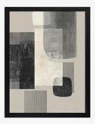
Poster Urbane geometrische Formen in Schwarz, Grau und Beige
Translation missing: de.products.product.sale_price Ab £11.95£19.95 -

Poster Muse in Monochrom – weibliche Silhouette in schwarz-weiß-grau
Translation missing: de.products.product.sale_price Ab £11.95£19.95 -

Leinwandbild Monochrome geometrische Formen
Translation missing: de.products.product.sale_price Ab £44.95£74.95 -

Poster Bär & Blumen von Morris
Translation missing: de.products.product.sale_price Ab £11.95£19.95 -

Leinwandbild Silhouetten-Muse, monochromes Porträt
Translation missing: de.products.product.sale_price Ab £44.95£74.95 -

Poster Abstrakte Pinselstriche in Schwarz und Beige
Translation missing: de.products.product.sale_price Ab £11.95£19.95 -
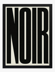
Poster Typografie – Markantes Statement in Schwarz-Weiß
Translation missing: de.products.product.sale_price Ab £11.95£19.95 -

Poster William Morris – Vögel, Blüten und Granatäpfel
Translation missing: de.products.product.sale_price Ab £11.95£19.95 -

Poster Pfauen in Mitternachtsblau – inspiriert von William Morris
Translation missing: de.products.product.sale_price Ab £11.95£19.95 -
Poster Minimalistische Dämmerung in warmen Tönen
Translation missing: de.products.product.sale_price Ab £11.95£19.95 -
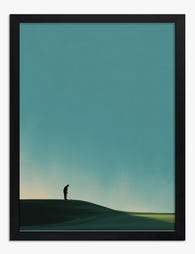
Poster stiller Golfer in der Dämmerung
Translation missing: de.products.product.sale_price Ab £11.95£19.95 -

Poster urbane Ruhe – abstrakte Pinselstriche in Schwarz & Beige
Translation missing: de.products.product.sale_price Ab £11.95£19.95 -

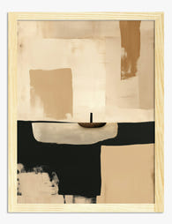
Leinwandbild Warme Dämmerung – minimalistisch in Beige und Braun
Translation missing: de.products.product.sale_price Ab £44.95£74.95 -

Poster Sanfte Formen in Monochrom
Translation missing: de.products.product.sale_price Ab £11.95£19.95 -

Poster Weg durch den nächtlichen Wald
Translation missing: de.products.product.sale_price Ab £11.95£19.95 -

Poster Mondnacht von William Morris
Translation missing: de.products.product.sale_price Ab £11.95£19.95 -

Poster minimalistische Muse – Markante Formen in Olive & Schwarz
Translation missing: de.products.product.sale_price Ab £11.95£19.95 -

Poster Schwarze Katze im botanischen William-Morris-Stil
Translation missing: de.products.product.sale_price Ab £11.95£19.95 -

Poster Palmenschatten in Schwarz-Weiß
Translation missing: de.products.product.sale_price Ab £11.95£19.95


Mehr aus The Frame

Art for Pink Walls
Pink walls are the most misunderstood backdrop in interiors. People assume they're tricky, twee, or only for nurseries, when in fact pink is one of the most flattering colours you...

Art for Blue Walls: Sage, Navy, and Powder
Blue walls are one of the most rewarding paint decisions you can make, and one of the trickiest to style. Navy swallows light, powder blue can wash out, and sage...

Art for Cool Neutral Walls: Greys and Off-Whites
Cool neutrals aren't a design problem to solve. They're a deliberate, considered backdrop that deserves art chosen with the same care that went into picking the paint. Most advice treats...