How to Arrange Wall Art Sets: Layouts That Actually Work (With Measurements)
The exact measurements, spacing rules, and layout decisions for hanging sets of 2, 3, and 4 prints properly.

You've got the prints. You've got a hammer. You're staring at a blank wall trying to remember what that interiors article said about eye level. This guide skips the inspiration and gives you the measurements, the rules, and the one trick that makes any arrangement look intentional rather than improvised.
The 2/3 rule: why your set should cover two-thirds of the furniture below it
Art that's too small for the furniture beneath it makes a wall look apologetic. The fix is one of the most reliable rules in interior design: your art set should span roughly two-thirds of the width of the sofa, bed, sideboard, or console below it.
Do the maths before you buy anything. A 180cm (71in) sofa wants art spanning around 120cm (47in). A 220cm (87in) sofa wants roughly 145cm (57in) of art. A 150cm (59in) sideboard wants around 100cm (39in) of coverage. That total includes the gaps between prints, not just the prints themselves.
This is why measuring your furniture matters before you order. A pair of 30x40cm prints with a 5cm gap between them spans just 65cm, which looks lost above almost any sofa. Two 50x70cm prints with a 5cm gap spans 105cm, which sits properly above a 160cm loveseat but still looks undersized above a three-seater. If you're shopping for living room wall art, measure the sofa first, then work backwards to print sizes.
The exception is when there's no furniture below, like a hallway or stairwell wall. Then the wall itself becomes your reference, and you want your set to occupy the central two-thirds of the available wall width.

Hanging height: 145cm to centre is not a suggestion, it's the rule
The centre of your art set should sit at 145cm (57in) from the floor. This isn't a stylistic preference. It's the height galleries and museums use because it matches the average human eye level when standing, and it's the height your eye naturally settles on whether you're sitting or standing.
The mistake almost everyone makes is hanging too high. Art floats up the wall, disconnected from the furniture, and the room feels off without anyone being able to say why. If you've ever walked into a room and thought "the art looks lonely up there," it was hung above 145cm.
For a set, 145cm refers to the centre of the entire arrangement, not the centre of any individual print. So if you've got two prints stacked vertically, the midpoint of the gap between them sits at 145cm. If you've got a horizontal row of three, the horizontal centreline of the prints sits at 145cm.
There's a second rule that works alongside this: leave 15 to 20cm (6 to 8in) between the top of your furniture and the bottom of your lowest frame. Less than that and the art feels glued to the sofa. More than that and it floats. Most of the time, hitting 145cm to centre will land you in this zone naturally.
When to break the rule
Tall ceilings (over 3m) can take a slightly higher centre point, around 150 to 155cm. Very low ceilings (under 2.3m) sometimes look better with the centre at 140cm. Low seating like a daybed or low-slung sofa is the only context where you might drop the centre to 135cm to keep the connection to the furniture.
Set of 2: the only two layouts that work
There are exactly two arrangements for a pair of prints that look deliberate. Side-by-side, or stacked.
Side-by-side
This is the default and it works almost everywhere. Two prints of identical size, hung horizontally next to each other with 5cm (2in) between them. Use this above sofas, beds, sideboards, and any furniture that's wider than it is tall.
For a 180cm sofa, two 50x70cm portrait prints with a 5cm gap gives you 105cm of coverage. Tight on the 2/3 rule but workable. Two 60x80cm portrait prints with a 5cm gap gives you 125cm. That's the sweet spot.
Stacked
Two prints, identical size, hung one above the other with 5cm between them. Use this for narrow walls: between two windows, beside a doorway, in a hallway, or on either side of a fireplace. Stacked pairs also work brilliantly above bedside tables, where horizontal width is limited.
A pair of 30x40cm prints stacked with a 5cm gap gives you a vertical run of 85cm. A pair of 40x50cm stacked gives you 105cm. For bedroom wall art over nightstands, stacked pairs of 30x40cm are usually the right call.
What doesn't work: two prints of different sizes, two prints at slightly different heights, or two prints with a randomly chosen gap. Asymmetry needs confidence and a third or fourth element to balance against. With just two prints, symmetry is the only safe move.

Set of 3: horizontal line vs staggered
A trio of prints offers more layout flexibility, but the choice is still narrower than the internet suggests. We strongly recommend the horizontal line, and here's why.
The horizontal line
Three identical prints, equal sizes, in a row, with consistent 5cm gaps between them. The horizontal centreline at 145cm. This is the most forgiving layout for DIY hanging because there's only one height to get right, and the spacing is repeated, which makes errors visible and correctable.
For a 200cm sofa, three 40x50cm prints with two 5cm gaps gives you 130cm of total width. For a 220cm sofa, three 50x70cm prints with two 5cm gaps gives you 160cm. Both hit the 2/3 rule cleanly.
The staggered or stepped layout
Three prints arranged with the centre print slightly higher or lower than the outer two. We don't recommend this for most people. It looks intentional only when the offset is precise (usually a 5cm step), and a small measuring error makes it look like a mistake rather than a design choice.
If you want visual variety, get it from the prints themselves, not from the layout. Three prints from the same series, or three pieces with related palettes, will create more interest than a fiddly arrangement of mismatched ones. Browse wall art sets curated as trios if you want the colour and composition work done for you.
Vertical column
Three prints stacked in a column work in narrow vertical spaces, like a stairwell or beside a tall doorway. Same rules apply: identical sizes, 5cm gaps, centred at 145cm.
Set of 4: grid layout measurements for different wall widths
A grid of four (two by two) is the cleanest layout for a set of four. We rarely recommend a horizontal row of four unless the wall is very wide, because the eye loses the grouping when prints stretch too far.
Here's the maths for a 2x2 grid using 40x50cm portrait prints with 5cm gaps:
- Total width: 40 + 5 + 40 = 85cm
- Total height: 50 + 5 + 50 = 105cm
This grid works on a wall of around 130cm wide and above a roughly 130cm sideboard. For a wider wall, scale up.
Using 50x70cm prints with 5cm gaps:
- Total width: 50 + 5 + 50 = 105cm
- Total height: 70 + 5 + 70 = 145cm
That suits a 160cm sideboard or a 220cm media unit. Using 60x80cm prints with 5cm gaps gets you to 125cm wide and 165cm tall, which is a serious statement and needs a wall of at least 170cm clear width.
For a horizontal row of four, the rule of thumb is each print should be no smaller than 30x40cm or the row starts to look like postage stamps. Four 30x40cm prints with three 5cm gaps gives you a 135cm row. Four 40x50cm prints with three 5cm gaps gives you 175cm.

Spacing: why 5-8cm is the magic range
Most online guides cite 2 to 6 inches, which is uselessly wide. We think 5cm (2in) is the right answer for almost every set, with 8cm (3in) reserved for thicker frames or larger prints (over 70x100cm) where visual weight needs more breathing room.
Here's why a tighter gap works better: prints in a set should read as one composition. Wide gaps break the grouping and the eye sees three separate things rather than one arrangement. At 5cm, the prints stay visually connected. At 10cm or more, they drift apart and the wall looks indecisive.
The other thing about 5cm is that it's repeatable. You only have to measure it once and use the same spacer for every gap, which guarantees consistency. Inconsistent spacing is the single biggest tell that art was hung by eye.
Frame thickness matters too. A chunky 4cm frame profile carries more visual weight, so 7 to 8cm spacing prevents the prints from feeling crowded. A slim profile (under 2cm) looks best at a tight 5cm.
The cardboard spacer trick for perfectly even gaps
This is the technique that separates a professional-looking hang from a wonky one, and it takes about ninety seconds.
- Cut a strip of cardboard exactly 5cm wide and around 30cm long. The width is what matters, the length just needs to be enough to hold.
- Hang your first print in its final position. Use a level. Confirm the centre is at 145cm if it's a single-row arrangement.
- Hold your cardboard spacer flat against the side (or bottom) of the first print, pressed against the frame edge.
- Position the next print's frame edge directly against the other side of the cardboard. The cardboard now guarantees a perfect 5cm gap.
- Mark your hanging points through the back of the second frame, remove the spacer, hang it, and check with a level.
- Repeat for every print in the set.
Before you put a single hole in the wall, do a paper template run. Cut newspaper or kraft paper to the exact dimensions of each print, mark where the hanging hardware sits on the back, and tape the templates to the wall in your planned arrangement. Step back. Sit on the sofa. Look from the doorway. Adjust until it looks right, then mark through the templates with a pencil.
This step takes ten minutes and saves you from filler, repainting, and the slow crawl of a print drifting two centimetres lower than its neighbour because you skipped the level.

Common mistakes that make expensive prints look cheap
You can spend serious money on art and ruin it with the hang. Here are the errors we see most.
Hung too high. The single most common mistake. Art creeping up to 160cm or 170cm to centre disconnects from furniture and floats. If your art looks lonely, it's almost always too high.
Gaps too wide. A 10cm or 15cm gap between prints in a set turns one arrangement into three lonely prints. Stick to 5cm. If it feels tight, trust it. Step back and look from across the room.
Ignoring the 2/3 rule. Two 30x40cm prints above a three-seater sofa looks apologetic, like the wall is being nibbled rather than dressed. Buy bigger or buy more, but don't undersize.
Inconsistent spacing. Eyeballing the gaps creates a 5cm space here and a 7cm space there, and the whole set looks lopsided even when no individual gap is obviously wrong. Use the spacer.
Mixed frame styles in one set. A black frame next to a natural oak frame next to a white frame reads as accidental. Pick one frame finish per set and commit. If you want variety, vary the prints inside identical frames.
Single-nail hanging on larger frames. Anything over 50x70cm should hang from two fixtures, not one. A single nail lets the frame pivot, and within a week one corner will drift down. Two fixtures, levelled, lock the frame in place. This matters more for canvas than framed prints because canvas frames are lighter and more sensitive to knocks.
Skipping the sight-line check. You hang while standing, but you live while sitting. Always look at your finished wall from the sofa or bed, not just from where you held the hammer. Sometimes a 2cm adjustment makes the whole thing click.
Hanging before unpacking properly. Check every print is square in its frame, the acrylic glaze is clean, and the hanging hardware is secure before you start measuring. Fixing a misaligned print after it's on the wall is harder than fixing it on the floor.
Final checks before you commit
Measure your furniture, calculate two-thirds, choose print sizes that hit that number with 5cm gaps included, hang the centre at 145cm, use a paper template, use a cardboard spacer, and check from the sofa before you call it done. Get those six things right and almost any set of prints will look like you knew exactly what you were doing.

Fab products featured in this blog
-
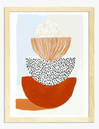
Stacked Shapes Study Art Print
Translation missing: en.products.product.sale_price From €16,95€23,95 -

Colorful Book Stack Art Print
Translation missing: en.products.product.sale_price From €16,95€23,95 -
Urban Neutral Geometry Art Print
Translation missing: en.products.product.sale_price From €16,95€23,95 -

Modern Neutral Geometry Art Print
Translation missing: en.products.product.sale_price From €16,95€23,95 -

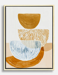
Stacked Modern Shapes Art Print
Translation missing: en.products.product.sale_price From €16,95€23,95 -

Bauhaus Geometry Poster Canvas Print
Translation missing: en.products.product.sale_price From €64,95€92,95 -

Bauhaus Modern Geometry Art Print
Translation missing: en.products.product.sale_price From €16,95€23,95 -
Modern Balance Study Canvas Print
Translation missing: en.products.product.sale_price From €64,95€92,95 -

Small People Painting Line-Up Art Print
Translation missing: en.products.product.sale_price From €16,95€23,95 -

Earthy Overlap Art Print
Translation missing: en.products.product.sale_price From €16,95€23,95 -

Modern Bauhaus Geometry Art Print
Translation missing: en.products.product.sale_price From €16,95€23,95 -

Modern Neutral Geometry Canvas Print
Translation missing: en.products.product.sale_price From €64,95€92,95 -

Urban Geometry Art Print
Translation missing: en.products.product.sale_price From €16,95€23,95 -

Modern Balance Shapes Art Print
Translation missing: en.products.product.sale_price From €16,95€23,95 -

Earthy Stack Shapes Canvas Print
Translation missing: en.products.product.sale_price From €64,95€92,95 -

Sunlit Stack Shapes Art Print
Translation missing: en.products.product.sale_price From €16,95€23,95


More from The Frame

How to Build a Minimalist Plant Gallery Wall Th...
Most gallery walls fail in the same way: too many prints, mismatched frames, and spacing that looks accidental. A minimalist plant gallery wall flips the formula. You're not filling a...

How to Build a Calming Gallery Wall That Actual...
Most gallery walls promise serenity and deliver visual static. The fix isn't softer colours or gentler subjects, it's restraint, repetition, and a few specific measurements that almost nobody gets right....

How to Build a French-Themed Gallery Wall That ...
A French-themed gallery wall sits on a knife edge. Done well, it reads like a well-travelled friend's flat in the 6th arrondissement. Done badly, it looks like the back wall...