


 Order today for delivery by
 The Nature Art Edit: Curated Prints for Modern Homes
How to bring the outdoors into a city flat without turning your lounge into a woodland cabin.


You love the outdoors, but your flat is decidedly not a cabin. The good news is that nature art belongs in modern interiors just as much as it does in country cottages, provided you choose the right pieces and style them with intent. This guide is for anyone who wants their walls to nod to forests, coastlines and botanicals without veering into rustic pastiche.
Why nature art works in every interior style (yes, even minimalist)
Nature is the original neutral. Foliage greens, sea greys, sand tones and stone whites are colours your eye has been calibrated to for millennia, which is why a single well chosen landscape can soften a stark, concrete-floored flat without fighting the architecture.
Biophilic design, the principle that humans feel better in spaces connected to the natural world, is the reason interior architects keep specifying it in glass-walled apartments and minimalist new builds. You do not need a forest view to get the effect. A single large print of misty pines above a low Scandi sofa does much of the same psychological work.
The trick is treating nature art like any other piece of contemporary art. Composition, frame, scale and placement matter more than subject. A moody mountain print framed in slim black on a plaster pink wall reads as modern. The same image in an ornate gilt frame on chintz wallpaper reads as your grandmother's hallway. Same picture, different intent.

The colour palette cheat sheet: matching nature prints to your walls and furniture
Vague advice about "earthy tones" is why people end up with rooms that look like a garden centre. Here are specific pairings that actually work.
For botanical greens (ferns, palms, eucalyptus)
Pair with warm off-whites like Farrow & Ball's Pointing or Dulux Natural Calico. Avoid bright cool whites, which make greens look acidic. Furniture in light oak, rattan or pale linen upholstery flatters botanical prints without competing. If your walls are bolder, deep clay pinks and burgundy work surprisingly well with sage and olive botanicals. Cold greys do not.
For landscape blues (seascapes, mountain skies, lakes)
These prints want quiet around them. Walls in soft grey-blues like Little Greene's French Grey, or chalky off-whites, let the depth of the image breathe. Pair with mid-century walnut, brushed brass hardware, and textured wool throws. Avoid navy furniture in the same room as a navy-heavy seascape. You will create a pool of colour with no contrast.
For earthy and desert tones (canyons, savannahs, autumn forests)
Terracotta, ochre and burnt sienna in the artwork need wall colours that step back. Stick to bone, plaster, oat or the palest taupe. Mid-century furniture in teak or walnut sings next to these prints. Steer clear of cool greys, which fight every warm undertone in the image.
For monochrome nature (black and white photography)
The most forgiving category. Works with anything from glossy white walls to deep forest green panelling. The frame becomes the styling decision rather than the wall colour.
Botanicals in modern spaces: keeping it fresh, not fussy
Botanical prints have a Victorian conservatory problem. Done badly, they look like wallpaper from a tea room. Done well, they are some of the most adaptable pieces you can hang.
The shift is composition. Vintage botanical illustrations, with their labelled latin names and clinical white backgrounds, feel academic and dated unless deliberately leaned into. Modern botanicals work differently. Think single oversized leaves cropped at the edges, monstera shadows photographed against concrete, or pressed plants on coloured grounds.
Frame matters enormously here. A traditional botanical print in a thin black frame looks editorial. The same print in a wide ornate gold frame looks like a hotel breakfast room. For most modern flats, slim profiles in black, natural oak or off-white will modernise even quite traditional botanical imagery.
Scale is your other lever. A single A3 botanical above a console looks twee. The same image printed at 70x100cm reads as bold and considered. Browse the botanical art prints collection thinking about scale before subject.
One styling rule worth keeping: never hang botanical art directly next to a real plant of the same species. A monstera print above an actual monstera is the visual equivalent of wearing a band t-shirt to the band's concert.

Landscape prints that feel cinematic, not generic
The hotel lobby effect is what happens when nature photography lacks point of view. Generic sunset over generic beach. Generic snowy peak under generic blue sky. Technically beautiful, emotionally inert.
Cinematic landscape prints share certain compositional traits. Strong leading lines, like a road disappearing into fog or a coastline curving out of frame. Unusual perspectives, like aerial shots, ground-level macro, or extreme wide-angle. Dramatic or ambiguous light, the moment before a storm rather than midday clear skies. A clear emotional register, whether melancholic, austere, or quietly joyful.
The test is simple. Could this image be a screensaver on a corporate laptop? If yes, keep looking. If it makes you pause and want to know where it was taken, you have found something worth hanging.
When you find a strong piece, give it space. Landscape prints suffer in busy gallery walls because the eye needs room to travel into the image. A single large landscape on an otherwise quiet wall will outperform three medium ones clustered together every time. Our landscape art prints collection is worth browsing slowly for this reason. Save the ones that make you stop scrolling.
Mixing nature subjects without creating a theme park
The fastest way to ruin nature art is to over-theme. Birds in the bedroom, butterflies in the bathroom, mushrooms in the kitchen. Each individually fine. Together, a Disney film.
A useful formula for a multi-print room or gallery wall is one hero, two supporters, one wildcard. The hero is your statement piece, often a landscape or large botanical. The supporters are smaller pieces that share either a palette or a mood with the hero, but not both. The wildcard is something off-theme, often an abstract, a typography piece or a portrait, that breaks the spell and stops the room feeling like a curated set.
Avoid symmetrical pairs of nature subjects above sofas and beds. Two matching botanical prints in identical frames is the most dated styling move in the category. If you want two prints, make them different subjects with a shared colour or different sizes with a shared frame. Asymmetry reads as modern. Symmetry reads as a 2008 show home.
The same logic applies across rooms. If your living room is heavy on coastal imagery, do not extend the theme into the hallway and bedroom. Let each room have its own atmosphere. Continuity comes from frame style and palette, not subject matter.
Size and framing choices that elevate nature art
Most people hang things too small. The single biggest upgrade you can make to a nature print is to size up.
Quick scale guide
- Above a three-seater sofa (210cm): one print at 70x100cm, or a pair of 50x70cm
- Above a two-seater (160cm): one print at 60x80cm
- Above a console or sideboard: print width should be 50 to 75 percent of the furniture width
- Above a bed (king, 150cm): one piece at 70x100cm, or three 30x40cm in a row
- Stairwell or hallway: vertical orientation, minimum 50x70cm to register from a distance
For larger statement walls in open-plan flats, canvas pulls ahead. Our canvas prints go up to 100x150cm, which is the kind of scale that makes a landscape feel like a window rather than a picture. Canvas is also lighter than glass-fronted framed work, which matters if you are hanging on plasterboard or in a rental.
Framing by interior style
- Minimalist or Scandi: slim natural oak or off-white frames. Avoid black, which can feel too graphic in soft palettes.
- Mid-century modern: walnut frames echo the furniture. Black works too if your hardware is also black.
- Industrial or contemporary: slim black frames, or unframed canvas for a softer counterpoint to hard materials.
- Period flat with modern furniture: white frames keep things contemporary against original cornicing and skirting.
A practical note on what to look for in any framed print. UV-protective glazing matters more than people realise, especially in sun-flooded flats where prints fade within a couple of years if unprotected. Acrylic glazing is lighter and safer than glass, particularly above beds and sofas. And frames should arrive fitted to the print in one box, not flat-packed for you to assemble at the kitchen table.

Room-by-room placement ideas with specific print recommendations
Living room
The living room is where landscape prints earn their keep. A single large piece above the sofa, ideally with a horizon line that sits roughly at your eye level when seated, will anchor the room. Moody coastal scenes, foggy forests and mountain ranges all work. Avoid anything too saturated or you will fight your furniture. For more inspiration, the living room wall art edit is organised by mood rather than just subject.
If you have a long wall opposite a window, consider a triptych of related but not identical nature prints. Three different forest scenes at the same time of year, for instance, rather than the same forest in spring, summer, autumn (too literal).
Bedroom
Bedrooms reward quieter nature art. Misty landscapes, abstract botanical studies, soft monochrome florals. Save the dramatic storm scenes for the hallway. Hang above the bed at a size that fills 60 to 75 percent of the bed width, with the bottom of the frame around 20cm above the headboard.
Kitchen and dining
Botanicals come into their own here, but keep them edible-adjacent rather than literal. A print of olive branches, citrus or herbs reads as considered. A print of a baguette and wine glass reads as a 1990s trattoria. Frame in oak or black, never gilt.
Hallway and stairs
Vertical prints, dramatic perspectives, anything with depth. Hallways are where you can get away with the most cinematic and slightly unsettling landscapes because no one lingers long enough to find them oppressive.
Bathroom
Canvas works particularly well in bathrooms because it handles humidity better than paper behind glass. A single botanical or abstract water study at moderate scale beats anything literal. No fish, no shells, no driftwood photography.
Home office
Landscapes with depth give your eyes somewhere to travel during long screen sessions. Position one in your peripheral vision rather than directly behind you on video calls, where it becomes a distraction for everyone else.

A few final styling principles
Treat nature art the way you treat any contemporary piece. Pick one strong image over three mediocre ones. Frame it properly. Hang it at a generous scale. Give it room to breathe on the wall.
Resist the urge to coordinate too tightly. Your walls should feel collected over time, not bought in a single afternoon. If you are starting from scratch, buy your hero piece first, live with it for a few weeks, then decide what else the room actually needs.
And the hotel lobby test is worth repeating. Before you commit to a print, ask whether it has a point of view. If it could hang in any room in any city without anyone noticing, keep looking. The pieces worth hanging are the ones that make a specific room feel like yours.

Fab products featured in this blog
-

Whimsical Woodland Hills Canvas Print
Sale price From €65,95€94,95 -

British Botanical View Art Print
Sale price From €16,95€23,95 -

Mustard Botanical Cut-Out Art Print
Sale price From €16,95€23,95 -

Modern Green Botanical Burst Art Print
Sale price From €16,95€23,95 -

Whimsical Woodland Hills Art Print
Sale price From €16,95€23,95 -

Magnolia in Terracotta Pot Art Print
Sale price From €16,95€23,95 -

Snow Peak Garden Hideaway Art Print
Sale price From €16,95€23,95 -

Yellow Villa with Cypress Art Print
Sale price From €16,95€23,95 -

Modern Oasis Retreat Art Print
Sale price From €16,95€23,95 -
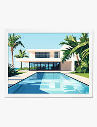
Modern Oasis Retreat Art Print
Sale price From €16,95€23,95 -

Rocks and Trees by Cézanne Art Print
Sale price From €16,95€23,95 -

The Botanical House Chrysanthemum Study Art Print
Sale price From €16,95€23,95 -

Modern Botanical Shapes Art Print
Sale price From €16,95€23,95 -

Tranquil Woodland Stroll Art Print
Sale price From €16,95€23,95 -
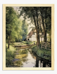
Cottage by the Mill Stream Art Print
Sale price From €16,95€23,95 -

Caryota Sobolifera Vintage Palm Study Art Print
Sale price From €16,95€23,95 -

Modernist Living — Poolside Courtyard Art Print
Sale price From €16,95€23,95


More from The Frame

The Greenhouse Aesthetic: How to Bring Victoria...
The greenhouse aesthetic has quietly taken over interiors Pinterest, design magazines and the walls of some very photogenic flats. The catch: almost every guide you'll find assumes you own an...

The Best Art for Conservatory Walls (That Won't...
Most people leave their conservatory walls bare, and it's not because they don't want art there. It's because they're quietly worried about fading, warping, and whether anything will look right...

Vintage Frog Prints: From 18th-Century Naturali...
Frogs have been drawn, painted and engraved for over 300 years, long before they became the unlikely stars of modern wall art. The best vintage frog prints sit at a...