How to Build a Capri Gallery Wall That Actually Looks Considered
A foolproof system for arranging Italian coastal prints, with exact measurements, frame rules, and the layouts that actually work.

Capri prints have a quiet superpower: their colour palette does most of the curating before you've even hung anything. Azure water, whitewashed walls, lemon yellows, terracotta tile. Get the layout and frames right and the wall almost composes itself.
Why Capri prints make gallery walls easier
Most gallery walls fail because the prints fight each other. Different colour temperatures, mismatched lighting, no shared logic. You end up with a wall that reads as a scrapbook rather than a composition.
Capri solves this through repetition. Every photograph taken on the island shares the same Tyrrhenian blue, the same hard Mediterranean sunlight, the same architectural whites and pastels. A black and white shot of the Faraglioni rocks and a colour-saturated shot of Da Luigi's striped umbrellas don't clash, because they were taken under identical light a few hundred metres apart.
This is the unique advantage of building around a single coastal location. You're not curating across moods, you're curating within one. The same applies if you widen the brief to Amalfi Coast prints, where Positano's pinks and Ravello's greens slot neatly alongside Capri's blues because they share the same southern Italian light.
Practically, this means you can mix photography, vintage travel posters, and illustrative prints without the wall fragmenting. Which is the whole game.

Choosing a layout: grid, salon, or asymmetric line
Three layouts work for Capri walls. Pick one and commit. Hybrids look indecisive.
The grid
Two by two, three by two, or three by three, all in identical frame sizes with identical spacing. The grid is the most forgiving option because the geometry carries the wall. It suits photography-heavy collections where you want each image to read clearly.
A grid wants quiet imagery. Save the busiest, most graphic prints for other layouts.
The salon hang
Multiple frame sizes arranged tightly around a central anchor print, with deliberately uneven edges. Salon walls feel collected over time even when you assemble them in an afternoon. They suit a mix of photography, illustration, and posters because the visual variation is part of the point.
The rule: pick one large anchor print (around 50x70cm) and orbit four to six smaller pieces around it. Keep the outer silhouette roughly rectangular.
The asymmetric line
Three to five prints in a horizontal row, all hung with their centres on the same horizontal axis but in mixed sizes. This is the cleanest option above a sofa or console. It reads as one long composition rather than separate works.
If you're hanging above furniture, this is usually the right answer.
The ideal mix: photography, posters, and painterly prints
A Capri wall built entirely from photography looks beautiful but flat. All entirely from illustration looks like a children's book. The interesting walls mix all three, but in a specific ratio.
We use 60/30/10: sixty percent photography, thirty percent illustrative or painterly, ten percent vintage poster. On a five-print wall, that's three photographs, one or two painterly pieces, and one vintage-style travel poster.
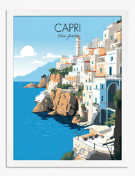
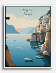
Photography anchors. It's where the eye lands first, and it carries the location's authenticity. Look for the obvious icons (Faraglioni rocks, Marina Piccola, the Gardens of Augustus) and at least one less obvious shot. A close-up of a tiled staircase or a single lemon on a white tablecloth gives the wall a quieter beat.
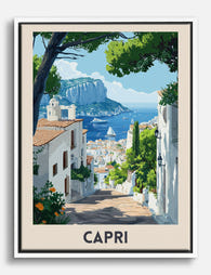
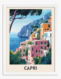
Illustration accents. A loose watercolour of a lemon branch, a painterly cypress study, a hand-drawn map of the island. These break up the photographic realism and add texture.
Vintage posters punctuate. One travel poster, maximum, on a five-print wall. More than that and the wall starts to feel themed in a tourist-shop way.
You'll find most of these formats sitting together in our Capri art prints collection, which makes the curation easier than hunting across multiple sources.
Frame finishes that work, and the one to avoid
Frame choice can quietly ruin a perfectly chosen set of prints. The Mediterranean palette is warm, sun-bleached, and architectural. Your frames should match that mood.
What works:
- Natural oak or white oak. The pale, slightly warm wood echoes the bleached timber of beach club loungers and shutters. Our default recommendation.
- Thin matte black. A slim black frame (around 1.5cm wide) gives photography the gallery treatment without competing. Best for monochrome or high-contrast colour shots.
- White painted wood. Disappears into the wall, lets the imagery do the work. Particularly good in bedrooms or against pale plaster.
What to avoid:
- Chunky gold. Reads as Versailles, not Capri. The island is rustic-elegant, not gilded.
- Distressed farmhouse. The faux-aged grey or whitewashed plank style fights the clean Mediterranean architecture.
- Glossy black. Too hard, too urban. The reflective surface also catches glare.
The other rule: pick one finish for the entire wall. Mixing oak with black on the same composition almost never works unless you're doing it deliberately and at scale (think a checkerboard grid). On a salon wall it just looks like you ran out of one type.
A note on what's inside the frame. Frames shipped separately from prints are where most gallery walls go wrong. Warped mounts, bubbling, prints not sitting flush. Our framed prints arrive ready to hang with the print already fitted properly behind UV-protective acrylic, so the wall stays consistent for years rather than weeks.

Exact spacing and hanging heights
This is where most guides go vague. Here are the actual numbers.
Spacing between frames:
- Grid layout: 5cm (2 inches) between frames, edge to edge
- Salon hang: 7-8cm (3 inches) between frames
- Asymmetric line: 5-6cm (2-2.5 inches)
Tighter spacing reads as one composition. Wider than 10cm and the prints start to look like separate decisions.
Hanging height (centre line):
- Standalone wall: centre of the composition at 145-152cm (57-60 inches) from the floor. This is gallery standard and matches average eye level.
- Above a sofa or console: bottom edge of the lowest frame 15-20cm (6-8 inches) above the furniture
- Above a bed: bottom edge 20-25cm (8-10 inches) above the headboard
Width relative to furniture:
Your gallery wall should span roughly two-thirds the width of the furniture below it. A 220cm sofa wants a composition around 145-150cm wide. Anything narrower looks marooned.
Sizes that nest cleanly:
Stick to standard sizes that play well together. 30x40cm, 50x70cm, and 70x100cm are the three workhorses. A salon wall built from one 70x100cm anchor, two 50x70cm supports, and two 30x40cm accents will fill a 220cm sofa wall almost perfectly.
A five-print Capri gallery wall: our recommended layout
Here's a foolproof recipe for an asymmetric line above a standard sofa or console.
The prints:
1. Anchor (centre-left): 70x100cm portrait photograph of the Faraglioni rocks or Marina Piccola. The widest, most recognisable image.
2. Support (right of anchor): 50x70cm landscape photograph. Striped umbrellas at a beach club, or the view from Anacapri.
3. Accent (far right): 30x40cm illustrative print. A loose watercolour of a lemon branch or bougainvillea.
4. Accent (far left): 30x40cm vintage-style travel poster. Italian Riviera or Capri tourism poster, ideally from the 1950s-60s aesthetic.
5. Quiet beat (above accent): 30x40cm detail photograph. A tiled staircase, a doorway, a single boat on blue water.
The arrangement:
Hang prints 1, 2, and 3 in a horizontal line with their vertical centres aligned. Place print 4 to the left of print 1, slightly lower, with its centre at sofa-arm height. Stack print 5 above print 4 with 6cm of spacing.
The composition reads as a long horizontal anchored by the big photograph, with a small vertical column on the left providing rhythm. Total wall coverage: roughly 220cm wide by 110cm tall.
For more pre-curated approaches, our wall art sets are built around this kind of proportional logic if you'd rather skip the curation.

Mixing Capri with broader Amalfi Coast and Italian prints
You don't have to limit yourself to Capri. The wider Italian coastal palette extends the same logic without breaking cohesion.
Stays cohesive:
- Positano (pink and ochre buildings, same Tyrrhenian blue)
- Sorrento (citrus groves, terracotta)
- Ravello (greens and whites, dramatic coastal views)
- Procida and Ischia (pastel facades, fishing boats)
Stretches the palette but still works:
- Cinque Terre and Portofino (Ligurian coast, slightly cooler light, deeper greens)
- Lake Como (architectural, grand, cooler tones)
Breaks the spell:
- Tuscany interiors (warm and golden, not coastal)
- Venice (canal greens and architectural complexity that competes)
- Rome (urban, not coastal)
If you want to widen the search beyond a single island, our Italy art prints collection groups locations by region so you can build across compatible palettes.
The rule of thumb: stay south of Rome and stay on the coast. Everything below that line shares enough light, colour, and architectural language to read as one wall.
Common gallery wall mistakes and how to sidestep them
The mistakes are predictable. Avoid these and you'll be ahead of most attempts.
Frames that don't match. One oak, one black, one white painted. Looks accidental. Pick a finish, commit to it.
Spacing that drifts. Some prints 3cm apart, others 8cm. The eye reads the inconsistency before it reads the imagery. Use a tape measure, not your eye.
Hanging too high. The most common error. Centre line should be 145-152cm from the floor, not the top of the frame. Most people hang gallery walls roughly 15cm too high.
Too many fonts. If you're using vintage posters or any prints with text, limit yourself to one. Multiple typefaces fragment the wall.
Ignoring sight lines. A gallery wall positioned where you only ever see it at an angle (behind a door, in a narrow hallway with no viewing distance) wastes the composition. Hang where there's at least 2m of stand-back room.
Random sizes. Five prints in five different sizes with no proportional logic. Stick to two or three sizes that nest cleanly: 30x40, 50x70, 70x100.
Skipping the floor layout. Always lay the composition out on the floor first, then transfer to the wall using paper templates. Hanging directly is how you end up with extra holes.
Treating it as permanent. Swap one or two prints seasonally. Brighter beach club scenes for summer, moodier architectural shots for winter. The wall stays alive without the cost of starting again.

A note on getting the wall right the first time
The single biggest determinant of whether a gallery wall looks considered isn't the prints, the layout, or even the frames. It's the consistency of the finish, properly fitted prints, frames that arrive flat, glazing that doesn't reflect the room back at you. A perfect layout falls apart when one frame sits 2mm proud of the others or warps in six months.
Lay your composition on the floor. Measure twice. Pick one frame finish. Use the 60/30/10 mix. Hang the centre line at 150cm. Then leave it alone and let the Capri light do the work it's been doing for two thousand years.

Fab products featured in this blog
-

Capri Coastline Charm Canvas Print
Translation missing: en.products.product.sale_price From €54,95€91,95 -
Capri Coastal Charm Art Print
Translation missing: en.products.product.sale_price From €14,95€24,95 -

Capri Coastal Escape Art Print
Translation missing: en.products.product.sale_price From €14,95€24,95 -

Capri Coastline Charm Art Print
Translation missing: en.products.product.sale_price From €14,95€24,95 -

Capri Coastline Charm Art Print
Translation missing: en.products.product.sale_price From €14,95€24,95 -
Capri Coastal Escape Canvas Print
Translation missing: en.products.product.sale_price From €54,95€91,95 -

Capri Coastal Graphic Art Print
Translation missing: en.products.product.sale_price From €14,95€24,95 -

Capri Coastal Vibes Poster Canvas Print
Translation missing: en.products.product.sale_price From €54,95€91,95 -

Capri Coastal Scene Art Print
Translation missing: en.products.product.sale_price From €14,95€24,95 -

Capri Coastal Charm Canvas Print
Translation missing: en.products.product.sale_price From €54,95€91,95 -

Capri Charm Canvas Print
Translation missing: en.products.product.sale_price From €54,95€91,95 -
Capri Coastal Charm Art Print
Translation missing: en.products.product.sale_price From €14,95€24,95 -

Capri Coastal Charm Canvas Print
Translation missing: en.products.product.sale_price From €54,95€91,95 -

Capri Coastal Charm Canvas Print
Translation missing: en.products.product.sale_price From €54,95€91,95 -

Capri Italy Retro Poster Canvas Print
Translation missing: en.products.product.sale_price From €54,95€91,95 -

Capri Coastal Escape Art Print
Translation missing: en.products.product.sale_price From €14,95€24,95 -

Capri Sunrise Poster Art Print
Translation missing: en.products.product.sale_price From €14,95€24,95 -
Capri Coastline Charm Canvas Print
Translation missing: en.products.product.sale_price From €54,95€91,95 -

Capri Sun & Sea Poster Canvas Print
Translation missing: en.products.product.sale_price From €54,95€91,95 -

Mediterranean Coastal Lane Art Print
Translation missing: en.products.product.sale_price From €16,95€23,95


More from The Frame

How to Create an Eclectic Gallery Wall That Loo...
You love a botanical line drawing, a moody abstract, and a vintage portrait, and you want them all on the same wall. The fear is that it'll look like a...

How to Build a Gallery Wall Around Mountain Art...
Mountain prints are some of the most rewarding pieces to anchor a gallery wall with, and some of the easiest to get wrong. Their horizontal weight, dramatic tonal range, and...

Kitchen Gallery Wall Ideas: How to Plan, Hang, ...
Most kitchen gallery walls fail before a single nail goes in. The prints arrive, you eyeball the layout, drill optimistically, and end up with something that feels chaotic instead of...