
 Order today for delivery by
 5 Rooms Where Vegetable Prints Look Better Than in the Kitchen
The kitchen is the most obvious home for a cabbage print, and probably the worst.


Why we need to stop thinking of vegetable art as kitchen-only
Vegetable prints have been exiled to the kitchen for so long that most people can't picture them anywhere else. But hang a large vintage aubergine study above a dining table, or a pair of radish illustrations in a hallway, and you'll see why the kitchen is actually the least interesting place for this kind of art.
Vegetables belong in the wider botanical tradition, alongside ferns, wildflowers and citrus studies. Treated seriously, they're not quirky. They're grounded, textural, and older than most of the art on your walls.

The dining room: large-format vintage vegetable prints as a focal point
The dining room is where vegetable art earns its keep. There's a direct link between the food on the table and the food on the wall, but it works best when the reference is oblique rather than literal. A dramatic vintage illustration of an artichoke reads as heritage, not menu.
Go big. A single 70x100cm print above a six-seater table has far more presence than three medium prints trying to do the same job. The rule of thumb is that your artwork should be roughly two-thirds the width of the furniture below it, so a 180cm table wants art in the 100-120cm range.
Framing choices for dining rooms
For a traditional or period dining room, a warm oak or aged gold frame with a generous mount (5-8cm of white space around the print) reads like something from a natural history museum. For a more modern dining room, a slim black frame with no mount tightens everything up and lets the illustration do the work.
Hang the centre of the print 145-155cm from the floor if there's no furniture below, or 20-25cm above the top of the sideboard or table if there is. Any higher and it starts floating away from the room.
Colour matters more here than anywhere else in the house. Muted vintage illustrations of root vegetables (carrots, beetroot, turnips) work beautifully with the warm, low lighting most people use over a dining table. Bright watercolour tomatoes look cheap under a dimmer. Save the vivid palettes for rooms with cooler, brighter light.
Browse the full dining room art collection if you want to see how different scales sit above different table sizes.
Hallways and entryways: first impressions with botanical character
Hallways are the most under-styled rooms in most homes, which is strange because they're the first thing anyone sees. Vegetable wall art works particularly well here because it signals warmth and personality within about two seconds of someone walking in.
The trick in a hallway is scale and rhythm. You're rarely working with a wall wide enough for one big statement piece, so think in sets. A row of three or four 30x40cm prints, evenly spaced, gives you movement as you walk down the corridor.
Placement and spacing
Space prints 5-8cm apart. Closer than that and they look cramped. Wider than 10cm and the eye stops reading them as a group. Hang the centre line at 150cm, which is standard gallery height and roughly average eye level.
If your hallway is narrow, one print per wall alternating down the corridor works better than a single row. It slows people down and stops the space feeling like a chute.

For entryways with a console table, a single 50x70cm print centred above the table gives you a proper focal point without needing to commit to a full gallery wall. Botanical vegetable prints in muted greens, ochres and terracottas work particularly well because they set a tone without demanding attention.
Have a look at the hallway art print collection for sizing that suits typical corridor proportions.
The home office: grounded, earthy art that isn't distracting
Home offices tend to swing between two extremes: aggressively motivational (typography prints telling you to hustle) or bland (a neutral abstract nobody chose deliberately). Vegetable prints solve both problems at once.
The reason they work in an office comes down to what they're not. They're not narrative, so they don't pull your attention on a video call. They're not colour-saturated, so they don't compete with a screen. They're not trendy, so they won't look dated in eighteen months.
What to choose and where to hang it
Vintage botanical illustrations of alliums, leaves and pulses hit the sweet spot. The palette is naturally muted (creams, sages, soft browns), the compositions are calm, and there's enough detail to reward a lingering glance between meetings without pulling you away from work.
A single 40x50cm or 50x70cm print behind your desk, visible on camera but not directly behind your head, is the standard placement. Hang it so the top of the print sits roughly level with the top of your head when seated, which means most people are looking at around 110-130cm from the floor as the centre point.
If you have a full wall opposite your desk, a set of two or three prints at 40x50cm works well. This is the wall you stare at when you're thinking, so pick illustrations you actually enjoy looking at rather than ones that just fill the space.
Simple frames only. A thin natural oak or black frame keeps the focus on the illustration and doesn't fight with the rest of your setup.
Garden rooms and conservatories: doubling down on the botanical theme
There's a common instinct to avoid botanical art in a room already full of plants, on the grounds that it's overkill. It isn't. A garden room with real plants and botanical illustrations feels considered and layered, like a nineteenth century greenhouse. A garden room with plants and abstract art feels confused.
The botanical art print collection is a good place to start if you want to see how vegetable illustrations sit alongside fern studies, seed catalogues and pressed flower prints.
Choosing the right style
Vintage botanical vegetable prints in the style of old seed catalogue plates work best here. They have the same visual language as the space itself: neutral backgrounds, precise line work, labelled specimens. The effect is scholarly rather than decorative.
Because garden rooms often have a lot of glass, direct sunlight is a real concern. Art printed with fade-resistant inks and protected by UV acrylic glaze (rather than glass) matters here more than in almost any other room. It's also worth noting that acrylic is lighter and safer than glass, which is useful in rooms where humidity fluctuates.

Canvas can also work well in conservatories and garden rooms because it copes with humidity better than paper behind glass. A large canvas of a vintage vegetable illustration, hung on the one solid wall most garden rooms have, gives you weight and warmth against all the glass.
Living rooms: how to make a vegetable print feel sophisticated, not quirky
The living room is where most people hesitate. Vegetables feel too casual, too farmhouse, too much like a birthday card. But that's a styling problem, not a subject problem.
The difference between quirky and sophisticated comes down to three things: scale, framing, and what you hang it near.
Scale
Small vegetable prints in a living room read as novelty. A 30x40cm carrot above the sofa looks like a joke. The same illustration at 70x100cm, with a wide mount and a proper frame, reads as botanical art. Go up at least one size larger than your instinct tells you.
Framing
Skip the rustic wood frames. In a living room, they push the whole thing towards country cottage. A slim black frame, a matte white frame, or a warm brass frame all work. The frame should look like something you'd see in a gallery, not something you'd see in a farm shop.
What to hang it near
The fastest way to make vegetable wall art feel sophisticated is to pair it with art that has nothing to do with vegetables. A vintage aubergine study next to an abstract charcoal drawing and a small black and white photograph reads as an eclectic, considered collection. The same aubergine surrounded by other vegetables reads as a theme.
For gallery walls, a good ratio is one vegetable print for every three or four other pieces. It becomes a texture in the mix rather than the subject of the wall.
Muted colour palettes (soft greens, ochres, faded reds) sit more comfortably in a living room than saturated ones. Save the vibrant watercolour peppers for a breakfast nook.
Choosing the right size and frame for each room
Here's the short version of the sizing logic, room by room.
Dining rooms: One large print (60x80cm to 70x100cm) above the table, or a pair of 50x70cm prints flanking a sideboard. Traditional rooms take gold or aged oak frames with generous mounts. Modern rooms take slim black frames with no mount.
Hallways: Sets of three or four 30x40cm prints spaced 5-8cm apart at 150cm centre height. Matching thin frames (black, oak or brass) keep the rhythm clean. For console tables, one 50x70cm print centred above.
Home offices: One 40x50cm or 50x70cm print at seated eye level, or a set of two or three 40x50cm prints on the wall opposite the desk. Simple oak or black frames.
Garden rooms: Two or three medium prints (40x50cm to 50x70cm) in vertical or horizontal arrangements, or one large canvas up to 100x150cm on the solid wall. UV-protected framing matters here.
Living rooms: Go one size larger than you think. 60x80cm minimum for a single statement, or mixed sizes for a gallery wall where vegetables are one element among several. Slim modern frames only.

A note on frames arriving intact
Framing failures are the single biggest complaint in the wall art category. Frames shipped separately from prints and assembled at home almost always end up slightly crooked. Prints that aren't properly fitted develop bubbles or warping within months, especially in humid rooms like garden rooms and conservatories.
Fab's framed prints ship in one box with the print already fitted, the acrylic glaze in place, and the fixtures attached. They arrive ready to hang, which sounds like a small thing but makes a real difference for anything larger than 50x70cm where alignment is fiddly.
Vintage illustration vs. modern watercolour
Vintage botanical illustrations (the seed catalogue style, with neutral backgrounds and precise line work) suit dining rooms, offices, hallways and living rooms. They read as heritage art regardless of context.
Modern watercolour vegetable prints (looser, more colour-saturated, often on white backgrounds) suit garden rooms, breakfast nooks, and children's spaces. They're more playful, and they lose the sophistication argument in formal rooms.
If you're only going to buy one vegetable print, buy a vintage-style illustration in muted colours. It will work in more rooms than a bright watercolour will.
The vegetable art print collection covers both styles, so it's worth spending time filtering by palette before you commit to a room.
Where to go from here
Pick the room where you least expected a vegetable print to work, and start there. A vintage artichoke above a dining table, a set of three radish illustrations down a hallway, a single muted allium study behind your desk. Size up, keep the frame simple, and pair it with things that aren't vegetables.
The rooms where this art looks most surprising are the rooms where it looks best.

Fab products featured in this blog
-

Vintage Vegetable Harvest Study Art Print
Sale price From €14,95€24,95 -

Playful Veggie Parade Art Print
Sale price From €14,95€24,95 -

Soft Shapes Vegetable Study Art Print
Sale price From €16,95€23,95 -

Playful Veggie Parade Canvas Print
Sale price From €54,95€91,95 -

Fresh Market Veggies Art Print
Sale price From €14,95€24,95 -

Vintage Vegetable Harvest Study Canvas Print
Sale price From €54,95€91,95 -
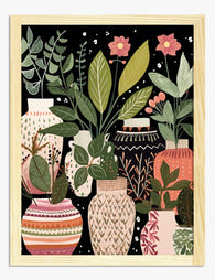
Boho Vases and House Plants Art Print
Sale price From €14,95€24,95 -

The Plants and the Flowers Art Print
Sale price From €14,95€24,95 -

Vintage Vegetable Basket Still Life Art Print
Sale price From €14,95€24,95 -

Stacked Vegetables Abstract Art Print
Sale price From €16,95€23,95 -

Verdant Dreams Art Print
Sale price From €14,95€24,95 -

Union Square Veggie Market Art Print
Sale price From €14,95€24,95 -

Boho Botanical Vases Art Print
Sale price From €14,95€24,95 -

Kew Gardens Carnivorous Plants Poster Art Print
Sale price From €14,95€24,95 -
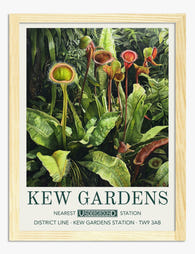
Kew Gardens Carnivores Art Print
Sale price From €14,95€24,95 -

Gardens of the World III Art Print
Sale price From €14,95€24,95 -

Botanical Paradise Cut-Outs Art Print
Sale price From €14,95€24,95 -

Gardens of the World Art Print
Sale price From €14,95€24,95 -

The Plants and the Flowers Canvas Print
Sale price From €54,95€91,95


More from The Frame

Why Do Matisse Tree Prints Work in Every Room?
Matisse's trees and gardens sit in a strange sweet spot: recognisable enough to feel considered, quiet enough to live with. Unlike his cut-outs, which shout, his tree work whispers. That's...

Farmhouse Wall Decor Ideas That Don't Look Like...
Farmhouse decor has a reputation problem. Somewhere between the shiplap boom and the "Live Laugh Love" invasion, it stopped meaning "warm, rustic, layered" and started meaning "coordinated set of three...

Farmhouse Kitchen Wall Art: 7 Ideas That Go Bey...
Farmhouse kitchens have a problem, and it's not the aesthetic itself. It's what happens when the aesthetic gets flattened into a shopping list of signs, sayings and stencilled roosters. The...