How to Build a Gallery Wall That's Funny Without Being Silly
The deliberate art of injecting personality into a gallery wall without tipping into novelty territory.

A gallery wall with one perfectly placed witty print feels considered. A gallery wall with five feels like a gift shop. The difference between personality and parody comes down to ratio, placement, and frame discipline, and once you understand the formula you can build a wall that makes guests laugh without making your home feel like a punchline.
Why one funny print in a gallery wall hits harder than five
Humour works on contrast. A clever line about wine, a tongue-in-cheek illustration, a deadpan typographic print, these all land because they sit against something more serious. Surround them with more of the same and the contrast vanishes. Suddenly nothing is funny because everything is trying to be.
Think of it like seasoning. One pinch of salt makes the dish. A handful makes it inedible. The same logic applies to humorous wall art: it earns its place when it's outnumbered.
There's also a maturity issue. A wall full of jokes reads as a teenager's bedroom. A wall with one well-chosen joke reads as someone with taste who refuses to take themselves too seriously. That's the tone you want.

The ideal ratio: how many humorous pieces to include in a 5, 7, or 9-piece arrangement
Here's the formula nobody else will give you. Treat it as a working rule, not a law.
- 5-piece gallery wall: 1 humorous print, 4 serious. Any more and the wall tips comedic.
- 7-piece gallery wall: 1 to 2 humorous prints. If you choose 2, separate them on opposite sides of the arrangement so they don't form a punchline cluster.
- 9-piece gallery wall: 2 humorous prints maximum. Same rule applies, keep them apart.
The pattern is roughly 20%. Once humour exceeds a fifth of your wall, the serious pieces start looking like setups rather than standalone art. You want guests to notice the funny print on the second or third pass, not the first.
If you're working with a smaller arrangement of 3 prints, skip the comedy entirely or commit to a single witty piece flanked by two abstract or photographic works. Three-piece walls are too small to absorb tonal variety gracefully.
Choosing a layout: grid vs. organic for humorous collections
Grid layouts (everything the same size, evenly spaced) lend humour a dry, deadpan quality. The uniformity flattens the joke into something more conceptual. This works beautifully for typographic humour, single-line quotes, or minimalist illustration. A 3x2 or 3x3 grid with one quietly funny print embedded reads as confident and curated.
Organic layouts (mixed sizes, irregular spacing around a central anchor) give humour more theatrical breathing room. The funny print becomes a personality reveal rather than a design element. This suits illustrative humour, quirky character prints, and anything with visual punchlines.
Our position: if your humour is text-based, go grid. If it's image-based, go organic. The format should support the joke's delivery, not fight it.
What about salon-style?
Dense salon-style hangs (frames almost touching, varied sizes, layered) can absorb humour well because the eye is busy. But the risk is that your funny print disappears into visual noise. If you go salon-style, give your humorous piece a small breathing gap of 5 to 7cm on at least two sides so it has room to land.
Frame consistency and why it stops a funny gallery wall from looking chaotic
This is the single most important rule. Funny art tends to be visually loud. Bright colours, bold type, exaggerated illustration. If you also vary your frames, you double the chaos and the wall starts shouting.
Pick one frame finish and commit. Black oak is the most flexible. Natural oak softens any humour and stops it feeling sharp. White works in bright rooms but can wash out lighter prints.
Uniform frames act as the grown-up in the room. They tell the eye that the wall has been planned, which gives every piece (including the funny one) more credibility. A witty print in a sleek black frame feels intentional. The same print in an ornate gold frame feels like a costume.
This is also where shipping quality matters. A frame that arrives warped, or a print that bubbles inside its mount, undermines the entire effect. Look for framed prints that arrive ready to hang with the print properly fitted, fixtures attached, and acrylic glaze rather than glass (lighter, safer, and no glare across the wall).

Size mixing: where to place your funny centrepiece for maximum impact
Where you put the funny print matters as much as the print itself.
Don't bury it in a corner. A humorous piece tucked at the bottom right of a 9-piece wall reads as embarrassed. The joke needs to be visible, just not central.
Don't put it dead centre either. Centre placement makes the humour the anchor of the entire room, which forces every other piece to support it. Few jokes can carry that weight.
The sweet spot: off-centre but at or just above eye level (roughly 145 to 155cm from the floor to the centre of the print). This puts your funny piece in the natural sightline as someone enters the room, but lets the surrounding work breathe.
For size, your funny print should be medium relative to the wall. Not the largest piece, not the smallest. A 30x40cm or 40x50cm humorous print embedded among a mix of 50x70cm and 21x30cm serious works tends to land cleanly.
The largest piece on the wall should almost always be a serious anchor: a landscape, a strong photograph, an abstract. This piece sets the tone, and the humour orbits it.
Subjects that pair brilliantly with humour (and a few that clash)
Not every art subject can sit next to a joke. Some pairings sing, others fight.
Pairings that work
- Landscapes and witty quotes: A misty coastline next to a deadpan one-liner is a classic combination. The seriousness of the landscape gives the quote its punch.
- Botanical illustrations and quirky character prints: Both share an illustrative sensibility. The botanicals lend authority, the character print lends warmth.
- Architectural prints and typographic humour: Clean lines and clean type. They speak the same visual language.
- Black and white photography and absurdist illustration: The restraint of monochrome photography gives absurd imagery somewhere serious to land.
- Vintage maps and dry humour: Maps imply heritage and intelligence. Pair them with sly, understated wit and you get a sophisticated wink.
Pairings that clash
- Bold abstracts and slapstick humour: Both compete for attention with loud colour and movement. Nobody wins.
- Religious or memorial imagery and any humour: Tonal whiplash. Avoid.
- Children's illustration and adult sarcasm: The two registers cancel each other out and confuse the room's intended audience.
- Photorealistic portraits and cartoonish prints: The stylistic gap is too wide and the wall feels stitched together.
The unifying principle: humour pairs best with subjects that have inherent gravitas. The gravitas legitimises the joke. Lightweight pairings just compound the lightness.
Colour as the unifying thread
When you're mixing tones, lean on a shared palette to hold everything together. If your serious pieces are dominated by sage green, terracotta, and cream, choose a funny print that pulls from at least two of those colours. The shared palette tells the eye these pieces belong on the same wall, regardless of subject.
You'll find plenty of options in quirky art prints that work in muted, considered palettes rather than primary-colour shouting.
Hanging it right: spacing, heights, and tools you actually need
The hanging stage is where good plans die. Here's the short version.
Spacing: 5 to 7cm between frames is the standard for gallery walls. Tighter than 5cm starts looking cluttered. Wider than 8cm and the wall reads as separate pieces rather than a coherent gallery.
Eye level: The centre of your gallery wall (not the centre of any single print, but the visual centre of the whole arrangement) should sit between 145 and 155cm from the floor. In a dining room or any space where you mostly sit, drop that to 135 to 140cm.
Above furniture: Leave 15 to 25cm between the top of the sofa or sideboard and the bottom of your lowest frame. Closer feels cramped, further feels disconnected.
Tools:
- Tape measure
- Pencil
- Spirit level (or the level on your phone)
- Brown paper or newspaper cut to the size of each frame
- Painter's tape
Cut paper templates for every frame, tape them to the wall in your chosen layout, and live with it for 24 hours. You will move at least two of them. This step saves you from hammering nails into the wrong places.
For frames over 50x70cm, use two hanging points rather than one. It keeps them level and stops them tilting if someone slams a door.

Three gallery wall templates you can copy today
These are starting points. Adjust to your wall and your taste.
Template 1: The Considered Lounge (5-piece, organic)
Best for a sofa wall measuring around 200x130cm.
- 1 large landscape print (50x70cm), positioned slightly left of centre
- 1 medium botanical illustration (40x50cm), upper right
- 1 small abstract (21x30cm), lower right
- 1 medium black and white photograph (30x40cm), lower left
- 1 humorous typographic print (30x40cm), middle right (the off-centre sweet spot)
Frames: matching black oak. Spacing: 6cm between pieces. Centre of arrangement at 150cm from floor.
Template 2: The Dry-Witted Office (6-piece grid)
Best for a desk wall measuring around 180x90cm.
- 6 prints, all 30x40cm, in a 3x2 grid
- 5 are architectural line drawings or city maps
- 1 is a deadpan single-line quote
Place the quote in the bottom-left or top-right position, never centre. Frames: matching natural oak. Spacing: 5cm between pieces.
This grid format works particularly well with typography art prints because the uniformity lets the type breathe.
Template 3: The Playful Kitchen-Diner (7-piece, salon)
Best for a feature wall measuring around 220x160cm.
- 1 large food photograph or still life (70x100cm) as the anchor, lower centre
- 2 medium botanical or culinary illustrations (40x50cm), flanking upper sides
- 2 small vintage-style prints (21x30cm), tucked at lower edges
- 1 medium typographic humour piece (30x40cm), upper right
- 1 small illustrative humour piece (21x30cm), middle left
Frames: matching black oak with white mounts. Spacing: variable, 5 to 8cm. The two humorous pieces sit on opposite sides of the wall so they don't cluster.
If you'd rather buy a coordinated starting point and add your own funny piece, pre-curated wall art sets give you the serious foundation in matching frames and let you slot in the personality afterwards.
A few mistakes to avoid
- More than two funny prints in any arrangement under 9 pieces. The wall tips into novelty.
- Mixing frame finishes when you're already mixing tones. Pick one variable to vary, keep the others tight.
- Using a humorous print as the largest piece. It can't carry the room.
- Buying funny prints purely for the joke. If the design wouldn't hold up without the punchline, it won't hold up on a wall either. Look for pieces where typography, composition, or illustration are strong in their own right.
- Hanging too high. This is the most common error in any gallery wall. When in doubt, drop it 5cm.

A note on rotation
Funny art ages faster than serious art. A joke that feels fresh this year can feel tired in two. Build your wall so the humorous piece can be swapped without rehanging everything. If you stick to a consistent frame size for that slot (say, always 30x40cm in the same frame), you can update the print itself in five minutes and keep the wall feeling current.
The best funny wall decor ideas treat humour as a layer you can refresh, not a permanent fixture.
Build the serious bones first. Add the joke last. Keep the frames quiet, the spacing generous, and the ratio under 20%. Do that and your gallery wall will earn the laugh without ever asking for it.

Fab products featured in this blog
-

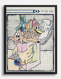
Laugh Out Loud Friends Art Print
Translation missing: en.products.product.sale_price From €16,95€23,95 -

Playful Gathering Canvas Print
Translation missing: en.products.product.sale_price From €64,95€92,95 -

Playful Compliment Statement Canvas Print
Translation missing: en.products.product.sale_price From €64,95€92,95 -
Playful Cartoon Collage Canvas Print
Translation missing: en.products.product.sale_price From €64,95€92,95 -

Judging in Silence Canvas Print
Translation missing: en.products.product.sale_price From €64,95€92,95 -
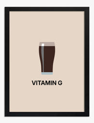
Vitamin G Guinness Glass Minimalist Art Print
Translation missing: en.products.product.sale_price From €16,95€23,95 -

Otter Bathroom Humor Canvas Print
Translation missing: en.products.product.sale_price From €64,95€92,95 -

Classical Wit Art Print
Translation missing: en.products.product.sale_price From €16,95€23,95 -

Swearing Solution Quote Canvas Print
Translation missing: en.products.product.sale_price From €64,95€92,95 -

Judging Elegance Canvas Print
Translation missing: en.products.product.sale_price From €64,95€92,95 -

Classic Wit Portrait Canvas Print
Translation missing: en.products.product.sale_price From €64,95€92,95 -

Guinness Vitamin G Humor Canvas Print
Translation missing: en.products.product.sale_price From €64,95€92,95 -

Cheeky Bathroom Greeting Art Print
Translation missing: en.products.product.sale_price From €16,95€23,95 -

Laughing Friends Minimal Canvas Print
Translation missing: en.products.product.sale_price From €64,95€92,95 -

Classical Grace with Humor Canvas Print
Translation missing: en.products.product.sale_price From €64,95€92,95 -

Lively Pub Gathering Canvas Print
Translation missing: en.products.product.sale_price From €64,95€92,95 -
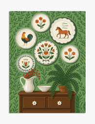
Folk Art Plates on Green Wall Illustration Art Print
Translation missing: en.products.product.sale_price From €16,95€23,95 -

Folk Garden Wall Plates Canvas Print
Translation missing: en.products.product.sale_price From €64,95€92,95 -

Grumble! Troll Whimsy Art Print
Translation missing: en.products.product.sale_price From €16,95€23,95


More from The Frame

How to Build a Cocktail Gallery Wall That Looks...
Most cocktail gallery walls fail for the same reason: they're a pile of prints someone liked, hung roughly together, hoping the theme will do the heavy lifting. It won't. A...

How to Build an Architecture Gallery Wall That ...
Gallery walls intimidate people because they look like they require a designer's eye. They don't, especially if you choose architecture as your subject. The geometry, repetition, and structural language of...

How to Decorate with Vintage London Prints (Roo...
Vintage London prints are everywhere right now, from Brooklyn brownstones to Bristol terraces. The trick is making them feel collected and considered rather than like you raided a National Trust...