
 Order today for delivery by
 Matisse Botanical Art vs Modern Botanical Prints: Which Suits Your Space?
One is emotional and colour-drenched, the other precise and quiet. Choosing between them starts with knowing your room.


Both trends promise to bring nature indoors, but they do it in almost opposite ways. Matisse throws colour at the wall like a jazz solo. Modern botanical prints whisper in taupe and sage. Picking the wrong one for your space is the difference between a room that hums and a room that feels off.
Two very different ways to bring nature onto your walls
Walk into most well-styled homes right now and you'll see one of two things above the sofa. Either a burst of coral, cobalt, or emerald in the loose, cut-paper style of Henri Matisse, or a set of pale, precisely drawn ferns and pressed flowers in cream mounts.
Both are botanicals. Both are having a moment. But they signal completely different design instincts, and they behave differently in real rooms.
The confusion muddying this decision is that a lot of what gets sold as "Matisse-inspired" botanical art is actually neither. It borrows his loose leaf shapes but strips out the colour, giving you sage green cut-outs on off-white paper. That's a hybrid trend, not real Matisse. Understanding the difference matters before you spend money on either.

Matisse botanical art: expressive colour, loose form, emotional impact
Matisse spent the last decade of his life making cut-outs, working with scissors and painted paper because illness had made painting difficult. The results are some of the boldest botanical images in twentieth-century art. Think of the leaf forms in The Parakeet and the Mermaid, the seaweed shapes in Polynesia, the Sea, or the deep pink and orange florals of Les Pivoines.
The defining features of Matisse's botanical and tree work are:
- Saturated, unmixed colour. Vermilion. Cobalt. Sap green. Lemon yellow. He rarely muted things.
- Simplified, flat shapes. No shading, no gradient, no attempt at photographic accuracy.
- Rhythm and movement. Leaves float, curl, and dance across the composition.
- Emotional temperature. These aren't studies of plants. They're feelings about plants.
That last point is what makes his work sit so differently on a wall. A real Matisse botanical doesn't ask you to identify a species. It asks you to feel warmer, brighter, a bit more alive. In a room, it functions almost like a light source.
The trade-off is honesty: this kind of art dominates. If you hang a 70x100cm framed Matisse cut-out on a neutral wall, that piece is now the loudest voice in the room. Everything else has to work around it. If you want quiet, this isn't quiet.
What "Matisse-inspired" usually means (and why it's often not really Matisse)
Search "Matisse botanical" online and you'll get pages of prints in dusty pink, oatmeal, and terracotta. These borrow his line but not his palette. There's nothing wrong with them as design objects, but calling them Matisse is a stretch. If the colour palette looks like a coffee shop menu, it's probably a modern reinterpretation rather than a print of his actual work.
For his real palette, look at Matisse's original art prints and check the source paintings. If a print is drawn from La Gerbe, Icarus, or his Jazz series, expect proper colour.
Modern botanical prints: precision, muted palettes, and the scientific illustration trend
The modern botanical trend takes its cues from nineteenth-century scientific illustration. Think pressed flower plates, Victorian herbariums, Ernst Haeckel's biological studies. The visual language is:
- Precise, illustrative linework. You can identify the species.
- Muted palette. Warm cream backgrounds, sage, olive, dusty brown, occasional soft pink.
- Symmetrical or grid compositions. Sets of three, four, six. Rarely a single statement piece.
- Restraint. These prints add texture and calm rather than energy.
They work because they're quiet. A wall of four small botanical studies above a bed reads as considered, natural, and grown-up without demanding anything of you emotionally. This is the aesthetic that dominates rental-friendly interiors, holiday cottages, and any space aiming for a sense of composed neutrality.
The trade-off, again in the interest of honesty: they can tip into generic. Because the palette is so consistent across the trend, a set of muted botanicals can look interchangeable with what your neighbour has. They rely heavily on framing, sizing, and grouping to feel considered rather than default.
Browse the botanical art prints collection if you want to see the range, from vintage-inspired plates to more contemporary illustrated studies.
Which works better in minimalist and Scandi-inspired spaces
Scandi and minimalist rooms are built on restraint: pale walls, oak or ash wood, warm whites, one or two accent tones. The instinct is to reach for muted modern botanicals, and often that instinct is right. Small framed studies in sets of three or four, hung in a tight grid above a sideboard or bed, do exactly what these rooms want.
But here's where we'd push back on the default. A single, larger Matisse piece can work beautifully in a minimalist space precisely because everything else is quiet. Imagine a 60x80cm framed Matisse leaf print in cobalt and green above a pale oak console. The room stays minimal in structure but gains a heart.
Our rule of thumb:
- Multiple pieces in a Scandi room: go modern botanical, muted palette.
- One statement piece in a Scandi room: go Matisse, let the colour sing.
Frame choice reinforces this. For modern botanicals in Scandi spaces, choose natural oak or a slim black frame with a generous white mount. For a Matisse statement piece, we'd go with black or natural wood, minimal mount, letting the colour do the talking.

Which works better in warm, eclectic, or maximalist rooms
Warmer, more layered rooms are where Matisse comes into his own. If your walls are clay pink, deep green, or a proper saturated colour, muted botanicals can disappear or look apologetic. Matisse's palette has enough weight to hold its own against a strong wall.
In an eclectic lounge with a velvet sofa, layered rugs, and a mix of vintage furniture, a large Matisse tree or nature print becomes an anchor. It gives the eye somewhere to land amid the pattern.
Maximalist rooms can absolutely handle both, but the ratio shifts. In a room with a lot going on, we'd lean 70% Matisse and 30% modern botanical, using the muted pieces as visual rest between the bolder ones.
Frame recommendations flip here too. In warm and eclectic rooms:
- Matisse pieces: black frames for graphic punch, or natural wood if the room already has a lot of dark tones.
- Modern botanicals used as accents: natural or warm oak, no black. You want them to recede slightly.
Can you mix both styles on the same wall? (Yes, but here's how)
Yes, and when it works it's one of the most sophisticated wall arrangements you can make. The tension between bold and quiet, expressive and precise, gives a gallery wall real depth. But it requires rules.
The 70/30 rule
Pick a dominant style and stick to it. Either one large Matisse piece surrounded by four to six smaller modern botanicals, or a grid of modern botanicals with one Matisse piece as the punctuation. Fifty-fifty tends to feel indecisive.
Bridge with colour
Look at your Matisse piece and pull one or two colours from it. Then choose modern botanicals that share those tones, even if only faintly. If your Matisse cut-out uses a deep sap green, choose modern botanicals with the same green in their linework or background wash. This is the single most important step and the one most people skip.
Match frames, don't mix them
Different art styles on the same wall need consistent framing to read as intentional. Pick one frame colour (black, natural oak, or white) and use it for everything on that wall. Mixing styles AND frames makes a gallery wall look accidental.
Size hierarchy
One piece should be visibly larger than the others. A 70x100cm framed Matisse anchor with six 30x40cm modern botanicals around it works. Seven pieces at the same size fights itself.
When not to mix
If your room is already busy with pattern, colour, and texture, don't. Pick a lane. Mixing styles works best when the surrounding room is relatively calm, giving the wall itself the job of creating interest.

Seasonal rotation, if you can't decide
One approach we genuinely recommend to anyone torn between the two: rotate. Bold Matisse pieces bring energy in autumn and winter, giving you warmth and colour when the light outside is grey. Muted modern botanicals feel right in spring and summer, when the room already has plenty of natural light and life.
If you invest in a couple of pieces from each direction, you can swap them twice a year. The room feels genuinely different without buying new furniture. Prints stored flat in a wardrobe hold up perfectly well, especially when they're printed on thick matte paper that resists creasing.
This is also the honest answer to "which one should I buy?" for a lot of people. Both, at different times.
Practical framing and sizing recommendations
We've covered frame colour in each section, but a few overall principles:
- For Matisse pieces: go larger than you think. These prints are designed to breathe. A 50x70cm framed piece works above a bedside table. Above a sofa or bed, 70x100cm is the minimum. Anything smaller and the loose composition can feel cramped.
- For modern botanicals: smaller and in sets works better than one large piece. A trio of 30x40cm prints reads as considered. A single 70x100cm scientific botanical illustration often looks like a museum poster.
- Glazing matters. UV-protective acrylic keeps the colour of a Matisse print stable even in bright rooms, which is exactly where you'd want to hang one. Real Matisse colour that fades to pastel within a couple of years defeats the point entirely.
- Canvas vs framed paper. For Matisse's flat, graphic style, framed paper prints usually look better. The matte finish and clean frame edge suit the poster-like quality of his cut-outs. Canvas can work but softens the graphic impact. Modern botanicals almost always want to be framed on paper with a mount, never on canvas.
Our recommendation: when to choose Matisse over modern botanical art
If we had to give one piece of advice, it's this: choose based on what your room lacks, not what it already has.
If your space is quiet, neutral, and well-composed but feels a bit lifeless, you need Matisse. His botanicals inject the emotional colour that a considered neutral room is often missing. One well-chosen Matisse nature print at a proper size will do more for the room than five muted botanicals ever could.
If your space is already warm, layered, colourful, and lived-in, you probably need modern botanicals. They provide the visual pause that a busy room needs. They calm things down without going cold.
The trend right now pushes everyone toward the muted, illustrative botanical look because it's safe and it photographs well. Safe is fine. But if you're drawn to Matisse's actual work, the bold colour, the loose leaves, the joy of it, don't talk yourself out of it because it doesn't match a trend. His botanicals have looked good on walls for seventy years. They'll look good on yours.
Buy the piece that makes you feel something when you look at it. Frame it properly, hang it at the right size, and trust the rest of the room to catch up.


Fab products featured in this blog
-

Sunlit Botanical Room, Matisse-Inspired Art Print
Sale price From €16,95€23,95 -

Matisse-Inspired Botanical Joy Art Print
Sale price From €16,95€23,95 -

Matisse-Inspired Cut-Out Botanical Art Print
Sale price From €16,95€23,95 -

The Flowers — Pink Vase Botanical Art Print
Sale price From €16,95€23,95 -

Matisse Paper Cuts in Pastels Art Print
Sale price From €16,95€23,95 -

The Artist's Garden at Issy by Matisse Art Print
Sale price From €16,95€23,95 -

Branch of Flowers by Henri Matisse Art Print
Sale price From €16,95€23,95 -

Pink Garden Florals in Bloom Art Print
Sale price From €16,95€23,95 -

Botanical Tennis Muse Art Print
Sale price From €16,95€23,95 -
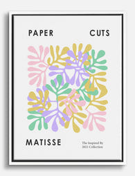
Matisse Paper Cuts in Pastels Canvas Print
Sale price From €65,95€93,95 -
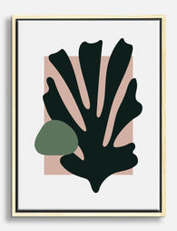
Matisse-Inspired Cut-Out Botanical Canvas Print
Sale price From €65,95€93,95 -

Foliage by Henri Matisse Art Print
Sale price From €16,95€23,95 -

Papiers Matisse Botanical Blue Art Print
Sale price From €16,95€23,95 -

Matisse in the Garden Room Art Print
Sale price From €16,95€23,95 -

Matisse-Inspired Garden Retreat Art Print
Sale price From €16,95€23,95


More from The Frame

Why Do Matisse Tree Prints Work in Every Room?
Matisse's trees and gardens sit in a strange sweet spot: recognisable enough to feel considered, quiet enough to live with. Unlike his cut-outs, which shout, his tree work whispers. That's...

Farmhouse Wall Decor Ideas That Don't Look Like...
Farmhouse decor has a reputation problem. Somewhere between the shiplap boom and the "Live Laugh Love" invasion, it stopped meaning "warm, rustic, layered" and started meaning "coordinated set of three...

5 Rooms Where Vegetable Prints Look Better Than...
Why we need to stop thinking of vegetable art as kitchen-only Vegetable prints have been exiled to the kitchen for so long that most people can't picture them anywhere else....