


 Order today for delivery by
 Pink Abstract Art Prints
Pink covers a lot of ground in abstract work: dusty rose washes that barely register, hot magenta shapes that run the room, blush and grey layers that sit quietly behind a sofa. Decide how loud you want the pink to be, then check it against the temperature of the colours already in the room. If shapes aren't what you're after, pink floral art prints or softer pastel art prints take a different route.


Bright Path Through the Woods Art Print

Serene School of Koi Art Print

Colour Blocks by Paul Klee Art Print

Urban Earth Abstract Art Print

Apollo by Henri Matisse Art Print
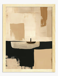
Warm Minimal Dusk Art Print

Matisse Floral Essence Art Print
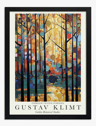
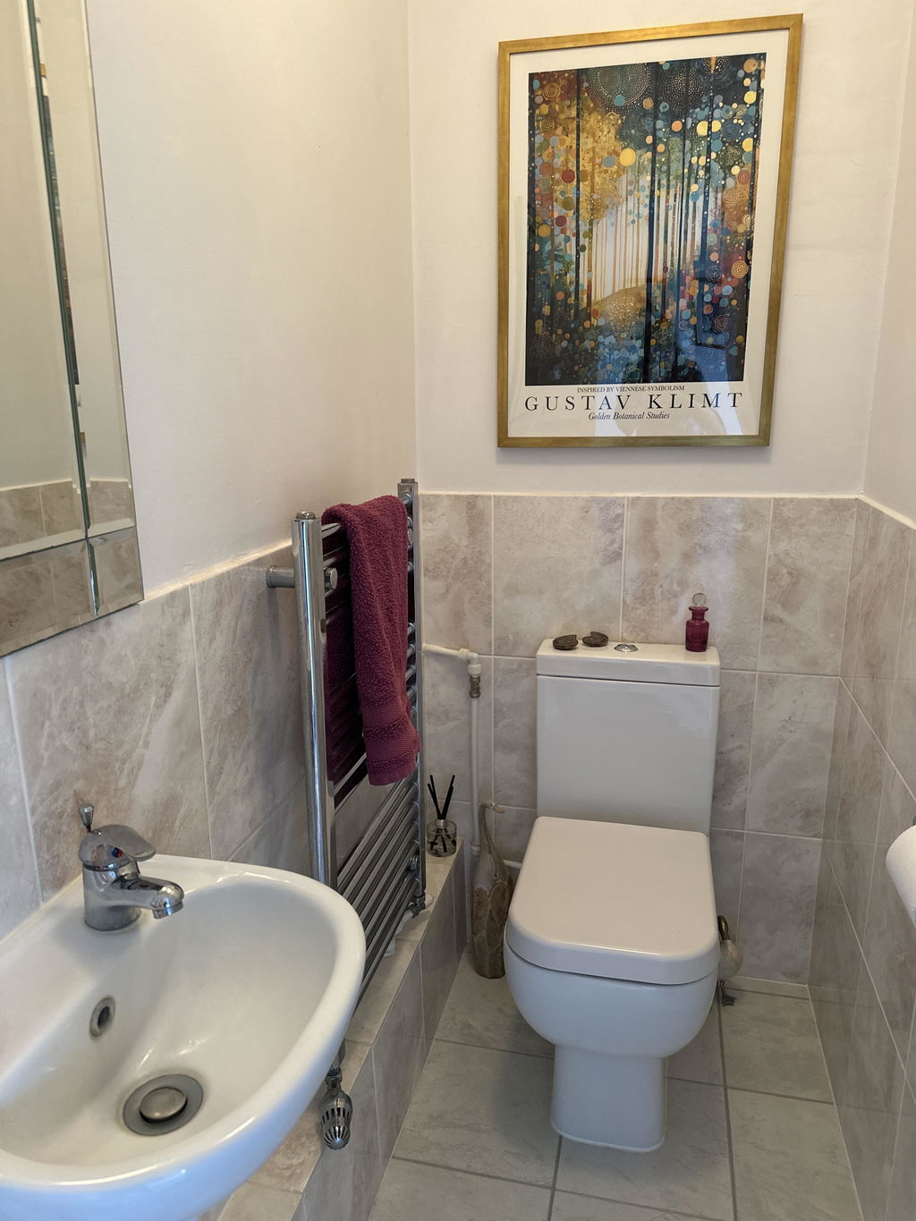
Golden Botanical Studies — Klimt Inspired Art Print

Gilded Sage Botanical Abstract Art Print

Striped Reflection Art Print

Abstract Studies II Art Print

Cobalt and Clay Abstract Art Print
More Fab art curations




Hanging in 100k+ homes
What people say about Pink Abstract Art Prints
Auto-generatedVibrant colours, crisp detail and sturdy paper stand out, while the prints brighten bedrooms, hallways and other living spaces.
Klimt Inspired Print
The colors are vibrant and the quality of the print is excellent. The paper it is printed on is very good quality, too. Will definitely buy more prints from you, I've very impressed with overall.
 Reviewed
Klimt-Inspired Forest Radiance Art Print →
Reviewed
Klimt-Inspired Forest Radiance Art Print →
I Googled the Colors I Wanted and Found my Perfect Print
I just moved from a three-bedroom, two story house to a two bedroom ground floor apartment. This is the start of my new life and I want new things in my new place. I stumbled across Fab by Googling, "Print, gold, teal, brown" and they popped up. I found the perfect picture in the perfect orientation with the perfect frame. My anal-retentive brother came over and hung it for me--Perfectly level! It looks perfect. I'm already eyeballing another print for my bedroom that has yet to be decorated. I'll definitely buy from them again.
 Reviewed
Klimt-Inspired Forest Radiance Art Print →
Reviewed
Klimt-Inspired Forest Radiance Art Print →
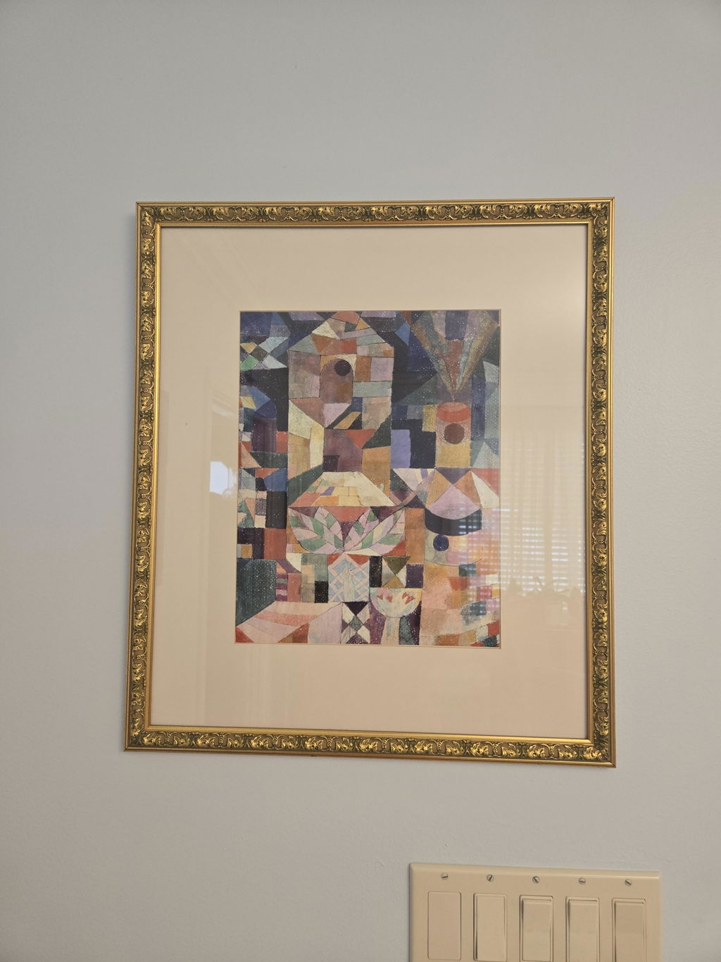
I was very happy with the quality of the paper the prints were on
I was very happy with the quality of the paper the prints were on. Colors were nice & bright. The only aspect that I was not happy with, was that prints did not have an edge around them. I bought a 11x14 cause mat's opening was that size & I basically had to tape it to the mat. I've never encountered this. You should do better in this area.
 Reviewed
Burggarten by Paul Klee Art Print →
Reviewed
Burggarten by Paul Klee Art Print →




 Buying pink abstract art: your questions



Quick answers on choosing shades of pink, framing choices, hanging spots and how returns work