How to Build a Meadow-Themed Gallery Wall That Actually Works
A subject-specific gallery wall guide for anyone who loves wildflowers but freezes at the planning stage.

Gallery walls intimidate people because they require dozens of small decisions to land right. Meadow art quietly removes most of those decisions for you, because the colour palette and mood are already doing the heavy lifting. This guide walks you through every step, from choosing the wall to hammering the last nail.
Why meadow prints make gallery walls easier than most subjects
A gallery wall succeeds or fails on cohesion. Mix unrelated subjects (a portrait, an abstract, a city map, a botanical) and you've got a fight on your hands trying to make them feel like one display. Meadow art skips this problem entirely. Sage greens, ochre yellows, dusty pinks, and soft creams keep recurring no matter which artist or style you choose, so the palette holds itself together.
The mood is also consistent. Meadows are quiet, romantic, slightly nostalgic. You don't get jarring tonal shifts the way you would mixing punchy modern abstracts with moody landscapes. This is the single biggest reason we recommend meadow art prints to anyone building their first gallery wall: the theme is forgiving.
That doesn't mean anything goes. You still need contrast, variety, and a sensible layout. But you're starting from a much easier place than someone trying to hang seven prints with nothing in common.
Choosing your wall: which spaces suit a meadow gallery grouping
Meadow art rewards proximity. The detail in a wildflower print, the texture of grasses, the soft transitions between greens and golds, all of it gets lost from across a large open-plan room. So pick a wall where people will actually stand close to it.
Hallways are the obvious winner. You walk past at arm's length, the lighting tends to be softer, and the elongated proportions of most hallways suit a horizontal grouping. Stairwells work beautifully too, because the natural diagonal of the staircase mirrors the slightly wild, uncontrolled feel of meadow imagery.
In living rooms, hang the gallery above a sofa or sideboard rather than on a vast empty wall. You want furniture to anchor the grouping. Bedrooms above the headboard or a dressing area also work, particularly if you favour softer, more romantic wildflower compositions.
Avoid kitchens with strong cooking smells and steam, and avoid bathrooms with no extraction. Canvas tolerates humidity better than framed prints in those conditions, but neither is built for a constantly damp environment.

The layout formula: start with one anchor print and build out
Every good gallery wall has a hero. This is your anchor: the largest print, the one with the most visual weight, the piece your eye lands on first. For a meadow gallery, the anchor is usually a wider landscape composition (think 60x80cm or 70x100cm) rather than a single botanical study, because landscapes carry more across distance.
Place the anchor slightly off-centre within your wall area, not dead in the middle. Then build outwards. Smaller prints orbit the anchor, with the most visually busy pieces closer to it and the quieter pieces (faded backgrounds, single stems, soft washes) further out.
Here's a starting formula that works for most spaces:
- One large anchor print (60x80cm or 50x70cm)
- Two medium prints (40x50cm or 30x40cm)
- Two to four small prints (21x30cm or 30x40cm)
This gives you five to seven pieces total. Odd numbers feel more organic than even numbers, which is exactly what meadow art is going for. A perfect 2x2 grid of wildflowers looks oddly clinical. A scattered five-piece grouping feels like it grew there.
The 57 inch rule (and when to break it)
Professional gallery hangers centre artwork at 57 to 60 inches (roughly 145 to 152cm) from the floor, which corresponds to average eye level. For a gallery wall, treat this as the centre point of the entire grouping, not of any single print. So measure to the middle of the imaginary box that contains all your frames.
Break the rule when you're hanging above a sofa or sideboard. There, you want the bottom of the lowest frame to sit roughly 15 to 25cm above the furniture, regardless of where eye level falls. Floating frames too high above a sofa is the most common gallery wall mistake we see.
Mixing styles within a theme: landscapes, botanicals, and abstract meadow art
The trap with single-theme gallery walls is repetition. Five photographic meadow landscapes side by side will read as wallpaper, not a curated display. Variety within the theme is what makes it interesting.
Aim for three styles in rotation:
Landscape meadow scenes. Wide horizons, soft focus, often with a path or treeline in the background. These give your wall depth and atmosphere.
Botanical studies. Single stems or small clusters of identifiable flowers (poppies, cornflowers, ox-eye daisies). These add detail and a more graphic, illustrative feel. Browse our botanical art prints for these.
Abstract or impressionistic meadow art. Looser brushwork, blurred wildflower fields, painterly compositions. These soften the grouping and stop it feeling too literal.
A working ratio is roughly 40 percent landscape, 40 percent botanical, 20 percent abstract. Adjust to taste, but resist going all-in on one style. The contrast between a tight botanical illustration and a loose impressionist meadow is what gives the wall its rhythm.
Should you mix seasons?
Yes, but carefully. Spring wildflowers (delicate, pale, lots of white and pastel) and high-summer meadows (saturated greens, golden grasses) sit comfortably together. Autumn grasslands (rust, ochre, bleached straw) work as accents but can dominate if you use too many. Winter meadow scenes rarely play nicely with the others, so we'd save those for a different room.

How many prints do you actually need? (Hint: fewer than you think)
Most people overshoot. They picture a wall covered in art, buy nine or eleven prints, and end up with something that feels cluttered and exhausting. A great meadow gallery wall usually lives between five and seven pieces.
Three prints is the minimum. Below that, it's not really a gallery, it's just a small grouping. Three works beautifully in a tight space (above a desk, in a narrow hallway nook) when arranged in a stepped or triangular layout.
Five is the sweet spot for most rooms. Enough variety to feel curated, not so much that any single print gets lost.
Seven works for larger walls, above big sofas or up stairwells. Beyond seven, you're entering "salon wall" territory, which has its own rules and is much harder to pull off without it looking chaotic.
If you're nervous, start with five and add a sixth or seventh later. Pre-planned wall art sets can simplify this further if you'd rather not source each piece individually.
Keeping it cohesive: matching frames, tones, and spacing
This is where amateur gallery walls fall apart and where professional ones quietly succeed.
Frame strategy
For meadow art, you have three solid options:
Natural oak or light wood. Our default recommendation. The warm, organic tone echoes the subject matter and never competes with the artwork. Works in almost any room.
White frames. Best in bright, airy rooms with white or pale walls. They disappear into the wall and let the prints do all the talking. Avoid in darker rooms where they'll look stark.
Black frames. The most graphic, modern choice. Use when your meadow prints lean impressionistic or abstract, or when the rest of your room has black accents (light fittings, window frames, hardware). Black can feel heavy with delicate botanicals, so test before committing.
The hard rule: pick one frame finish and stick with it across the whole gallery. Mixing frame colours within a single grouping almost always reads as accidental rather than intentional. If you want variation, vary the matt width or the print size, not the frame.
We use solid FSC-certified wood for our frames rather than MDF or veneer, which matters for a gallery wall because cheaper frames warp over time and the differences become visible when they're hung close together. The UV-protective acrylic glaze also means you can hang the gallery in a sunny hallway or a south-facing living room without watching the colours fade over a few years.
Spacing
Keep 5 to 8cm (roughly 2 to 3 inches) between every frame, measured edge to edge. Closer than that and the wall feels cramped. Wider than that and the grouping loses cohesion and reads as separate pieces.
Maintain the same spacing throughout. Inconsistent gaps are the single fastest way to make a gallery wall look amateur, even if every other decision is perfect.
How to hang it without ending up with a wall full of holes
Never start with a hammer. Start on the floor.
Step 1: Lay it out flat
Clear a section of floor roughly the size of your wall area. Arrange your frames on the floor and shuffle them around until the composition feels balanced. Take photos from above. Move the largest piece first, then build outwards. Allow at least 20 minutes of fiddling before you commit.
Step 2: Make paper templates
Trace each frame onto kraft paper or newspaper, cut out the shapes, and write the print name on each one. Mark where the hanging hook or D-ring sits on each template, measured from the top edge.
Step 3: Tape the templates to the wall
Use low-tack masking tape to position your paper templates exactly where you want each frame. Step back. Live with it for a day if you can. Adjust until you're certain.
Step 4: Hammer through the templates
Drive your nails or picture hooks straight through the paper at the marked hook position. Tear away the paper. Hang the frame. The position is guaranteed.
This method takes an extra hour but eliminates the "drill twelve holes, fill nine of them" disaster that ruins most first attempts.
Our framed prints arrive with fixtures already attached and the print properly fitted inside the frame, which removes one of the worst gallery wall headaches: prints arriving warped, frames shipped separately, or pieces not aligning with each other when you finally get them on the wall.

Gallery wall examples for living rooms, hallways, and stairwells
Living room: above a three-seater sofa
A five-piece grouping centred above the sofa works brilliantly here. Anchor with a 60x80cm landscape meadow scene placed slightly left of centre. Flank with two 40x50cm botanical studies, then add two 30x40cm prints in the remaining gaps, one slightly higher than the centre line, one slightly lower.
Total wall span: roughly 180cm wide by 110cm tall. Bottom edge sits 20cm above the sofa back.
Hallway: horizontal seven-piece run
Hallways suit longer, lower groupings rather than tall stacks. Run seven prints in a loose horizontal band, alternating between 30x40cm portraits and 40x30cm landscapes. Mix in one slightly larger 50x70cm piece roughly two-thirds along to break the rhythm.
This layout rewards close viewing, so use detailed wildflower art prints where the texture and small details actually pay off.
Stairwell: stepped diagonal grouping
Follow the angle of the staircase. Use five or six prints, with the bottom of each frame stepping up roughly in line with the stairs themselves. Keep the spacing consistent (5 to 8cm) but allow the overall grouping to climb.
Anchor near the middle of the run, not at the top or bottom. Larger prints at the top of stairwells get lost because nobody looks up while climbing.

Troubleshooting: when your meadow gallery isn't working
Too much green. Add a print with strong neutral or warm tones (a meadow at golden hour, a dried grass study, a chalk-toned sky-heavy landscape). One contrasting piece resets the whole grouping.
Prints too similar. Vary the style ratio. If you've bought five photographic landscapes, swap one for a botanical illustration or an abstract.
Wall feels small. Your frames are probably too small for the space. A gallery wall should occupy roughly two-thirds the width of the furniture beneath it. If your sofa is 220cm wide, your gallery should span at least 145cm.
Hung too high. The most common mistake. Centre of grouping at 145 to 152cm from the floor, or 15 to 25cm above furniture. Lower than feels right.
Build slowly. Start with three or five prints, live with them for a few weeks, and add more only when you're certain the wall needs it. The best meadow gallery walls look like they were collected over time, not bought in a single afternoon.

Productos Fab destacados en este blog
-

Lienzo flores silvestres de pradera
Translation missing: es.products.product.sale_price Desde €64,95€92,95 -

Lienzo flores silvestres de pradera
Translation missing: es.products.product.sale_price Desde €64,95€92,95 -

Lámina flores silvestres de pradera
Translation missing: es.products.product.sale_price Desde €16,95€23,95 -

Lámina pradera de flores silvestres en tonos suaves
Translation missing: es.products.product.sale_price Desde €16,95€23,95 -

Lámina paisaje de pradera con flores silvestres
Translation missing: es.products.product.sale_price Desde €16,95€23,95 -

Lámina flores silvestres de pradera
Translation missing: es.products.product.sale_price Desde €16,95€23,95 -
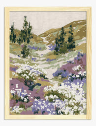
Lámina sendero en pradera de flores silvestres
Translation missing: es.products.product.sale_price Desde €16,95€23,95 -
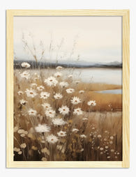
Lámina serenidad en pradera de flores silvestres
Translation missing: es.products.product.sale_price Desde €16,95€23,95 -

Lámina pradera de flores silvestres en acuarela
Translation missing: es.products.product.sale_price Desde €16,95€23,95 -

Lámina serenidad en pradera de flores silvestres
Translation missing: es.products.product.sale_price Desde €16,95€23,95 -

Lienzo pradera de flores silvestres estilo William Morris
Translation missing: es.products.product.sale_price Desde €64,95€92,95 -

Lienzo sendero en pradera de flores silvestres
Translation missing: es.products.product.sale_price Desde €64,95€92,95 -

Lienzo prado con flores silvestres
Translation missing: es.products.product.sale_price Desde €64,95€92,95 -

Lámina paisaje brisa de pradera
Translation missing: es.products.product.sale_price Desde €16,95€23,95 -

Lienzo serenidad en pradera de flores silvestres
Translation missing: es.products.product.sale_price Desde €64,95€92,95 -

Lienzo pradera de flores silvestres en acuarela suave
Translation missing: es.products.product.sale_price Desde €64,95€92,95 -
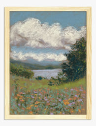
Lámina paisaje con flores silvestres y lago tranquilo
Translation missing: es.products.product.sale_price Desde €16,95€23,95 -

Lienzo flores de pradera alegres
Translation missing: es.products.product.sale_price Desde €64,95€92,95 -

Lámina flores de prado silvestre
Translation missing: es.products.product.sale_price Desde €16,95€23,95 -

Lienzo flores silvestres de pradera
Translation missing: es.products.product.sale_price Desde €64,95€92,95


Más de The Frame

How to Build a Gallery Wall With People Art Pri...
Putting one portrait on a wall is easy. Putting six on the same wall, all staring out at you and your dinner guests, is where things get awkward. This is...

How to Build a Gallery Wall with Watercolor Cit...
You love watercolour cityscapes, but you've seen the gallery walls where Paris, Tokyo and New York fight each other for attention like postcards on a fridge. The problem isn't the...

How to Build a French-Themed Gallery Wall That ...
A French-themed gallery wall can go one of two ways: refined Left Bank apartment, or first-year student dorm with a beret problem. The difference is not the prints you choose....