
 Pide hoy, entrega el
 Are Floral Prints Still in Style? The Trends That Are Actually Worth Following
A clear-eyed guide to which botanical prints have real staying power and which will feel tired by next spring.


Floral art is having one of its quieter, more interesting moments. The shift away from busy, pastel-saturated bouquet prints toward something darker, more considered, and more grown-up is well underway. If you've been hesitant about committing to florals, this is the guide that tells you which styles will still look good in five years and which won't make it past next spring.
Floral art isn't going anywhere (but the style has changed)
Botanical and floral imagery has been part of interior decoration for roughly 500 years. It survived art deco, postmodernism, the great minimalist purge of the 2010s, and the cottagecore wave of 2020. The question isn't whether florals are "in." They are, reliably, always. The real question is which version of floral art currently looks intentional rather than inherited.
What's changed is the tone. The bright, dense, vaguely Provençal bouquet print that defined floral wall art for two decades has been pushed aside by something moodier, more graphic, and more botanically literate. Interior designers are specifying floral art that reads as confident and editorial, not pretty and decorative. That's the shift to pay attention to.
The broader context here is biophilic design, the principle that interiors feel better when they reference the natural world. It's the same instinct driving the houseplant boom, the move toward natural materials, and the surge in earthy paint palettes from brands like Farrow & Ball and Little Greene. Botanical art slots into this directly, which is why the category has staying power even as specific styles cycle in and out.

The move toward moody, dark-background botanicals
The single biggest trend in floral art right now is the shift to dark backgrounds. Charcoal, ink black, deep forest green, aubergine, oxblood. Instead of botanicals floating on cream or white paper, the subject sits against a saturated, almost theatrical ground.
There are a few reasons this works. Dark backgrounds make colours read as jewel-like rather than sweet. A coral peony against ivory looks pretty. The same peony against near-black looks like a Dutch still life. It pulls floral art away from "decorative" and toward "art."
It also solves a practical problem. Pale floral prints tend to disappear on white walls, which is most British walls. A dark-ground botanical anchors a room the way a piece of furniture does. You can hang one 70x100cm print above a sofa and it does the work of three smaller prints.
The trade-off is commitment. Dark botanicals don't whisper. If you want art that recedes politely into the background, this isn't it. We'd argue that's a feature, not a bug, but it's worth knowing before you order.
For framing, we'd avoid ornate gold on dark-ground florals. It pushes the whole thing toward Victorian pastiche. A thin black or natural oak frame keeps the focus on the print itself. If you want to explore the category, our botanical art prints collection leans heavily into this moodier direction.
Vintage botanical prints: why the scientific illustration revival keeps growing
The other dominant style is what's loosely called the scientific or Victorian botanical illustration: detailed, accurate, often labelled drawings of a single specimen on a neutral background. Think of the plates from a 19th-century herbarium or the work of artists like Pierre-Joseph Redouté and Maria Sibylla Merian.
This style has been quietly growing for the last five years and shows no sign of slowing. The reason is simple. Scientific illustration is the opposite of trend-driven. It doesn't have a "look" tied to a particular decade. It reads as old, scholarly, and slightly eccentric, all qualities that age well in a home.
There's also a craft element. A proper vintage botanical illustration shows the leaf structure, the root system, sometimes a cross-section of the seed pod. It rewards looking at up close, which is exactly the use case for a high-detail giclée print on matte paper. Glossy paper or canvas tends to flatten that level of detail.
Are vintage botanical prints valuable? Original 18th and 19th century plates can be, particularly named works from Curtis's Botanical Magazine or similar. But for wall art purposes, a well-printed reproduction at proper scale is usually a better decision than chasing an original. You get the visual impact without the conservation headaches.
The styles that work best here are ferns, herbs, fruiting branches, and single flowering stems. We'd avoid the heavily coloured Victorian floral plates that veer toward Hallmark territory. The more restrained the palette, the longer the print will last in your home. Browse our vintage art prints collection for examples that hit the right register.

Oversized single-stem prints vs busy bouquet compositions
If we had to identify the visual marker that separates current floral art from dated floral art, it would be this: scale and subject density.
Current floral art tends toward the oversized single stem. One tulip, one protea, one branch of magnolia, printed large enough to fill a wall. The composition is graphic, almost like a botanical portrait. There's space around the subject. Negative space does a lot of the work.
Dated floral art tends to be the opposite. A small or medium frame containing a busy, multi-stem bouquet, often in soft watercolour, often pastel, often suggesting a tea towel more than a piece of art. You've seen these in waiting rooms and budget hotels. They aren't bad exactly, but they aren't doing anything that interesting either.
The reason oversized single-stems work is that they read as deliberate. Choosing one flower and giving it the wall feels like a decision. A bouquet print feels like a default. Designers know this, which is why every editorial interior shoot in the last three years has featured at least one giant single-stem botanical somewhere.
Practically, this means going bigger than feels comfortable. A 70x100cm framed print above a sofa, or a 100x150cm canvas in a larger room. Most people undersize their art by about a third. If you're going to commit to floral, commit to scale.
This is one area where canvas earns its place. A 100x150cm canvas print using mirrored edge wrapping gives you serious presence without the weight of a framed piece that size. In a bathroom or kitchen where humidity is a factor, canvas also outperforms framed paper.
Colour trends in floral art: what interior designers are actually choosing
The palette conversation is where a lot of floral art goes wrong. The temptation is to match florals to a "feminine" palette: blush, dusty pink, sage, cream. This was the dominant scheme from roughly 2016 to 2021, and it's the look that now reads as tired.
What interior designers are actually specifying right now skews darker and earthier. Burgundy, terracotta, oxblood, deep mustard, forest green, ink. Pantone's 2024 Colour of the Year, Peach Fuzz, suggested a return to warmer tones, but the version designers are using is much more saturated than the name implies. Think baked clay, not bridesmaid dress.
The most reliable palette for floral art that will age well is what we'd call botanical realism: the actual colours plants are. Real foliage greens (which are darker and more yellow than "sage"), real petal colours (which are rarely pastel), real bark and earth tones. When floral art looks artificial in colour, it dates faster.
If you're working with a neutral interior, look for florals where one or two colours dominate rather than a full rainbow. A single deep red bloom against dark green leaves on a charcoal ground will do more work than a mixed bouquet in twelve shades. Restraint reads as expensive.
For brighter, more contemporary interiors, the same restraint applies but with more saturation. A graphic black-and-white botanical line drawing, or a high-contrast single stem in one strong colour, sits comfortably alongside modern art prints without competing with them.

Styles to avoid if you want your prints to last beyond one season
This is the part most wall art content won't tell you, because most wall art content is trying to sell you everything. We'd rather you buy one print you love for ten years than three you replace next year. So here's the honest list.
Avoid pastel watercolour bouquets. The soft, washy, mixed-flower-in-a-mason-jar style had its moment around 2018. It now reads as dated almost immediately. The watercolour effect itself isn't the problem. It's the combination of pastel palette, soft edges, and bouquet composition that puts it firmly in last decade.
Avoid cottagecore saturation. The peak-pandemic move toward dense, romantic, vaguely Edwardian floral imagery has cooled significantly. If a print would look at home on a Cath Kidston tea cosy, it's probably not the one to frame at scale.
Avoid cutesy florals with text. "Bloom where you're planted" overlaid on a watercolour daisy. Anything with hand-lettered scripture or motivational quotes alongside flowers. This style has never aged well and never will.
Avoid faux-vintage with artificial distressing. Real vintage botanicals work because they were made with intent. Digitally distressed "vintage-effect" florals with sepia filters and fake foxing read as inauthentic.
Avoid matching sets. Three identical-style floral prints in a row, particularly small ones, is the visual shorthand for unconsidered decorating. If you want multiple botanicals, vary the scale and composition. One large print plus two smaller, different prints reads as collected. Three matched prints reads as bought-in-a-bundle.
Avoid ornate gold frames on bright florals. This combination pushes any floral print toward grandmother's parlour, even if the print itself is good. Save the gold for moody dark-ground botanicals where it can work, or skip it.
Are floral prints outdated? No. Specific styles of floral prints are outdated. The category itself is one of the most durable in art history.
Our picks: floral art prints with genuine staying power
A few categories we'd back to still look good in 2030.
Single-specimen scientific illustrations. Ferns, herbs, single fruiting branches, mushrooms. Neutral backgrounds, detailed line work, restrained colour. These have been hanging in homes for two centuries and will continue to. Print them large on matte paper to do justice to the detail.
Dark-ground floral studies. One or two blooms against deep, saturated backgrounds. The closer to a Dutch still life sensibility, the better. Frame thin and dark, hang at scale.
Graphic botanical line drawings. Black ink on white, or white on black. Single stems, leaves, or simple compositions. These read as architectural rather than decorative and slot into modern interiors without effort.
Pressed flower or herbarium-style prints. Real specimens, real proportions, neutral grounds. There's something quietly compelling about a single pressed poppy at 60x80cm that no bouquet print can match.
Oversized single-flower close-ups. Photographic or painterly, the key is scale and singularity. One subject, given room to breathe, printed large enough to act as the focal point of a room.
For each of these, we'd recommend going larger than feels natural, choosing matte paper over glossy, and being conservative with framing. A solid wood frame in black or natural oak with UV-protective glazing will keep a print looking right for decades. Our floral design art prints collection is curated with these principles in mind.

A final note on choosing well
The best floral art doesn't announce that it's floral. It reads first as art, second as botanical. If a print is doing the heavy lifting of being "the flowery one in the house," it's working too hard. Choose pieces that hold their own as compositions, then let the fact that they happen to depict plants be a quiet bonus.
When in doubt: bigger, darker, simpler, fewer. That's the formula for floral art that won't embarrass you in three years.

Productos Fab destacados en este blog
-

Lámina mujer con abrigo floral de impacto
Translation missing: es.products.product.sale_price Desde £11.95£19.95 -

Lámina botánica moderna de formas fluidas
Translation missing: es.products.product.sale_price Desde £11.95£19.95 -

Lámina bodegón de flores moderno
Translation missing: es.products.product.sale_price Desde £11.95£19.95 -

Lámina elegancia botánica
Translation missing: es.products.product.sale_price Desde £11.95£19.95 -

Lámina jarrones con flores de estilo moderno
Translation missing: es.products.product.sale_price Desde £13.99£19.99 -

Lámina de flor botánica moderna
Translation missing: es.products.product.sale_price Desde £11.95£19.95 -

Lámina floral moderna con jarrón
Translation missing: es.products.product.sale_price Desde £11.95£19.95 -

Lámina botánica moderna con estallido floral
Translation missing: es.products.product.sale_price Desde £11.95£19.95 -

Lámina botánica de arte pop moderna
Translation missing: es.products.product.sale_price Desde £11.95£19.95 -
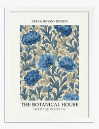
Lámina floral azul clásica
Translation missing: es.products.product.sale_price Desde £11.95£19.95 -

Lámina botánica morada vintage
Translation missing: es.products.product.sale_price Desde £11.95£19.95 -

Lámina naturaleza muerta moderna con flores
Translation missing: es.products.product.sale_price Desde £11.95£19.95 -

Lámina botánica de jarrones boho
Translation missing: es.products.product.sale_price Desde £11.95£19.95 -

Lámina bodegón botánico moderno en ocre y azul cielo
Translation missing: es.products.product.sale_price Desde £13.99£19.99 -

Lámina botánica de arte pop moderna en rosa y verde
Translation missing: es.products.product.sale_price Desde £11.95£19.95 -
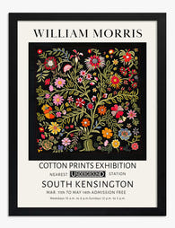
Lámina botánica estilo William Morris
Translation missing: es.products.product.sale_price Desde £11.95£19.95 -

Lámina de estudio botánico vintage
Translation missing: es.products.product.sale_price Desde £11.95£19.95 -

Lámina explosión floral boho moderna
Translation missing: es.products.product.sale_price Desde £11.95£19.95 -

Lámina ramo de flores vintage
Translation missing: es.products.product.sale_price Desde £11.95£19.95 -

Lámina bodegón botánico moderno
Translation missing: es.products.product.sale_price Desde £11.95£19.95


Más de The Frame

Why William Morris Prints Look Brilliant in Mod...
William Morris has been quietly miscategorised for decades. His patterns get filed under "country cottage" or "Arts and Crafts revival" and rarely escape, which is a shame because his tree...

Why Arts and Crafts Nature Prints Are the Antid...
The minimalism hangover: why bare walls stopped feeling calming For about a decade, the aspirational interior was a white box with one boucle chair in it. That look has officially...

Botanical Petal Art: Why Close-Up Prints Feel M...
Full florals have had a long run, and they're not going anywhere. But if you've noticed that the botanical art appearing in design magazines, boutique hotel lobbies, and the better-styled...