Bedroom Wall Art: How to Choose Prints You'll Love Waking Up To
The art above your bed shapes how you fall asleep and how you wake up. Choose it like it matters.

Bedroom art does something no other art in your home does. It is the last thing you look at before you close your eyes and the first thing you register when you open them. That makes it uniquely powerful, and it means the rules for choosing and hanging it are different from every other room.

The above-bed wall: sizing rules specific to your headboard
The starting point for any bedroom wall art is the headboard width. Designers generally agree on the two-thirds to three-quarters rule: your art should span between 66% and 75% of the headboard width. Any narrower and the piece looks like it is floating apologetically. Any wider and it visually crushes the bed.
Here is how that translates to actual sizes:
- Single bed (90cm / 3ft headboard): aim for art around 60 to 70cm wide. A medium 18x24in (45x60cm) print works beautifully, framed or unframed.
- Double bed (135cm / 4ft 6in headboard): target 90 to 100cm of total width. One large 28x40in (70x100cm) print is ideal, or a pair of 18x24in prints hung side by side.
- King bed (150cm / 5ft headboard): you want around 100 to 115cm of width. A single XL canvas at 36x48in (90x120cm) is gorgeous here, or a triptych of three 16x20in prints.
- Super king bed (180cm / 6ft headboard): go bold. You need 120 to 135cm of width, which means a 40x60in (100x150cm) canvas or a set of three 18x24in prints with proper spacing.
For height, hang the bottom edge of your art 15 to 20cm above the headboard. If you have no headboard, the bottom edge should sit roughly 20 to 25cm above pillow height. This keeps the artwork in conversation with the bed rather than drifting up the wall.
One large print vs a set of three: which arrangement suits which bed
This is the decision most people get wrong. They default to a set of three because it feels safe, when often a single piece would be far more powerful.
Choose one large print when: you have a king or super king bed, your headboard is plain or upholstered in a quiet colour, and your bedroom style leans minimalist, Japandi, or contemporary. A single statement piece anchors the room and lets the bed remain the hero. It also feels calmer because your eye does not bounce between three frames.
Choose a pair when: you have a double bed and want symmetry without busyness. Two identical prints flanking a central headboard line look intentional and confident.
Choose a triptych or set of three when: you have a super king with a wide expanse of empty wall, or your style is more traditional, gallery-led, or boho. The key with three prints is the spacing. Hang them 10 to 12cm apart. Closer than that feels cramped. Wider than that and they stop reading as a set.
For most bedrooms, we think one large piece beats three smaller ones. It is more restful, easier to get right, and makes the ceiling feel higher.
Calm, romantic, or bold: choosing a mood for your bedroom
Before you look at a single image, decide what you want your bedroom to feel like at 10pm and at 7am. The art has to support both.
Calm bedrooms lean on muted palettes, slow subjects, and plenty of negative space. Think mist over hills, a single ceramic vessel, abstract washes in oat and stone. This is where our calm and serene art prints earn their keep.
Romantic bedrooms want softness with a little richness. Think loose florals, classical figures, faded landscapes in dusty pinks and burgundy. Romantic does not mean kitsch. It means warm, slightly imperfect, painterly.
Bold bedrooms are for people who find too much calm boring. You can still sleep well in a room with a strong piece of art, as long as the colours are deep rather than bright. A moody black and white photograph or a graphic abstract in indigo and rust gives you energy without electric blue jolts.

The best subjects for bedrooms (and the ones that keep people awake)
Some imagery genuinely settles the nervous system. Other imagery is the equivalent of leaving the TV on at low volume.
Subjects that work:
- Soft landscapes (coastal mist, rolling fields, distant mountains)
- Botanical studies and pressed flowers
- Loose, flowing abstracts
- Gentle figurative work (a single figure, a quiet interior)
- Architectural studies in neutral palettes
- Black and white photography with soft contrast
Subjects that quietly disrupt sleep:
- Busy cityscapes with lots of small details (your eye tries to scan them)
- Stormy seas and dramatic weather (high arousal)
- Faces staring directly out at the bed (mildly unsettling, even if you do not consciously notice)
- Clocks and any imagery with strong forward motion
- Harsh black and white contrasts and high-glare graphics
- Religious or memorial imagery, unless that is genuinely soothing for you
The test is simple: imagine looking at it for ten seconds in low light. Does your shoulders drop, or does your eye start working? You want the first answer.
Botanical and nature prints: how to do it without being basic
Botanical art prints dominate bedroom walls for good reason. They bring living energy without movement, they pair with almost any palette, and they have been hanging in bedrooms since the eighteenth century. The risk is that they tip into generic.
Here is how to keep botanicals interesting:
Choose specific over generic. A detailed study of a single fern frond beats a vague leafy print every time. Vintage botanical illustrations with Latin names have more character than modern stock-photo florals.
Mind the palette. If your room is already green and beige, a green leaf print on a beige background disappears. Either go for high-contrast botanicals (dark backgrounds, jewel-toned petals) or move into floral art prints with stronger colour stories.
Scale up. A small botanical print on a king-size wall looks timid. If you love the genre, commit to a large or XL size. A single oversized fern in a 28x40in (70x100cm) frame feels gallery, not garden centre.
Mix eras. Pair a vintage-style pressed-flower illustration with a contemporary abstract botanical, and the room reads as collected rather than catalogued. Our wider nature art prints collection is a good place to find the contemporary half of that mix.
Abstract art in bedrooms: which styles relax and which ones agitate
Abstract is a broad category, and not all abstracts belong above your bed.
Relaxing abstracts share a few qualities. The brushwork is loose. The palette is tonal rather than contrasting. There is breathing room in the composition. Think colour field paintings, soft washes, and minimalist compositions with two or three muted shapes. Our Japandi and Scandi calm collection is full of this kind of work.
Agitating abstracts tend to involve sharp geometry, high colour contrast (especially red against black), busy mark-making, or jagged lines. These are brilliant in offices and hallways, where you want a small jolt of energy. Above your bed, they make the room feel busy even when nothing is moving.
If you love abstract work generally, browse our abstract art prints with the bedroom filter in mind: tonal, slow, and easy on the eye.
Colour psychology: blues, greens, neutrals, and when pink actually works
Designers and sleep researchers tend to agree that cool, low-saturation colours support rest. The mechanism is reasonably well established. Cool tones are associated with lower physiological arousal, while warm bright tones correlate with higher alertness.
Blue is the most-recommended bedroom colour for a reason. It reads as restful, spacious, and clean. The trick is to avoid bright cobalts and electric blues, which carry energy. Aim for dusty blue, slate, navy, and soft teal.
Green is grounding and easy on the eye. Sage, eucalyptus, and deep forest all work. Bright limes and synthetic greens do not.
Neutrals (oat, stone, taupe, soft white, warm grey) are the safe choice and a genuinely good one. The risk is blandness. If you go fully neutral, lean on texture and mark-making in the artwork to keep things interesting.
Pink is more bedroom-friendly than its reputation suggests, but only in specific shades. Dusty pink, terracotta, and rosy beige work beautifully and feel warm rather than babyish. Avoid hot pink and fluorescent coral, which are stimulating.
Reds and oranges are best used as accents rather than dominant tones. A small terracotta detail in a larger neutral abstract is fine. A red-saturated print above your bed is a bad idea unless you struggle to wake up.

The other bedroom walls: wardrobe, dressing table, and the view from the door
The above-bed wall gets all the attention. The other walls get ignored. This is a missed opportunity.
The wall opposite the bed is what you see when you sit up in the morning. It deserves a piece of art you genuinely love. Because you view it from a distance and head-on, you can go larger and more graphic here than you would above the bed itself.
Above the dressing table is a chance for something more personal. A small vintage portrait, a favourite photograph, or a delicate line drawing all suit this spot. Keep the scale modest, around 30x40cm or 40x50cm, so it does not overpower the mirror.
Beside the wardrobe is often a narrow strip of wall that suits a tall, portrait-orientation print. A 20x28in (50x70cm) print hung vertically draws the eye up and makes the ceiling feel taller.
The view from the doorway is the first impression you get of the room each time you walk in. Stand in the doorway and ask what you see. If the answer is a blank wall, that is your next piece of art.
Browse our full bedroom art prints collection or bedroom canvas prints with these secondary walls in mind.
Hanging heavy frames above your bed safely
This is the part most articles skip, and it is the part that genuinely matters. There is real psychology around objects suspended above where you sleep. If part of you is worrying it might fall, the room never fully feels restful.
Know your wall. Most modern UK and Irish bedrooms have plasterboard walls (drywall) over a timber or metal stud frame. Plasterboard alone holds very little weight. A nail straight into plasterboard will pull out under anything heavier than a postcard.
Find a stud if you can. A cheap stud finder will locate the timber behind the plasterboard. A screw into a stud will hold up to 35kg easily, which covers any framed print you are likely to hang.
If there is no stud where you need one, use proper plasterboard fixings. Self-drilling metal anchors (sometimes sold as snaptoggles or hollow-wall anchors) hold 15 to 20kg per fixing in standard plasterboard. Use two for any frame above 5kg.
Avoid these mistakes: standard picture hooks tapped into plasterboard, single nails, adhesive strips for anything heavier than a small unframed print. Adhesive strips are fine for a 6x8in print. They are not fine for a framed 24x32in.
A practical advantage of canvas over framed prints in the bedroom is weight. A large stretched canvas weighs a fraction of the same size framed behind acrylic, which makes hanging easier and the wall less stressed. Our framed prints use UV-protective acrylic glaze rather than glass, which also keeps the weight down compared to traditional glazed framing, and means no shattered glass risk above your pillow.

A note on lighting
Bedroom lighting changes how art reads more than in any other room, because you see it in three completely different lights: morning, evening, and lamp-lit. Warm bedside lamps push everything towards amber. Cool overhead lighting flattens colour. Daylight reveals the truth.
Where possible, judge a print in daylight first, then check it under your warmest bedside lamp. If it still looks good in both, you are safe. Matte papers and matte canvas finishes (which is what we print on) handle mixed lighting far better than glossy surfaces, because there is no glare to deal with as the light shifts.

What to do this week
Stand in your bedroom doorway and look at the wall above your bed. Measure your headboard width and multiply it by 0.7. That is the size of art you should be looking for. Decide whether you want one piece or three. Then shortlist two or three options that fit the mood you want, in colours that lean cool and tonal rather than bright and contrasting. Hang the bottom edge 15 to 20cm above the headboard, into a stud or proper plasterboard anchor, and stop worrying about it.
The best bedroom art is the kind you stop noticing in the best possible way. It just makes the room feel right.
Productos Fab destacados en este blog
-

Lámina el dormitorio de Van Gogh
Translation missing: es.products.product.sale_price Desde £11.95£19.95 -

Lienzo cama moderna y acogedora
Translation missing: es.products.product.sale_price Desde £49.95£74.95 -

Lámina cama minimalista en azul y naranja
Translation missing: es.products.product.sale_price Desde £11.95£19.95 -

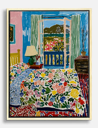
Lámina vista de dormitorio inspirada en Matisse
Translation missing: es.products.product.sale_price Desde £11.95£19.95 -

Lámina retrato sereno en azul
Translation missing: es.products.product.sale_price Desde £11.95£19.95 -

Lienzo cama minimalista en azul y naranja
Translation missing: es.products.product.sale_price Desde £49.95£74.95 -

Lienzo interior de dormitorio de inspiración Matisse
Translation missing: es.products.product.sale_price Desde £49.95£74.95 -

Lámina retrato musa de la mañana
Translation missing: es.products.product.sale_price Desde £11.95£19.95 -

Lienzo serenidad del dormitorio de Van Gogh
Translation missing: es.products.product.sale_price Desde £49.95£74.95 -

Lámina refugio soleado inspirada en Matisse
Translation missing: es.products.product.sale_price Desde £11.95£19.95 -

Lámina mañana entre sábanas en azul y naranja
Translation missing: es.products.product.sale_price Desde £11.95£19.95 -
Lienzo vibrante inspirado en Matisse para dormitorio
Translation missing: es.products.product.sale_price Desde £49.95£74.95 -

Lámina copa de champán en la cama
Translation missing: es.products.product.sale_price Desde £11.95£19.95 -
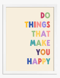
Lámina tipográfica recordatorio para vivir feliz
Translation missing: es.products.product.sale_price Desde £11.95£19.95 -

Lámina refugio vibrante inspirada en Matisse
Translation missing: es.products.product.sale_price Desde £11.95£19.95 -

Lámina refugio sereno inspirada en Matisse
Translation missing: es.products.product.sale_price Desde £11.95£19.95 -

Lámina noches en casa con corazón
Translation missing: es.products.product.sale_price Desde £11.95£19.95 -

Lámina vista de la mañana desde la ventana
Translation missing: es.products.product.sale_price Desde £11.95£19.95 -

Lámina dormitorio soleado con gato y puertas azules
Translation missing: es.products.product.sale_price Desde £11.95£19.95


Más de The Frame

Countryside Decor Ideas: How to Bring Rural Cal...
Countryside art has quietly become one of the most versatile choices in modern interiors. Not the chintz-and-bunting version, but the kind of soft, considered pastoral scenes that bring the outside...

Arts and Crafts Animal Prints: The Victorian De...
The Arts and Crafts revival: why Victorian animal prints are trending again Scroll through any interior design hashtag right now and you'll see them everywhere: hares peering through curling foliage,...

You're Overthinking Your Arts and Crafts Galler...
Most gallery wall advice assumes you're working with clean, simple imagery. Photographs. Line drawings. Quiet little prints with breathing room baked in. Arts and Crafts prints are the opposite of...