Botanical Prints vs Floral Prints: Which Style Actually Suits Your Home?
One leans scientific and serene, the other romantic and bold. Here's how to pick the right one for your walls.

Most online stores use "botanical" and "floral" as if they mean the same thing. They don't. The difference shapes the mood of a room, the furniture it pairs with, and whether your wall feels like a quiet library or a sun-filled garden.
Botanical vs floral: what's the actual difference?
A botanical print is rooted in scientific illustration. The point is accuracy: you can identify the species, the leaves are anatomically correct, and the composition usually shows a single specimen against a plain cream or off-white background. Often there's a Latin name, a hand-lettered label, or numbered details of the seed, root, or cross-section.
A floral print is decorative. It prioritises mood over accuracy. Think a loose watercolour of peonies tumbling out of a vase, an impressionistic field of poppies, or a stylised modern bouquet in saturated colour. The flower might be unidentifiable as a specific cultivar, and that's fine, because the goal is feeling, not taxonomy.
The simplest test: if the print looks like it could have come from a 19th-century reference book, it's botanical. If it looks like it could have come from an artist's studio, it's floral.

The history of botanical illustration (and why it's having a moment)
Botanical illustration is one of the oldest forms of functional art. Before photography, scientists, herbalists, and explorers needed accurate visual records of plants for medicine, agriculture, and classification. The genre peaked between the 1700s and late 1800s, when figures like Pierre-Joseph Redouté and Maria Sibylla Merian produced work that was simultaneously scientific reference and serious art.
Those original plates, with their cream paper, fine ink lines, and restrained watercolour washes, have become some of the most reproduced wall art of the last decade. Part of the appeal is aesthetic: the muted palette and white space sit beautifully in modern interiors. Part of it is cultural. There's a quiet, almost contrarian pleasure in hanging something that values precision and patience in a world that doesn't.
The result is that vintage-style botanical art prints now feel both classic and current. They work in a 1930s flat and a new-build kitchen with equal ease, which is rare for any decorative category.
When to choose floral art: warmth, colour, and emotional impact
Floral art is for rooms you want to feel alive. The colour is usually richer, the brushwork looser, and the overall effect more emotional than intellectual. A blowsy peony watercolour, a moody Dutch-style still life, or a bright modern poppy painting will pull the eye and warm the temperature of a space immediately.
Choose floral if:
- Your interior leans cottage, romantic, traditional, French country, or maximalist.
- You want a single piece to do heavy lifting as a focal point above a sofa, bed, or fireplace.
- Your existing palette is neutral and you want art to inject the colour.
- You like layered, decorated rooms with patterned textiles, books, and objects.
Floral works particularly well in lounges, bedrooms, and dining rooms where you want a feeling of generosity. A 70x100cm framed floral above a grey velvet sofa, paired with a couple of patterned cushions, will pull a whole scheme together in a way a precise fern study simply won't.
The trade-off is commitment. Saturated florals have a stronger personality, so they're harder to swap in and out without rethinking the room. If you tend to redecorate often, that's worth knowing. Browse the floral art prints collection if this sounds like your direction.
When to choose botanical art: precision, calm, and a more modern feel
Botanical art does almost the opposite. It's quiet. The plain backgrounds, fine line work, and restrained palette make it read as architectural rather than emotional. In a minimalist or Scandinavian room, a set of three botanical prints will look composed and considered without overwhelming anything else in the space.
Choose botanical if:
- Your interior leans modern, minimalist, Scandi, mid-century, Japandi, or library.
- You want art that reads as quiet detail rather than statement.
- You like the idea of a series, a grid, or a wall art set rather than a single hero piece.
- Your home has a lot of natural materials (oak, linen, ceramic) that you want to echo.
Botanical prints are particularly effective in offices, hallways, kitchens, and bathrooms. These are spaces where you don't want art shouting at you while you try to concentrate or unwind. A grid of four ferns in matching oak frames above a console table is one of the most reliably good-looking moves in interior design.

The colour palette deserves a mention. Genuine botanical prints typically sit in a narrow range of greens, browns, soft yellows, and the occasional muted pink or red. That restraint is why they layer so well with almost any existing scheme. They don't fight with your wallpaper, your sofa, or your rug.
Where water lily prints sit on the botanical-to-floral spectrum
Water lilies are the most interesting case in this whole conversation, because they exist on both sides of the line.
A scientific illustration of Nymphaea alba, with its anatomical cross-sections of the bud and tuber, is unmistakably botanical. A Monet-style painting of the same plant, with its dappled light, blurred reflections, and loose colour, is unmistakably floral. Same subject, completely different category.
This is why botanical water lily prints are so versatile. Depending on which version you choose, they can anchor a precise, modern wall or soften a romantic, layered one. If your room is mostly neutral and architectural, a vintage scientific water lily plate adds depth without disturbing the calm. If your room is rich with colour and pattern, an impressionistic water lily painting amplifies the mood.
A quick note on water lilies versus lotus, since the two get confused constantly. They're different plants. Water lilies sit flat on the water with rounded, notched leaves and are common across European ponds. Lotus rise above the water on tall stems with cup-shaped leaves and are most associated with East and South Asian iconography.
Aesthetically, water lily prints tend to feel more European, more impressionistic, more associated with garden painting. Lotus flower art prints often carry stronger symbolic weight, with cleaner geometric compositions, and pair particularly well with minimalist or East Asian-influenced interiors. Neither is better. They just say different things on a wall.
Mixing botanical and floral prints in a gallery wall
You can absolutely combine the two styles. Done well, the contrast between scientific precision and painterly looseness is what makes a gallery wall feel collected rather than catalogued. Done badly, it looks like a junk drawer.
Three rules keep it cohesive.
Unify through frames. Pick one frame style for the whole wall. If half your prints are vintage botanical and half are loose floral watercolours, putting them all in the same thin black or natural oak frame will pull them into one family. Mixing frame finishes on top of mixing styles is usually a mix too far.
Unify through palette. Even if the styles differ, the colours shouldn't. If your botanical prints are muted greens and creams, your florals should sit within a compatible range. Avoid pairing a soft sepia fern study with a neon-bright modern poppy. They'll fight.
Unify through scale logic. A gallery wall reads better when there's a clear hierarchy. One larger anchor piece, two medium pieces, three smaller pieces. If you give every print equal weight, the eye doesn't know where to land.

A reliable formula: a single larger floral as the focal point at 70x100cm, surrounded by four to six smaller botanical studies at 30x40cm, all in matching frames. The floral provides the warmth, the botanicals provide the structure, and together they look like a considered collection rather than a random assortment.
Frame and size recommendations for each style
Frames change the personality of a print as much as the print itself, so it's worth being deliberate.
For botanical prints
Botanical prints look best in thin, restrained frames that don't compete with the fine detail. Natural oak, black, or white in a slim profile works almost universally. Avoid ornate or wide frames. They overwhelm the quiet of the print.
Size depends on use. A single botanical print needs to be larger than people expect, ideally 50x70cm or 70x100cm, to hold a wall on its own. Botanicals genuinely shine in sets: a grid of four at 30x40cm or a row of three at 40x50cm gives you the museum-cabinet feel that's so much of the appeal.
A practical note on framed prints generally. The biggest disappointment in this category is when the frame and print arrive separately, the print warps in the post, or the fitting is sloppy. Look for prints that ship pre-fitted in one box, with proper UV-protective glazing rather than glass (lighter, no glare, and they don't shatter if you drop a hammer near them while hanging).
For floral prints
Floral art can carry more frame. A wider profile in oak, walnut, or even a soft white painted finish suits the more generous mood. A bold, painterly floral in a thin black frame can look stranded. Give it some structure to sit in.
Size up rather than down. Florals are emotional, and emotion needs scale. A small floral print on a large wall reads as undersized and slightly apologetic. For a single hero piece, go to 70x100cm framed, or move into canvas at 100x150cm if you want the looser, more painterly feel. Canvas suits impressionistic florals particularly well, because the matte surface and stretched edges echo the texture of an actual painting.

A quick decision checklist
- Modern, minimalist, Scandi room: botanical, slim oak or black frame, set of three or four.
- Cottage, romantic, traditional room: floral, wider frame, single large piece.
- Office, library, hallway: botanical, sets and grids.
- Lounge, bedroom, dining room: floral, statement scale.
- Bathroom or kitchen: botanical, smaller scale, in a moisture-tolerant material like canvas if the room runs humid.
- Can't decide: water lily. It bridges both worlds.
A final thought
The honest answer to "botanical or floral?" is that the right choice has very little to do with which one is objectively better and almost everything to do with how your room actually feels when you walk into it. If you want it calmer and more architectural, go botanical. If you want it warmer and more emotional, go floral. If you want a bit of both, water lilies are doing exactly that work and have been since Monet.
Pick the print that matches the temperature you want the room to hold. Then size it generously, frame it simply, and hang it lower than you think.

Productos Fab destacados en este blog
-

Lámina jarrones con flores de estilo moderno
Precio de oferta Desde £11.95£19.95 -

Lámina botánica morada vintage
Precio de oferta Desde £11.95£19.95 -
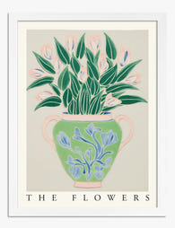
Lámina botánica con jarrón y flores en verde y rosa pastel
Precio de oferta Desde £11.95£19.95 -

Lámina de flor botánica moderna
Precio de oferta Desde £11.95£19.95 -

Lámina de plantas en maceta sobre fondo amarillo
Precio de oferta Desde £11.95£19.95 -

Lámina fantasía botánica abstracta en tonos pastel
Precio de oferta Desde £11.95£19.95 -
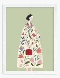
Lámina mujer con abrigo floral
Precio de oferta Desde £11.95£19.95 -

Lámina botánica elegante en verde oscuro
Precio de oferta Desde £11.95£19.95 -

Lámina botánica de jarrones boho
Precio de oferta Desde £11.95£19.95 -

Lámina mujer con abrigo floral de impacto
Precio de oferta Desde £11.95£19.95 -

Lámina oasis botánico boho
Precio de oferta Desde £11.95£19.95 -

Lámina botánica moderna de formas fluidas
Precio de oferta Desde £11.95£19.95 -
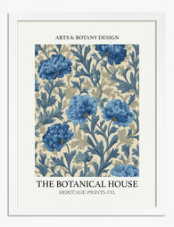
Lámina floral azul clásica
Precio de oferta Desde £11.95£19.95 -

Lienzo botánico verde heritage
Precio de oferta Desde £49.95£74.95 -

Lámina botánica oscura de inspiración clásica
Precio de oferta Desde £11.95£19.95 -

Lámina de estudio botánico vintage
Precio de oferta Desde £11.95£19.95 -

Lienzo de jarrones boho botánicos
Precio de oferta Desde £49.95£74.95 -

Lámina botánica con macetas sobre estante, fondo amarillo
Precio de oferta Desde £11.95£19.95 -

Lámina armonía botánica griega
Precio de oferta Desde £11.95£19.95


Más de The Frame

Our Favourite Art Prints for Bedrooms That Help...
Bedroom art is the one place in your home where a "statement piece" is usually the wrong instinct. The job here is quieter, and getting it right means unlearning most...

Vintage Rose Prints: From Botanical Illustratio...
Vintage rose prints are having a proper moment. Not the dusty, chintzy kind your nan had over the settee, but the considered, well-framed kind that anchor a modern room and...

Why Rose Print Decor Works Better Without the C...
Why Roses Are the One Floral That Never Truly Goes Out of Style Roses have been painted, printed and photographed for centuries, and they still turn up in the work...