How to Create a Literary Gallery Wall That Actually Looks Curated
The exact rules, spacing measurements, and layout templates for a bookshop-inspired wall that looks deliberate, not chaotic.

Most literary gallery walls fail in the same way: too many quote prints, mismatched frames, and a layout that drifts off-centre above the sofa. The fix is a small set of rules that take the guesswork out of it. This is the guide you follow once and never have to think about again.
The 2/3 rule and why it matters for gallery walls above furniture
Your gallery wall should span roughly two-thirds the width of the furniture below it. So if your sofa is 210cm wide, your gallery wall (the full outer rectangle of all your prints together) should land somewhere between 130 and 150cm wide.
Why this specific ratio? Anything narrower looks like a postage stamp floating above a large piece of furniture. Anything wider visually competes with the sofa or sideboard and the whole composition starts to feel top-heavy. Two-thirds is the sweet spot where the art feels anchored to the furniture without being dwarfed or overwhelming it.
This rule applies above sofas, beds, sideboards, consoles, and dining benches. It does not apply on a blank wall with no furniture below, where you have more freedom.
If your wall is too small to make the 2/3 rule work (a narrow alcove, for example), prioritise visual centring over the ratio. A single larger anchor print with one or two smaller pieces beside it will read as more intentional than a cramped grid of nine.

Choosing your anchor piece: start with one strong bookstore print
Every good gallery wall has an anchor: the largest, most visually dominant piece that everything else orbits around. For a literary wall, your anchor should almost always be a photograph rather than a quote print or illustration.
Why photography? A black and white shot of a Parisian bookshop interior, a stack of vintage spines, or a reading nook gives your wall a real-world reference point. Typographic prints and illustrations work better as supporting characters because they're flatter and more graphic. Lead with one of those and the wall starts to feel like a Pinterest mood board rather than a curated room.
Aim for an anchor in the 50x70cm or 60x80cm range. If your wall is generous and your sofa is over 220cm wide, push up to 70x100cm. Browse bookstore art prints or photography prints and pick the one image you'd happily hang on its own. That's your anchor. Everything else builds around it.
A quick test: if you removed every other print from the wall, would your anchor still hold the space confidently? If yes, you've chosen well.
How many prints you actually need (spoiler: fewer than you think)
Five to nine. That's the range. Most beginners think they need 12 or 15 to fill a wall, then end up with something that looks more like a noticeboard than a curated display.
- Above a sofa or bed: 5 to 7 prints
- Above a console or sideboard: 3 to 5 prints
- A full feature wall (no furniture below): 7 to 9 prints
Odd numbers tend to look more dynamic than even ones, but this is a guideline, not a law. A clean grid of 4 or 6 can look beautifully intentional, especially with matching sizes and frames.
The reason fewer works better: every additional print introduces another decision (which size, which frame, where it sits). With 6 pieces you can curate. With 14 you're managing chaos.
If you're nervous about committing, a pre-made wall art set gives you 3 to 5 pieces designed to work together. It's a faster path to a cohesive wall than trying to source individual prints that happen to harmonise.
Mixing bookshop photography with illustrated and typographic prints
This is where most literary gallery walls go wrong. Bookshop photography, illustrated book covers, and typographic quote prints come from completely different visual languages. Throw them together without a plan and the wall feels chaotic.
The fix is to choose one unifying thread and let everything else vary. There are three threads that reliably work:
Thread 1: Colour temperature
Pick warm or cool, then commit. Warm literary walls lean into sepia bookshop photography, cream typographic prints, and illustrations with terracotta or ochre tones. Cool walls use crisp black and white photography, ink-blue typography, and muted green or grey illustrations. Mixing warm sepia with cool blue typography is the single most common reason literary walls look off.Thread 2: Subject matter
Every print is about books, reading, or libraries. The styles can vary (a photo of a Lisbon bookshop alongside a typographic Austen quote alongside an illustrated stack of spines), but the subject keeps the wall coherent.Thread 3: Era
Vintage feels and modern feels rarely cohabit well. A 1920s library photograph next to a sans-serif minimalist quote print will feel like two people shouting past each other. Pick old or new and stay there.You only need to commit to one of these threads. Pick two and you've effectively narrowed your choices so much it becomes hard to fill the wall.
For a foolproof bookshop aesthetic print mix, lean into black and white art prints for your photography. They sidestep the colour temperature problem entirely and give you a neutral base to build on.

Layout on the floor first: the paper template method that saves your walls
Never start hanging until you've planned the layout flat. This is the single biggest difference between gallery walls that look intentional and ones that drift sideways across the room.
Step 1: Cut a piece of paper to the exact size of each frame. Brown kraft paper or newspaper works fine. Label each one with the print it represents.
Step 2: Lay them out on the floor in front of the wall they're going on. Start with your anchor in the rough position you want it on the wall (typically slightly left or right of dead centre, never bang in the middle as that can look static).
Step 3: Arrange the rest around the anchor. Aim for visual balance, not symmetry. If you have a heavy black-framed photograph on the left, balance it with two smaller pieces on the right, not a single matching one.
Step 4: Once you're happy, photograph the layout from directly above. This is your blueprint.
Step 5: Tape the paper templates to the wall in the exact arrangement, using a spirit level to keep the outer rectangle square. Live with it for 24 hours. Walk past it. Look at it from the doorway. Adjust before you commit.
Only then do you start hanging.
Frame colour and finish: why consistency beats variety here
Generic gallery wall advice often celebrates "eclectic frame mixing." Ignore this for literary walls. The literary aesthetic relies on the prints themselves carrying the variety (photography, typography, illustration), so the frames need to do the opposite job: hold everything together.
Match the finish, not necessarily the exact frame style. All matte black, or all natural oak, or all warm walnut. The width and depth of the frames can vary slightly, but the colour and finish should be consistent across every piece on the wall.
Why? Your eye reads frame finish before it reads frame style. A wall of mixed black frames in slightly different profiles looks curated. A wall of identical-profile frames in black, gold, and white looks accidental.
For literary walls specifically:
- Matte black: sharpest, most modern, works with black and white photography
- Natural oak: warmer, softer, suits sepia photography and vintage illustrations
- Warm walnut: richest, most traditional, ideal for old library aesthetics
Pick one and apply it across all five to nine pieces. This is the rule that makes the biggest visible difference and the one beginners most often skip.
A quick note on quality: cheap frames warp, especially in humid rooms or anywhere with temperature swings. Solid wood frames stay flat and square for decades. The alternative, MDF wrapped in plastic veneer, will eventually bow at the corners and pull the print with it. If you're committing to a gallery wall you want to look at for years, the frame matters as much as the print.
Mat boards: when to use them, when to skip them
A mat board (the white border between print and frame) makes a print feel more formal and museum-like. For literary walls leaning vintage or traditional, mat boards add to the curated feel. For modern minimalist literary walls, skip them and let the print fill the frame edge-to-edge.
The rule of thumb: if your anchor print has a mat, every other print should too. Mixing matted and unmatted prints on the same wall reads as inconsistent.
Spacing, levelling, and hanging hardware for a clean result
Three measurements you need to know:
5 to 7cm between frames
Roughly 2 to 3 inches. Why this specific gap? Closer than 5cm and the wall reads as one solid block, which fights the gallery effect. Wider than 7cm and individual prints start to feel disconnected from each other.For very small prints (under 30x40cm) lean toward 5cm. For larger prints (50x70cm and up), 7cm gives them room to breathe.
15 to 20cm above furniture
Roughly 6 to 8 inches between the top of your sofa or sideboard and the bottom of your lowest frame. Much closer and the wall feels cramped. Much further and the art floats free of the furniture and stops feeling anchored to it.Centre at 145 to 152cm from the floor
This is the gallery rule (the "57 inch rule" in imperial). The visual centre of your gallery wall, not necessarily the centre of any individual frame, should sit at average eye level. This applies regardless of ceiling height.For hanging hardware, two D-rings on the back of each frame with picture wire is more forgiving than a single sawtooth hook. You can adjust each frame slightly left or right after hanging without re-drilling. For framed prints that arrive ready to hang with proper fixtures already attached, you skip the guesswork entirely.

Three literary gallery wall layouts you can copy directly
These are designed for a sofa or bed roughly 200 to 220cm wide. Scale up or down proportionally.
Layout 1: The Classic Asymmetric (6 prints)
A 60x80cm bookshop photograph as the anchor on the left. To its right, stacked vertically, two 30x40cm prints (one typographic quote, one illustrated book stack). Below the anchor and stretching right, a 40x50cm horizontal photograph and two more 30x40cm pieces forming a loose L shape.Best for: warm, lived-in living rooms. Feels collected, not symmetrical.
Layout 2: The Tight Grid (6 prints)
Three prints across, two rows down. All 40x50cm, all portrait orientation, all in matching matte black frames. Mix of three bookshop photographs on top, three typographic prints below.Best for: modern, minimalist rooms. Looks like a deliberately curated bookshop window.
Layout 3: The Salon Stack (9 prints)
A 70x100cm anchor (a single dramatic library or bookshop photograph) on the left. To the right, a tight cluster of eight smaller prints (mix of 21x30cm and 30x40cm) in a roughly rectangular arrangement. Mix typography, illustration, and smaller photography prints freely, but keep all frames the same finish.Best for: tall walls, period homes, anyone who wants the maximalist literary aesthetic without it tipping into chaos.
A final word on starting
The biggest mistake is overthinking. Pick your anchor. Choose five to seven supporting pieces with one unifying thread. Match every frame finish. Lay it out on the floor, transfer to paper templates on the wall, and hang only when you're sure. Do those things and your literary gallery wall will look curated, because it will be.


Productos Fab destacados en este blog
-

Lámina refugio literario acogedor
Translation missing: es.products.product.sale_price Desde £11.95£19.95 -

Lienzo escena encantadora de librería
Translation missing: es.products.product.sale_price Desde £44.95£74.95 -

Lienzo librería con encanto
Translation missing: es.products.product.sale_price Desde £44.95£74.95 -

Lienzo rincón de lectura acogedor
Translation missing: es.products.product.sale_price Desde £44.95£74.95 -

Lámina librería acogedora
Translation missing: es.products.product.sale_price Desde £11.95£19.95 -

Lienzo librería acogedora
Translation missing: es.products.product.sale_price Desde £44.95£74.95 -

Lámina fachada de librería en acuarela
Translation missing: es.products.product.sale_price Desde £11.95£19.95 -
Lienzo rincón de lectura acogedor
Translation missing: es.products.product.sale_price Desde £44.95£74.95 -

Lámina rincón de lectura acogedor
Translation missing: es.products.product.sale_price Desde £11.95£19.95 -

Lámina paseo invernal con libros
Translation missing: es.products.product.sale_price Desde £11.95£19.95 -

Lienzo rincón de lectura acogedor en la sala
Translation missing: es.products.product.sale_price Desde £44.95£74.95 -
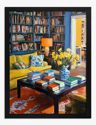
Lámina rincón de lectura acogedor
Translation missing: es.products.product.sale_price Desde £11.95£19.95 -

Lámina salón acogedor con biblioteca
Translation missing: es.products.product.sale_price Desde £11.95£19.95 -

Lámina villa retro de diseño geométrico
Translation missing: es.products.product.sale_price Desde £11.95£19.95 -

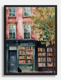
Lámina escena encantadora de librería
Translation missing: es.products.product.sale_price Desde £11.95£19.95 -
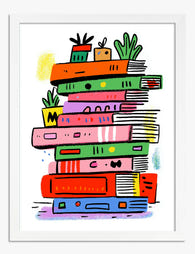
Lámina pila de libros de colores
Translation missing: es.products.product.sale_price Desde £11.95£19.95 -

Lámina refugio literario urbano
Translation missing: es.products.product.sale_price Desde £11.95£19.95 -

Lienzo salón acogedor con biblioteca y sofá amarillo
Translation missing: es.products.product.sale_price Desde £44.95£74.95


Más de The Frame

How to Build a Frida Kahlo Gallery Wall That Ac...
Most gallery walls fail in the same way: too many competing ideas, mismatched frames, prints that look great alone but argue with each other on the wall. Kahlo's work raises...

How to Build a Gallery Wall Around Town and Vil...
You've fallen for town prints. Maybe a hilltop village in Provence, a cobbled lane in Whitby, a market square you walked through once and never forgot. The question is how...

Whimsical vs Traditional Landscape Art: What's ...
Landscape art splits cleanly into two camps once you start looking properly: the kind that tries to show you the world as it is, and the kind that bends the...