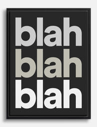
How to Display Typography Prints Without the Clutter
Typography needs the opposite of standard gallery wall advice. Here's how to hang text-based art so it actually looks intentional.

Typography prints break the rules of normal art display. Text demands to be read, not just glanced at, which means the standard gallery wall advice you've absorbed from interiors content is actively working against you. This guide gives you the specific measurements, spacing rules, and ratios that make text-based art look intentional rather than chaotic.
Why typography prints need more breathing room than other art
A landscape photograph or abstract print is processed visually in a fraction of a second. Your brain registers shape, colour, mood, and moves on. Typography is different. Your eye stops, reads, decodes meaning, then moves to the next thing. That extra cognitive work is exactly why text art needs more space around it than any other type of print.
Standard gallery wall guides recommend 5 to 7cm (roughly 2 to 3 inches) between frames. For typography, push that to 8 to 10cm minimum. The extra centimetres give each piece time to be read before the next one competes for attention. Crowd typography prints together and you create a wall that nobody can actually look at properly. The eye bounces, gives up, and the message of every print is diluted.
There's a second reason for the extra space. Typography is high-contrast by nature, usually black ink on white paper or white on a dark ground. High contrast pulls focus aggressively. Without breathing room, two typography prints next to each other will fight rather than complement.

The single statement piece: choosing the right size for your wall
For most UK homes, a single statement typography print is the right answer. Terraced houses, Victorian conversions and new builds rarely have the wall acreage that American gallery wall content assumes, and one well-sized print almost always reads more confidently than three average-sized ones.
The rule is simple: your print should occupy between 60% and 75% of the available wall width above whatever sits below it (sofa, sideboard, bed, console). For a standard 2-seater sofa around 160cm wide, that means a print roughly 100cm wide. Above a typical 180cm 3-seater, aim for 120cm wide, or go vertical if your ceilings allow.
For typography specifically, err towards the larger end of that range. Text needs to be readable from typical viewing distance. In a living room where the sofa sits 2.5 to 3m from the wall, type below about 4cm tall starts to feel apologetic. A 70x100cm framed print with a single bold word or short phrase reads beautifully from across a room. A 30x40cm print with the same content reads as a stamp.
Heights matter too. Hang the centre of the print at 145 to 150cm from the floor, or roughly 20 to 25cm above the top of your sofa or sideboard. Lower than that and the print drifts visually away from the furniture; higher and it floats unmoored.
Single-word vs multi-line quotes
A one-word statement (think THINK, BREATHE, HOME) can be enormous and still feel calm. Multi-line quotes need more careful sizing. The longer the text, the more important it is that the smallest characters remain readable from where you sit. As a rough guide: if you can't read the print comfortably from your sofa, the print is too small or too far away. Move it, swap it, or upsize.
Building a typography gallery wall (and how many prints is too many)
Typography gallery walls are the most commonly botched arrangement in home interiors. The instinct is to gather every favourite quote and treat them as a set. The result reads like a noticeboard.
Here's the honest answer competitors won't give you. For a gallery wall composed entirely of typography:
- Small wall (under 1.5m wide): maximum 2 prints
- Medium wall (1.5 to 2.5m wide): maximum 3 prints
- Large wall (2.5 to 4m wide): maximum 4 prints
- Anything beyond 4 typography prints in one arrangement is too many, full stop
The reason is reading load. Each typography print is a sentence the viewer has to process. Five sentences arranged together stop being art and start being homework.
If you're building a wall art set with multiple typography pieces, treat one as the lead and the others as supporting cast. The lead should be larger, bolder, or more visually dominant. The supporting prints can carry shorter phrases, smaller type, or more whitespace within the print itself.
Spacing for a typography gallery wall stays at 8 to 10cm between frames, slightly more than you'd use for mixed art. Anchor the arrangement around an invisible centre line at 145cm from the floor (the midpoint of the whole arrangement, not each individual frame).

Mixing typography with photography or abstract prints
This is where most people land in practice, and it works beautifully when you respect one ratio: maximum one typography piece per three total prints in any single arrangement.
A four-print gallery wall? One typography print, three image-based prints. A six-print arrangement? No more than two typography pieces, ideally placed at opposite ends rather than next to each other. Two typography prints sitting side by side in a mixed gallery wall create a reading bottleneck that breaks the flow.
The mix works because the image prints give the eye somewhere to rest. After reading the typography piece, the viewer's gaze can drift to a black and white photograph or an abstract composition and decompress. Without that visual rest, even one typography print in a busy arrangement starts to feel demanding.
For mixed walls, consider these pairings:
- One bold quote with three minimalist line drawings
- A single typographic poster with two muted landscape photographs
- One word-based print with a pair of abstract colour studies in similar tones
Tonally, match the typography to the rest of the arrangement. A grungy vintage-style poster will fight a set of clean, contemporary photographs. A crisp minimalist print sits comfortably alongside almost anything.
The one-text-per-sightline rule
Stand in your room and look around. Anywhere your eye naturally lands, you should see at most one piece of typography. Two text pieces visible from the same seated position create competing messages. If your living room has art on three walls, only one of those walls should carry typography.
Frame consistency: why matching frames matter more with text art
For mixed art, you can get away with mismatched frames. A gallery wall of varied frame finishes can look collected and considered. For typography, this almost never works.
Text already carries visual weight in the form of letterforms, contrast, and meaning. Adding frame variation creates a second layer of visual noise that competes with the text itself. The result is a wall where neither the frames nor the words land cleanly.
Stick to identical frames across all typography in a single arrangement. Same colour, same width, same finish. Black frames are the safest default for high-contrast typography because they reinforce the text without adding new information. Natural oak works well for warmer interiors and softens bold type. White frames work for minimalist, low-contrast typography on coloured grounds.
Whatever you choose, commit to it across the whole arrangement. Solid wood frames hold their shape and finish properly over time, which matters when you're committing to a unified look. Veneered or MDF frames warp and discolour unevenly, which destroys frame consistency within a year or two regardless of how careful you were at the start.
When you can break the matching frame rule
There's exactly one situation where mixing frame styles works for typography: when the typography styles themselves are dramatically different and the frames are deliberately reinforcing that contrast. A vintage circus-style poster in a thick gilt frame next to a minimalist contemporary quote in a slim black frame can work because the frames are doing different jobs for prints that are doing different jobs. This is advanced territory and requires real confidence. If in doubt, match.

Spacing rules that actually work in real rooms
Generic gallery wall guides love vague advice. Here are the actual numbers.
Between typography frames: 8 to 10cm. Wider than mixed-art spacing because text needs reading room.
Between a typography print and a non-text print in the same arrangement: 6 to 8cm. The text piece still needs slightly more space than purely visual art, but the gap doesn't need to be as wide as between two text pieces.
Above a sofa or sideboard: the bottom of the frame should sit 20 to 25cm above the top of the furniture. Closer than 15cm and the art looks crammed; further than 30cm and it floats.
Centre height: aim for 145 to 150cm from the floor to the centre of the print (or the centre of the arrangement). This is roughly average UK eye level. In rooms with very high ceilings (Victorian conversions with 2.7m+ ceilings), you can push the centre to 155cm. In rooms with low ceilings (typical new builds at 2.4m), keep it at 145cm or even slightly lower.
Distance from corner of wall: at least 30cm. Typography crammed into a corner reads as cluttered no matter how perfect the spacing within the arrangement is.
Distance from light switches, radiators, plug sockets: at least 25cm. These are visual interruptions and need clearance.
Optimal viewing distance
For typography, viewing distance dictates minimum size. As a rough guide:
- Hallways (1 to 2m viewing distance): A3 prints work, type can be smaller
- Bedrooms (2 to 3m typical viewing): aim for 50x70cm minimum
- Living rooms (2.5 to 4m typical viewing): 70x100cm minimum for serious impact
- Open-plan spaces (4m+): go as large as the wall allows, up to 100x150cm canvas
If the smallest letterform on your print isn't comfortably readable from where you'd actually sit or stand, the print is too small for the room.
Common display mistakes and how to avoid them
Mistake 1: Treating typography like wallpaper. Filling every available wall with quotes and phrases. The cure: pick one wall per room for typography, leave the others to image-based art or stay bare.
Mistake 2: Mixing too many fonts. Three different decorative fonts in three frames creates visual chaos. Stick to one or two typographic styles per room. A serif and a sans-serif work together. Three different scripts do not.
Mistake 3: Hanging too high. The most common error in UK homes. People hang art at the wall's vertical midpoint rather than relating it to the furniture below. The result is art floating awkwardly above eye level. Always relate height to what's beneath the print.
Mistake 4: Choosing prints with poor print quality. Pixelated text is glaring in a way that pixelated photography never is. The eye is built to recognise letterforms with extreme precision, so any softness, banding or compression artefact in typography reads immediately as cheap. Giclée printing on heavyweight matte paper is what you want, particularly for fine type and serifs.
Mistake 5: Glass glare blocking the words. If you can't read the print because of reflections, the print fails its primary job. UV-protective acrylic glazing solves this without the glare problem of standard glass, and has the added benefit of preventing the text from fading in sunny rooms.
Mistake 6: Frames arriving separately or warped. A surprisingly common failure with text art specifically, because any imperfection in the frame draws the eye towards the print rather than letting the eye land on the words. Look for prints that ship pre-fitted in their frames, ready to hang in one box.
Mistake 7: Forgetting the room itself. A bold MOTHER print in the kitchen is fine. The same print in a home office competes with your work. Match typography content to the function of the room. Calm rooms get calm words.

Browse typography prints and look for pieces where the type is doing the heavy lifting visually, not relying on decorative flourishes to carry the design. Strong typography is confident enough to stand alone with breathing room around it.
The bottom line
Typography prints reward restraint more than any other category of wall art. Fewer prints, more space between them, identical frames, and sizes large enough to actually read. Pick one wall per room, commit to one or two prints, and resist the urge to add a third "just to fill the space." The empty wall around a single perfect typography print is doing as much work as the print itself.

Productos Fab destacados en este blog
-

Lámina tipográfica de impacto en dorado
Translation missing: es.products.product.sale_price Desde £11.95£19.95 -

Lámina tipográfica número 9 en negro
Translation missing: es.products.product.sale_price Desde £11.95£19.95 -

Lámina tipográfica caos audaz
Translation missing: es.products.product.sale_price Desde £11.95£19.95 -

Lienzo tipografía moderna en tonos marrones
Translation missing: es.products.product.sale_price Desde £44.95£74.95 -

Lámina tipográfica de impacto en tonos marrones
Translation missing: es.products.product.sale_price Desde £11.95£19.95 -

Lienzo tipográfico en negro sobre fondo neutro
Translation missing: es.products.product.sale_price Desde £44.95£74.95 -

Lámina tipográfica Bold Zero en blanco y negro
Translation missing: es.products.product.sale_price Desde £11.95£19.95 -

Lámina tipográfica audaz en marrón oscuro
Translation missing: es.products.product.sale_price Desde £11.95£19.95 -

Lámina tipográfica en negrita con icono
Translation missing: es.products.product.sale_price Desde £11.95£19.95 -

Lámina tipográfica de impacto en blanco y negro
Translation missing: es.products.product.sale_price Desde £11.95£19.95 -

Lienzo tipográfico de impacto en blanco y negro
Translation missing: es.products.product.sale_price Desde £44.95£74.95 -

Lámina tipográfica audaz y minimalista en blanco y negro
Translation missing: es.products.product.sale_price Desde £11.95£19.95 -
Lienzo tipográfico neutro y audaz
Translation missing: es.products.product.sale_price Desde £44.95£74.95


Más de The Frame

How to Create a Gallery Wall That Looks Intenti...
You've seen a hundred gorgeous gallery walls saved to a Pinterest board. The gap between those images and your actual blank wall is execution, and execution is just measurements, spacing,...

How to Build a Picasso Gallery Wall That Actual...
Most gallery wall guides tell you to "play around with the layout" and "trust your eye." That advice is useless when you're staring at over a hundred Picasso prints trying...

How to Build a Market-Themed Gallery Wall That ...
A gallery wall of market scenes does something a single print never can: it tells a story across cultures. You're not decorating with one image, you're curating a small museum...