Klimt at the Lake: The Landscapes That Changed How We See Nature Art
The painter of gold portraits spent every summer obsessing over forests, lakes, and meadows. Here's why that matters.

The other side of Klimt: from gold portraits to green forests
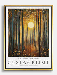
Most people know one Klimt. Gold leaf, embracing couples, a certain art history poster that has hung in roughly every student flat since 1985. But for several months every year, between 1900 and his death in 1918, Gustav Klimt put down the gold and painted trees.
He produced around 50 landscapes, roughly a quarter of his total output, and they look almost nothing like the work that made him famous. No allegory. No symbolism. No commissioned countesses staring out from shimmering tile work. Just orchards, birch trunks, a pond clogged with water lilies, the corner of a farmhouse seen through high summer foliage.
These are the Klimt paintings to know if you're tired of the obvious ones.

Lake Attersee and the Austrian countryside that inspired him
Every summer, Klimt left Vienna for the Salzkammergut, the lake district east of Salzburg, and specifically for Lake Attersee. He went with Emilie Flöge, his lifelong companion and the designer who ran a celebrated Viennese fashion house. They rowed. They swam. He wore a long blue smock and slippers and almost nothing else, which is why locals nicknamed him "Waldschrat", the forest demon.
This wasn't a holiday in the modern sense. It was Sommerfrische, an Austrian tradition where the urban bourgeoisie decamped to the countryside for months at a time, escaping city heat and city expectations. For Klimt, Sommerfrische meant something more specific: no commissions, no patrons, no society portraits. Just painting whatever he wanted, however he wanted, all day.
That freedom shows. His landscape paintings feel loose where his portraits feel choreographed. They're him painting for himself, which is part of why they've aged so well. There's no audience baked into them.
The Attersee paintings, in particular, have a quality of pure attention. A farmhouse wall. A row of sunflowers. The shimmer of water seen from a boat. They feel like the visual equivalent of a deep breath.
How Klimt used a telescope to compose his landscapes
Here's the detail that makes Klimt's landscapes click into focus once you know it: he composed them through a telescope.
Or sometimes a viewfinder cut from a piece of cardboard, held at arm's length, framing slices of the countryside as if he were taking a photograph. He'd lock onto a single section of forest or a corner of a field, then paint only what was visible inside that tight rectangle, with everything beyond the edges cropped away.
This is why his landscapes look the way they do. The horizon line is often missing entirely. The sky barely appears. You're looking at a wall of trees, or the surface of a pond, or a tapestry of meadow flowers, with no clear sense of where the scene ends. It flattens everything. The eye has nowhere to escape to, so it has to slow down and read the surface.
The technique was influenced by pictorialist photography, then a fashionable movement in Vienna, and by Japanese woodblock prints, which Klimt collected. Both traditions favoured cropped, flattened compositions over the deep perspective Western painters had been chasing since the Renaissance. Klimt's landscapes are quietly avant-garde in this respect. They look decorative and pretty, but they're doing something formally radical underneath.
The square format and what it does to the viewer
Almost all of Klimt's landscapes are square. Not a slight rectangle. Properly square: 110 by 110 centimetres, give or take.
Square paintings were rare in European art before the twentieth century. The format has no built-in direction, no portrait-style verticality or landscape-style horizontal sweep. Your eye doesn't know where to start, so it tends to spiral inward toward the centre and then drift across the whole surface in loops. The result is contemplative. You look at a square painting for longer than a rectangular one. It refuses to resolve quickly.
This is also, conveniently, why Klimt landscapes work brilliantly in modern interiors. Square formats are having a real moment in contemporary framing and gallery walls. They sit elegantly above sideboards, console tables, beds, and bathtubs where a tall portrait orientation would feel wrong and a wide landscape would feel stretched. A single 70x70cm square print can anchor a wall without dominating it.
If you're building a gallery wall, mixing one square print among rectangles immediately makes the arrangement look more considered. It breaks the grid in a useful way.

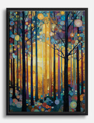
Pointillism, mosaics, and the texture of Klimt's nature art
Up close, Klimt's landscapes don't look like landscapes at all. They look like beadwork.
He painted in thousands of tiny dots and dabs and short strokes, building up surfaces almost the way he built the gold mosaic backgrounds of his portraits. A single tree might be made of hundreds of separate touches of green, ochre, violet, and pink, all sitting next to each other rather than blended together. Step back and it resolves into foliage. Step closer and it dissolves into pure pattern.
This was partly influenced by the French pointillists, particularly Seurat and Signac, whose work Klimt would have seen in Vienna. It was also influenced by Van Gogh, whose thick, expressive brushwork Klimt absorbed into his own vocabulary of dots and flecks. You can see the connection clearly in something like Klimt's apple trees, which have the same heat and density as Van Gogh's orchards but with more decorative restraint.
The mosaic quality is what gives Klimt's nature art such an unusual presence on a wall. It rewards both distance and proximity. From across a room, you see a landscape. From a metre away, you see abstract pattern. From thirty centimetres, you see what looks like embroidery or a textile sample.
This is also, frankly, why print quality matters so much with Klimt landscapes. Cheap reproductions flatten all that texture into a single muddy surface. You want a print that holds the dots, the layering, the small shifts in colour temperature. Museum-grade giclée on thick matte paper preserves the surface complexity in a way glossy prints simply can't.
Why Klimt landscapes are having a moment in modern interiors
A few design currents are converging here, and Klimt landscapes happen to sit at the intersection.
The first is biophilic design, the now well-established idea that interiors feel better when they reference the natural world. Klimt's landscapes are nature without being literal. They're not photographs of forests or generic botanical illustrations. They're forests filtered through pure decorative intelligence, which means they bring the calming effect of nature imagery without the slightly bland quality that botanical prints can have.
The second is the slow retreat from cold minimalism. Interiors are getting warmer, more layered, more texturally rich. Sage greens, terracotta, ochre, rust, deep teal. Klimt's landscape palettes map directly onto this. His apple trees are essentially a colour-grading reference for a modern warm interior.
The third is the appetite for art that feels personal rather than obvious. The Kiss has been printed onto so many mugs and tote bags it's become design shorthand for "I like art in general." A Klimt landscape signals something different. It says you know there's another side to him, and you find that side more interesting. It's a quieter choice and a more confident one.
Klimt's tree paintings in particular have become the gateway. Birch Forest, Apple Tree, Beech Grove. These are the works that translate most easily into contemporary rooms because they read as both art history and modern decoration at once.
Our favourite Klimt landscape prints and where to hang them
Here's where to actually put these on your walls.
Birch Forest (1903)
A wall of pale, slender birch trunks rising from a forest floor of fallen orange leaves. The composition is almost entirely vertical lines with a horizontal carpet of warm colour at the bottom.
This one belongs in a minimalist bedroom, ideally above a low bed with linen bedding in cream or pale grey. The vertical rhythm of the trunks does something quietly architectural to the room. A 70x70cm framed print in a slim natural oak frame is the move here. The pale wood echoes the birch trunks without competing with them.
Apple Tree I (1912)
Dense, almost suffocating foliage in shades of green, yellow, and orange, with red apples scattered like jewels through the canopy. There is no sky, no ground, just pattern.
Hang this in a living room that needs more colour and texture. It works particularly well above a velvet sofa in moss green or burnt orange. The maximalism of the painting gives you permission to layer more boldly elsewhere. This is a print that benefits from going large. A 100x100cm canvas wraps you in the painting in a way smaller formats can't.
Park at Kammer Castle (1909)
A view through a screen of tall, dark trees toward a glimpse of yellow castle wall and lawn. The composition is essentially a vertical lattice of trunks with small bright patches of colour breaking through.
This is a dining room print. The contemplative depth of it, the way you have to look between the trees to see the structure beyond, rewards the kind of slow attention that dining rooms invite. Pair with a moody wall colour, deep forest green or a clay-toned plaster finish.
Farm Garden with Sunflowers (1907)
A riot of summer flowers, with sunflowers rising above a tapestry of zinnias, dahlias, and daisies. The most joyful of his landscapes.
Put this somewhere it can lift the mood: a kitchen, a small hallway, a study. It works beautifully in spaces that don't get much natural light because the painting itself glows. Framed in a warm walnut or black wood frame, it reads as deliberately art-historical rather than purely decorative.
Beech Grove I (1902)
A more abstract one. Tall beech trunks fading into a hazy autumn floor of pink and gold leaves, with very little detail and a lot of atmospheric colour.
This is the bathroom or bedroom choice. Specifically, a softly lit room where you want a sense of dissolving rather than sharpness. Canvas works particularly well for this one because the matte finish enhances the painting's softness, and canvas is also more forgiving in rooms with variable humidity.

A note on mixing styles
Klimt landscapes are unusually flexible across interior styles. They'll sit happily in a bohemian room full of textiles and plants because the pattern language matches. They suit Scandinavian interiors that have moved beyond pure white into warmer earth tones. They're a natural fit for any kind of art nouveau revival because that's literally where they come from. And they bring just enough decoration to modern maximalist rooms without tipping into clutter.
What they don't quite work with is hard industrial minimalism. The texture and colour need an environment that can absorb them. If your walls are concrete and your sofa is steel, look elsewhere.

A last thought
The pleasure of Klimt landscape prints is that they keep revealing things. The telescope crop. The square format. The thousands of tiny brushstrokes. The way he used colour like he used to use gold. None of this is visible at first glance, which means the painting on your wall stays interesting for years rather than fading into background decoration after a month.
Buy the one you can't stop looking at. Hang it where you spend real time. Then go back and look at it properly, up close, from thirty centimetres away. That's where Klimt actually lives.

Productos Fab destacados en este blog
-

Lienzo paisaje exuberante de Gustav Klimt
Translation missing: es.products.product.sale_price Desde £44.95£74.95 -

Lienzo lago Attersee de Gustav Klimt
Translation missing: es.products.product.sale_price Desde £44.95£74.95 -

Lámina paisaje vibrante de Gustav Klimt
Translation missing: es.products.product.sale_price Desde £11.95£19.95 -

Lámina paisaje exuberante de Gustav Klimt
Translation missing: es.products.product.sale_price Desde £11.95£19.95 -

Lienzo paisaje floral sereno de Gustav Klimt
Translation missing: es.products.product.sale_price Desde £44.95£74.95 -

Lámina sinfonía floral de Klimt
Translation missing: es.products.product.sale_price Desde £11.95£19.95 -

Lámina Attersee de Gustav Klimt
Translation missing: es.products.product.sale_price Desde £11.95£19.95 -

Lámina bosque bañado por el sol de Klimt
Translation missing: es.products.product.sale_price Desde £11.95£19.95 -

Lámina bosque bañado por el sol de Klimt
Translation missing: es.products.product.sale_price Desde £11.95£19.95 -

Lienzo jardín salvaje de Klimt
Translation missing: es.products.product.sale_price Desde £44.95£74.95 -

Lámina bosque luminoso inspirado en Klimt
Translation missing: es.products.product.sale_price Desde £11.95£19.95 -

Lámina el bosque encantado de Klimt
Translation missing: es.products.product.sale_price Desde £11.95£19.95 -

Lámina bosque bañado por el sol de Klimt
Translation missing: es.products.product.sale_price Desde £11.95£19.95 -

Lámina bosque bañado por el sol de Gustav Klimt
Translation missing: es.products.product.sale_price Desde £11.95£19.95 -

Lámina jardín silvestre de Gustav Klimt
Translation missing: es.products.product.sale_price Desde £11.95£19.95 -
Lienzo bosque bañado por el sol de Klimt
Translation missing: es.products.product.sale_price Desde £44.95£74.95 -

Lámina bosque bañado por el sol de Klimt
Translation missing: es.products.product.sale_price Desde £11.95£19.95 -

Lienzo retiro en el bosque de Klimt
Translation missing: es.products.product.sale_price Desde £44.95£74.95 -
Lienzo bosque bañado por el sol inspirado en Klimt
Translation missing: es.products.product.sale_price Desde £44.95£74.95 -

Lámina bosque bañado por el sol inspirada en Klimt
Translation missing: es.products.product.sale_price Desde £11.95£19.95


Más de The Frame

Every Klimt Garden Painting Worth Knowing (and ...
Most people know Klimt for the gold leaf and the kiss. But spend a summer at Lake Attersee, as he did almost every year from 1900 onwards, and you'd come...

Klimt Landscape Prints: Classic or Contemporary...
Gustav Klimt is famous for gold leaf and gilded portraits, but his landscapes are the quieter, weirder, more wearable half of his output. Painted mostly during summers at Lake Attersee...

Beyond the Tree of Life: Klimt's Most Beautiful...
You've seen the Tree of Life everywhere. Spiralled gold branches, swirling roots, the whole thing reproduced on cushions, mugs and yoga mats. But Klimt painted dozens of actual trees, and...