Nursery Wall Decor That Isn't Boring: Art, Layout, and Colour Ideas for New Parents
Four nursery styles, the colour formulas that actually work, and how to arrange art that grows with your baby.

Most nursery advice online stops at "choose soft pastels and add a cloud print." You can do better than that, and your baby will spend more time staring at these walls than anyone else in the family. This is a strategic guide to building a nursery aesthetic that holds up beyond the newborn phase.
The four nursery styles that actually look good in real homes
Before you start buying anything, pick a lane. The nurseries that look intentional in photos (and feel calm in real life) commit to one of four directions.
Modern minimalist
Think clean lines, off-white walls, one or two large-scale prints, and a restrained palette of black, ivory, and warm grey. Furniture stays low-profile. Art does the heavy lifting, so it needs to be good. A single 70x100cm framed line drawing above the changing table will outperform six small prints fighting for attention.
Scandi warmth
The most forgiving style for new parents because it tolerates clutter. Pale oak, soft wool, cream walls, and art in warm neutrals. Botanical illustrations, abstract shapes in oat and clay tones, and the occasional muted animal print. Frames should be natural wood, never high-gloss black.
Bold eclectic
For parents who already have strong taste and don't want to suppress it for the sake of "baby-friendly." Saturated colour, mixed art styles, vintage children's book illustrations next to abstract prints, and gallery walls that build up over time. The key is restraint within boldness: one dominant colour family, then accents.
Gender-neutral earthy
The dominant nursery aesthetic right now, and for good reason. Terracotta, sage, ochre, cream, and warm brown create a calm, grown-up room that doesn't read as a baby cave. Art leans into nature: pressed botanicals, landscape abstracts, mountain prints, soft animal illustrations.

Colour palettes that work: sage, terracotta, monochrome, and warm neutrals
Generic "soft pastels" advice produces generic rooms. These are four specific palette formulas with print pairings that actually work together.
Sage + cream + oat
The most liveable nursery palette of the last few years. Sage green on one feature wall or in textiles, cream everywhere else, and oat-coloured wood. Pair with botanical art prints in muted greens, pressed eucalyptus studies, or abstract leaf shapes. Avoid anything with bright primary colours, it'll fight the calm.
Terracotta + clay + ivory
Warm without tipping into orange. A small clay-coloured rug, ivory cot, and terracotta accents in cushions or curtains. Art should echo the warmth: desert landscapes, abstract sun shapes, ochre line drawings. One large 60x80cm print above the cot anchors the room better than three smalls.
Monochrome with one warm accent
Black, white, and soft grey, plus a single recurring accent colour (mustard, rust, or dusty pink). High contrast prints actually support early visual development in the first months, which is a bonus rather than the reason to choose this look. Keep frames consistent: black on black-and-white art, natural wood if you want softness.
Warm neutrals: bone, mushroom, and camel
The "expensive looking" palette. No strong colours at all, just tonal layering. Art prints in similar neutral tones with subtle textural interest work better here than anything graphic. Abstract brushwork, minimal figurative line art, and soft landscape paintings all suit this approach.
A note on paint versus decals: paint is almost always the better long-term choice. Decals peel, date quickly, and damage walls when you remove them. If you're renting, large-scale art prints are a smarter route to colour than peel-and-stick wallpaper, you can take them with you and they look more considered.
Choosing nursery art prints that feel personal (not mass-produced)
The fastest way to make a nursery feel generic is to buy the same alphabet print, rainbow print, and "you are loved" print that's in every other nursery on Instagram. Personal doesn't have to mean custom or expensive, it just means specific to you.
A few approaches that work:
Reference something specific to your life. A print of the mountains you got engaged near. A botanical study of your grandmother's favourite flower. A map illustration of the city you live in. None of this is "baby" content, and that's the point, it tells a story your child will eventually grow into.
Choose art you'd hang elsewhere in your home. If you wouldn't put it in your lounge, don't put it in the nursery. Children pick up on visual quality earlier than people think, and good art works in any room.
Mix illustration with fine art. A pencil sketch of a hare next to an abstract colour study, both in matching frames, immediately reads as curated rather than themed. The "matching set of three woodland animals" approach is what makes nurseries feel like nursery showrooms.
Print quality matters more than people realise. Thin paper and visible pixelation are the giveaway that something was printed cheaply. Look for giclée printing on heavy matte paper, the kind that has actual weight to it when you hold it. Glare from glossy finishes is also a problem in nurseries, where you're often looking at art from low angles while feeding or rocking. Matte paper and acrylic glazing (rather than glass) solve both of these issues, and acrylic is safer above a cot.

Gallery wall layouts for small nursery walls
Most nursery walls are smaller than the ones in design magazines. You're working around windows, cots, monitors, and shelving. Here's how to arrange art so it looks intentional rather than crammed.
The basic spacing rules
Keep prints 5 to 8cm apart in a gallery arrangement. Tighter than that and it reads as one chaotic blob, wider and the wall looks underdressed. Hang the centre of your art arrangement at roughly 145cm from the floor, which is standard gallery height. If the art sits above a piece of furniture, leave 15 to 25cm between the top of the furniture and the bottom of the frame.
Three layouts that work in small nurseries
The grid. Four or six prints of identical size, in identical frames, in a clean rectangle. The most forgiving layout because it doesn't require any aesthetic judgement, just a tape measure. Works best in modern minimalist and monochrome rooms.
The asymmetric cluster. One larger anchor print (around 50x70cm), with two or three smaller prints arranged around it. Imagine a loose triangle. This suits Scandi and eclectic styles and lets you add prints over time.
The horizontal pair. Two matching prints, side by side, above the cot or dresser. Quietly elegant and the easiest way to make a small wall feel considered. Works in every style.
Sizing relative to furniture
Art above a cot or dresser should span roughly two-thirds the width of the furniture below it. So for a 120cm cot, you're looking at art (or a combined arrangement) around 80cm wide. A single 60x80cm print is the most common sweet spot for above-furniture placement.
A safety note worth mentioning: never hang heavy framed art directly above the cot itself. Even with secure fixtures, you don't want anything that could fall. Hang large statement pieces on the wall opposite the cot or above the dresser instead. Smaller, lighter prints are fine above the cot if you must.
One big print or a curated set? Our honest recommendation
Both work. Here's when to choose which.
Choose one big print when: you have a single focal wall, you're decorating in a hurry, or your style is modern minimalist. One well-chosen 70x100cm framed piece does more for a room than six average prints. It's also genuinely cheaper than building a gallery wall, despite costing more upfront.
Choose a curated set when: you want the nursery to evolve, you have an awkward wall shape, or you enjoy the process of collecting. Sets give you flexibility to add and swap over the years.
Our actual recommendation for most parents: start with one large anchor print on your main wall, then add a small cluster of two or three smaller prints elsewhere in the room (above the dresser, near the reading chair). You get the impact of a statement piece without the all-eggs-in-one-basket commitment.
On frames: stick to one frame style across the whole room. Natural wood is the most forgiving and works in every style except the strictest monochrome. Black frames look sharp in modern and bold rooms but can feel heavy in small nurseries. White frames blend into white walls and often disappear, which is sometimes what you want and sometimes not.
You can browse curated nursery art prints to see how different styles work together as sets, which is easier than trying to imagine combinations from scratch.

How to refresh your nursery art as your baby grows
The nursery you design for a newborn is not the room a two-year-old wants to sleep in. Plan for change from the start.
0 to 6 months
High contrast and simplicity help with early visual development, but you don't need to plaster the walls with black-and-white circles. One or two graphic prints in your main palette are plenty. Babies this age are mostly looking at faces and ceilings, so don't overinvest in floor-level decor.
6 to 18 months
This is when your baby starts noticing art on the walls. Introduce gentle figurative content: animals, plants, simple landscapes. Anything they can point at and you can name. Keep it tasteful rather than cartoonish, the art should still feel like part of your home.
18 months to 3 years
Toddlers want to see themselves in their room. This is the moment to add a few pieces with characters, vehicles, or whatever they're currently obsessed with. Rotate one or two prints out, don't redo the whole room. Keep your anchor pieces and let the smaller prints evolve.
3 years and up
By now they have opinions. Let them choose one print themselves. It will probably be terrible. Frame it properly anyway and hang it next to your considered choices, the contrast somehow works.
The trick to making this easy is buying prints unframed where possible (or in standard sizes you can swap into existing frames) so refreshing doesn't mean starting over. Solid wood frames with replaceable prints are worth the small premium for this reason alone.
Our top nursery art picks by style
A starting point for each of the four styles, with specific print directions rather than specific products.
For modern minimalist nurseries
One large abstract line drawing in black on cream, framed in natural wood, hung above the dresser. Add a small geometric study elsewhere in the room. Browse abstract art prints for line work that isn't too cold for a child's space.
For Scandi warmth
A pair of botanical prints in soft sage and oat tones, plus one warm-toned abstract for contrast. All in matching pale wood frames. Look toward pressed leaf studies, simple wildflower illustrations, and minimalist landscapes.
For bold eclectic
One vintage-style children's illustration as the centrepiece, surrounded by a cluster of smaller abstracts in your accent colour. Mix frame styles deliberately, this is the one style where matching frames can feel too safe.
For gender-neutral earthy
A large landscape print in terracotta and clay tones above the cot wall (not the cot itself), with a smaller botanical print near the reading chair. Natural wood frames throughout. This is the easiest formula to get right and the hardest to get wrong.
For more options across all four styles, the wider kids room art prints selection covers art that works in nurseries and grows into older children's rooms.

A final practical note
Buy fewer, better prints than more, cheaper ones. Three considered framed pieces outperform a wall covered in budget prints every time, and they'll survive multiple room refreshes as your child grows. Measure your walls before you order, hang the centre of your arrangement at 145cm, and keep frames consistent. Everything else is taste, and yours is probably better than you think.

Productos Fab destacados en este blog
-

Lienzo bebé (cuna) de Gustav Klimt
Translation missing: es.products.product.sale_price Desde £44.95£74.95 -

Lienzo retrato de bebé de Van Gogh
Translation missing: es.products.product.sale_price Desde £44.95£74.95 -

Lámina bebé (cuna) de Gustav Klimt
Translation missing: es.products.product.sale_price Desde £11.95£19.95 -

Lienzo floral escandinavo vibrante
Translation missing: es.products.product.sale_price Desde £55.99£79.99 -

Lienzo flores abstractas estilo nórdico
Translation missing: es.products.product.sale_price Desde £55.99£79.99 -

Lámina desfile alegre de animales de safari
Translation missing: es.products.product.sale_price Desde £11.95£19.95 -
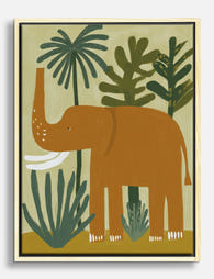
Lienzo elefante juguetón de la selva
Translation missing: es.products.product.sale_price Desde £44.95£74.95 -

Lámina lápices de colores arcoíris
Translation missing: es.products.product.sale_price Desde £11.95£19.95 -

Lámina floral escandinava
Translation missing: es.products.product.sale_price Desde £13.99£19.99 -

Lámina flores nórdicas atrevidas
Translation missing: es.products.product.sale_price Desde £13.99£19.99 -

Lienzo naturaleza muerta moderna de jarrón en tonos neutros
Translation missing: es.products.product.sale_price Desde £55.99£79.99 -

Lámina sendero de bosque colorido con árboles azules
Translation missing: es.products.product.sale_price Desde £11.95£19.95 -
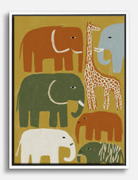
Lienzo desfile de safari infantil con elefantes y jirafa
Translation missing: es.products.product.sale_price Desde £44.95£74.95 -

Lámina flores gráficas estilo nórdico
Translation missing: es.products.product.sale_price Desde £13.99£19.99 -
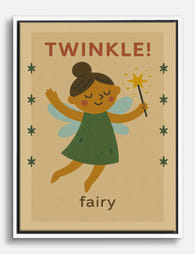
Lienzo magia de hadas
Translation missing: es.products.product.sale_price Desde £44.95£74.95 -

Lienzo pollito amarillo
Translation missing: es.products.product.sale_price Desde £44.95£74.95 -

Lámina animales de safari juguetones
Translation missing: es.products.product.sale_price Desde £11.95£19.95 -

Lienzo escondite en la selva
Translation missing: es.products.product.sale_price Desde £44.95£74.95 -

Lámina cama minimalista en azul y naranja
Translation missing: es.products.product.sale_price Desde £11.95£19.95 -
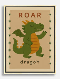
Lienzo rugido de dragón juguetón
Translation missing: es.products.product.sale_price Desde £44.95£74.95


Más de The Frame

Art for Green Walls: What Works, What Fights
You painted the walls green. Maybe sage, maybe forest, maybe something in between. Now the room feels half-finished and the art you owned before suddenly looks wrong against it. Green...

What to Put in a Stairwell: The Hardest Wall in...
Stairwells are the wall everyone postpones. The ceiling is too high, the angle is wrong, the lighting is bad, and every nail hole feels like a permanent mistake on a...

Art at the Top and Bottom of a Staircase
Staircases are the most overlooked walls in the house. They are also the trickiest, because the top of the stairs, the bottom of the stairs, and the landing in between...