How to Build a Gallery Wall Around Kandinsky Prints Without It Looking Like a Mess
A tactical guide to pairing, framing and arranging the most visually intense art on your walls without chaos.

Kandinsky is harder to hang than almost any other artist. His compositions are loud, saturated, and full of competing geometric noise, which means standard gallery wall advice falls apart the moment you put one on the wall. This guide gives you the exact rules, pairings and measurements to make it work.
The gallery wall mistake most people make with abstract art
Most gallery wall guides treat every print the same. Pick a few things you like, hang them in a loose grid, mix some sizes. With botanicals or black and white photography, that approach is forgiving. With Kandinsky, it produces visual chaos within seconds.
The problem is intensity. A Kandinsky print contains five to ten saturated colours, sharp geometric shapes, and asymmetric movement all in one frame. Hang it next to another piece of equally busy abstract art and the wall starts vibrating. Your eye has nowhere to rest.
The fix is simple in theory and disciplined in practice: treat the Kandinsky as the star, and let everything around it play a supporting role. That means quieter prints, restrained colour, and consistent framing. The supporting cast exists to frame the lead, not compete with it.

Choosing your anchor: which Kandinsky print to build around
Your anchor is the largest piece on the wall and the print everything else responds to. With Kandinsky, this choice matters more than usual because his work spans wildly different periods, and they don't mix well with each other.
The geometric Bauhaus period
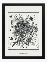
Works like Composition VIII, Several Circles, and Squares with Concentric Circles are the most popular choices, and for good reason. They're graphic, structured, and read clearly from a distance. The geometry gives your eye something to anchor to, which makes them easier to pair than his lyrical abstractions.
Composition VIII is our top pick for most gallery walls. It has a strong horizontal pull, balanced colour distribution, and enough negative space to breathe. Squares with Concentric Circles works beautifully too but functions almost as a study, so it tends to feel best at smaller sizes around 50x70cm.
The Blue Rider and early lyrical period
Earlier works like Improvisation 28 or Composition VII are denser, more emotional, and harder to pair. The colours bleed into one another and there's no clear geometric grid. If you're new to gallery walls, skip these as your anchor and use a Bauhaus piece instead.
The one-Kandinsky rule
Never use more than one Kandinsky print on a single gallery wall. Two compete with each other and the rest of the wall collapses around them. Browse the full range of Wassily Kandinsky art prints and pick the single piece that resonates. That's your anchor. Everything else gets built around it.
For an anchor on a standard wall above a sofa or sideboard, go large. 70x100cm framed is the sweet spot. Smaller and the wall feels apologetic, larger and you struggle to find supporting pieces that hold their own.
Pairing partners: what styles and subjects complement Kandinsky
The supporting cast needs to be quieter than your anchor, but not boring. Three categories work consistently.
Minimalist line drawings. Single-line nudes, abstract faces, simple botanical contours. These have personality but almost no colour saturation, so they let the Kandinsky breathe. Browse line art prints for options that pair particularly well.
Black and white photography. Architectural details, abstract shadow studies, minimal landscapes. The absence of colour creates a deliberate contrast that makes your Kandinsky feel even richer. Avoid portrait photography, which fights for attention.
Restrained geometric abstracts. Bauhaus-style colour blocks, single-shape studies, monochrome geometric prints. These echo Kandinsky's visual language without copying it. Look for pieces with one or two colours maximum.
What to avoid: other busy abstracts, vintage botanical illustrations with lots of detail, anything with text or typography, vibrant landscape photography, and pop art. They all compete on intensity rather than supporting it.
A colour-matching cheat sheet for common Kandinsky palettes
Pull the two or three dominant colours from your Kandinsky and use those to filter every other print on the wall. Each supporting piece should pick up at least one of those colours, ideally in a quieter form.
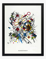
If your Kandinsky leans blue and yellow (Composition VIII, Yellow-Red-Blue): pair with deep navy line drawings, soft mustard abstracts, black and white photography with warm tones, and cream or off-white minimalist prints. Avoid red-dominant supporting pieces.
If your Kandinsky leans red and black (parts of Composition VII, Several Circles): pair with charcoal architectural photography, terracotta or rust-toned minimalist prints, and warm beige or sand-coloured abstracts. Cool blues will fight the warmth.
If your Kandinsky leans pastel and lyrical (Improvisation series, softer Bauhaus): pair with sage green botanicals (line drawings only, not detailed illustration), dusty pink minimalist abstracts, and soft cream geometric prints. Stay tonal.
If your Kandinsky is high-contrast and primary-heavy: pair with pure black and white pieces. Anything with muddy mid-tones will look awkward next to the saturation.
The rule of thumb: take the most saturated colour in your Kandinsky and never repeat that intensity in any other piece on the wall. Echo it at half strength or in a desaturated cousin.

Frame consistency: why mixing frame styles kills the layout
This is where most Kandinsky gallery walls fall apart. People try to add visual interest with mixed frame finishes, but Kandinsky already provides all the visual interest the wall needs. The frames should disappear.
Three frame finishes that work
Black. Sharp, contemporary, makes saturated colours look more graphic. Best for Bauhaus-period anchors and high-contrast supporting cast. Works in modern interiors with darker furniture.
Natural oak or ash. Warm, calm, slightly Scandinavian. Lets the colour do the talking. Best for lyrical Kandinsky pieces and rooms with lots of wood, linen, or earth tones.
White. Gallery-style, light, recedes into the wall. Best for very white rooms and when you want the art to feel like it's floating. Be careful: white frames can look chalky against off-white walls.
Pick one finish for the entire wall. Not "mostly black with one wood." Not "two black and two white for contrast." One. Mixing kills the layout because each frame becomes a distraction from the art it surrounds.
What absolutely doesn't work
Ornate gilt frames, coloured frames, distressed wood, thick chunky frames over 4cm wide, and any frame with decorative moulding. They all draw attention to themselves and undermine the discipline you've built into the rest of the wall.
A note on quality: cheap frames warp, especially with larger pieces, and the print inside often shifts or bubbles. We use solid FSC-certified wood with UV-protective acrylic glaze on every framed print, and they ship fully assembled with fixtures attached, so the frame and print arrive as one piece. It removes the variable that wrecks most gallery walls.
The matting question
For Kandinsky specifically, skip the mat almost every time. Mats add formality and create distance between you and the image, which dilutes the impact of his colour and movement. The exception is small geometric studies (under 40x50cm), where a narrow mat of 3 to 4cm can give them gravitas in a wall of larger pieces.
Two gallery wall templates that work every time
These are tested layouts. Follow the measurements exactly and they will work.
Template one: the asymmetric trio
Best for: above a sofa, sideboard, or console table. Wall width of 180 to 240cm.
- Anchor: Kandinsky print, 70x100cm portrait orientation, framed
- Supporting piece A: minimalist line drawing, 50x70cm portrait, same frame finish
- Supporting piece B: black and white photograph, 30x40cm portrait, same frame finish
Hang the anchor first. Centre of the print should sit at 145cm from the floor (this assumes a standard 240cm ceiling and furniture below). Place supporting piece A to the right of the anchor, with a 6cm gap between frames, top edges aligned. Place supporting piece B below supporting piece A with a 6cm gap between frames, right edges aligned.
The result is a stepped composition that feels relaxed but anchored. The asymmetry stops it feeling like a corporate hotel.
Template two: the structured five
Best for: feature walls, hallway ends, larger rooms. Wall width of 220 to 300cm.
- Anchor: Kandinsky print, 70x100cm landscape orientation, framed, centred
- Two supporting pieces above: 30x40cm portrait, sat side by side, centred above the anchor
- Two supporting pieces below: 30x40cm portrait, sat side by side, centred below the anchor
Gap between every frame: 5cm. The anchor's centre point sits at 150cm from the floor. The supporting pieces above and below act like a frame within a frame, formalising the wall and making the Kandinsky feel like a museum piece.
If you'd rather not source the supporting cast individually, pre-curated wall art sets can give you a coordinated starting point that you build a single Kandinsky into.

Sizing and spacing: the exact measurements to follow
Get these wrong and even a perfect pairing falls apart.
Centre height
The centre of your gallery wall (not the centre of any individual print) should sit at 145 to 150cm from the floor. This is gallery standard and it works because it lands at average eye level. Going higher makes the wall feel disconnected from the room. Going lower makes it feel like the art is sliding off.
If you're hanging above furniture, the bottom edge of the lowest frame should sit 15 to 20cm above the top of the furniture. Closer than 15cm feels cramped. Further than 20cm makes the art look like it's floating away.
Spacing between frames
5 to 7cm between frames is the sweet spot. Closer than 5cm makes the pieces read as one chaotic mass. Further than 7cm makes them feel like unrelated objects sharing a wall.
Use the same gap between every pair of frames on the wall. Inconsistent spacing is the single biggest reason gallery walls look amateur.
Sizing your anchor to the wall
Your anchor should occupy roughly 50 to 60% of the available wall width when measured alongside its supporting cast. Smaller and the wall feels timid. Larger and the supporting pieces become irrelevant.
For a 200cm wide wall above a sofa, a 70x100cm anchor with two 50x70cm supporting pieces hits this ratio almost exactly.
Lighting
Kandinsky's saturated colours need warm light, around 2700K to 3000K. Cool white LEDs (4000K and above) wash out the reds and make the blues look icy. If you have a directional spot or picture light, angle it at 30 degrees to the wall to avoid glare and bring out the texture in the print.
Direct sunlight is fine for our prints because the UV-protective acrylic glaze stops fading, but you'll still get a wash-out effect at the brightest hours. If your wall gets strong afternoon sun, position the gallery wall on an adjacent wall instead of the sun-facing one.

Final thought
The discipline of a Kandinsky gallery wall is restraint everywhere except the anchor itself. One loud piece, three or four quiet ones, identical frames, consistent spacing, eye-level centre. If you find yourself adding a fifth colour or a second statement print, take it down. The wall will always look better with one less thing on it than one too many.
Start with the anchor, measure twice, and resist the urge to fill space. For more options to build your supporting cast, our abstract art prints collection is the easiest place to find pieces that share Kandinsky's visual language without competing for the spotlight.

Produits Fab présentés dans cet article
-

Affiche Kandinsky petits mondes IX
Translation missing: fr.products.product.sale_price À partir de €19,95€33,25 -

Affiche Petits mondes II de Kandinsky
Translation missing: fr.products.product.sale_price À partir de €19,95€33,25 -

Toile peinture avec du vert de Kandinsky
Translation missing: fr.products.product.sale_price À partir de €64,95€92,95 -
Affiche Kandinsky Petits mondes VIII
Translation missing: fr.products.product.sale_price À partir de €19,95€33,25 -

Toile énergie abstraite inspirée de Kandinsky
Translation missing: fr.products.product.sale_price À partir de €64,95€92,95 -

Affiche Kandinsky petits mondes IV
Translation missing: fr.products.product.sale_price À partir de €19,95€33,25 -

Affiche petits mondes IX inspirée de Kandinsky
Translation missing: fr.products.product.sale_price À partir de €19,95€33,25 -

Affiche Composition VIII de Kandinsky
Translation missing: fr.products.product.sale_price À partir de €19,95€33,25 -

Affiche Kandinsky tension délicate
Translation missing: fr.products.product.sale_price À partir de €19,95€33,25 -
Affiche lignes abstraites inspirée par Kandinsky
Translation missing: fr.products.product.sale_price À partir de €19,95€33,25 -

Toile composition VIII de Kandinsky
Translation missing: fr.products.product.sale_price À partir de €64,95€92,95 -

Toile Kandinsky petits mondes VIII
Translation missing: fr.products.product.sale_price À partir de €64,95€92,95 -

Affiche Kandinsky petits mondes I
Translation missing: fr.products.product.sale_price À partir de €19,95€33,25 -

Toile petits mondes II de Kandinsky
Translation missing: fr.products.product.sale_price À partir de €64,95€92,95 -

Toile ligne bleue inspirée de Kandinsky
Translation missing: fr.products.product.sale_price À partir de €64,95€92,95 -

Affiche abstraction bleue inspirée de Kandinsky
Translation missing: fr.products.product.sale_price À partir de €19,95€33,25 -

Affiche petits mondes II de Kandinsky
Translation missing: fr.products.product.sale_price À partir de €19,95€33,25 -

Affiche petits mondes I de Kandinsky
Translation missing: fr.products.product.sale_price À partir de €19,95€33,25 -

Toile Kandinsky tension délicate
Translation missing: fr.products.product.sale_price À partir de €64,95€92,95 -

Affiche Gris de Wassily Kandinsky
Translation missing: fr.products.product.sale_price À partir de €19,95€33,25


Plus de The Frame

How to Create a Spring Gallery Wall That Actual...
Most spring gallery walls go wrong for the same reason: they're a pile of "spring-ish" prints hung in a vaguely pleasing shape. Intentional gallery walls follow a small set of...

Decorating with Botanical Prints: A Room-by-Roo...
Botanical prints have quietly become one of the most flexible categories in wall art, but mixing them well is harder than it looks. Pile up too many ferns and florals...

How to Build a Pop Art Gallery Wall with Haring...
Haring, Warhol, and Basquiat weren't just contemporaries. They were friends, collaborators, and rivals who defined downtown New York in the 1980s. Putting their work together on one wall isn't a...