Building an Amalfi Coast Gallery Wall: Sizes, Spacing, and the Prints to Pick
The exact formulas, measurements, and pairing rules for a Mediterranean gallery wall that feels curated, not cluttered.

Most gallery wall advice stops at "mix sizes and have fun." That's not enough when you're working with five similar-looking coastal scenes that could easily turn your lounge into a tourist office. This guide gives you the actual formulas: how many prints, what sizes, exact spacing in centimetres, and how to keep an impressionist Amalfi wall feeling airy rather than chaotic.
Why Amalfi Coast prints are perfect for gallery walls
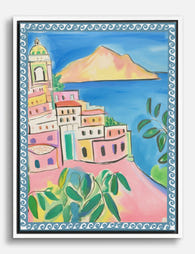
Amalfi and Italian coastal scenes share a built-in visual language: terracotta rooftops, cobalt sea, lemon yellow, sun-bleached stone, and the kind of soft, painterly light that flattens beautifully into impressionist compositions. That shared palette does most of the cohesion work for you, which is why themed coastal walls almost always read better than the typical "anything I liked on Pinterest" mix.
The format helps too. Most Amalfi Coast art prints are landscape orientation, which suits the horizontal flow of a sofa, console, or bed. And impressionist coastal art has loose, atmospheric brushwork that forgives small alignment imperfections in a way that crisp photography never does.
The catch: when every print is broadly the same colour family and the same orientation, you have to be deliberate about scale, spacing, and frame choice. Otherwise you get five squares of blue and orange that blur together.

How many prints you actually need (hint: fewer than you think)
Three to five prints is the sweet spot for an Amalfi gallery wall. Beyond that, you start to lose the relaxed Mediterranean feel that drew you to this aesthetic in the first place. Seven or nine prints can work for eclectic, maximalist styles, but coastal impressionism wants breathing room. The art is already busy with brushwork and colour. Crowd it, and the wall starts shouting.
Here's a useful test. Squint at your planned arrangement. If you see one calm composition with negative space around the edges, you're there. If you see a quilt of rectangles, you've added two prints too many.
For most rooms, we'd suggest:
- Above a two-seat sofa or console: 3 prints
- Above a three-seat sofa or king bed: 5 prints
- Tall stairwell or large feature wall: 5 to 7 prints
Don't fill the wall to the edges. The gallery should occupy roughly two-thirds to three-quarters of the width of the furniture below it. A three-metre sofa wants a gallery wall around 2 to 2.25 metres wide, not the full 3.
The size combinations that work: our go-to formula
Mixing sizes is where most gallery walls go wrong. People either play it safe (everything the same size, which feels stiff) or go too wild (six different dimensions, which feels accidental). The trick is one anchor piece plus supporting prints in two complementary sizes.
Here are five formulas we use repeatedly. Stick to one and you can't really mess it up.
3-print formula (small wall or above console)
1x 50x70cm anchor + 2x 30x40cm supporters
3-print formula (above a two-seat sofa)
1x 60x80cm anchor + 2x 40x50cm supporters
5-print formula (above a three-seat sofa, our most-used)
1x 60x80cm anchor + 2x 40x50cm + 2x 30x40cm
5-print symmetric formula (above a bed)
1x 70x100cm anchor (centred) + 4x 30x40cm (two on each side, stacked)
5-print landscape-heavy formula (long horizontal wall)
1x 50x70cm anchor + 4x 40x50cm landscape
The anchor piece should be roughly 1.5 to 2 times the size of your supporting prints. Anything closer and the hierarchy disappears. Anything further and the smaller prints feel like afterthoughts.
A note on orientation: because Amalfi prints skew landscape, deliberately introduce one or two portrait-format prints (a tall view of cliffside houses, a vertical lemon tree composition) to break the rhythm. Without a portrait print somewhere in the mix, a five-print landscape wall can feel like a film strip.
Exact spacing: the 5cm rule and when to break it
The professional consensus on gallery wall spacing is 5 to 7cm (2 to 3 inches) between prints. We default to 5cm. It's tight enough to read as one composition, generous enough to let each print breathe.
When to go tighter (3 to 4cm):
- Narrow hallways where you're viewing prints from up close
- Small walls under 1.5 metres wide
- Tightly grouped clusters within a larger asymmetric layout
When to go wider (8 to 10cm):
- Very large walls above three metres wide
- Double-height ceilings where the wall is viewed from a distance
- When you want a more curated, gallery-style feel rather than a tight cluster
The single most important thing: keep spacing consistent across the entire wall. 5cm between every print, every gap. Vary the spacing and the eye reads it as a mistake, even if it can't tell you why.
For the gallery wall as a whole, the centre point should sit at roughly 145 to 150cm from the floor (eye level for the average adult). When hanging above furniture, leave 15 to 25cm between the top of the sofa and the bottom of the lowest frame.

Keeping it cohesive: sticking to one style or mixing impressionist with other formats
Cohesion is harder with themed gallery walls than people assume, because every print is already in the same key. You need a tiebreaker beyond "they're all coastal."
The two rules that do the heavy lifting:
1. One time of day, one palette family. Don't mix sunset oranges and pinks with bright midday blues and whites. Pick a palette family and stay in it. A "golden hour" wall (warm ochres, soft pinks, terracotta, deep blue water) reads completely differently from a "midday" wall (bright cobalt, white stone, lemon yellow). Both work. Mixing them looks confused.
2. One painterly style. If you've chosen impressionist Amalfi prints, don't drop a hyper-detailed photographic print into the mix. The brushwork has to be consistent. Loose with loose, tight with tight. This is the single biggest reason themed walls fail.
Can you mix impressionist Amalfi prints with other Mediterranean subjects? Yes, carefully. A loose impressionist Positano scene sits beautifully next to a similarly painted Capri or Portofino view. Browse Italian coastal wall art prints and Mediterranean art prints together rather than treating Amalfi as a closed category.
What doesn't work: mixing Amalfi with unrelated travel destinations. Tuscan hills, French Riviera, Greek islands, Cornish coast. Even when colour palettes overlap, the architectural language clashes and the wall starts feeling like a holiday slideshow.
Frame colour consistency and why it matters more than you'd expect
For impressionist coastal art, frame consistency matters more than it does for almost any other genre. The art itself has soft edges, atmospheric colour, and loose composition. Mixed frames pull the eye away from the prints and onto the hardware.
Our position: pick one frame colour and finish for the entire wall. No mixing.
For Amalfi Coast prints specifically, natural oak or warm wood works best. It picks up the sun-bleached stone and terracotta tones in the art, and stays out of the way. White frames are a good second choice for brighter, airier rooms. Black can work in more graphic, contemporary spaces but tends to fight the softness of impressionist work.
What to avoid: ornate gold or silver frames. They push coastal art toward a stuffy, traditional aesthetic that's the opposite of the relaxed Mediterranean feel you're going for.
Frame material is worth a thought too. Solid FSC wood frames hold their shape, sit flat against the wall, and age well. Cheap MDF frames warp, especially in humid rooms or near radiators, and that warping is highly visible on a gallery wall where you're seeing five frames at once. Our framed prints come with UV-protective acrylic glaze rather than glass, which means no glare across the wall (glass gallery walls reflect every lamp in the room) and no fading even in sunny south-facing rooms.
Step-by-step hanging method (no spirit level drama)
You don't need a spirit level, a laser, or three hours. You need brown paper, scissors, masking tape, and a tape measure.
1. Lay it out on the floor first. Arrange your prints on the floor in front of the wall. Move them around until the composition feels right. Take a phone photo from above. Live with it for a day if you can.
2. Make paper templates. Cut a piece of brown paper or newsprint to the exact dimensions of each frame. Write the print name on each template.
3. Mark the hanging point. Each Fab framed print arrives with fixtures attached. Measure from the top of the frame down to the hanging point on the back, and mark that same distance on each paper template.
4. Tape templates to the wall. Use masking tape to position the templates exactly where you want each frame. Use a 5cm cardboard spacer (cut a strip of cardboard exactly 5cm wide) between each template to keep gaps consistent. Step back. Adjust.
5. Anchor first, build outward. Place your largest print slightly off-centre rather than dead centre. True symmetry feels stiff and museum-like. A subtle asymmetry, where the anchor sits a little to one side and the smaller prints balance it, creates better visual flow. The eye lands on the anchor first, then travels outward.
6. Hammer through the templates. Drive your nails or hooks straight through the marked point on each paper template. Tear the paper away. Hang.
This method takes about 30 minutes and removes almost all the guesswork. No pencil marks on the wall, no holes in the wrong place.

Common mistakes to avoid
A short list of the things that consistently sink Amalfi gallery walls:
- Starting with tiny prints. A wall of 30x40cm prints reads as fussy. Always include at least one piece 50x70cm or larger.
- Perfect symmetry. A grid of identical sizes feels like a hotel corridor. Introduce one anchor and asymmetric supporters.
- Mixing destinations. Stick to Amalfi or Italian coastal. Don't add a Provence print because you also went there.
- Inconsistent spacing. 5cm between two prints and 8cm between two others. The eye notices.
- Hanging too high. Centre point at 160cm or above floats the wall away from the furniture. Keep it at 145 to 150cm.
- Mixed frame finishes. One oak, one black, one white. Pick one.
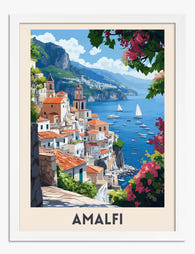
Our top Amalfi Coast prints for a gallery wall
When you're choosing the best Amalfi Coast artwork for a multi-print arrangement, look for variety within a consistent palette. You want different vantage points (the sea from above, a street-level view, a harbour scene, a close-up of architecture, a wider landscape) but the same time of day and the same painterly style.
A reliable five-print combination looks like this:
- One wide harbour or coastline view as the anchor (60x80cm)
- One vertical cliffside or village scene (40x50cm)
- One close-in architectural detail, like pastel houses or a doorway (40x50cm)
- One boat or sea-focused composition (30x40cm)
- One quieter, less busy scene as breathing space (30x40cm)
That last point matters. In a gallery wall of five busy compositions, one calmer print acts as a visual rest. A simple horizon line, a single sailboat, an empty stretch of water. Without it, the wall has nowhere for the eye to settle.
If you'd rather not piece the formula together yourself, pre-curated wall art sets take the matching guesswork out of it. The prints are chosen to share palette, style, and scale, which solves most of the cohesion problem before you've even hung anything.

Where to start
Pick your formula first, then your palette family, then your prints. Doing it in that order stops you from buying five beautiful prints that don't work together and trying to make them fit afterwards. Measure your wall, decide on three or five, and order all the prints together so the colour and frame finish match across the set. The gallery wall is meant to feel like one composition, not five purchases.

Produits Fab présentés dans cet article
-

Toile paysage de la côte amalfitaine
Translation missing: fr.products.product.sale_price À partir de €54,95€91,95 -
Affiche rêve de la côte amalfitaine
Translation missing: fr.products.product.sale_price À partir de €14,95€24,95 -

Toile paysage de la côte amalfitaine
Translation missing: fr.products.product.sale_price À partir de €54,95€91,95 -

Affiche côte amalfitaine au trait
Translation missing: fr.products.product.sale_price À partir de €14,95€24,95 -

Affiche côte amalfitaine rêve méditerranéen
Translation missing: fr.products.product.sale_price À partir de €14,95€24,95 -

Affiche aquarelle de la côte amalfitaine
Translation missing: fr.products.product.sale_price À partir de €14,95€24,95 -

Affiche côte amalfitaine ensoleillée
Translation missing: fr.products.product.sale_price À partir de €14,95€24,95 -

Affiche côte amalfitaine
Translation missing: fr.products.product.sale_price À partir de €14,95€24,95 -

Toile charme de la côte amalfitaine
Translation missing: fr.products.product.sale_price À partir de €54,95€91,95 -

Affiche côte amalfitaine, tons pastel
Translation missing: fr.products.product.sale_price À partir de €14,95€24,95 -

Toile paysage de la côte amalfitaine
Translation missing: fr.products.product.sale_price À partir de €54,95€91,95 -

Toile charme de la côte amalfitaine
Translation missing: fr.products.product.sale_price À partir de €54,95€91,95 -
Toile paysage de rêve de la côte amalfitaine
Translation missing: fr.products.product.sale_price À partir de €54,95€91,95


Plus de The Frame

You're Overthinking Your St. Louis Gallery Wall
Most St. Louis gallery walls fail for the same reason: too many ideas competing for attention. You bought a beautiful Gateway Arch print, found a Soulard map you love, threw...

Stop Matching Everything: How to Choose Artwork...
Matching artwork is the fastest way to make a living room feel like a hotel lobby. What you actually want is cohesion, which is a much more interesting problem to...

Random or Curated? Making Your Motivational Wal...
Motivational prints have a reputation problem. Hang too many, in too many fonts, with too many frame styles, and your lounge starts to look like the breakroom of a startup...