
 Commandez aujourd'hui, livré le
 Are Botanical Prints Still in Style? The Trend That Refuses to Die
Why plant art has outlasted every trend cycle since 1750, and how to spot the pieces worth living with.


Botanical prints have been declared "over" roughly every three years since 2015, and yet they keep hanging on more walls than ever. The truth is they're not a trend at all, they're a category, and like landscape painting or portraiture, they simply evolve. What's shifting in 2026 is which botanical looks feel current, and which ones are quietly ageing out.
From 18th-century specimen sheets to Instagram walls: a very brief history
Botanical illustration as we know it took shape in the 1700s, when scientific expeditions needed accurate visual records of newly documented plants. Artists like Maria Sibylla Merian and, later, the illustrators behind Curtis's Botanical Magazine created plates that were part science, part art. Neutral backgrounds, precise line work, delicate watercolour washes, Latin names in careful script at the base.
Those originals still get reproduced today because they've earned their place. But somewhere around the 2010s, botanical art split into two parallel tracks. One track kept the vintage specimen aesthetic. The other threw out the rulebook and reinvented plant art as graphic design.
By 2018, monstera leaves were on everything from cushions to phone cases. That saturation created the backlash we're now recovering from. And what's emerged on the other side is more interesting than either the 18th-century originals or the tropical leaf boom.

Vintage botanical prints vs modern botanical art: what's changed
Here's the distinction most articles skip. Vintage botanical prints are descended from scientific illustration. They tend to feature a single specimen centred on a cream or ivory ground, rendered with anatomical accuracy, often with Latin labels and stem details. The mood is quiet, academic, timeless.
Modern botanical prints are descended from graphic design. They treat the plant as a compositional element rather than a subject. Backgrounds might be deep forest green, charcoal, or terracotta. The leaf might be cropped aggressively, drawn in flat blocks of colour, or abstracted into shape and line.
So what is botanical art now? It's a spectrum. On one end, you have museum-quality specimen reproductions that would look at home in a natural history library. On the other, you have oversized, near-abstract leaf silhouettes that read almost as sculpture. Both are valid. Both have staying power. Knowing which end of the spectrum you're drawn to is the single most useful thing you can do before buying.
The other big shift is scale. Vintage prints were designed to be studied up close, dense with detail. Modern botanical art is often designed to be read from across the room. A single palm frond at 70x100cm reads completely differently to a busy specimen sheet at the same size.
The minimalist plant print movement and why it works in contemporary homes
The minimalist plant print took over because contemporary interiors got quieter. Walls got whiter, furniture got lower, colour palettes narrowed. Busy Victorian-style specimen sheets started to feel like they were shouting in a library.
A minimalist botanical print typically features one plant, one dominant colour, generous negative space, and a composition that feels more like a photograph than an illustration. Think a single olive branch across a warm off-white ground, or a fig leaf rendered in two flat tones of green.
This look works because it borrows from the same design language as the room around it. If your sofa is linen, your floors are pale oak, and your lighting is warm, a minimalist botanical print doesn't compete with any of it. It reads as calm, considered, and undated.
The trap with minimalism is that anything simple lives or dies on execution. A slightly wonky line, muddy colour reproduction, or cheap paper will show immediately. This is where print quality matters more than most buyers realise. Thick matte paper with no glare, accurate colour, and clean detail are non-negotiable in this style. Anything glossy or washed-out kills the effect. Fab's minimalist art prints collection leans heavily into this territory if you want to see how it should look.
Tropical leaf prints: still going strong or past their peak?
Let's answer this directly. The saturated, bright-green, high-contrast monstera and palm prints of 2015 to 2020 are past their peak. If your feed is telling you otherwise, your feed is a few years behind.
But tropical botanical art hasn't died. It's grown up. The evolution is what we'd call "soft tropics", muted greens, watercolour washes, sepia-toned palms, and moody, low-light interpretations of the same plants that once looked like they were lit by an Instagram ring light.

A muted watercolour palm on a warm neutral ground looks nothing like the 2018 version of the same subject. It reads as sophisticated, not trend-chasing. Same plant, completely different mood.
If you're drawn to tropical subjects, the safest long-term choice is to avoid anything that feels like it was designed to photograph well on a phone screen. Look for interpretations with restraint, tonal variety, and painterly qualities. Fab's tropical art prints collection includes several of these softer takes if you want to see the difference in practice.
The really strong tropical prints going into 2026 tend to feature single leaves at large scale, deep or dark backgrounds, and colour palettes that pull toward olive, moss, and sage rather than emerald and lime.
Abstract botanical wall art: the next evolution
The genuinely new territory in botanical art right now is abstraction. Artists are pulling further away from botanical accuracy and closer to pure form. A print might reference a leaf shape without ever committing to being a specific plant. Colour blocks stand in for petals. Ink washes suggest foliage without describing it.
This is where botanical art overlaps with contemporary abstract painting, and it's where the category is heading. Abstract botanical works have two big advantages. They don't tie themselves to any specific plant trend, so they can't age out with it. And they read as art rather than decor, which shifts how the room feels.
The risk is that abstraction is harder to get right. A vague blob of green isn't automatically sophisticated. Look for pieces where the composition still has clear intent, where the colour relationships feel deliberate, and where you can sense the plant reference even if you can't name it.
Dark backgrounds are doing heavy lifting in this space. A charcoal or forest-green ground with a single abstract leaf form on top instantly reads as gallery rather than gift shop. This is the single biggest trend shift in botanical art heading into 2026, and it's the reason so much older tropical work now looks dated by comparison. The light, airy background isn't wrong, it's just no longer the default.
Why green is the colour your walls keep asking for
There's a reason botanical prints outlast almost every other decor category. Green is the most common colour in the natural world, and human eyes are calibrated for it. We physiologically relax when we see green. This isn't wellness marketing, it's the reason biophilic design became a serious field of study in architecture and interior design over the last decade.
Green also plays well with almost every other colour. Warm neutrals, cool neutrals, terracotta, navy, mustard, blush, black, cream. It's a chromatic diplomat. This is why green wall art ideas dominate Pinterest boards for every style from Scandi to maximalist to English country.

If you want the calming effect of nature in a room without committing to painting the walls sage or filling the space with houseplants, botanical art is the shortcut. A large-scale leaf print delivers a lot of what a real plant does psychologically, without the watering schedule. The houseplants art prints collection is worth a look if you want that specific "living with plants" feel without the responsibility.
Different greens carry different moods. Sage and olive read as calm and grounded. Emerald and forest read as rich and dramatic. Lime and chartreuse read as energetic and modern, though they age faster than the muted greens. If you're buying for longevity, lean toward the muted end.
How to pick a botanical print you'll love in five years, not five months
Here's the framework we'd give a friend. It's not complicated.
Choose simplicity over novelty
The prints that survive decades tend to have simple compositions. One plant, clear silhouette, restrained palette. Complex, cluttered designs with lots of visual gimmicks are the first to feel dated. If a print relies on being "of the moment" to work, it will stop working when the moment passes.
Prioritise print quality over subject matter
A mediocre print of a beloved plant will disappoint you every day. A brilliant print of a plant you're mildly interested in will still delight you five years in. Thick matte paper with no glare, accurate colour reproduction, and museum-grade inks that don't fade in sunlight are what separate a print you'll keep from one you'll quietly replace. UV-protective acrylic glazing matters if the print will hang anywhere near a window, which most of them do.
Watch the palette
Muted, tonal, and neutral-leaning palettes age better than saturated, high-contrast ones. This doesn't mean everything has to be beige. A print with deep forest green on charcoal is neutral in the sense that it doesn't chase any specific trend, even though the colours themselves are rich.
Go bigger than you think
Small prints tend to feel tentative on modern walls. If you're choosing between 40x50cm and 60x80cm, go up. If you're choosing between 60x80cm and 70x100cm above a sofa or bed, go up again. Botanical art in particular benefits from scale because a large leaf reads as a design statement, while a small one reads as an afterthought. Canvas prints can go even larger, up to 100x150cm, if you want a piece that anchors a whole wall.
Framed or unframed?
Unframed canvas gives you a lighter, more casual look and works well in humid rooms like kitchens and bathrooms because there's no paper or glazing to worry about. Framed prints look more polished and formal, and the frame becomes part of the composition. For botanical art specifically, we think a slim solid wood frame in natural oak or matte black elevates almost any print, but a canvas with a mirrored edge wrap can work beautifully for oversized single-leaf compositions where you want the image to feel immersive.
The other thing worth knowing: how a framed print arrives matters. Frames shipped separately from prints, warped mounts, and prints that need to be fitted at home are the biggest failure points in this category. A print that arrives already properly fitted, in one box, ready to hang, saves you the entire faff.

Think about where it's going
A botanical print in a bedroom probably wants to feel restful, so lean toward muted, single-subject compositions. A print in a hallway or kitchen can handle more energy, so a bolder graphic interpretation might work. A print in a home office benefits from something calming rather than stimulating, since you're staring at it for hours. Match the mood of the print to what the room is asked to do.
Browse the full botanical art prints collection with these filters in mind and you'll find the choice narrows quickly. Most people don't need more options, they need better ones.
The short version
Botanical prints aren't going anywhere because they never really were a trend. Specific styles within the category rise and fall, but plant art itself is one of the oldest and most persistent subjects in visual culture. Buy for simplicity, quality, and scale, avoid anything that looks designed for a specific social platform, and lean into the muted, moody, larger-format direction the category is heading. Do that, and you'll be looking at your walls five years from now with no regrets.

Produits Fab présentés dans cet article
-

Affiche botanique moderne vert éclatant
Prix promotionnel À partir de €14,95€24,95 -

Affiche botanique moderne
Prix promotionnel À partir de €16,95€23,95 -

Affiche botanique moderne aux pétales crème sur fond vert
Prix promotionnel À partir de €14,95€24,95 -

Affiche botanique vintage aux verts profonds
Prix promotionnel À partir de €14,95€24,95 -

Affiche botanique Morris héritage
Prix promotionnel À partir de €14,95€24,95 -
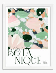
Affiche botanique éclat de vert
Prix promotionnel À partir de €14,95€24,95 -

Affiche botanique vert tendre élégante
Prix promotionnel À partir de €14,95€24,95 -

Affiche croquis botanique noir et blanc
Prix promotionnel À partir de €14,95€24,95 -

Affiche vases bohèmes aux motifs botaniques
Prix promotionnel À partir de €14,95€24,95 -

Toile botanique moderne au feuillage vert
Prix promotionnel À partir de €65,95€93,95 -

Affiche botanique Morris, feuillage vert et fleurs blanc crème
Prix promotionnel À partir de €14,95€24,95 -

Affiche jardin enchanté
Prix promotionnel À partir de €14,95€24,95 -

Affiche allée du jardin botanique royal d'Édimbourg
Prix promotionnel À partir de €14,95€24,95 -

Affiche harmonie botanique bohème
Prix promotionnel À partir de €14,95€24,95 -

Affiche médaillons botaniques printaniers vintage
Prix promotionnel À partir de €16,95€23,95 -
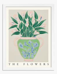
Affiche botanique vase aux fleurs
Prix promotionnel À partir de €14,95€24,95 -

Affiche botanique pop aux couleurs vives
Prix promotionnel À partir de €16,95€23,95 -

Affiche botanique verte Morris
Prix promotionnel À partir de €14,95€24,95 -

Affiche botanique moderne à aplats de couleur
Prix promotionnel À partir de €16,95€23,95


Plus de The Frame

Room-by-Room or Whole-Home? Styling Botanical P...
Most botanical prints are hung wrong. They're too small for the wall, glossy in rooms that need calm, and floating at eye level above sofas they should be anchoring. This...

You're Overthinking Art Above Your Sofa
The blank wall above your sofa isn't a maths problem. It's a mood decision, a colour decision, and a "what do I actually want to look at every evening" decision....

Our Favourite Art Prints for Bedrooms That Help...
Bedroom art is the one place in your home where a "statement piece" is usually the wrong instinct. The job here is quieter, and getting it right means unlearning most...