How to Hang Framed Art Prints Without Getting It Wrong
The measurements, methods, and small fixes that separate art that looks intentional from art that looks improvised.

Most badly hung art isn't a taste problem. It's a height problem, a spacing problem, or a hardware problem, and all three are fixable with a tape measure and ten minutes of planning. This guide assumes your prints are in your hands and you want them on the wall properly the first time.
The 57-inch (145cm) rule and why it exists
The 57-inch rule says the centre of your artwork should sit at 145cm from the floor. That's roughly the average human eye level, which is also the height galleries and museums hang work at. Your art lines up with where people naturally look, so it feels grounded rather than floating off into the ceiling.
The most common mistake is hanging too high. People instinctively put art near the ceiling because the wall above the sofa looks empty, but it disconnects the piece from the room. If you only remember one number from this article, make it 145cm to centre.
Here's the worked example. Say you have a 60x80cm framed print hung portrait. The centre is 40cm from the top of the frame. You want that centre at 145cm, so the top of the frame needs to be at 145 + 40 = 185cm from the floor.
But there's one more variable: the hanging hardware. Most framed prints hang from a wire or D-rings that sit a few centimetres below the top edge. When you pull the wire taut, it might sit 5cm down from the top of the frame. That means your nail or hook goes at 185 - 5 = 180cm from the floor, not 185cm. Always pull the wire taut, measure the drop, and subtract.

Hanging above furniture: the 15-20cm gap that makes all the difference
The 57-inch rule has one big exception: when you're hanging above a sofa, sideboard, console, or bed, the furniture takes priority. You want a gap of 15 to 20cm between the top of the furniture and the bottom of the frame.
Why this overrides 57 inches: art needs to feel anchored to the furniture below it, not floating above it. If you mechanically apply 145cm to centre above a tall sideboard, the art ends up too close to the furniture or weirdly disconnected from it. The 15-20cm gap creates a clean visual relationship where the art reads as belonging to the piece below.
So the priority order is simple. Empty wall, use 145cm to centre. Above furniture, use a 15-20cm gap and let the centre fall where it falls. In practice, that often puts the centre slightly higher than 145cm above a sofa, and that's fine.
One small caveat: if you're hanging a small print above a tall piece of furniture, the gap rule can push it uncomfortably high. In that case, scale up the artwork. A 30x40cm print above a sofa will almost always look undersized. For sofa walls, look at large wall art in the 70x100cm range or bigger.
Single statement piece vs gallery wall: choosing your layout
A statement piece is one large frame doing all the heavy lifting. A gallery wall is multiple frames working as a composition. Both can look brilliant. They solve different problems.
Choose a statement piece when the wall is wide, the room is calm, and you want a single focal point. It's the easier option to execute well, because there's only one thing to align. For sofa walls and bedrooms, a single large piece almost always looks more considered than three medium ones.
Choose a gallery wall when you have an awkward wall (narrow, broken up by doors or sockets), a collection you want to show together, or a staircase that needs visual rhythm. Gallery walls reward patience and punish shortcuts. If you don't enjoy planning, go statement.
A useful rule for sizing a statement piece: the artwork should fill roughly two-thirds the width of the furniture beneath it. A 200cm sofa wants art around 130-150cm wide, which is why XL canvas sizes exist. Anything narrower than half the furniture width starts to look apologetic.
For inspiration on what works above seating, living room art prints tend to land best when they're either bold and singular, or grouped intentionally as a set rather than scattered.
Step-by-step gallery wall method (start centre, build out)
The mistake that ruins most gallery walls is starting at one corner and working across. You end up off-balance, and by the time you notice, you've already drilled four holes. The fix is to start in the centre and build outwards.
1. Plan flat on the floor first
Lay all your frames out on the floor in front of the wall. Move them around until the composition looks balanced. The biggest or most visually heavy piece usually wants to be near the centre, slightly off from dead-centre to avoid feeling stiff. Take a photo when you like it.
2. Use paper templates
Trace each frame onto kraft paper or newspaper, cut out the shapes, and label them. Mark where the hanging hardware sits on each template (wire pulled taut, or D-ring position). This is the trick that turns gallery walls from a guessing game into a clean process.
3. Tape templates to the wall
Stick the templates up with low-tack masking tape, starting with the centre piece. Use a level. Step back, look from across the room, adjust. The whole grouping should feel anchored at roughly 145cm to its visual centre, with 5cm gaps between frames as a starting point.
4. Hammer through the templates
Once you're happy, drive your nail or hook directly through the marked spot on each paper template. Tear the paper away. Hang the frames. Because you measured the hardware drop on each template, every frame lands exactly where you planned.
The 5cm spacing is the consensus for gallery walls. Tighter than 3cm and frames look cramped. Wider than 8cm and the composition falls apart into separate pieces. A scrap of cardboard cut to 5cm makes a perfect spacer between frames as you hang.

If you're working with a curated grouping rather than mismatched frames, wall art sets take most of the planning out of it because the proportions are already designed to work together.
Tools and fixings you actually need (and what to skip)
You don't need a kit. You need five things.
- A tape measure
- A pencil
- A spirit level (a phone level app works for small frames, a real level is better for anything 60cm or wider)
- A hammer or a small drill
- The right fixing for your wall (more on that below)
Skip the laser levels, the pricey hanging templates, the rubber bumpers that come in starter kits. They solve problems you don't have. The one accessory worth buying is a small pack of self-adhesive felt pads to stick on the bottom corners of frames so they sit flush against the wall and don't shift.
Do framed prints come ready to hang?
Yes, if you buy them properly framed. Our framed art prints arrive with all the fixtures attached, ready to go straight on the wall. You don't need to buy hardware separately or fit anything yourself.
What you'll typically find on the back of a framed print:
- D-rings with wire: Two metal rings screwed into the back of the frame, joined by a tensioned wire. You hang from one or two hooks, and the frame self-levels slightly because of the wire. Most common on medium and large frames.
- Sawtooth hanger: A small jagged metal strip in the centre of the frame back. You hang it directly off a single nail. Common on smaller frames.
- Two hooks instead of wire: Some larger frames use two D-rings without a wire, hung from two separate nails. More stable, less forgiving on alignment.
Knowing which hardware you've got matters because it changes your measuring. With a wire, you measure the drop when the wire is pulled taut, not the resting position. With a sawtooth, the hanging point is fixed and easy to measure. With two hooks, you need to measure the distance between them precisely and mark both points on the wall, which is where a spirit level becomes essential.
How to hang on tricky walls: plasterboard, brick, and picture rails
The wall matters as much as the measurement.
Plasterboard (drywall)
Most modern interior walls. For frames under 5kg, a picture hook with a small nail driven at an angle into the plasterboard is enough. For anything heavier, use plasterboard anchors (the screw-in plastic ones) or self-drive metal anchors. A nail straight into bare plasterboard will pull out under any real weight.
Brick and masonry
Older walls and many external walls. You'll need a drill with a masonry bit, a wall plug, and a screw. Drill slowly, push the plug in flush with the wall, screw in the hook or hanger. It's a bit more effort but it'll hold any weight you're likely to hang.
Concrete
Same as brick but harder. Use a hammer drill if you have one, and don't try to muscle through with a standard drill bit. Use proper concrete plugs.
Picture rails
If you're in a period property with picture rails along the top of the wall, use them. Picture rail hooks slot over the rail, and you hang frames from cord or wire dropped down. No drilling, no damage, and you can rearrange whenever you want. This is also the best option for renters.
Renting and damage-free options
Adhesive strips work for frames up to about 2-3kg, which covers most A3 and smaller framed prints. Read the weight rating on the packet. They fail when overloaded, and they fail dramatically.

Quick fixes for common mistakes (too high, too spread out, off-centre)
You've hung it. Something's wrong. Here's how to diagnose and fix without re-drilling everything.
Too high (the floating feeling)
The most common mistake. The art looks like it's drifting toward the ceiling, disconnected from the room. Stand across the room and look: if the bottom of the frame is well above your eye line when you're seated, it's too high.
Fix: lower it by 10-15cm at a time until it feels grounded. Above a sofa, check the gap. If it's more than 25cm above the back of the sofa, drop the art.
Too spread out (the disconnected gallery wall)
You've hung four frames and they look like four separate decisions instead of one composition. The gaps are probably over 8cm.
Fix: identify the two frames that are furthest apart and move one closer. You only need to re-hang the outliers, not the whole wall. Aim for 5cm gaps and the composition will pull together.
Crooked
The thing every visitor will notice and nobody will mention. Wire-hung frames go crooked easily because the wire shifts on the hook.
Fix: stick a small felt pad or a blob of museum putty on each bottom corner of the frame back. It grips the wall and stops the frame rotating. For frames hung on two hooks, double-check both nails are at exactly the same height with a level. A 2mm difference over 60cm reads as obviously crooked.
Off-centre above furniture
The art is hung well, but it's not centred over the sofa or sideboard. This always looks worse than you expect.
Fix: measure the furniture, find its midpoint, mark it lightly on the wall in pencil. Move the art so its centre lines up with that mark. If the furniture sits asymmetrically in the room (against a corner, near a door), centre the art on the furniture, not on the wall.
Get it right and forget about it
Hang at 145cm to centre on empty walls. Leave a 15-20cm gap above furniture. Use 5cm spacing on gallery walls and start from the centre. Match your fixing to your wall type. That's most of the job.
The rest is paying attention to the details that make hung art look intentional rather than improvised: pulling the wire taut before measuring, levelling each frame properly, sticking felt pads on the corners so nothing drifts. Ten extra minutes of care is the difference between art that quietly works and art you keep walking past and noticing is wrong.


Produits Fab présentés dans cet article
-

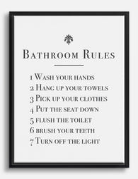
Affiche règles de salle de bain classique en noir et blanc
Prix promotionnel À partir de €14,95€24,95 -

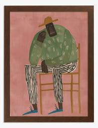
Affiche portrait femme aux rayures colorées
Prix promotionnel À partir de €14,95€24,95 -
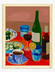
Affiche table rouge et conviviale
Prix promotionnel À partir de €14,95€24,95 -
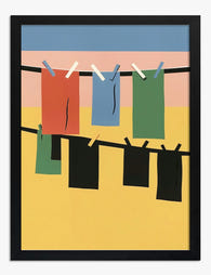
Affiche vêtements colorés sur corde à linge
Prix promotionnel À partir de €14,95€24,95 -

Affiche moment de lecture cocooning sur canapé
Prix promotionnel À partir de €16,95€23,95 -
Affiche portrait à rayures
Prix promotionnel À partir de €14,95€24,95 -

Affiche règles de cuisine noir et blanc
Prix promotionnel À partir de €14,95€24,95 -

Affiche refuge chaleureux inspirée de Matisse
Prix promotionnel À partir de €14,95€24,95 -

Affiche portrait moderne à rayures
Prix promotionnel À partir de €16,95€23,95 -

Affiche élégance à rayures
Prix promotionnel À partir de €14,95€24,95 -

Affiche son histoire, ses règles à elle
Prix promotionnel À partir de €14,95€24,95 -

Toile géométrique Bauhaus bleu et blanc
Prix promotionnel À partir de €54,95€91,95 -
Toile rappels élégants pour la salle de bain
Prix promotionnel À partir de €54,95€91,95 -

Affiche minimaliste noir et blanc équilibre et grâce
Prix promotionnel À partir de €14,95€24,95 -

Affiche table conviviale
Prix promotionnel À partir de €16,95€23,95 -

Affiche librairie vintage chaleureuse
Prix promotionnel À partir de €14,95€24,95 -

Toile randonneurs en montée noir et blanc
Prix promotionnel À partir de €54,95€91,95 -

Toile portrait à rayures bleu marine et beige
Prix promotionnel À partir de €65,95€94,95 -

Toile défilé de chaises colorées
Prix promotionnel À partir de €65,95€94,95


Plus de The Frame

Vintage Rose Prints: From Botanical Illustratio...
Vintage rose prints are having a proper moment. Not the dusty, chintzy kind your nan had over the settee, but the considered, well-framed kind that anchor a modern room and...

Why Rose Print Decor Works Better Without the C...
Why Roses Are the One Floral That Never Truly Goes Out of Style Roses have been painted, printed and photographed for centuries, and they still turn up in the work...

Beyond the Fruit Bowl: Kitchen Wall Art Ideas T...
The kitchen is the most photographed, most lived-in room in your home, and yet it's usually decorated like an afterthought. A print of lemons here, a chalkboard-style coffee poster there,...