The Amsterdam Print Edit: Curated Display Ideas That Work
Professional gallery techniques applied to canals, bicycles and gabled rooftops, with the measurements that actually matter.

Amsterdam prints have a specific failure mode. Buy three or four, hang them in roughly the right area, and somehow the wall reads less "considered European apartment" and more "souvenir shop near Centraal." This guide fixes that with measurements, layouts, and a few opinions about why most hanging advice you've read is subtly wrong.
The two-thirds rule explained (and why eye-level advice is usually wrong)
The two-thirds rule is the single most useful number in wall art. Your art (or the combined width of a pair or grouping) should occupy roughly two-thirds of the width of the furniture beneath it. Not equal, not narrower than half. Two-thirds.
Quick maths. A standard three-seater sofa is around 220cm wide, so your print or grouping should sit between 140cm and 150cm wide. A 180cm console wants art around 120cm wide. A 90cm sideboard wants something closer to 60cm. This is why a single 30x40cm print floating above a large sofa always looks lost: it's hitting maybe a fifth of the width.
Now the eye-level advice. You'll read everywhere that art centres should sit at 145-152cm (57-60 inches) from the floor. That's true in empty galleries. It's wrong above furniture. Above a sofa, console, or bed, the bottom edge of the art should sit 15-20cm above the furniture itself. Anchor to the furniture, not the floor. If you measure from the floor every time, you'll end up with a print floating 40cm above your sofa back like it's been evicted.

Single Amsterdam statement print: where and how to hang it
A single statement print is the cleanest way into Amsterdam wall art, and honestly the option we'd recommend if you're new to this. One well-chosen print at the right scale beats four mediocre ones every time.
For a sofa or bed, go big. We'd choose 70x100cm framed, or 100x150cm if you're going canvas. Anything smaller above a three-seater will feel apologetic. The orientation should mirror the furniture: landscape above a sofa, portrait above an armchair or narrow console.
Subject matters too. A wide canal scene with rows of gabled houses works beautifully horizontal above a sofa. A single bicycle leaning against a brick wall, or a portrait shot up a narrow alley, suits a vertical format in tighter spots. Match the geometry of the print to the geometry of the space, then let the two-thirds rule handle the size.
One opinion: avoid the obvious bicycle-on-bridge shot if it's your only piece. As your statement, you want something with a bit of weight. A misty morning canal, a graphic illustration of a single canal house, or a strong architectural detail will carry a wall better than the postcard cliché.
Building an Amsterdam gallery wall: layout, sizing, and spacing
Three or more prints is where most people lose the plot. The fix is structure, and the structure is built on three rules.
The anchor print rule
Every Amsterdam gallery wall needs one dominant piece. Make it 50x70cm or larger, and treat everything else as supporting cast. Without an anchor, your eye has nowhere to land and the wall reads as a scrapbook. Choose the anchor based on your room's existing palette: brick-red rooftops if you have warm tones, blue canal water if your room leans cool, black-and-white architecture if you want to stay neutral.
Spacing
Leave 5-7cm (2-3 inches) between frames. Closer than that and the grouping looks crowded. Wider than 10cm and the prints stop reading as a set and become individual prints that happen to share a wall. Use the same spacing on all sides for symmetrical layouts. For asymmetric salon-style hangs, keep horizontal and vertical spacing consistent even when the prints aren't.
The two-thirds rule still applies
Measure the total footprint of your gallery wall, not the individual prints. Six prints arranged in a 180x120cm rectangle above a 220cm sofa? You're at 80% width, slightly too wide. Pull it in or drop a print.
For layout itself, three formats work reliably. A grid of four or six prints in matching sizes (foolproof, slightly formal). A horizontal row of three at the same height (clean, gallery-style). An asymmetric cluster around one anchor (more relaxed, harder to nail). If you're unsure, start with the grid. You can browse pre-curated wall art sets if you'd rather skip the layout maths entirely.

Mixing photography prints with illustrated Amsterdam posters
This is where Amsterdam-themed walls go wrong most often. Photography of canals tends to be moody and tonal: blues, greys, soft brick. Illustrated posters lean graphic and saturated: bold oranges, primary blues, flat colour blocks. Throw them together randomly and the wall fights itself.
The fix is a shared element. Pick one and commit.
Shared colour. If your photography features blue canal water, choose illustrations that use a similar blue as their dominant colour. The styles can differ wildly as long as one colour repeats across pieces. This is the easiest path.
Shared subject category. All architecture, or all transport (bicycles, trams, boats), or all street scenes. Style differences become interesting rather than chaotic when subject matter is consistent.
Shared tonal weight. All your pieces are either high-contrast or all soft and washed out. A high-contrast vintage travel poster next to a soft pastel watercolour will always look mismatched, no matter how nicely they're framed.
Our preferred recipe: two or three black-and-white photographs, one graphic illustration with a punch of colour that picks up something else in the room, one architectural detail shot. The illustration becomes a focal point precisely because it's the only saturated piece. Browse photography prints if you're building the photographic backbone first.
Frame consistency: why matching frames make mismatched art work
If you take one thing from this article, take this. Matching frames are the single biggest lever for making a varied collection of Amsterdam prints look intentional rather than accidental.
Mix subjects freely. Mix eras (vintage travel posters next to contemporary photography). Mix illustrated and photographic. But put them all in the same frame finish and the wall will read as a curated collection. Use three different frame finishes across six prints and it will read as a pile of things you bought on holiday.
Three finishes work for Amsterdam. Black gives you graphic punch and suits high-contrast photography and bold illustration. Natural oak feels warmer and softer, ideal if your room already has wood tones or you're leaning into the Dutch design tradition of restrained natural materials. White is the cleanest and most modern, and it makes colourful illustrated posters pop.
Pick one. Use it across the entire wall. This is also why we'd push you toward framed prints that ship pre-fitted with the print already mounted properly, rather than buying frames separately and trying to match finishes from different sources. The most common gallery wall disaster is six frames in "black" that are actually six slightly different blacks.
A note on materials. Solid wood frames hold their finish and stay square. The cheaper alternative, MDF wrapped in printed veneer, tends to chip at the corners and the "wood grain" reads as plastic up close. If you're investing in a gallery wall you'll keep for years, the frame quality matters as much as the print.

The hallway trick: using narrow Amsterdam prints in overlooked spaces
Hallways are the most underused walls in most homes, and Amsterdam prints are unusually well suited to them. The reason is geometry. Amsterdam itself is vertical: tall narrow canal houses, slim alleys, vertical bicycle silhouettes against brick. These compositions translate directly to the long, narrow walls of a hallway.
A few rules for hallway walls.
Go vertical, not horizontal. A 30x40cm or 50x70cm portrait orientation works far better in a corridor than a wide canal panorama. Save the panoramic shots for above the sofa.
Hang in a row at the same height. In a hallway, your viewing angle is always oblique because you're walking past, so a clean horizontal line along the centres of the prints reads beautifully. Aim for centres at around 150cm.
Use 3-4 prints minimum. A single print in a long hallway looks marooned. Three or four spaced evenly turns the corridor into a journey.
Pick tight subjects. A close-up of a bicycle wheel, a single window with shutters, a detail of a gabled roofline. Wide establishing shots get lost in narrow spaces because you can't step back to take them in. The same logic applies to other city prints if you're mixing destinations.
Common display mistakes and how to avoid them
A short list of the errors we see most often, and the fixes.
Hanging too high. The most common mistake by miles. People treat travel prints like formal gallery art and hang them at gallery height regardless of furniture. Anchor to the furniture: 15-20cm above the back of the sofa, console, or headboard.
Too many frame finishes. Already covered, but worth repeating. One finish across the wall. If you must mix, do it with at least three of one and one accent, not two-and-two.
Undersizing. A 30x40cm print above a three-seater sofa will always look wrong. If your budget only stretches to small prints, build a grouping rather than hanging one small piece in isolation.
The Schiphol Airport test. Before you commit, ask three questions. Is there visual variety in subject? (Not all bicycles, not all canals.) Are you mixing tight detail shots with wider scenes? Does anything in the grouping break the obvious tourist cliché? If the honest answer to all three is no, swap one print.
Identical compositions. Three canal scenes shot from the same angle, all featuring rows of houses receding into the distance, will look like duplicates. Vary the framing: one wide, one medium, one tight detail.
Forgetting the room. Amsterdam decor inspiration tends to feature the prints in isolation, but on your wall they'll sit next to a particular sofa, beside a particular lamp, under a particular ceiling colour. Pull one colour from the prints into a cushion or throw and the wall stops looking like a separate project and starts feeling integrated.
Cheap framing that warps. Prints arrive bowed, frames split at the corners, glazing scratched in transit. The fix is buying framed prints that are properly fitted in solid wood frames and shipped as one piece, ready to hang. It sounds obvious. It's not the norm.

Where to start
If this feels like a lot, do the simplest thing first. Pick one anchor print at 70x100cm, frame it in black or natural oak, and hang it 18cm above your sofa. Live with it for a fortnight. Then build out from there with a second print, then a third, keeping the frame finish identical and the spacing at 6cm. A great Amsterdam wall is almost always built slowly, one considered piece at a time, rather than ordered all at once and assembled in a panic.

Produits Fab présentés dans cet article
-
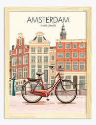
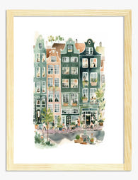
Affiche Amsterdam, vélo et maisons des canaux
Translation missing: fr.products.product.sale_price À partir de €14,95€24,95 -

Toile charme urbain d'Amsterdam
Translation missing: fr.products.product.sale_price À partir de €54,95€91,95 -

Toile charme d'Amsterdam
Translation missing: fr.products.product.sale_price À partir de €54,95€91,95 -

Affiche reflets d'Amsterdam
Translation missing: fr.products.product.sale_price À partir de €14,95€24,95 -
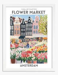
Toile marché aux fleurs d'Amsterdam
Translation missing: fr.products.product.sale_price À partir de €54,95€91,95 -

Affiche reflets des canaux d’Amsterdam
Translation missing: fr.products.product.sale_price À partir de €14,95€24,95 -

Affiche charme d'Amsterdam
Translation missing: fr.products.product.sale_price À partir de €14,95€24,95 -

Affiche maisons colorées d'Amsterdam
Translation missing: fr.products.product.sale_price À partir de €14,95€24,95 -
Affiche tulipes du marché aux fleurs d'Amsterdam
Translation missing: fr.products.product.sale_price À partir de €14,95€24,95 -

Toile champ de tulipes et silhouette d'Amsterdam
Translation missing: fr.products.product.sale_price À partir de €54,95€91,95 -
Toile charme d'Amsterdam
Translation missing: fr.products.product.sale_price À partir de €54,95€91,95 -

Affiche charme des tulipes d'Amsterdam
Translation missing: fr.products.product.sale_price À partir de €14,95€24,95 -

Toile reflets d'Amsterdam
Translation missing: fr.products.product.sale_price À partir de €54,95€91,95 -

Affiche paysage urbain d'Amsterdam
Translation missing: fr.products.product.sale_price À partir de €14,95€24,95 -
Affiche reflets d’Amsterdam
Translation missing: fr.products.product.sale_price À partir de €14,95€24,95 -
Affiche façades pittoresques d'Amsterdam
Translation missing: fr.products.product.sale_price À partir de €14,95€24,95 -

Toile charme des canaux d’Amsterdam
Translation missing: fr.products.product.sale_price À partir de €54,95€91,95 -

Affiche charme des maisons de canal d'Amsterdam
Translation missing: fr.products.product.sale_price À partir de €14,95€24,95 -

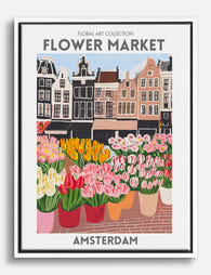
Affiche marché aux fleurs d'Amsterdam
Translation missing: fr.products.product.sale_price À partir de €14,95€24,95 -

Toile charme des canaux d’Amsterdam
Translation missing: fr.products.product.sale_price À partir de €54,95€91,95


Plus de The Frame

The Abstract Tree Art Edit: 12 Curated Picks fo...
Tree art has a reputation problem. For years it's been associated with rustic cabins, woodland nurseries, and the kind of soft botanical prints that whisper "country kitchen." But abstract tree...

Going Big: How to Use Large Vintage Sea Art Pri...
A large vintage seascape does something a cluster of small prints never can: it stops you at the doorway. The trick is choosing the right print, hanging it at the...

Why Matching Frames Make Botanical Gallery Wall...
Botanical gallery walls have a higher failure rate than almost any other style. Too many leaf varieties, mismatched frames, and guesswork spacing turn what should feel like a calm indoor...