The Complete Guide to Peacock Gallery Walls
How to build a multi-piece peacock display that feels curated, not chaotic, with exact layouts and sizes.

Peacock art is bold, jewel-toned, and full of personality, which makes it brilliant for gallery walls and risky in equal measure. Build it well and you get a wall that looks like a private collection. Build it badly and you get a fight between three full-bird portraits all demanding attention. This guide covers exactly how to get the first version.
Why peacock prints make excellent gallery wall anchors
A good gallery wall needs a centre of gravity. Something with enough visual weight to hold the arrangement together and enough character to set the tone for everything else. Peacock prints do this naturally because they bring three things at once: a strong silhouette, a recognisable colour palette (teal, emerald, gold, ink blue), and an ornamental quality that bridges traditional and modern interiors.
That colour palette is the secret weapon. Once you've established teal, emerald, and gold as your visual thread, you can pull in botanicals, abstract textures, and other wildlife without the wall looking random. The peacock sets the rules and the rest of the arrangement follows them.
The other reason peacock art anchors so well is scale tolerance. A peacock print works at 30x40cm and at 70x100cm, which means you can build outward from a hero piece in either direction without losing impact.

Choosing your hero piece: full peacock vs feather detail
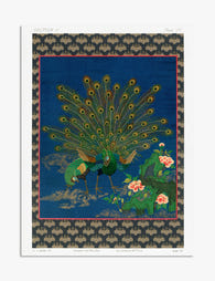
Every gallery wall needs a hero, and with peacock wall art ideas there are two routes. A full-bird portrait, where the peacock is the entire subject, or a feather detail, where the focus is on pattern, texture, and colour rather than the whole animal.
Full-bird heroes are dramatic and confident. They give you a clear focal point and read instantly from across a room. The trade-off is that they demand quieter supporting pieces. Pair a full peacock portrait with another full peacock portrait and they will compete rather than complement.
Feather details are more flexible. Because they're closer to abstract pattern, they sit comfortably alongside botanicals, watercolours, and even other birds without visual jostling. If you're nervous about going too maximalist, lead with a feather detail at 50x70cm and build the rest of the wall around it.
Our rule of thumb: one full-bird portrait per gallery wall, maximum. Everything else should be feather details, complementary subjects, or abstract textures that share the colour palette.
When to size up your hero
If your wall is over two metres wide, your hero piece should be at least 50x70cm, and ideally 70x100cm. A small hero on a large wall looks tentative. Better to commit to one statement-sized piece and use smaller supporting prints around it than to scatter four medium prints with no clear lead.
Complementary subjects that sit well alongside peacock art
The biggest mistake people make with decorative peacock prints is pairing them only with more peacock prints. You end up with a themed wall rather than a curated one. The fix is to expand the subject matter while keeping the colour thread tight.
Botanicals. Tropical leaves (monstera, banana, palm) and dark moody florals are the natural partners for peacock art. They share the lush, slightly exotic register and they bring green tones that echo the peacock's plumage. Browse botanical art prints for monstera silhouettes, fern studies, and dark florals on charcoal backgrounds.
Abstract textures. Gold leaf abstracts, ink-wash watercolours in teal and navy, and marbled patterns in jewel tones add visual rest between the more representational pieces. They give your eye somewhere to land.
Other wildlife, carefully. Hummingbirds, kingfishers, and pheasants work because they share the iridescent jewel-tone register. What doesn't work: zebras, tigers, leopards, or anything with strong graphic patterning that competes with the peacock's own ornamental detail. For more exotic-bird options that play nicely, look through nature art prints.
What to avoid. Bright pop art, cool minimalist line drawings on pure white, and anything in a clashing colour temperature (think coral, hot pink, or bright primary red). These will fight the peacock palette rather than support it.
The colour thread is non-negotiable. Every piece on the wall should contain at least one of: teal, emerald, deep blue, gold, or ink black. If a piece you love doesn't share any of those, it belongs on a different wall.
Layout templates: the 3-piece, 5-piece, and asymmetric cluster
Most gallery walls fail because there was never a layout in the first place. People buy prints they like, hang them roughly, and hope. The fix is to commit to a template before you buy anything.
The 3-piece symmetrical row
The simplest and most forgiving layout. One hero piece in the centre, two supporting pieces of equal size flanking it, all in a horizontal row at the same eye level.
- Centre: 50x70cm peacock (full bird or large feather detail)
- Left and right: 30x40cm each (botanical, feather detail, or abstract)
- Spacing: 6 to 8cm between frames
This works beautifully above a sofa, a sideboard, or a console table. It's calm, classical, and almost impossible to get wrong.
The 5-piece grid
A step up in ambition. One hero piece in the centre, four supporting pieces arranged in a square or rectangle around it.
- Centre: 50x70cm or 60x80cm peacock hero
- Four corners: 30x40cm prints, all portrait orientation
- Spacing: 5 to 7cm between frames
The trick with a 5-piece grid is to alternate subject matter around the corners so two similar pieces are never adjacent. Botanical, feather detail, abstract, botanical, going clockwise, for example.
The asymmetric cluster
The most editorial-looking layout, and the hardest to nail. You're working with 5 to 7 pieces of varying sizes, arranged in a loose cluster that reads as balanced without being symmetrical.
- One hero at 50x70cm or 60x80cm, placed slightly off-centre
- Two mid-size pieces at 40x50cm
- Three to four smaller pieces at 30x40cm or 20x30cm
- Spacing: keep it tight, 4 to 6cm, so the cluster reads as one composition
The unwritten rule: your eye should travel through the arrangement in a triangle or zigzag, not bounce around looking for somewhere to settle. Heaviest piece bottom-left or centre-left tends to ground the composition best.
For pre-coordinated multi-piece options that take some of the guesswork out, browse wall art sets where the sizing and palette are already worked out.

Keeping frames consistent for a polished finish
Frame coordination is what separates a curated gallery wall from a yard-sale wall. The single biggest upgrade you can make to any multi-piece arrangement is unifying the frames.
The default rule: match every frame
If this is your first gallery wall, match every frame. Same colour, same profile, same width. Black frames give you a graphic, modern finish. Natural oak gives you warmth and a slightly Scandinavian feel. White frames recede and let the prints do the talking. Dark walnut leans traditional and rich, which suits peacock art particularly well.
Whichever you choose, commit. Mixed frames on a first attempt almost always read as accidental rather than intentional.
When to break the rule
Once you're confident, you can mix frames in two specific ways:
- Same colour, different widths. All black frames, but the hero piece has a wider profile than the supporting pieces. This subtly emphasises the hero without disrupting the visual unity.
- Two-tone palette only. Half black, half oak, distributed evenly across the arrangement. Three frames of one and three of the other, never five-and-one.
What you should never do is mix three or more frame finishes on a single gallery wall. It looks like you couldn't decide.
A quick word on framing quality
Frames matter beyond aesthetics. The most common failure in framed art is warping, bubbling, and prints shifting inside the frame after a few months on the wall. Solid wood frames (not MDF or veneer) hold their shape, and prints that arrive properly fitted with the frame stay flat. UV-protective glazing also matters if your wall gets any direct sunlight, since peacock art's deep blues and greens will fade fastest under UV.
Size ratios that work: mixing 40x50cm with 30x40cm prints
Sizing is where most gallery walls go wrong. Every print at the same size feels flat. Every print at a different size feels chaotic. The fix is a clear ratio between hero and supporting pieces.
The reliable formulas:
- Two-tier (3-piece walls): Hero at 50x70cm, supporting at 30x40cm. Ratio roughly 2:1 by surface area.
- Two-tier (5-piece grids): Hero at 60x80cm, supporting at 40x50cm. Cleaner, more architectural feel.
- Three-tier (asymmetric clusters): Hero at 70x100cm, mid-size at 40x50cm, accents at 30x40cm or 20x30cm.
Always have a clear largest piece. If your two biggest prints are within 10cm of each other in either dimension, they'll compete for hero status and the wall will lose its focal point.
Orientation matters too. A portrait-oriented hero with portrait supporting pieces reads as quiet and ordered. A landscape hero with portrait supporting pieces creates more energy and works well above wide furniture like a sofa or sideboard. Mixing orientations randomly across smaller pieces is fine in an asymmetric cluster but should be avoided in symmetrical layouts.

Spacing and hanging tips for a straight, level result
You've chosen the prints, the frames, and the layout. Now you have to actually hang them, which is where most people lose their nerve. Three rules will save you.
Rule 1: plan on the wall, not in your head
Cut paper templates to the exact size of each print, label them, and tape them to the wall with low-tack painter's tape. Live with the arrangement for 24 hours. Move things until it feels right. Only then mark the hanging points and commit.
If paper feels excessive, take a photo of the wall, drop the prints into the photo using any layout app on your phone, and use that as your reference.
Rule 2: hang from the centre line, not the floor
Gallery wall centre line should sit at roughly 145 to 150cm from the floor (gallery standard). That's the average eye level. The exception is above furniture: leave 15 to 20cm between the top of the sofa or sideboard and the bottom edge of the lowest frame. Any closer and the art looks like it's resting on the furniture. Any further and it floats.
Rule 3: spacing is tighter than you think
The most common spacing mistake is leaving too much air between frames. For symmetrical layouts, 6 to 8cm. For asymmetric clusters, 4 to 6cm. The tighter spacing makes the arrangement read as one composition rather than a series of separate prints.
Negative space around the cluster matters too. Leave at least 30cm of clear wall on every side of the arrangement so it has room to breathe. A gallery wall that runs all the way to the edges of a wall feels cramped.
Starting small and expanding
You don't have to buy everything at once. Plenty of the best peacock gallery walls started with a single hero piece, expanded to three, and grew to seven over a year. The trick is to plan the full layout from the beginning so each new piece slots into a pre-decided spot. If you're working from one peacock print you already own, treat it as the hero, sketch your eventual 5-piece or cluster layout around it, and add pieces one at a time as you find them.

A few last things to get right
If you take only three things from this guide, take these. Hold the colour thread (teal, emerald, gold, ink blue) across every piece. Limit yourself to one full-bird hero per wall. Match your frames before you do anything clever with them. Get those right and the wall will look curated whether you have three pieces or seven.
Then trust your eye, hang it tight, and live with it for a week before you decide it's finished.

Produits Fab présentés dans cet article
-

Toile paon majestueux et fleurs luxuriantes
Translation missing: fr.products.product.sale_price À partir de €54,95€91,95 -

Impression sur toile élégante avec motif paon
Translation missing: fr.products.product.sale_price À partir de €54,95€91,95 -

Toile paon et roses
Translation missing: fr.products.product.sale_price À partir de €54,95€91,95 -

Affiche paon et roses vintage
Translation missing: fr.products.product.sale_price À partir de €14,95€24,95 -

Affiche paon majestueux
Translation missing: fr.products.product.sale_price À partir de €14,95€24,95 -
Affiche paon majestueux
Translation missing: fr.products.product.sale_price À partir de €14,95€24,95 -

Toile paon royal bleu et vert, charme vintage
Translation missing: fr.products.product.sale_price À partir de €54,95€91,95 -

Affiche paon élégant de William Morris
Translation missing: fr.products.product.sale_price À partir de €14,95€24,95 -

Affiche paon botanique Morris
Translation missing: fr.products.product.sale_price À partir de €14,95€24,95 -

Affiche William Morris élégance du paon
Translation missing: fr.products.product.sale_price À partir de €14,95€24,95 -

Affiche paon élégant par Morris
Translation missing: fr.products.product.sale_price À partir de €14,95€24,95 -

Toile paons élégants de William Morris
Translation missing: fr.products.product.sale_price À partir de €54,95€91,95 -

Toile paon élégant William Morris
Translation missing: fr.products.product.sale_price À partir de €54,95€91,95 -

Affiche paon élégant de William Morris
Translation missing: fr.products.product.sale_price À partir de €14,95€24,95 -
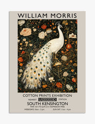
Affiche paon élégant inspirée par William Morris
Translation missing: fr.products.product.sale_price À partir de €14,95€24,95 -

Affiche paon majestueux par Morris
Translation missing: fr.products.product.sale_price À partir de €14,95€24,95 -

Toile paon et motifs floraux de William Morris
Translation missing: fr.products.product.sale_price À partir de €54,95€91,95 -

Impression d'art textile Morris Peacock
Translation missing: fr.products.product.sale_price À partir de €14,95€24,95 -

Toile élégance du paon de William Morris
Translation missing: fr.products.product.sale_price À partir de €54,95€91,95


Plus de The Frame

You're Overthinking Your St. Louis Gallery Wall
Most St. Louis gallery walls fail for the same reason: too many ideas competing for attention. You bought a beautiful Gateway Arch print, found a Soulard map you love, threw...

Stop Matching Everything: How to Choose Artwork...
Matching artwork is the fastest way to make a living room feel like a hotel lobby. What you actually want is cohesion, which is a much more interesting problem to...

Random or Curated? Making Your Motivational Wal...
Motivational prints have a reputation problem. Hang too many, in too many fonts, with too many frame styles, and your lounge starts to look like the breakroom of a startup...