9 Sun Wall Art Ideas We Keep Coming Back To
Nine genuinely useful ways to style sun art at home, with sizes, pairings and rooms that actually work.

Sun art is one of those motifs that keeps reinventing itself, from terracotta boho suns to clean black line drawings. The trick is matching the style of sun to the room you're actually living in, not the one on a mood board. Here are nine ideas we keep returning to, with the sizes, palettes and placements that make them work.
1. The single oversized sun print as a statement piece
If you only buy one piece, make it big. A single oversized sun print does more for a room than three medium prints fighting for attention, and it solves the most common styling mistake we see: art that's too small for the wall.
Above a three-seater sofa, aim for art that spans roughly two thirds of the sofa's width. For a standard 200cm sofa, that means a print at 70x100cm portrait or, ideally, a 100x150cm canvas in landscape. Anything smaller floats awkwardly above the cushions.
We like a warm-toned sun here, terracotta, ochre or burnt sienna, hung 15 to 20cm above the sofa back. Canvas works particularly well at this scale because it's lighter than a framed print and the mirrored edge wrapping means none of the image gets lost around the sides. If you want something more polished, a slim black frame draws the eye in without competing with the artwork.

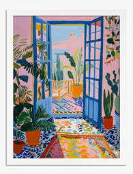
2. Boho sun wall art with woven textures and dried plants
Boho sun wall art lives or dies by what you put around it. The print itself should be the calm centre, not the loudest thing in the room. Layer texture around it: a woven wall hanging to one side, dried pampas in a stoneware vase, a rattan pendant overhead.
Stick to a tight palette. Cream, rust, clay, sand and a single deeper accent like olive or cocoa. Avoid mixing in cool blues or stark whites here, they fight the warmth that makes the look work in the first place.
For sizing, a 50x70cm print at the centre of a textured arrangement is usually enough. The surrounding objects do the visual heavy lifting. Natural oak or unframed canvas suits this style best, black frames can feel too sharp against the soft textures.
If you're building a whole boho corner, browse the sun art prints collection for terracotta, mustard and clay-toned options. They're the workhorses of this look.
3. Minimalist sun prints in a Scandinavian-style space
Minimalist sun prints, the single line-drawn arc with rays, or a flat circle in a muted tone, are made for Scandinavian interiors. They give you the suggestion of warmth without breaking the visual quiet that defines the style.
Hang one print, not three. A 50x70cm or 60x80cm print in a slim black or pale oak frame, centred on a wall above a low sideboard or a simple bench, is all you need. The negative space around it is part of the composition.
We'd avoid heavy ornate frames here. The whole point is restraint. UV-protective acrylic glaze keeps the print looking crisp even if your Scandi space is, as it should be, full of natural light. Glass would catch reflections and undermine the matte calm.
For more ideas in this register, the minimalist art prints collection is a good place to start.
4. Sun and moon pairings for a symmetrical setup
The sun and moon pairing has quietly become one of the most-searched art combinations, and there's a reason. The symmetry feels resolved, the symbolism is open enough to suit almost anyone, and the contrast (warm sun, cool moon, or both in the same tonal family) gives you a built-in colour story.
Two layouts we keep recommending:
Above a bed. Two 40x50cm or 50x70cm prints, hung at equal height, with roughly 5 to 10cm between the inner edges of the frames. Centre the pair over the bed, not over each pillow. For a king-size bed (160cm wide), 50x70cm portraits work best.
Flanking a fireplace or doorway. Same sizing logic, but treat the architectural feature as the centre line. The prints should sit at picture-rail height, with their centres aligned with each other rather than the mantel.
Match the frames exactly. This is one of the few times we'd argue against mixing finishes. Symmetry is the whole appeal, don't dilute it.

5. Vintage sun prints grouped as a salon wall
A salon wall (a dense, edge-to-edge grouping of mixed prints) is where vintage sun imagery really comes alive. Think botanical sun studies, old astronomical charts, faded almanac illustrations, weathered tarot suns. The variety is the point.
The rule we follow: keep the subject loose but the palette tight. All your prints should share a tonal range, sepia and cream, or muted blues and ochres, even if the imagery jumps from celestial diagrams to floral sun motifs.
Start with one anchor print at 50x70cm, then build outwards with five to nine smaller pieces in 21x30cm and 30x40cm. Lay everything out on the floor first. Aim for consistent gaps of 4 to 6cm between frames. Hang the anchor first, then work outwards.
Mixed frame finishes are fine here, in fact, encouraged. Antique brass, dark walnut and matte black together feel collected rather than coordinated. Pre-curated wall art sets can save you the headache of matching pieces from scratch.
6. Abstract sun wall art for modern and contemporary rooms
Abstract sun art, geometric suns, painterly washes, suns rendered as colour blocks, suits modern interiors precisely because it doesn't read as literal. It functions almost as a colour study, which lets it sit comfortably alongside contemporary furniture without feeling thematic.
For a modern living room with a clean-lined sofa and minimal accessories, go large and singular. A 70x100cm framed print or a 100x150cm canvas above a credenza, in a frame that matches your hardware (matte black with black handles, brushed brass with brass legs), keeps the room feeling intentional.
Colour matters more than subject here. A burnt orange abstract sun warms up a grey-and-white room that might otherwise feel clinical. A pale, washed-out sun in dusty pink or sage softens an industrial space with concrete and metal. Pick your sun for the temperature it adds, not for the symbolism.
The living room wall art collection has plenty of pieces that work this way, where the sun is more of a compositional element than a clear subject.
7. Golden sun prints as a warm focal point in a neutral bedroom
Neutral bedrooms (oat, taupe, bone, soft white) can drift into feeling flat. A single golden sun print is the fastest way to give the room a centre of gravity without disrupting the calm.
Above the bed is the obvious placement, but consider the wall opposite the bed too, the one you actually look at when you're lying down. A 50x70cm or 60x80cm print, framed in natural oak or warm walnut, hung at eye level when seated, can completely change the room's mood without you redecorating anything else.
We'd steer away from black frames here. They're too graphic against the softness. Wood tones, especially honey oak or pale ash, echo the warmth of the print itself. If you want a touch more polish, a thin gold or brass frame works, but keep it slim, anything chunky tips into hotel-lobby territory.
One practical note: even though our prints use UV-protective acrylic glaze and inks rated to last hundreds of years without fading, we'd still avoid hanging any artwork on a wall that gets hours of direct, unbroken afternoon sun. The glaze does the heavy lifting, but giving art some shade is just sensible long-term care.

8. A sun-themed gallery wall: how to mix subjects without chaos
A gallery wall built around a sun theme is one of the harder things to pull off, because the temptation is to use only sun imagery, which gets repetitive fast. The better approach: let the sun be the through-line, then mix in supporting subjects that share its palette and energy.
A formula that works:
- One large sun print as the anchor (50x70cm or 60x80cm).
- Two medium pieces in related subjects: a desert landscape, a celestial chart, an abstract in matching tones (30x40cm each).
- Three to four smaller prints: textural close-ups, botanical studies, typography (21x30cm).
Keep the colour palette to four shades maximum across the whole wall. This is what stops it tipping into chaos. If your anchor is a terracotta sun, your supporting prints should pull from terracotta, cream, clay and one accent (deep green, navy or black).
For spacing, 5cm between frames for a denser look, 8 to 10cm for a more relaxed feel. Decide on one and stick to it across the whole arrangement. Inconsistent gaps are what make gallery walls look amateur.
A grid layout (everything aligned on invisible vertical and horizontal axes) feels modern and orderly. An organic layout (pieces arranged around a central anchor with no strict grid) feels collected and warm. Pick based on the rest of the room, grid for modern, organic for boho or traditional.
9. Sunset art prints for cosy, warm-toned spaces
Sunset prints are sun art's softer, moodier cousin. Where a graphic sun is bright and direct, a sunset is atmospheric, and that makes it ideal for rooms you use in the evening: snugs, dining rooms, reading corners, the end of a hallway you walk past at dusk.
Look for prints with real depth in the sky, gradients moving from peach through coral into deep plum or navy. These work best at larger sizes where you can actually see the colour transitions. A 70x100cm framed print or a 100x150cm canvas above a dining table or behind a velvet armchair pulls the whole room into the same warm register.
Canvas particularly suits sunset imagery. The matte poly-cotton finish softens the colour transitions in a way that feels painterly rather than printed. If you'd rather frame it, a deep walnut or matte black frame deepens the mood, pale wood frames can wash out the richness.
One placement we love: a sunset print at the end of a long hallway, lit with a single picture light. You walk past it every evening and it lifts the whole journey through the house.

A few practical notes on materials and placement
A quick reference, because choosing format matters as much as choosing the print itself:
- Canvas suits boho, soft, painterly and sunset imagery. Lighter to hang, no glare, mirrored edges mean nothing gets cropped. Better in steamier rooms (kitchens, near bathrooms) where framed prints can be more sensitive.
- Framed prints suit minimalist, graphic, line-drawn and abstract suns. The acrylic glaze keeps them looking crisp and sharp, and the FSC-certified solid wood frames feel substantial without being heavy.
- Frame finish matters more than people think. Black for minimalist and modern, natural oak for Scandinavian and neutral bedrooms, walnut for warm and traditional, brass or gold for boho glam. Match to your hardware where you can.
Whichever format you go for, prints arrive ready to hang with fixtures attached, and frame and print ship together properly fitted. This is worth saying because it's the single most common failure point in the category, prints arriving with separate frames, warped corners, or bubbling under the glass. None of which should ever happen.
Where to start
If you're not sure which idea fits your room, start with the wall, not the print. Measure it, work out what size print would fill roughly two thirds of the available space, and then choose the style based on what's already in the room. Warm room, warm sun. Cool, minimal room, line-drawn or abstract sun. Crowded shelves and texture, a single calm print to anchor it all.
The sun is one of the most forgiving subjects in art because everyone responds to it. Get the size and frame right, and the rest tends to follow.

Prodotti Fab presentati in questo blog
-

Poster stanza moderna illuminata dal sole
Translation missing: it.products.product.sale_price A partire da CHF 16.00CHF 22.00 -

Poster stanza moderna illuminata dal sole
Translation missing: it.products.product.sale_price A partire da CHF 16.00CHF 22.00 -

Poster finestra minimalista illuminata dal sole
Translation missing: it.products.product.sale_price A partire da CHF 16.00CHF 22.00 -
Poster veranda soleggiata in stile Matisse
Translation missing: it.products.product.sale_price A partire da CHF 16.00CHF 22.00 -

Tela soggiorno moderno illuminato dal sole
Translation missing: it.products.product.sale_price A partire da CHF 62.00CHF 88.00 -

Poster sole e luna boho
Translation missing: it.products.product.sale_price A partire da CHF 16.00CHF 22.00 -

Poster astratto alba boho moderna
Translation missing: it.products.product.sale_price A partire da CHF 16.00CHF 22.00 -

Poster incontro estivo baciato dal sole
Translation missing: it.products.product.sale_price A partire da CHF 16.00CHF 22.00 -

Tela interno modernista inondato di luce
Translation missing: it.products.product.sale_price A partire da CHF 62.00CHF 88.00 -

Tela stanza moderna bagnata di sole
Translation missing: it.products.product.sale_price A partire da CHF 62.00CHF 88.00 -

Poster campo di girasoli al sole
Translation missing: it.products.product.sale_price A partire da CHF 16.00CHF 22.00 -

Tela alba boho moderna
Translation missing: it.products.product.sale_price A partire da CHF 62.00CHF 88.00 -

Tela sole e sabbia minimalista
Translation missing: it.products.product.sale_price A partire da CHF 62.00CHF 88.00 -

Tela girasoli al sole
Translation missing: it.products.product.sale_price A partire da CHF 62.00CHF 88.00 -

Poster storie illuminate dal sole
Translation missing: it.products.product.sale_price A partire da CHF 16.00CHF 22.00 -

Poster girasoli baciati dal sole
Translation missing: it.products.product.sale_price A partire da CHF 16.00CHF 22.00 -

Tela soggiorno moderno inondato di sole
Translation missing: it.products.product.sale_price A partire da CHF 62.00CHF 88.00 -

Tela passeggiata al sole
Translation missing: it.products.product.sale_price A partire da CHF 62.00CHF 88.00 -

Poster alba in stile boho moderno
Translation missing: it.products.product.sale_price A partire da CHF 16.00CHF 22.00 -

Poster stanza modernista illuminata dal sole
Translation missing: it.products.product.sale_price A partire da CHF 16.00CHF 22.00


Di più da The Frame

What Colours Go With Bouquet Prints? Pairings I...
You've found a bouquet print you love. Now you need to know if it will actually work above your sofa, opposite that mustard armchair, next to the curtains you spent...

Boho Sun Wall Art: How to Nail the Look Without...
Boho sun art has a reputation problem. Done badly, it screams student halls and macramé overload. Done well, it's one of the warmest, most grounding aesthetics you can put on...

Every Animal in William Morris's Designs: The C...
Most people know the thrush in Strawberry Thief and stop there. But Morris's wider body of work contains foxes, hares, peacocks, ravens, lions, herons, woodpeckers, deer, and doves, often half-buried...