How to Build a Dublin Gallery Wall That Actually Looks Pulled Together
The insider framework for turning Ha'penny Bridge, Georgian doors, and Poolbeg chimneys into one cohesive display.

Most people who want a Dublin gallery wall stop at one print. Not because they don't want more, but because they're worried five Dublin prints on one wall will look like a tourist shop. Done well, a themed gallery wall is the most personal art statement you can make in a room, and Dublin happens to be one of the easiest cities in the world to build one around.
Why Dublin is ideal for a themed gallery wall
Dublin has a tight, recognisable visual language. Georgian doors in primary colours, the iron arch of the Ha'penny Bridge, the red and white candy-stripe of Poolbeg, the Liffey at dusk, Trinity's cobbles, the brass lettering on old shopfronts. The city repeats itself in a good way: warm reds, mustard yellows, sage greens, soft greys, and a lot of weathered brick.
That repetition is what makes a Dublin gallery wall easier to pull off than, say, a generic "city" wall. The colours already talk to each other. The challenge is editing, not finding cohesion.
You also get natural variety in format. Dublin works equally well as moody black and white photography, as flat-colour illustration, and as detailed line drawings of landmarks. That gives you genuine flexibility when you start mixing pieces.

Choosing a unifying thread: the single most important decision
The rule that separates a good gallery wall from a chaotic one is this: pick one thing to keep consistent and let everything else vary. Most people try to vary everything at once and end up with visual noise.
You have three sensible threads to choose from for a Dublin wall.
Option one: a tight colour palette
Pick three or four colours and only buy prints that contain them. A classic Dublin palette is warm red, mustard, charcoal, and cream, which pulls in Georgian doors, brick facades, the Poolbeg stripes, and old pub signage. Another that works is sage green, brass, and off-white, which leans into Trinity College, the Long Room, and the more academic side of the city.
The trick is being ruthless. If a print is beautiful but contains a colour outside your palette, it doesn't go on this wall.
Option two: black and white only
The fastest way to make a multi-piece Dublin display look intentional. Black and white photography of the Liffey, the Ha'penny Bridge, Grafton Street in the rain, and the Custom House will hang together effortlessly because the tonal range is already doing the unifying work for you.
This is the option to choose if you're nervous. It's almost impossible to get wrong. Browse black and white prints and you'll see how forgiving this approach is across very different subjects.
Option three: subject matter
All bridges. All doors. All landmarks at night. All maps and typography. This is the most editorial approach and it works brilliantly when you commit to it. A wall of nine Georgian doors in different colours, hung in a tight grid, is one of the most striking things you can do in a hallway.
The layout that works every time: anchor piece plus satellites
If you want a gallery wall that looks designed rather than accumulated, use the anchor-and-satellites structure. It works in almost any room.
Pick one larger piece as your anchor, ideally 50x70cm or 60x80cm, and place it slightly off-centre. Then arrange smaller satellite prints around it, typically 30x40cm and 40x50cm, with the heaviest visual weight on the anchor side and lighter pieces trailing outward.
The anchor should be your strongest single image. A bold Ha'penny Bridge print, a moody shot of the Poolbeg chimneys, or a graphic illustration of a Georgian door all make excellent anchors because they read instantly from across the room.
The satellites are where you build texture. Smaller details, supporting landmarks, typographic prints, or abstract sections of a Dublin scene all work as long as they share your unifying thread.
For a more structured look, you can do a clean grid instead: four, six, or nine prints in identical sizes, hung with military precision. Grids suit Georgian-style rooms with high ceilings and feel more formal. Salon-style asymmetric layouts feel more relaxed and suit period flats, kitchens, and reading nooks.
How many prints you actually need (spoiler: fewer than you think)
The magic numbers for gallery walls are 5, 7, 9, or 12. Odd numbers create natural asymmetry and are easier to compose into organic salon-style layouts. Even numbers work better for grids.
Three prints is the minimum for it to read as a gallery wall rather than a row, but three only really works if the prints are quite large or hung as a tight horizontal trio above a sofa. Five is the sweet spot for most living rooms. Seven gives you proper visual richness without tipping into excess. Nine and twelve are for grids, statement walls, or stairwells.
Resist the urge to keep adding. A common mistake is buying nine prints when seven would have been stronger. Empty wall around the edges of your arrangement is what gives it room to breathe.
For above a sofa or sideboard, your gallery wall should cover roughly 60 to 75 percent of the furniture width. Any narrower and it looks marooned. Any wider and it looks like it's falling off.

Mixing photography and illustration without it clashing
This is the question that stops most people from buying multiple prints, and the answer is genuinely simple: photography and illustration mix well when they share a unifying thread, and clash badly when they don't.
If your photography is moody and atmospheric and your illustration is bright and graphic, you'll have a problem. If both share a colour palette, both share a mood, or both share a subject focus, they'll sit happily side by side.
A practical example. A black and white photograph of the Ha'penny Bridge at dawn will hang well next to a minimal line drawing of a Georgian door if both are restrained, both have plenty of negative space, and both feel calm. The same photograph next to a bright cartoon illustration of Temple Bar pubs will fight.
Mood is the most underrated unifier. Calm goes with calm. Bold goes with bold. Match the energy first and the medium second. A well-curated mix from a Dublin prints collection can include three photographs and two illustrations and still feel completely cohesive if the mood is consistent.
You can also extend the wall outward by pulling in pieces from a wider Ireland prints collection if you want to soften a strict city focus with a Howth coastline or a Wicklow landscape, as long as the palette agrees.
Frame colour and finish: the single biggest unifying device
If you take one piece of advice from this article, take this. Matching your frames is the fastest way to make any gallery wall look intentional.
You have three serious options for a Dublin wall:
- All black frames. Sharpest and most graphic. Suits black and white photography and bold illustration. Works in modern interiors and in dark, painted rooms.
- All natural oak frames. Warmest and most flexible. Suits photography, illustration, and colour. Works in almost any room.
- All white frames. Cleanest and most gallery-like. Suits minimalist illustrations and softer palettes. Best in light, neutral rooms.
Pick one and commit. Mixing frame colours within a gallery wall is something experienced stylists can pull off, but for a themed display where the subject already varies, frame consistency is what holds it together.
Solid wood matters here too. Cheap frames warp over time, particularly when prints are shipped separately and fitted at home, and a warped frame on a gallery wall is immediately visible because it sits next to others that aren't. Solid FSC wood frames with the print properly fitted in a single box mean the wall stays flat and aligned for years.
If you want the most polished result, framed prints with a UV-protective acrylic glaze keep colours from fading even on a wall that catches afternoon sun, which matters in Dublin gallery walls because a lot of the imagery relies on those rich Georgian door colours staying punchy.
Practical hanging tips: spacing, height, and avoiding a wonky grid
Here's the part most people skip and then regret.
Lay it out on the floor first
Before a single nail goes in the wall, arrange every print on the floor in front of the wall it's going on. Move pieces around. Stand back. Take a photo on your phone, look at the photo, then move things again. You'll find arrangements you wouldn't have thought of standing at the wall holding a frame in each hand.
Better still, cut paper templates to the exact size of each print, tape them to the wall, and live with the layout for a day. This single step prevents 90 percent of gallery wall regrets.
The 2 to 3 inch spacing rule
Leave 5 to 8 centimetres (2 to 3 inches) between each frame. Less than this and the wall looks cramped. More than this and the prints stop reading as a single composition. The spacing should be consistent throughout, even if the prints are different sizes.
Hanging height
The centre of your gallery wall, not the centre of any individual print, should sit at roughly 145 to 152cm (57 to 60 inches) from the floor. That's gallery standard eye level. If you're hanging above a sofa or sideboard, leave 15 to 20cm of breathing room between the top of the furniture and the bottom of the lowest frame.
Mix orientations on purpose
Alternate portrait and landscape pieces rather than clustering all your verticals on one side. A salon-style layout particularly benefits from this rhythm. A vertical Poolbeg, a horizontal Liffey, a vertical doorway, a horizontal bridge: the eye moves naturally across the wall instead of getting stuck.
Common Dublin-specific mistakes to avoid
Don't combine wildly different visual styles without a colour thread. A photorealistic Ha'penny Bridge next to a flat-colour mid-century illustration of Poolbeg will clash unless they share a palette. Don't mix every Dublin landmark you can think of into one wall, you'll end up with a souvenir shop. Pick a smaller pool of subjects and repeat them across different formats.

If you'd rather skip the curation entirely, pre-curated wall art sets take the guesswork out of palette and scale, and you can build outward from a set of two or three coordinated pieces.

A final thought
The best Dublin gallery walls aren't the ones with the most prints or the most landmarks. They're the ones where someone made a decision early on, stuck to it, and edited ruthlessly. Pick your thread, pick your frame, lay it out on the floor, and trust that fewer pieces, hung properly, will always beat more pieces hung in a hurry.

Prodotti Fab presentati in questo blog
-

Tela giardini botanici di Dublino
Translation missing: it.products.product.sale_price A partire da CHF 61.00CHF 87.00 -

Tela mercato dei fiori di Dublino
Translation missing: it.products.product.sale_price A partire da CHF 61.00CHF 87.00 -

Tela sentiero nel giardino di Dublino
Translation missing: it.products.product.sale_price A partire da CHF 61.00CHF 87.00 -

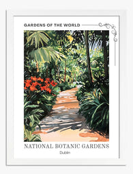
Poster sentiero nei giardini botanici di Dublino
Translation missing: it.products.product.sale_price A partire da CHF 16.00CHF 22.00 -

Tela mercato dei fiori di Dublino di Matisse
Translation missing: it.products.product.sale_price A partire da CHF 61.00CHF 87.00 -

Poster scena del mercato dei fiori di Dublino
Translation missing: it.products.product.sale_price A partire da CHF 16.00CHF 22.00 -
Poster sentiero rigoglioso di Dublino
Translation missing: it.products.product.sale_price A partire da CHF 16.00CHF 22.00 -

Tela oasi lussureggiante dei giardini botanici nazionali di Dublino
Translation missing: it.products.product.sale_price A partire da CHF 61.00CHF 87.00 -

Poster giardini botanici nazionali di Dublino
Translation missing: it.products.product.sale_price A partire da CHF 16.00CHF 22.00 -

Poster mercato dei fiori di Dublino di Matisse
Translation missing: it.products.product.sale_price A partire da CHF 16.00CHF 22.00 -

Poster giardini botanici nazionali di Dublino
Translation missing: it.products.product.sale_price A partire da CHF 16.00CHF 22.00 -

Tela oasi lussureggiante di Dublino
Translation missing: it.products.product.sale_price A partire da CHF 61.00CHF 87.00 -
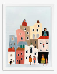
Poster città in pastello con piccole figure
Translation missing: it.products.product.sale_price A partire da CHF 16.00CHF 22.00 -

Poster serata in un pub di Londra
Translation missing: it.products.product.sale_price A partire da CHF 16.00CHF 22.00 -

Tela pub animato di Londra
Translation missing: it.products.product.sale_price A partire da CHF 61.00CHF 87.00 -

Tela vista di Parc Güell, Barcellona
Translation missing: it.products.product.sale_price A partire da CHF 61.00CHF 87.00 -

Poster scena festiva in città
Translation missing: it.products.product.sale_price A partire da CHF 16.00CHF 22.00 -

Tela Barcellona a blocchi di colore
Translation missing: it.products.product.sale_price A partire da CHF 61.00CHF 87.00 -

Tela il fascino della Barcellona di Gaudí
Translation missing: it.products.product.sale_price A partire da CHF 61.00CHF 87.00 -

Poster passeggiata per le strade di Londra
Translation missing: it.products.product.sale_price A partire da CHF 16.00CHF 22.00


Di più da The Frame

How to Build a Mediterranean Gallery Wall That ...
A Mediterranean gallery wall isn't just coastal art with extra blue. It's a specific balance of sun-bleached architecture, terracotta warmth, and that particular quality of light you only get on...

How to Create a Coastal Gallery Wall That Doesn...
You love the look on Pinterest. You've saved forty seascape prints. Then you stand in front of your wall holding a tape measure and a hammer, and your brain goes...

How to Create a Gallery Wall That Looks Intenti...
You've seen a hundred gorgeous gallery walls saved to a Pinterest board. The gap between those images and your actual blank wall is execution, and execution is just measurements, spacing,...