Matching Prints for Your Bedroom: Sets That Make the Room Feel Finished
The case for coordinated pairs over single statement pieces, plus the sizing rule that takes the guesswork out.

You've been in the house six months. The lounge is sorted, the kitchen has its rhythm, and the bedroom walls are still completely bare. The reason is almost always the same: too many choices, no obvious starting point, and a quiet fear of getting it wrong in the room you'll wake up in every single day.
Matching sets solve this. They're pre-coordinated, they create instant symmetry, and they remove about 80% of the decisions that keep people stuck. Here's how to choose them well.
Above the bed: why a set of 2 in matching frames beats a single oversized print
The default advice is to hang one big piece above the bed. It works, but it rarely looks finished. A single print floats. It announces itself, demands to be the focal point, and if the proportions are slightly off, the whole wall feels lopsided.
A set of two in matching frames does something different. It mirrors the symmetry of the bed itself, the two pillows, the two bedside tables, the two lamps. The repetition is calming before you've even looked at the subject matter. Hotels figured this out years ago, which is why almost every good hotel room you've ever stayed in had paired art above the headboard rather than one giant canvas.
There's a practical argument too. Two smaller prints are easier to hang straight, easier to swap individually if you change your mind, and easier to ship without damage. One enormous frame is a logistical event. Two medium ones are a Tuesday evening.

The 2/3 rule applied: sizing your set to your headboard width
The single most useful sizing rule for bedroom art: the total width of your art arrangement should be roughly two-thirds the width of your headboard or bed.
A standard UK double bed is 135cm wide. Two-thirds of that is 90cm. So your two prints, plus the gap between them, should add up to around 90cm of horizontal space. Two 40x50cm prints with a 5cm gap give you 85cm. Pretty much perfect.
For a king (150cm), aim for 100cm of total width. Two 50x70cm prints with a 5cm gap land at 105cm, which sits beautifully. For a super king (180cm), go bigger again: two 60x80cm prints with a 6cm gap will give you 126cm, slightly over two-thirds but still in the sweet spot.
Keep the gap between frames tight. Three to six centimetres is the range. Any wider and the two prints stop reading as a pair and start looking like two unrelated pieces awkwardly sharing a wall. Hang the centre of the arrangement around 15 to 20cm above the headboard. Higher than that and the art starts to feel disconnected from the bed.
One more thing on orientation: above a bed, matching portrait or matching landscape almost always beats mixed. Two portraits feel formal and architectural. Two landscapes feel restful and horizontal, which is exactly the mood you want in a bedroom. Mixing one of each creates visual tension that fights the room.
Subjects that work in bedrooms (and the ones that don't)
Bedrooms are for winding down. The art on the walls should agree with that brief. Some subjects work almost universally well in sleep spaces:
- Botanicals and pressed flowers. Soft, organic, never confrontational. A pair of muted floral prints is the closest thing to a default-good choice for bedrooms.
- Landscapes with horizon lines. Coastlines, misty hills, open fields. The horizontal composition is inherently restful. Your eye relaxes into them.
- Abstract washes in tonal palettes. Not chaotic abstraction. Soft, watercolour-like compositions with two or three colours blending gently.
- Architectural line drawings. Single-line sketches, soft pencil studies, quiet still lifes. Minimal information, plenty of breathing room.
- Black and white photography. Especially nature: birch trees, calm seas, soft fog. The lack of colour is itself a calming choice.
The subjects to avoid are mostly obvious once you say them out loud. Anything kinetic, loud, or emotionally heavy doesn't belong in a room you're trying to sleep in. That means:
- High-contrast graphic posters with big text or slogans.
- Bright pop art and anything aggressively saturated.
- Portraits with direct eye contact (genuinely unsettling at 3am, ask anyone who's tried it).
- Busy abstracts with hard angles and clashing colours.
- Anything horror-adjacent or melancholic, even if you love it. Save it for the hallway.
The test is simple. Look at the print and ask yourself if you'd want it to be the first thing you see at 7am. If the answer is "it might wake me up a bit too fast," it's wrong for the bedroom.
Colour psychology for the bedroom: soft, tonal, and deliberately quiet
Bedrooms are the one room where we'd argue strongly against bold colour choices on the walls. Not because bold is bad, but because your eyes need somewhere to rest, and you've got fewer hours of conscious time in this room than anywhere else in the house.
The palettes that consistently work:
- Warm neutrals. Oat, putty, mushroom, oatmilk, soft clay. These read as sophisticated rather than bland.
- Sage and eucalyptus greens. Calming, slightly herbal, work with almost any bedding.
- Dusty blues. Think sea-fog, chambray, soft denim. Cool without feeling cold.
- Blush and terracotta, used sparingly. A small amount of warm pink in an otherwise neutral print adds depth without shouting.
- Charcoal and ink. Black and white prints with soft mid-tones are surprisingly restful.
What to actively avoid: energising reds, bright oranges, electric yellows, and fluorescent anything. These colours raise alertness, which is the opposite of what you're going for. Even if your bedding is white and you think a pop of red would be "fun," your nervous system will disagree with you at bedtime.
Should bedroom art match bedding? Not exactly. Matching tone-for-tone usually looks try-hard. Aim for art that sits in the same family as your bedding without being identical. If your duvet is warm white with sage piping, your art can lean into sage greens and warm neutrals without being a direct colour match. Tonal harmony, not literal matching.

Bedside symmetry: using a pair of small prints to frame your bed like a hotel
Above-bed art gets all the attention, but the wall space above your bedside tables is genuinely underused. A small print above each nightstand, in matching frames, transforms the bed area from "a bed with art above it" to "a designed sleep space."
The sizing here is governed by the lamp and the nightstand, not the bed. A small print, 30x40cm or 21x30cm, sits proportionally right above most bedside lamps. Hang it so the bottom of the frame is roughly 20 to 30cm above the top of the lamp. Any closer and the lamp will look like it's bumping into the art. Any further and they stop relating to each other.
The trick to making this work is restraint. The bedside prints should feel like quieter cousins of the prints above the bed, not competitors. If you've got bold botanicals above the bed, your bedside pair could be a simpler line drawing or a soft monochrome study in the same colour family.
You can also use the bedside walls as the only art in a bedroom, skipping the headboard wall entirely. Two small prints flanking the bed, no art above the headboard. It's a confident, slightly unexpected look that works particularly well in bedrooms with statement headboards or panelled walls where the headboard is already doing the visual work.
Dressing area groupings
If you've got a dressing table, vanity, or chest of drawers in the bedroom, that's a third opportunity for a coordinated grouping. The rules shift slightly here because the furniture is shorter and you're often looking at the art while sitting down.
A pair of portrait prints, 30x40cm or 40x50cm, hung above a chest of drawers works beautifully. Two-thirds the width of the furniture, same sizing principle as above the bed. If the chest is 100cm wide, your art arrangement should land around 66cm of total width.
A trio also works in this spot if the wall is wide enough. Three smaller prints (21x30cm each), evenly spaced, give a slightly more curated, gallery-like feel. This is the only spot in the bedroom where we'd recommend three pieces over two. Above the bed, three almost always feels busy.
Pull from the same colour family and subject world as your above-bed set, but don't repeat the exact same prints. The goal is a room that feels considered, not themed.
Our favourite bedroom print sets right now
A few combinations we keep coming back to:
The botanical pair. Two pressed-flower studies in warm white frames, hung above a linen-upholstered headboard. Works in almost any bedroom and ages well. Our floral prints collection is the easiest place to start.
The coastal landscape duo. Two soft, horizon-line seascapes in matching oak frames. The horizontal composition pulls the eye sideways rather than up, which is deeply restful at the end of a long day.
The tonal abstract. Two soft watercolour abstracts in a palette of oat, dusty pink, and chalk. Quiet, slightly painterly, no hard edges. The kind of art that doesn't ask anything of you.
The line-drawing pair. Two minimalist nudes or single-line botanicals in slim black frames. Confident without being loud. Particularly good in bedrooms with white or pale grey walls. Browse minimalist art prints for this look.
The architectural diptych. Two soft black-and-white photographs of architectural details, arched doorways, vaulted ceilings, columns. Sophisticated without being cold.
When you're choosing, we'd point you towards wall art sets curated specifically as pairs. The work of coordinating two prints that genuinely belong together is the part most people get wrong, and a pre-coordinated set takes that decision off your plate entirely.

Why print quality matters more in a room you see first thing every morning
Here's the thing nobody talks about. The bedroom is the room you look at while you're at your most vulnerable, half-asleep, eyes adjusting, no distractions. Cheap art looks worse here than anywhere else in the house.
We're talking about the obvious failures: thin glossy paper that catches the morning light wrong, prints that have shifted in their frames during shipping, colours that look flat in person after looking vibrant on screen, and the giveaway warping that happens when a print isn't mounted properly inside its frame.
A few things worth getting right:
- Matte paper, not glossy. Glare from a bedroom window or bedside lamp will ruin a glossy print. Matte paper absorbs light and keeps the colour true at every angle. Our prints use a thick matte giclée paper specifically for this reason.
- A frame that arrives properly fitted. This is where the biggest failures in the category happen. Prints shipped separately from frames, prints not fitted flush, frames that warp in transit. A framed print should arrive in one box, properly mounted, ready to hang, no assembly required.
- Real wood frames, not MDF or veneer. MDF frames look fine for about six months and then start to show. Solid FSC-certified wood ages well and matches the rest of the furniture you've spent money on.
- UV protection if your bedroom gets direct sun. Morning light coming through a south-facing window will fade a cheap print within a year. Look for UV-protective glazing.
Frame finish matters in bedrooms too. Warm woods like oak and walnut soften the room. Black frames add definition and work brilliantly with grey, white, and sage palettes. We'd steer away from polished metallics and high-gloss frames in bedrooms. They reflect too much light and feel more suited to formal living spaces.
Spend slightly more on bedroom art than you think you need to. It's the room you see for the longest stretch of unbroken time every day, often in soft, revealing light. A print that looks "fine" in a hallway will start to bother you above your bed within weeks.

Where to start if you're still stuck
If you're staring at blank walls and you've got decision fatigue, here's the shortest possible path: pick a pre-coordinated pair of landscape-orientation prints, 40x50cm each, in matching oak or black frames, hung 15cm above your headboard with 5cm between them. That's it. Done. You can refine later.
The hard part of bedroom art isn't picking the perfect piece. It's getting something good enough on the wall so you can finally stop walking past blank plaster every morning. Browse bedroom wall art when you're ready, start with a pair, and let the rest of the room follow.

Prodotti Fab presentati in questo blog
-

Tela letto moderno dall’alto arancione e blu
Translation missing: it.products.product.sale_price A partire da €64,95€92,95 -

Poster letto minimalista arancione e blu
Translation missing: it.products.product.sale_price A partire da €16,95€23,95 -

Tela letto scompigliato minimalista blu e arancio
Translation missing: it.products.product.sale_price A partire da €64,95€92,95 -

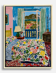
Poster camera con vista ispirato a Matisse
Translation missing: it.products.product.sale_price A partire da €16,95€23,95 -

Poster rifugio sereno ispirato a Matisse
Translation missing: it.products.product.sale_price A partire da €16,95€23,95 -

Poster rifugio accogliente in stile Matisse
Translation missing: it.products.product.sale_price A partire da €16,95€23,95 -

Poster letto a righe moderno con cuscino arancione
Translation missing: it.products.product.sale_price A partire da €16,95€23,95 -

Tela vista di camera da letto ispirata a Matisse
Translation missing: it.products.product.sale_price A partire da €64,95€92,95 -

Tela rituali di casa
Translation missing: it.products.product.sale_price A partire da €64,95€92,95 -
Tela floreale ispirata a Matisse per la camera da letto
Translation missing: it.products.product.sale_price A partire da €64,95€92,95 -

Tela righe blu e cuscini colorati, mattina accogliente
Translation missing: it.products.product.sale_price A partire da €64,95€92,95 -

Poster rifugio soleggiato ispirato a Matisse
Translation missing: it.products.product.sale_price A partire da €16,95€23,95 -

Poster romantico coppia perfetta con scatola di fiammiferi
Translation missing: it.products.product.sale_price A partire da €16,95€23,95 -

Tela rituali serali di relax
Translation missing: it.products.product.sale_price A partire da €64,95€92,95 -

Tela astratta bianco e nero con motivi fluidi
Translation missing: it.products.product.sale_price A partire da €64,95€92,95 -

Poster la camera da letto di Van Gogh
Translation missing: it.products.product.sale_price A partire da €16,95€23,95 -

Poster ispirato a Matisse: rifugio di colori
Translation missing: it.products.product.sale_price A partire da €16,95€23,95 -

Poster ritratto avvolto nella calma
Translation missing: it.products.product.sale_price A partire da €16,95€23,95 -

Poster piccoli piaceri quotidiani
Translation missing: it.products.product.sale_price A partire da €16,95€23,95 -

Poster fantasmi Matisse per la camera da letto
Translation missing: it.products.product.sale_price A partire da €16,95€23,95


Di più da The Frame

You're Overthinking Your Colourful Gallery Wall
Most colourful gallery walls fail for the same reason: every print is shouting. You don't need ten bold pieces fighting each other, you need one or two that carry the...

Creating a Gallery Wall with Matisse Prints: Si...
Matisse's cut-outs are the rare bit of art history that works as hard in a modern flat as it does in a museum. The shapes are bold, the palettes are...

Why Do Most London Gallery Walls Look Like Tour...
A red phone box. A Beefeater. Big Ben in cartoon watercolour. You've seen this wall a hundred times, and it never looks like someone actually lives there. The good news...