Stop Hanging Sketch Prints Like Regular Art: A Better Display Method
Most sketch prints disappear into the wall. Here is how to make yours hold the room instead.

The number one mistake people make with sketch art
You hang a small, thinly framed sketch on a pale wall and step back expecting magic. Instead, the print vanishes. The linework dissolves into the paint, the frame looks apologetic, and the whole thing reads as an afterthought rather than art.
This is the defining problem with sketch art and almost nobody talks about it. Sketches are low contrast by nature: pale paper, fine graphite or ink lines, generous negative space. They are quiet pieces. Hung the way you would hang a bold abstract or a saturated landscape, they get steamrolled by the room around them.
The fix is not a better sketch. It is a completely different display strategy, built around three ideas: give the print physical weight through framing, give it visual separation through wall colour, and give it company through clustering. Treat sketch art like the delicate thing it is, and it stops disappearing.

Why framing quality matters more for sketch prints than almost any other art style
A bold oil painting can survive a bad frame. The colour and composition do the heavy lifting and the eye reads the art before it reads the edge. Sketch art has no such buffer. The frame is part of the composition because the print itself sits so close to the wall in tone and value.
A thin, flimsy frame on a sketch reads as cheap regardless of the print's quality. There is nothing for it to push against. You need substance: moulding that is at least 2 to 3cm wide, with real depth, made from solid wood rather than wrapped MDF or veneer. Solid timber sits differently on a wall. It casts a small, real shadow and gives the print a perimeter the eye can land on.
Frame colour for low-contrast art
For black and white sketch prints, the safest opinionated choice is a deep frame: matte black, dark walnut, or smoked oak. These give you instant separation from almost any wall colour and add the visual weight the linework cannot supply on its own. Natural light oak works beautifully too, but only on walls with enough colour to hold their own (think clay, sage, ink blue). On a white wall, light oak plus a pale sketch is a recipe for nothing.
White and off-white frames can work, but only if you commit to a wide, deep moulding and a generous mat. A skinny white frame on a white wall around a pale sketch is the worst possible combination. Three layers of pale, no anchor.
Mats: width, colour temperature, and why they matter
Mats do two jobs for sketch prints. They create breathing room around delicate linework and they extend the visual footprint of the piece. A 5 to 8cm mat around a sketch transforms it from a postcard on the wall into an actual statement.
Colour temperature on the mat is the detail most people miss. Bright optical white mats can make a warm graphite sketch look dingy by comparison. A warm white or soft ivory mat keeps the paper of the print looking intentional rather than dirty. For ink sketches with true black lines, a cooler white reads cleaner. Match the mat temperature to the linework, not to the wall.
The other reason framing matters so much here is structural. Sketch art is unforgiving of poor fitting. Bubbled prints, off-centre mats, frames that arrive separately and need DIY assembly, all of this is visible immediately on a low-contrast piece because there is nothing else to distract you. This is where Fab's approach helps: the print and frame ship together, fitted properly, with solid FSC wood and UV-protective acrylic glaze rather than glass. No warping, no fiddling, no surprise gaps along the mat edge.
Wall colour pairings: which backgrounds make sketch art sing
If your walls are stark cool white, sketch art will struggle. This is the hardest truth in the whole guide. Builder's white, magnolia, and cool greys are the worst possible backdrops for low-contrast monochrome work because they sit in the same value range as the print itself.
Colours that work
Warm whites and creams. Think slightly yellow, slightly pink, slightly mushroom. These give just enough warmth to throw the cool tones of a graphite sketch into relief without competing for attention.
Deep, saturated colours. Ink blue, forest green, oxblood, charcoal. Counterintuitively, sketch art often performs best on dark walls. The pale paper glows, the linework reads as graphic rather than faint, and the contrast does the work your framing was trying to do.
Earthy mid-tones. Clay, terracotta, olive, putty. These warm, slightly chalky shades flatter the natural paper tones of giclée prints and give sketch art a Mediterranean, gallery-like quality.
Textured surfaces. Limewash, lime plaster, exposed brick, even hessian-textured wallpaper. Texture creates micro-shadow that sketch art reads against beautifully. If you cannot repaint, a textured wall finish is a clever cheat.
Colours to avoid
Cool grey is the silent killer of sketch prints. So is bright bluish white. So is any pale neutral with a green undertone. If your walls are one of these and you cannot change them, you must compensate with heavier framing, deeper mats, and clustering rather than single pieces.

Single statement piece vs gallery wall: choosing the right approach
Here is where sketch art breaks the rules of every general art hanging guide you have read. The standard advice (one big piece above the sofa, hung at 145cm centre height, done) often fails with sketches. A single small or medium sketch print floating in the middle of a large wall almost always underwhelms.
You have two real options. Go genuinely large, or go in a group. Middle-sized solo sketches are the trap.
When a single statement piece works
A solo sketch can carry a wall if the print is large (think 70x100cm framed), the frame is substantial, the mat is generous, and the wall behind it has either colour or texture. A large architectural line drawing in a deep walnut frame on a clay wall above a console table can absolutely hold its own. The piece has to earn its solitude through scale.
When to cluster
For anything smaller, or for any wall larger than about 1.5m wide, clustering is almost always the better answer. This is the rule sketch art rewrites: bold paintings can be soloists, sketches are usually a chorus. A group of three to five sketch art prints creates the critical mass that a single piece cannot.
Building a sketch art gallery wall: the 3-5 print rule
Two prints look like you ran out of ideas. Six or more starts looking busy on monochrome work. Three to five is the sweet spot for sketch art specifically, and it works for a clear reason: you need enough density to register as intentional, but not so much that the delicacy of the linework gets lost in clutter.
Composition strategies that work
The grid. Four matching prints in identical frames, hung in a 2x2 with consistent spacing of around 5cm. Best for portrait studies, botanical sketches, or any series with a shared subject. Clean, deliberate, very hard to get wrong.
The asymmetric cluster. Three to five prints in varying sizes, hung in a loose composition around an invisible centre line. One larger anchor piece, smaller pieces around it. This works beautifully for mixed-subject sketch collections (a figure study, a landscape sketch, an architectural drawing) because the variety in scale mimics the variety in content.
The horizontal line-up. Three to five same-size prints in matching frames, hung in a row at consistent height. Excellent above a long sofa or a sideboard. Reads as a single horizontal statement rather than separate pieces.
Should the frames match?
For sketch gallery walls, frame uniformity helps more than it hurts. Bold colourful art can survive mismatched frames because the art itself provides the variety. Sketches need the frames to act as a unified visual structure so the eye treats the group as one composition. Same frame, same mat width, same mat colour. Vary the print, not the framing.
If you want some variation, vary frame thickness rather than colour. A slightly chunkier frame on the anchor piece, matching slimmer frames on the supporting pieces, all in the same finish. That gives hierarchy without chaos.
Pre-curated wall art sets take a lot of the guesswork out of this. The pieces are designed to hang together, the frames match, and you skip the part where you spend three weeks trying to find a fourth print that "goes with" the others.

Lighting sketch art without glare or washout
Sketch art is harder to light than colourful work. Too little light and the fine linework disappears. Too much direct light and you get glare bouncing off the glazing, washing out the very details you wanted to highlight.
What works
Soft, indirect daylight from the side. Natural light from a window perpendicular to the artwork is the gentlest illumination you can give a sketch. It picks out the linework without flattening it.
Wall washers or picture lights set to warm white. Around 2700K to 3000K. Cool light makes graphite look grey and dead. Warm light brings out the natural paper tones.
Diffuse ambient lighting. A floor lamp with a fabric shade nearby will often light a sketch better than a dedicated picture light. The diffusion prevents hotspots and glare.
What to avoid
Direct downlighters mounted in the ceiling pointing straight at the artwork. These create reflections off the glazing and harsh shadows in the frame moulding. Equally, never light sketch art with a single bright spotlight from one angle. You will see the light source reflected back at you from any flat glazed surface.
The glass versus acrylic question
For sketch art specifically, acrylic glazing is the better choice and not for the obvious reasons. Yes, it is lighter and harder to break, but the real advantage is optical: good UV-protective acrylic has less greenish tint than standard glass, which keeps your blacks looking properly black and your paper looking properly warm. It also handles light more forgivingly, with fewer harsh reflections.
The one trade-off is that acrylic can build static, which historically was an issue with charcoal and pastel originals. For giclée-printed sketches on matte paper this is a non-issue because nothing is going to lift off the surface. Fab's framed prints use UV-protective acrylic precisely for this reason: better optics, lighter weight, no fading even in direct sunlight.
Mixing sketch prints with other art styles on the same wall
You do not have to commit to an all-sketch wall. Some of the best gallery walls mix monochrome line work with one or two carefully chosen pieces in other styles. The trick is restraint.
What to mix in
Black and white photography. The shared monochrome palette ties everything together. A grainy travel photograph next to an architectural sketch reads as a curated collection rather than a clash.
Abstract pieces in muted earth tones. A single ochre or terracotta abstract among three sketches gives the eye somewhere to rest and stops the wall feeling clinical.
Typography and text-based prints. Especially in black ink on cream paper. These read as siblings to sketch work rather than competitors.
What to keep off the wall
Anything highly saturated or photographically realistic in colour will dominate. A bright travel poster among sketches turns the sketches into wallpaper for the poster. Bold florals, vibrant abstracts, and high-colour portraits all overpower sketch work in a mixed grouping. If you want to use them, put them on a different wall.
This is also why minimalist art prints pair so well with sketches in mixed displays. They share the same restrained palette and visual quietness, so neither piece has to fight for attention.

A final word on getting it right
Sketch art rewards thoughtful display more than almost any other style. The pieces themselves are quiet, so every choice around them (frame substance, mat width, wall colour, lighting angle, neighbouring pieces) does real work. Get those right and a modest sketch print becomes a focal point. Get them wrong and even a beautiful drawing disappears.
If you take one thing from this guide: give your sketch art more weight than you think it needs. Heavier frames, wider mats, warmer walls, more pieces grouped together. Sketch art does not get loud on its own. You build the volume around it.

Prodotti Fab presentati in questo blog
-
Poster ritratto riflesso a righe
Translation missing: it.products.product.sale_price A partire da €16,95€23,95 -

Poster disegno di uccello nero di Hokusai
Translation missing: it.products.product.sale_price A partire da €16,95€23,95 -

Poster profilo in bianco e nero
Translation missing: it.products.product.sale_price A partire da €16,95€23,95 -

Poster sciatori e ombre sulla neve in bianco e nero
Translation missing: it.products.product.sale_price A partire da €16,95€23,95 -

Poster ritratto moderno a righe
Translation missing: it.products.product.sale_price A partire da €16,95€23,95 -

Poster après-ski disegnato a mano
Translation missing: it.products.product.sale_price A partire da €16,95€23,95 -

Tela sciatore minimalista in bianco e nero
Translation missing: it.products.product.sale_price A partire da €64,95€92,95 -
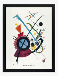
Poster linea viola di Kandinsky
Translation missing: it.products.product.sale_price A partire da €16,95€23,95 -
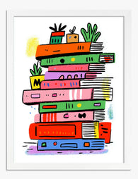
Poster pila di libri arcobaleno
Translation missing: it.products.product.sale_price A partire da €16,95€23,95 -

Poster ispirato a Kandinsky piccoli mondi IX
Translation missing: it.products.product.sale_price A partire da €16,95€23,95 -

Poster rami d’albero in bianco e nero
Translation missing: it.products.product.sale_price A partire da €16,95€23,95 -

Poster piccoli mondi IX di Kandinsky
Translation missing: it.products.product.sale_price A partire da €16,95€23,95 -

Poster monocromo con forme curve
Translation missing: it.products.product.sale_price A partire da €16,95€23,95 -

Poster minimal in bianco e nero equilibrio armonioso
Translation missing: it.products.product.sale_price A partire da €16,95€23,95 -

Poster calcio vintage a schizzi colorati
Translation missing: it.products.product.sale_price A partire da €16,95€23,95 -

Poster cavallo, disegno a inchiostro di Hokusai
Translation missing: it.products.product.sale_price A partire da €16,95€23,95 -

Poster astratto bianco e nero a motivo ipnotico
Translation missing: it.products.product.sale_price A partire da €16,95€23,95 -

Poster sci rosa in stile pop
Translation missing: it.products.product.sale_price A partire da €16,95€23,95


Di più da The Frame

Every Flower in William Morris's World: A Guide...
William Morris designed roughly 50 wallpapers and around 30 chintzes across his career, and almost every single one features a plant. If you've ever stood in front of a Morris...

What Colours Go With Bouquet Prints? Pairings I...
You've found a bouquet print you love. Now you need to know if it will actually work above your sofa, opposite that mustard armchair, next to the curtains you spent...

Boho Sun Wall Art: How to Nail the Look Without...
Boho sun art has a reputation problem. Done badly, it screams student halls and macramé overload. Done well, it's one of the warmest, most grounding aesthetics you can put on...