How to Decorate with Butterfly Art (Without Your Home Looking Like a Gift Shop)
A grown-up guide to butterfly prints, from frame choices to gallery walls, with zero plastic decals in sight.

Butterfly art has a reputation problem. Done badly it reads as a child's bedroom or a National Trust gift shop circa 2003. Done well it's one of the most quietly sophisticated subjects you can hang on a wall, with a long lineage in scientific illustration, Victorian naturalism, and contemporary minimalism.
This guide is about doing it well.
Why butterfly art works in almost any room (when you get it right)
Butterflies sit at the intersection of two things interior designers rely on heavily: organic form and saturated colour. The wing patterns are essentially natural geometry, which is why they read as graphic and modern when framed cleanly, and why they've appeared in serious art and design for centuries.
They also do something most nature subjects can't: they bring colour without bringing chaos. A single Blue Morpho print can throw an electric jolt of cobalt into an otherwise neutral room. A muted moth study can warm up a cold north-facing space without competing with anything.
The trick is treating butterflies like you'd treat any other serious subject. You wouldn't hang a poorly framed landscape, and you wouldn't pile twelve mismatched portraits onto one wall. The same standards apply here.

The one rule: pick a style and commit to it
If you take one thing from this article, take this. Butterfly art comes in three broad styles, and mixing them is what makes a room look incoherent.
Vintage botanical and naturalist
Think Victorian specimen plates, hand-tinted Lepidoptera illustrations, French naturalist studies with Latin labels. These prints are warm, slightly aged in palette, and feel scholarly. They suit older homes, panelled rooms, libraries, studies, and anywhere with antique or mid-century furniture. They look exceptional grouped in sets of three or six, mimicking the layout of a museum drawer.
Modern and minimalist
Single butterflies isolated on flat backgrounds. Often monochrome, often oversized, often abstracted into pattern or silhouette. This style works in newer builds, white-walled flats, and rooms with clean-lined furniture. The composition does the heavy lifting, so scale matters more than detail here.
Photographic and macro
High-resolution close-ups of wings, eyespots, or full insects against dark or pale backgrounds. These feel contemporary and gallery-like, and they're the most flexible of the three. They sit comfortably alongside abstract art, photography, and modern furniture.
The mistake is mixing all three on the same wall. A vintage specimen plate next to a graphic minimalist butterfly next to a macro photograph looks like you couldn't decide. Pick a lane.
Size and placement: what goes where
The single most common butterfly art mistake, after the 3D decal disaster we'll get to later, is going too small. A 30x40cm print floating alone above a three-seater sofa looks like an afterthought. Butterflies are small subjects, which makes people instinctively choose small prints. Resist this.
Living rooms
Above a sofa, you want art that spans roughly two-thirds of the furniture's width. For a standard three-seater that's around 120-140cm of art, which means either one statement piece at 70x100cm or 100x70cm, a diptych or triptych, or a tight gallery grouping.
A single oversized butterfly on canvas, hung centrally, is one of the most effective looks here. Canvas works particularly well for living rooms because it has presence without the weight or formality of a large frame. Our butterfly art prints go up to 70x100cm framed and 100x150cm on canvas, which is the scale you actually need for a main wall.
Hang the centre of the artwork around 145-150cm from the floor, or roughly 20cm above the back of the sofa. Lower than that and it floats. Higher and it disconnects.
Bedrooms
Above the bed is where butterfly art shines, because the subject is calm and the symbolism (transformation, lightness) suits the room. Go wide rather than tall. A pair of 50x70cm prints or a horizontal triptych above a king-size headboard reads as considered.
Avoid anything too saturated directly above where you sleep. Muted vintage palettes, sepia-toned naturalist plates, or monochrome studies work better than electric tropicals here.
Hallways and staircases
Hallways are the perfect home for specimen-style butterfly sets. The narrow space and repeated pacing rhythm of a corridor mimics the way you'd view a museum vitrine. Six or nine matched prints in identical frames, hung in a precise grid, transforms a dead corridor into something that looks deliberately curated.

Framing choices that elevate butterfly prints from poster to art
Framing is where most butterfly art lives or dies. The same print can look like £15 of dorm room décor or like something pulled from an estate sale, depending entirely on how it's framed.
Mat vs no mat
A wide white mat (4-6cm border) signals "this matters." It mimics museum and gallery presentation, gives the eye breathing room, and immediately reads as more expensive. For vintage botanical and specimen-style prints, always go with a mat.
For modern and minimalist butterflies, you can skip the mat. The print itself is the composition, and a mat can dilute the impact. A clean, narrow frame edge-to-edge often looks sharper.
Frame width and finish
Slim frames (1-2cm) suit modern prints and gallery walls where you want the art to dominate. Wider frames (3-5cm) suit single statement pieces and traditional interiors.
For finish, your three reliable options are matte black, natural oak, and warm walnut. Black anchors colourful prints and works in modern rooms. Oak softens everything and works almost everywhere. Walnut suits warmer palettes and traditional spaces. Avoid gold unless your whole room commits to it, and avoid anything described as "rustic" or "distressed."
Glass vs acrylic
This matters more than people realise. Standard glass causes glare and reflects everything in the room, which is particularly bad for detailed subjects like butterfly wings where the patterning gets lost. UV-protective acrylic, which is what we use on our framed prints, eliminates glare and prevents fading even if you hang the piece in direct sunlight. Butterfly prints often sit in bright rooms (they suit conservatories, garden-facing lounges, sunny bedrooms), so fade protection matters.
The other framing point worth making: a print and frame should arrive together, properly fitted, with no warping or bubbling. Buying a print one place and a frame another is how you end up with sagging paper and misaligned mats six months later.
Colour palette pairing
Butterflies bring colour. Your job is to decide whether that colour answers your room or argues with it.
Two reliable approaches
Complementary means picking butterflies whose dominant colour sits opposite your room's main palette on the colour wheel. A burnt orange Monarch in a deep blue or teal room. A yellow swallowtail against a charcoal wall. This creates contrast and energy.
Analogous means picking butterflies whose colours sit next to your room's palette. A muted sage Luna moth in a room with olive and cream. A dusty pink butterfly in a bedroom with terracotta and warm white. This creates harmony.
Both work. Mixing them on the same wall doesn't.
Neutral butterflies for bold rooms
If your walls are already painted a strong colour (think Farrow & Ball Hague Blue, deep forest green, oxblood), don't fight them with saturated butterfly prints. Go monochrome. Black-and-white naturalist plates, sepia-toned vintage specimens, or graphite illustrations let the wall colour do the work and the art reads as restrained rather than competing.
Colourful butterflies for neutral spaces
The opposite is also true. White, off-white, greige, and pale linen rooms are exactly where saturated butterfly art belongs. A single Blue Morpho or a tropical species print becomes the focal point of an otherwise quiet room. This is the easiest way to add colour without committing to a feature wall.

Building a butterfly gallery wall that feels curated
Gallery walls are where butterfly art most often falls apart. The temptation is to gather everything you love and put it all up. Don't. Curation is subtraction.
Use odd numbers
Three, five, seven, or nine pieces. Even numbers tend to look like a chart rather than a composition. The exception is a precise grid (four, six, or nine in matched frames), which reads as intentional because the symmetry is doing the work.
Unify the frames
The fastest way to make a butterfly gallery wall look chaotic is mismatched framing. Pick one frame style and one mat colour and use it for every piece. The variety should come from the prints, not the frames. This is a non-negotiable rule.
Mix subjects, not styles
A gallery wall of nothing but butterflies can feel one-note. Mix in complementary nature subjects: pressed leaves, botanical illustrations, bird studies, mushroom plates, or other nature art. The butterflies should be a recurring motif, not the entire show. Aim for roughly half butterflies and half related botanicals or naturalist subjects.
Spacing
Keep 5-7cm between frames. Tighter than that and it reads as cramped. Wider and the wall loses cohesion. Lay everything out on the floor first, photograph it, adjust, then commit to the wall.
Common mistakes
3D butterfly wall decals
The biggest single reason butterfly decor looks childish. Plastic or paper butterflies stuck directly to the wall in a "swarm" pattern look cheap because they are cheap, and because they reference craft projects rather than art. There is no version of this that reads as grown-up. If you want the swarm effect, achieve it through a series of small framed prints arranged in a flight pattern, or a single large print depicting multiple butterflies. The framing is what does the work.
Mismatched frames on a gallery wall
Already covered, but worth repeating. Mixing a thin black frame, a thick gold frame, and a distressed white frame on the same wall guarantees the result looks like a junk shop. Pick one frame system and stick with it.
Going too small
A single A4 butterfly print on a large wall is the visual equivalent of mumbling. If you only want to spend on one print, spend it on size. A 70x100cm framed print or a 100x150cm canvas commands a room. A 30x40cm print on the same wall disappears.
Choosing pink, glittery, or "feminine" styling
Butterflies don't need to lean girly to look beautiful. The best butterfly wall art tends to be the most restrained: scientific specimen plates, monochrome studies, single-subject macro prints. Anything with sparkles, pastel ombré, or inspirational quotes overlaid is the fast track to gift shop territory.
Hanging it in the wrong room
Butterfly art suits bedrooms, lounges, hallways, studies, and bathrooms. It doesn't suit kitchens (steam and grease) or formal dining rooms (where the subject can feel lightweight). Match the seriousness of the framing to the seriousness of the room.

A final thought
Butterfly art has been hanging in serious homes, museums, and natural history collections for more than two hundred years. It only looks juvenile when it's treated juvenilely. Choose one style, frame it properly, hang it at the right scale, and the subject does the rest.
If you're starting from scratch, buy one large piece for your main room before you build a gallery wall. Live with it for a few weeks. The right print teaches you what else your home wants.

Prodotti Fab presentati in questo blog
-

Poster farfalla bianca tra i fiori
Translation missing: it.products.product.sale_price A partire da €16,95€23,95 -

Poster farfalle incantevoli di Klimt
Translation missing: it.products.product.sale_price A partire da €16,95€23,95 -

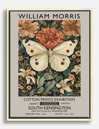
Poster farfalla con motivo floreale ispirato a William Morris
Translation missing: it.products.product.sale_price A partire da €16,95€23,95 -

Tela farfalla con motivi floreali ispirata a William Morris
Translation missing: it.products.product.sale_price A partire da €64,95€92,95 -

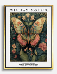
Poster farfalla di William Morris
Translation missing: it.products.product.sale_price A partire da €16,95€23,95 -

Poster farfalle Morris, eleganza botanica vintage
Translation missing: it.products.product.sale_price A partire da €16,95€23,95 -

Poster farfalla e fiori di William Morris
Translation missing: it.products.product.sale_price A partire da €16,95€23,95 -

Poster farfalla botanica Morris
Translation missing: it.products.product.sale_price A partire da €16,95€23,95 -
Tela farfalla di William Morris
Translation missing: it.products.product.sale_price A partire da €64,95€92,95 -

Tela con farfalla ispirata a William Morris
Translation missing: it.products.product.sale_price A partire da €64,95€92,95 -

Poster paesaggio dai colori vivaci di Gustav Klimt
Translation missing: it.products.product.sale_price A partire da €16,95€23,95 -

Tela farfalla autunnale di Morris
Translation missing: it.products.product.sale_price A partire da €64,95€92,95 -
Tela con farfalla in stile William Morris
Translation missing: it.products.product.sale_price A partire da €64,95€92,95 -

Poster botanico con farfalla Morris
Translation missing: it.products.product.sale_price A partire da €16,95€23,95 -

Poster eleganza delle farfalle di Morris
Translation missing: it.products.product.sale_price A partire da €16,95€23,95 -

Poster giardino floreale di Klimt
Translation missing: it.products.product.sale_price A partire da €16,95€23,95 -

Poster farfalle notturne di Gustav Klimt
Translation missing: it.products.product.sale_price A partire da €16,95€23,95 -

Tela farfalla e fiori ispirata a William Morris
Translation missing: it.products.product.sale_price A partire da €64,95€92,95 -

Tela parata di farfalle vintage
Translation missing: it.products.product.sale_price A partire da €64,95€92,95 -

Poster giardino di farfalle ispirato a William Morris
Translation missing: it.products.product.sale_price A partire da €16,95€23,95


Di più da The Frame

The Most Distinctive Art Print Styles Right Now...
Most art print guides confuse style with technique, listing lithography next to surrealism as if they're the same kind of thing. They're not. This article is about visual style, the...

The Gold Wall Art Edit: Our Curated Picks for E...
Gold art has a job to do. Done well, it warms a room, catches the light, and pulls a colour scheme together. Done badly, it looks like a hotel lobby...

7 Rules for Hanging Wall Art Prints That Look P...
Most art prints get hung too high, too small, and too far from anything else in the room. The good news: getting it right is more about a handful of...