Building a Gallery Wall Around a Rothko Print
How to anchor a gallery wall with a colour field print without letting it swallow the room.

Rothko prints are seductive and unforgiving in equal measure. Get the styling right and you have a gallery wall that feels like a small private museum. Get it wrong and you have visual mud, with the Rothko either drowning out everything else or sulking in the corner.
Why Rothko works as a gallery wall anchor (but not a background player)
Mark Rothko built his reputation on luminous floating rectangles of saturated colour. That same quality, the soft-edged glow that pulls you in close, is what makes rothko abstract prints such powerful gallery wall material. The eye lands on the Rothko first, then wanders.
The problem is that this gravitational pull does not switch off. A Rothko cannot be a quiet supporting piece in a gallery wall the way a botanical sketch or a black and white photograph can. Try to demote it and it will keep trying to be the main event, fighting the surrounding work and creating that low-level visual stress people often call "busy" without knowing why.
So the rule is simple. A Rothko earns its place as the anchor, the piece the whole arrangement orbits, or it does not belong in the gallery wall at all. Solo on a feature wall is also a perfectly good option, and often the better one for smaller rooms.

The golden rule: one Rothko as focal point, not three competing
The single most common mistake we see is people buying three or four Rothko-style prints and clustering them together. The logic feels sound. If you love the work, more must be better. In practice you get colour field chaos. Each print is shouting for attention and none of them wins.
Rothko's compositions are designed to be contemplated one at a time. Stack two side by side and the eye does not know whether to read them as a pair, a sequence, or a competition. The luminous quality that makes a single print mesmerising becomes overwhelming when multiplied.
One Rothko, sized generously, surrounded by quieter pieces. That is the formula. If you have your heart set on multiple Rothkos, hang them in different rooms and let each one breathe.
What "sized generously" actually means
For an anchor piece above a sideboard or sofa, you want the print to feel architectural. We would recommend 70x100cm as a minimum for a standard 1.8 metre sideboard, scaling up to 100x150cm on a canvas if the wall is taller than 2.4 metres. Smaller than 50x70cm and the print starts to look apologetic, and a hesitant Rothko is no Rothko at all.
The surrounding pieces should be noticeably smaller. Think 30x40cm or 40x50cm. The size differential is part of what tells the eye "this is the anchor, these are the supporting cast."
What to pair with Rothko: line art, minimal photography, and geometric prints
Rothko works best with art that does the opposite of what he does. His prints are all colour and atmosphere with no hard edges. So pair them with work that has hard edges and no atmosphere.
Single-line drawings and continuous line art. Faces, figures, or abstract loops in black ink on cream or white. They share Rothko's simplicity without competing for the colour palette. A 40x50cm line drawing next to a 70x100cm Rothko is a near-perfect balance.
Minimalist black and white photography. Architectural details, empty landscapes, a single tree, a long shadow. The monochrome palette pulls the eye through the gallery wall without trying to out-saturate the anchor piece.
Geometric and Bauhaus-inspired prints. Circles, grids, simple shape compositions in restrained palettes. These echo Rothko's flatness and structured composition while adding rhythm. You can browse minimalist art prints for the cleanest options here.
Typography prints, used sparingly. A single word or short phrase in a clean serif or sans serif can work, but only one in the arrangement. More than that and you tip into café wall territory.
The thread running through all of these is restraint. They are confident enough to share a wall with a Rothko without trying to upstage it.
What to avoid: clashing styles that kill the mood
A few categories of art reliably ruin a Rothko gallery wall.
Other large colour field works. Diebenkorn-style abstracts, Helen Frankenthaler-style washes, anything in the abstract expressionist family. They speak the same language as the Rothko, which sounds like it should be harmonious but actually creates a turf war.
Busy patterns and dense illustration. William Morris-style florals, intricate botanical plates, detailed architectural drawings, anything with high information density. The eye cannot rest. The Rothko's contemplative pull is fighting against a print that demands close reading, and both lose.
High-saturation, multi-colour prints. A Matisse cut-out style print in five primary colours next to a moody maroon and black Rothko is a wrestling match. If the Rothko is warm, the neighbours should be neutral. If the Rothko is cool, same rule.
Vintage travel posters and film posters. These are wonderful pieces of art on their own. Next to a Rothko they read as cluttered and commercial. The tonal mismatch is too severe.
Family photos in colour. Black and white can work, in the right frame. Colour family photos almost never sit well next to a Rothko. Keep them on a different wall.

A 5-piece layout that works above a console table or sideboard
This is the layout we keep returning to because it is forgiving, balanced, and works in dining rooms, hallways, and behind sofas with only minor adjustments. Assume a sideboard or console roughly 1.6 to 1.8 metres wide.
The anchor. One framed Rothko-style print at 60x80cm, hung centred above the sideboard. The bottom of the frame should sit 15 to 20cm above the surface of the sideboard. Any lower and it feels cramped, any higher and the gallery wall floats away from the furniture.
Top left. A 30x40cm line drawing or minimal portrait, hung so its top edge aligns roughly with the top edge of the Rothko, positioned about 5cm to the left of the Rothko's left edge.
Top right. A 30x40cm black and white photograph, mirroring the top left piece. Same top alignment, same 5cm gap from the Rothko.
Bottom left. A 24x30cm geometric print, hung directly below the top left piece with a 5cm vertical gap. Its left edge aligns with the left edge of the top left print.
Bottom right. A 24x30cm typography print or second photograph, mirroring the bottom left piece in the same way.
The result is a Rothko in the middle, framed by a small grid of four supporting pieces, two on each side. It reads as deliberate and architectural rather than scattered. If you want to swap in a wall art set for the four flankers, that is often the cleanest way to keep everything tonally aligned.
A note on spacing
Five centimetres between frames is our default. It feels generous without leaving gaps so large the pieces stop reading as a group. In tighter spaces, drop to 4cm. Never go to 3cm or below, the pieces start to look like they are about to collide.
Keeping frames consistent: why mismatched frames ruin the effect
If you take one piece of advice from this article, let it be this. The frames must match.
A Rothko in a chunky natural oak frame next to a line drawing in a thin black frame next to a photograph in a gold frame is the gallery wall equivalent of three different fonts on a wedding invitation. The content can be lovely and you still cannot stop looking at the inconsistency.
For Rothko-led gallery walls, we recommend two frame options.
Solid black wood, slim profile. This is the safest, most gallery-like option. It sharpens the colour field of the Rothko and treats every supporting piece with the same visual respect. Works in almost every room. Especially good with darker Rothko palettes (maroon, black, deep ochre).
Natural oak, slim profile. Warmer, more Scandinavian. Works best with lighter Rothko palettes (orange, soft yellow, dusty pink) and in rooms with a lot of wood furniture. Less formal than black.
Avoid white frames with Rothko. The high contrast between a white frame and a saturated colour field creates a visual halo that fights the print itself. Avoid ornate or wide frames. The Rothko's quiet power needs a thin, unobtrusive border.
This is also where the practical side of framing matters. Frames that arrive warped, or prints that bubble inside their frames, or fixtures you have to source yourself, will undermine even the best layout plan. Our framed prints arrive in one box with the print already fitted behind UV-protective acrylic, fixtures attached, ready to go up. The acrylic glaze is worth flagging here because Rothko's deep saturated colours are exactly the sort of pigments that fade quickly in direct sunlight under standard glass.

Colour-matching your gallery wall to the Rothko palette
Here is the step almost everyone skips, and it is the difference between a gallery wall that looks intentional and one that looks assembled.
Look at your Rothko print and identify two colours. Not "red" but the specific reds. A classic Rothko might give you a deep oxblood maroon and a soft burnt orange. Another might give you cobalt blue and dusty grey. Whatever they are, write them down.
Now every supporting piece in the gallery wall should contain at least one of those two colours, even if only as a small accent. The line drawing has a tiny patch of burnt orange. The geometric print includes maroon as one of its shapes. The photograph is a black and white landscape, which is neutral and therefore always safe.
This single rule is what makes a gallery wall feel curated rather than collected. The eye reads the repetition of colour as deliberate composition, even if it cannot consciously identify why.
Pulling the palette into the room
The same logic extends beyond the wall. A cushion in the Rothko's secondary colour on the sofa below. A ceramic vase on the sideboard in a related tone. A throw on a nearby armchair. You are not redecorating the entire room around the print, you are placing three or four small echoes that tie the gallery wall into the space.
Done well, the Rothko stops being a piece of art on a wall and becomes the colour key for the whole room. This is also why we suggest treating your Rothko choice as the first decision, not the last. Browse abstract art prints with the specific room in mind, not as standalone objects.

Lighting, the quiet variable
A quick note before we wrap up. Rothko prints are luminous in person partly because they are designed to interact with light. Hang one in a dim corner with no direct or reflected light and it goes flat.
Aim for soft, indirect daylight during the day, and a warm wall light or picture light in the evening. Avoid harsh overhead spots aimed directly at the print, which create hot spots and flatten the colour field. The acrylic glaze on a well-made framed print will not glare the way glass does, so you have more flexibility in placement than you might think.
Where to start
Pick the Rothko first. Decide on the wall and the anchor size. Choose your frame finish, black or oak, and commit to it for every piece in the arrangement. Identify two accent colours from the print. Then, and only then, start choosing the supporting work.
If you do it in that order, the gallery wall almost builds itself. If you do it the other way around, starting with a collection of prints you already own and trying to slot a Rothko in among them, you are almost certainly going to end up with that low-grade visual chaos we mentioned at the start. The Rothko sets the rules. Everything else follows.

Prodotti Fab presentati in questo blog
-

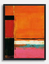
Poster armonia di rosso e arancio in stile Rothko
Prezzo scontato A partire da €16,95€23,95 -

Poster bagliore arancione di Rothko
Prezzo scontato A partire da €16,95€23,95 -

Poster armonia in rosso e rosa di Rothko
Prezzo scontato A partire da €16,95€23,95 -

Tela Rothko rosso e rosa in armonia
Prezzo scontato A partire da €65,95€93,95 -

Tela rosso e arancione stile Rothko
Prezzo scontato A partire da €65,95€93,95 -

Poster Rothko bagliore rosso e arancione
Prezzo scontato A partire da €16,95€23,95 -
Tela ispirata a Rothko con bagliore arancione
Prezzo scontato A partire da €65,95€93,95 -

Tela bagliore Rothko
Prezzo scontato A partire da €65,95€93,95 -

Tela espressionismo astratto rosa
Prezzo scontato A partire da €65,95€93,95 -

Poster ispirato a Kandinsky piccoli mondi IX
Prezzo scontato A partire da €16,95€23,95 -

Tela geometrie astratte stile Bauhaus
Prezzo scontato A partire da €65,95€93,95 -

Tela Bauhaus geometrica minimalista
Prezzo scontato A partire da €65,95€93,95 -

Tela cerchi concentrici Bauhaus
Prezzo scontato A partire da €65,95€93,95 -

Tela a geometrie Bauhaus audaci
Prezzo scontato A partire da €65,95€93,95 -

Poster cerchi concentrici in stile Bauhaus
Prezzo scontato A partire da €16,95€23,95 -
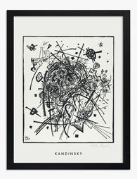
Poster piccoli mondi VIII di Wassily Kandinsky
Prezzo scontato A partire da €16,95€23,95 -

Tela Kandinsky viola e verde
Prezzo scontato A partire da €65,95€93,95 -

Tela astrazione botanica di Stolk
Prezzo scontato A partire da €65,95€93,95 -

Tela cerchi rosa stile Bauhaus
Prezzo scontato A partire da €65,95€93,95 -

Poster piccoli mondi IV di Kandinsky
Prezzo scontato A partire da €16,95€23,95


Di più da The Frame

The Best Wall Art for Plant Lovers (That Doesn'...
You already have too many plants. You know it, your partner knows it, the fiddle leaf fig blocking the window knows it. But your walls are still bare, and there's...

Are Botanical Prints Still in Style? The Trend ...
Botanical prints have been declared "over" roughly every three years since 2015, and yet they keep hanging on more walls than ever. The truth is they're not a trend at...

Room-by-Room or Whole-Home? Styling Botanical P...
Most botanical prints are hung wrong. They're too small for the wall, glossy in rooms that need calm, and floating at eye level above sofas they should be anchoring. This...