You're Overthinking Your Doodle Art Gallery Wall
A copy-paste guide to building a gallery wall around doodle prints, with real measurements and three recipes that work.

Doodle prints are the most forgiving art style you can put on a gallery wall. Their casual energy, generous negative space, and hand-drawn imperfection mean small spacing mistakes disappear instead of haunting you forever. This guide gives you the layout logic, the measurements, and three plug-and-play recipes to copy.
Why doodle prints make ideal gallery wall anchors
A traditional gallery wall asks a lot of you. Match the moods, balance the colours, pick frames that feel cohesive but not matchy, decide whether the antique botanical fights with the moody photograph. Doodle art skips most of that workload because line art reads as a single, friendly visual language regardless of subject.
The negative space is doing the heavy lifting. A black-and-white line drawing of a face, a vase, or a squiggle is mostly white paper. That breathing room means a wall of doodle prints never feels claustrophobic, even when you hang them close together. Compare that to a wall of dark photography, which can swallow a room.
Doodle prints are also psychologically lower-stakes. They feel personal rather than precious, which makes it easier to commit to a layout, hang the nails, and adjust later. If you've been staring at a blank wall for six months because everything you consider feels too "serious," doodle art prints are the unlock.
One more practical point. Line art is typically more affordable than fine art photography or large abstracts, so a five or seven piece doodle wall is achievable on a budget that would only buy you one statement piece elsewhere. That makes it perfect for a first proper gallery wall.

Choosing your layout: grid vs organic cluster for doodle art
You have two real options. A grid (equal-sized prints, equal spacing, aligned edges) or an organic cluster (mixed sizes, balanced asymmetry, varied spacing). Pick based on the room, not the art.
A grid works best in calm, minimal rooms with clean architecture. Think a flat plastered wall in a bedroom, a hallway with no skirting drama, or above a console table with strong horizontal lines. Doodle prints in a grid feel curated and quiet, almost like a typographic poster series. Four, six, or nine prints all sized 30x40cm or A3 with 5cm gaps between them is hard to get wrong.
An organic cluster works best in lived-in rooms where the rest of the space is already doing things. A sofa with mixed cushions, a shelf of plants, a kitchen with open shelving. The asymmetry of a cluster echoes the visual noise around it and feels intentional rather than busy.
We think doodle art slightly favours organic clusters. The hand-drawn quality wants a layout that breathes the same way the lines do. But if your room is sleek and you want the prints to feel a bit more grown up, grid every time.
A note on spacing for line art specifically
Standard advice is 5 to 7.5cm (2 to 3 inches) between frames. With doodle art, you can push tighter, down to 3 to 4cm, because the prints are visually light. Tight spacing makes a cluster read as one unified object rather than scattered pieces. Go looser (8 to 10cm) only if your frames are heavy or your prints are visually busy.
The best subjects to pair with doodle art prints
You don't need every print to be a doodle. The point of a gallery wall is variety with a through-line. Doodle prints anchor beautifully, and these pair without effort:
Abstract shapes and colour fields. Soft terracotta, sage, or mustard abstracts in the same size family as your doodles give the wall a colour story without competing for attention. Browse abstract art prints for partners that won't shout over a line drawing.
Botanical line drawings. Single-stem ink illustrations are doodle-adjacent and create a natural family. If your main doodles are figurative (faces, bodies, hands), botanical line work softens the wall.
Black-and-white photography with lots of white space. A still life of a single ceramic vase on a pale background, a minimalist architectural shot. Avoid busy street photography or dark moody landscapes, which fight the lightness of doodle art.
Typography prints. A single short phrase in a clean serif. Choose one, never two, or it starts to look like a motivational Pinterest board.
Other line art prints. Faces, figures, continuous-line drawings. These are the safest pairing and the easiest way to grow a wall over time.
What to avoid: heavily textured oil painting reproductions, vintage advertising prints, anything with a strong rectangular border or aggressive colour blocking. These styles speak a different visual language and will make your doodles look like an afterthought.

Size combinations that actually work (with measurements)
This is where most guides wave vaguely at "mixing sizes" and leave you stranded. Here are specific combinations for standard UK (A sizes, centimetres) and US (inches) frames. Each is built around one anchor print with supporting pieces.
Three-piece layouts (good for above a desk, console, or single chair)
UK: One 50x70cm doodle anchor, two 30x40cm supporting prints stacked vertically beside it. Total wall span roughly 95cm.
US: One 18x24 inch doodle anchor, two 11x14 inch supporting prints stacked beside it. Total wall span roughly 38 inches.
Five-piece layouts (good for above a sofa, bed, or sideboard)
UK: One 70x100cm doodle anchor on the left, two 40x50cm prints stacked top-right, two 30x40cm prints stacked bottom-right. Total wall span roughly 145cm.
US: One 24x36 inch doodle anchor, two 16x20 inch supporting prints, two 11x14 inch finishing prints. Total wall span roughly 58 inches.
Seven-piece organic cluster (statement wall, dining room or large lounge)
UK: One 70x100cm anchor, two 50x70cm, two 40x50cm, two 30x40cm. Mix orientation so two of the smaller prints are landscape.
US: One 24x36 inch anchor, two 18x24 inch, two 16x20 inch, two 11x14 inch.
The two-thirds rule for furniture
Your gallery wall should span roughly two thirds the width of the furniture below it. A 220cm sofa wants a gallery wall around 145cm wide. A 180cm bed wants a wall around 120cm wide. Going narrower makes the art look stranded. Going wider than the furniture makes the wall feel top-heavy.
Hang the bottom edge of your lowest frame 15 to 25cm above the back of the sofa or headboard. Any higher and the art disconnects from the furniture. Any lower and people will knock it with their heads.
Frame colour and finish: how to keep it cohesive
The fastest way to make a gallery wall look intentional is consistent framing. The fastest way to make it look chaotic is mixing four different frame finishes.
You have three sensible options:
All the same frame. Thin black or thin natural oak across every print. This is the most reliable and what we recommend if you're nervous. The art does the talking. Black frames sharpen doodle prints and suit modern interiors. Oak frames warm them up and suit older homes, neutrals, and earthy palettes.
Two frame finishes split by size. Larger pieces in oak, smaller pieces in black. Or vice versa. This creates rhythm without chaos. Keep the frame profile (the width and depth) consistent even if the colour changes.
All white frames. Works only on coloured walls. White frames on a white wall vanish, which sounds appealing but actually makes the art feel like it's floating awkwardly. On sage, navy, or terracotta walls, white frames look crisp and gallery-like.
Avoid gold and silver frames with doodle art unless you're going for a deliberately maximalist look. The shine competes with the simplicity of line work.
A practical aside on quality. The biggest problem with framed prints generally is poor execution: frames shipped separately from the print, warped MDF, prints that bubble or shift inside the mount after a few weeks. Fab frames are solid FSC-certified wood with UV-protective acrylic glaze, and the print arrives already fitted in the frame in a single box. It matters because a gallery wall with one warped frame draws the eye straight to the problem.

Hanging your gallery wall: tools, spacing, and the paper template trick
Don't freestyle this. Twenty minutes of prep saves you from a wall full of unnecessary holes.
What you need
- Tape measure
- Spirit level (or the level on your phone, which is fine for this)
- Pencil
- Brown craft paper or old newspaper
- Masking tape (the low-tack kind that won't pull paint)
- Scissors
- Hammer and picture hooks, or a drill for heavier pieces
The paper template method
Trace each frame onto craft paper and cut out a paper version. On the back of each paper rectangle, mark where the hanging fixture sits (measure from the top of the frame down to the hook or wire).
Tape your paper templates to the wall in your planned layout. Step back. Live with it for a day if you can. Adjust until it looks right.
When you're happy, mark the hook position through the paper with a pencil. Hammer or drill there. Tear the paper away. Hang the frame. Your spacing will be exact and you'll have one hole per print instead of seven.
Spacing in practice
Start with 5cm gaps for an organic cluster, 4cm for a tight modern grid, 7cm if you want a more spacious classical feel. Measure between the closest edges of the frames, not centre to centre.
For a five-piece layout, start by placing your anchor print first. Build outwards from there. The anchor sets the centre of gravity for the whole arrangement.
Hanging above a sofa or bed
The bottom of your lowest frame should sit 15 to 25cm above the back of the sofa or the top of the headboard. The centre of the whole arrangement should sit at roughly 145 to 150cm from the floor (gallery height), but slightly lower if your sofa is tall.
Three gallery wall recipes using doodle prints you can copy directly
These are designed to be lifted directly. Pick the one that suits your room and your appetite.
Recipe 1: The Calm Grid (small room, minimal energy)
Best above a desk, console, or single armchair.
- Four prints, all 30x40cm or 11x14 inch
- All thin black frames
- Subjects: two abstract face doodles, one continuous-line botanical, one minimal abstract shape
- Spacing: 4cm between all frames
- Total wall span: roughly 65cm wide
Why it works: tight grid, consistent framing, one tonal family. Looks expensive, costs less than one large statement piece.
Recipe 2: The Sofa Anchor (medium room, balanced energy)
Best above a 200 to 240cm sofa.
- One 70x100cm modern doodle print as the left anchor
- Two 40x50cm prints stacked top-right (one line-art figure, one soft abstract)
- Two 30x40cm prints stacked bottom-right (one botanical line drawing, one typography print)
- All thin oak frames
- Spacing: 5cm between frames
- Total wall span: roughly 145cm
Why it works: the large anchor pulls the eye, the smaller stack on the right adds rhythm without symmetry. The mix of doodle, abstract, and botanical reads as collected, not curated by an algorithm.
Recipe 3: The Dining Room Statement (large wall, high energy)
Best for a long dining wall or a generous lounge.
- One 70x100cm doodle anchor in the centre
- Two 50x70cm prints flanking it (line-art portraits)
- Two 40x50cm prints (one abstract, one botanical) above and below at outer edges
- Two 30x40cm prints (small doodle details) tucked into gaps
- Mixed black and oak frames split by size: anchor and 50x70cm in black, smaller prints in oak
- Spacing: 4 to 6cm, varied for organic feel
- Total wall span: roughly 220cm
Why it works: clear hierarchy, asymmetric balance, two-frame finishes that map to size so the rhythm reads as deliberate. This is the layout that gets photographed.
If you want a shortcut, pre-curated wall art sets take the sizing and pairing decisions off your plate entirely.

A final note on starting small
You don't have to build the whole wall on day one. Start with three doodle prints in a row, live with them for a month, then add a fourth and fifth piece as your eye adjusts. Gallery walls grow well. The paper template method makes it easy to test new additions without committing to nail holes you'll regret.
The real mistake isn't picking the wrong size or the wrong frame. It's waiting until everything is perfect before you hang anything at all.

Prodotti Fab presentati in questo blog
-
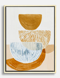
Tela astratta equilibrio moderno ocra e blu
Translation missing: it.products.product.sale_price A partire da €65,95€93,95 -

Poster ritratto cane labradoodle in acquerello
Translation missing: it.products.product.sale_price A partire da €16,95€23,95 -

Tela incontro giocoso
Translation missing: it.products.product.sale_price A partire da €65,95€93,95 -

Poster schizzi di cucina blu giocosi
Translation missing: it.products.product.sale_price A partire da €16,95€23,95 -
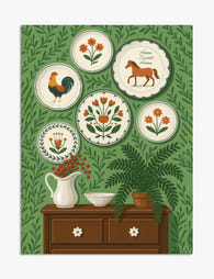
Poster stile folk con piatti decorativi
Translation missing: it.products.product.sale_price A partire da €16,95€23,95 -

Tela astratta stelle a raggiera e linee giocose
Translation missing: it.products.product.sale_price A partire da €65,95€93,95 -

Poster minimal in bianco e nero equilibrio armonioso
Translation missing: it.products.product.sale_price A partire da €16,95€23,95 -

Poster diagramma di Venn della teoria del colore
Translation missing: it.products.product.sale_price A partire da €16,95€23,95 -

Poster benvenuto in giardino floreale
Translation missing: it.products.product.sale_price A partire da €16,95€23,95 -

Tela disegno a linee yoga minimal in bianco e nero
Translation missing: it.products.product.sale_price A partire da €65,95€93,95 -
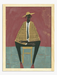
Poster ritratto di musa moderna
Translation missing: it.products.product.sale_price A partire da €16,95€23,95 -

Tela piatti da parete tema giardino folk
Translation missing: it.products.product.sale_price A partire da €65,95€93,95 -

Poster piccoli mondi II di Kandinsky
Translation missing: it.products.product.sale_price A partire da €16,95€23,95 -

Poster cucina italiana a linee blu
Translation missing: it.products.product.sale_price A partire da €16,95€23,95 -
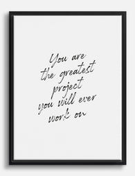
Tela con frase motivazionale 'Greatest Project'
Translation missing: it.products.product.sale_price A partire da €65,95€93,95 -

Poster forme organiche neutre
Translation missing: it.products.product.sale_price A partire da €16,95€23,95 -

Poster boho con margherite
Translation missing: it.products.product.sale_price A partire da €16,95€23,95 -

Tela figure minimaliste
Translation missing: it.products.product.sale_price A partire da €65,95€93,95 -

Poster piccoli mondi IV di Kandinsky
Translation missing: it.products.product.sale_price A partire da €16,95€23,95


Di più da The Frame

The Best Beige Art Prints for Bedrooms (And Exa...
Most guides tell you how to hang art, but not which beige prints actually suit a bedroom, or what size to buy for your specific bed. This one does both....

The Most Famous William Morris Designs, Ranked:...
William Morris designed over 50 patterns in his lifetime, and roughly six of them get all the attention. That's mostly fair, but not entirely. Here's our honest ranking of the...

Urban Jungle Interiors: Using Wall Art Instead ...
The urban jungle look is having a moment that refuses to end. But most of the people pinning those plant-drenched living rooms will never own 47 monsteras, and that's fine....