How to Build a Figure Art Gallery Wall That Feels Curated, Not Clinical
The difference between a wall that feels collected and one that feels like a life drawing classroom is mostly about what you hang next to the figures.

Figure art is one of the most rewarding subjects to build a gallery wall around, and one of the easiest to get wrong. Hung carelessly, a row of nudes can drift toward life-drawing-class or, worse, hotel-spa-boudoir. Done well, it looks like the work of someone who actually collects art.
This guide is for the person standing in front of a blank two-metre wall with a folder of figure prints and no idea where to start. We'll cover the layout fundamentals, but more importantly, the editorial decisions that make figure art feel warm and intentional rather than awkward.
Why figure art is perfect (and tricky) for gallery walls
Figurative art (work that depicts the human form, whether in line, paint, or photography) brings something other subjects can't: a sense of presence. A landscape recedes. A figure looks back. That's exactly why a gallery wall built around figure prints can feel more personal and more alive than one built around abstracts or botanicals.
It's also why it can go sideways. Three painted nudes in matching frames will read as one note. A scattered mix of styles with no logic will read as chaos. And a wall that's too sensual for the room it's in will make guests visibly uncomfortable. The fix isn't to play it safe. It's to build rhythm, vary the treatment, and use a few unifying constraints so the wall feels considered.

Step 1: Pick your anchor piece and build outward
Every gallery wall needs an anchor: the largest piece, the one your eye lands on first. Everything else orbits it. With figure art, the anchor sets the entire emotional tone of the wall, so choose deliberately.
A bold painted nude as an anchor will make the wall feel sensual and gallery-like. A soft, sketchy line drawing as an anchor will make it feel quiet and considered. A photographic figure (back-turned, in shadow, abstracted by movement) will make it feel modern and editorial. None of these are wrong. But they're not the same wall.
For most rooms, especially shared spaces like a lounge or hallway, we'd start with a single-line drawing or a muted painted figure at around 60x80cm or 70x100cm. It's expressive enough to lead the wall, but tonally quiet enough that it doesn't dominate the room. Save the bolder, more sensual anchor pieces for bedrooms or studies.
Once your anchor is chosen, every other piece should either complement its mood or deliberately contrast it for rhythm. Browse figure art prints with the anchor question in mind first. Don't pick six pieces and try to find a leader among them.
A quick note on shared spaces
If the wall is in a kitchen, hallway, or family lounge, lean toward figures that suggest the human form rather than depict it explicitly. Cropped torsos, back views, gestural line drawings, and abstracted figures all read as "art" rather than "nude." Save the more direct work for spaces where you control who walks in.
Step 2: Mix figure prints with complementary subjects
This is the step most guides skip, and it's the single biggest reason gallery walls fail. A wall of nothing but figures, no matter how varied, will always feel like a themed display. The cure is to bring in other subjects that share a visual language but break up the focus.
Four subjects mix beautifully with figure art:
Botanicals. A pressed-flower study or a single ink-drawn leaf softens a figure-heavy wall. Botanicals echo the organic curves of the human body without competing.
Abstract shapes. Soft geometric forms or muted colour-field pieces give the eye somewhere to rest between figures. Look for abstract art prints in similar tonal ranges to your figures (warm neutrals with warm neutrals, cool with cool).
Still life. A simple ceramic study, a bowl of fruit, a folded cloth. Still life adds a domestic, lived-in quality that grounds the wall and pulls it away from "gallery" toward "home."
Vintage landscape or architectural sketches. These add depth and a sense of time. A small etching of a doorway or hillside placed next to a contemporary nude makes both pieces look better.
The ratio we like is roughly 60/40: sixty per cent figure art, forty per cent supporting subjects. Less than that and the figure theme disappears. More than that and you're back in life-drawing-class territory.

Step 3: Vary the treatment (line, paint, abstract) for visual rhythm
Treatment means how the image is made: pen and ink, watercolour, oil, charcoal, photography, digital illustration. Even when subjects are similar, varied treatment creates the rhythm that makes a wall feel collected over time rather than bought in one go.
A useful rule: across your full gallery wall, aim for at least three different treatments. For example:
- A continuous-line drawing (delicate, mostly white space)
- A loose painted figure (visible brushwork, softer edges)
- A black-and-white photographic figure or silhouette
That trio alone will give you more visual interest than six matched paintings ever could. Add a botanical in watercolour and an abstract in flat blocks of colour, and the wall starts to feel genuinely curated.
If you're drawn to a minimal, restrained look, a wall of mostly line art prints with one or two painted accents reads beautifully. The trick is to commit to the contrast rather than splitting the difference. Lots of similar mid-weight pieces will look muddy.
Watch the negative space
Figure art needs room to breathe more than other subjects do. Crowded figures look chaotic and, frankly, voyeuristic. Aim for a slightly more generous gap between figure prints than you'd use for landscapes or abstracts. Around 6 to 8cm between figure-to-figure pieces, versus 4 to 5cm elsewhere on the wall.
Step 4: Choose a unifying frame finish
If you're mixing subjects and treatments, the frames have to do the heavy lifting on cohesion. This is the single most important rule on this page.
Limit yourself to a maximum of two frame families. We'd suggest:
- All natural oak, for a warm, soft, Scandi-leaning wall
- All black, for a graphic, gallery-feeling wall
- A mix of oak and black in roughly a 70/30 split, for something more layered
Avoid white frames for figure art. They tend to wash out the linework and make the wall feel sterile. Avoid ornate or gilded frames unless you're committing to a fully maximalist room. And never mix three or more frame finishes on the same wall. It looks like you couldn't decide.
The other consideration is frame quality. Cheap framing is the single thing that ruins gallery walls: warped mouldings, prints not properly fitted, glass that catches every overhead light. Solid wood frames sit flat against the wall and age well. UV-protective acrylic glaze (rather than glass) means a wall in afternoon sun won't fade over the years, and it's lighter and safer if anything ever falls. Our framed prints arrive ready to hang with the print already fitted, which removes the most common point of failure.
Step 5: Nail the spacing and layout on the floor first
Before a single nail goes in, lay the entire wall out on the floor. Use the actual frames if you have them, or cut paper templates to the exact dimensions of each piece.
The standard spacing rule is 5 to 8cm between frames (roughly 2 to 3 inches). For figure art, lean toward the upper end. The composition needs air.
A few principles to follow as you arrange:
- Treat the whole wall as one rectangle. The outer edges of your gallery wall should form a roughly rectangular shape, even if the arrangement inside is irregular.
- Keep the visual centre at eye level. That's around 145 to 150cm from the floor to the centre of the arrangement, not the centre of any single piece.
- Balance weight, not size. A small, dark, dense piece carries the same visual weight as a large, pale, sparse one. Don't cluster all the dense pieces on one side.
- Mirror lines, not pieces. If the top of one frame aligns with the top of another across the wall, the eye reads it as intentional. You don't need symmetry, just alignment cues.
Once the floor layout looks right, photograph it from directly above. Then transfer to the wall, working outward from the anchor piece.

Size combinations that work for common UK wall widths
Most UK lounges and bedrooms have walls in the 2 to 3 metre range. Here's what actually fits.
2m wall (above a standard three-seat sofa):
A five-piece gallery using one 70x100cm anchor (portrait) flanked by two 30x40cm pieces stacked on each side. Total width around 150cm, leaving generous breathing room either side.
Or: a seven-piece arrangement using one 60x80cm anchor, two 50x70cm secondaries, and four 30x40cm supporting pieces.
2.5m wall (longer lounge wall, behind a dining table):
A 100x70cm landscape anchor with three 40x50cm pieces to one side and two 30x40cm pieces to the other for asymmetric balance.
3m wall (large feature wall, hallway):
A nine-piece arrangement built around a 70x100cm and a 60x80cm pair, with seven smaller pieces (mix of 30x40cm and 40x50cm) filling out the composition.
For canvas, scale up. Canvas is lighter than framed glass and works in larger formats without dominating, which makes it ideal as an anchor piece up to 100x150cm in bigger rooms or humid spaces like a bathroom or kitchen where a framed print might struggle.
Gallery wall layouts to steal: 5-piece, 7-piece, and asymmetric grids
If you don't want to invent a layout from scratch, three configurations work almost universally for figure art.
The 5-piece classic
One large central anchor, with two medium pieces stacked on each side. The central piece is a figure (your strongest, most expressive work). The flanking pieces alternate: one figure and one supporting subject (botanical, abstract, or still life) on each side. Symmetrical, calm, suited to formal rooms and above sofas.
The 7-piece editorial
One off-centre anchor (placed about a third of the way across the wall), with six smaller pieces arranged around it in irregular clusters. Mix three figures, two supporting subjects, and two abstracts or texture pieces. Feels more collected and less staged. Suited to bedrooms, studies, and longer walls.
The asymmetric grid
A loose 3x3 or 2x4 grid where pieces are aligned to invisible vertical and horizontal lines but vary in size. The grid logic keeps it disciplined. The size variation keeps it from looking corporate. This works particularly well when you want a more graphic, modern feel and you're committing to a single frame finish throughout.
For any of these, pre-built wall art sets can give you a coordinated starting point that you then expand outward with a few personal additions over time. The best gallery walls usually grow. Buy the anchor and three or four supporting pieces now, leave space, and add the last two or three when you find them.

A few last things
Don't hang everything at once. Live with the floor layout for a day or two before committing. Walk past it. See if anything stops feeling right.
If a wall starts to feel too figure-heavy after it's up, swap one piece for a textile, a small mirror, or a sculptural object on a picture ledge. Three-dimensional elements break up the rhythm and stop the wall from reading as flat.
And trust your eye on the question of what belongs where. A figure print that feels too bold for the lounge will probably be perfect in the bedroom. The point of building a gallery wall around figure art isn't to display every piece you own. It's to choose the ones that belong in this room, in this configuration, looking at each other.

Prodotti Fab presentati in questo blog
-

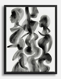
Tela figura pensierosa in verde
Translation missing: it.products.product.sale_price A partire da £44.95£74.95 -

Tela figure minimaliste
Translation missing: it.products.product.sale_price A partire da £44.95£74.95 -

Tela disegno a linee yoga minimal in bianco e nero
Translation missing: it.products.product.sale_price A partire da £44.95£74.95 -

Poster ritratto astratto in blu intenso
Translation missing: it.products.product.sale_price A partire da £13.99£19.99 -

Poster minimal in bianco e nero equilibrio armonioso
Translation missing: it.products.product.sale_price A partire da £11.95£19.95 -

Tela incontro giocoso
Translation missing: it.products.product.sale_price A partire da £44.95£74.95 -

Tela frase motivazionale 'Costruisci una vita che ami'
Translation missing: it.products.product.sale_price A partire da £44.95£74.95 -
Tela sagome fluide
Translation missing: it.products.product.sale_price A partire da £55.99£79.99 -

Poster figure minimaliste
Translation missing: it.products.product.sale_price A partire da £11.95£19.95 -

Tela astratta neutra dalle forme organiche
Translation missing: it.products.product.sale_price A partire da £44.95£74.95 -

Tela ritratto di figura rilassata con cappello di paglia
Translation missing: it.products.product.sale_price A partire da £44.95£74.95 -

Poster linee nere fluide su beige
Translation missing: it.products.product.sale_price A partire da £11.95£19.95 -

Poster ritratto classico con tocco moderno e irriverente
Translation missing: it.products.product.sale_price A partire da £11.95£19.95 -

Tela astratta con curve stile Matisse Maiorca, beige e nero
Translation missing: it.products.product.sale_price A partire da £44.95£74.95 -
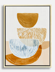
Tela astratta equilibrio moderno ocra e blu
Translation missing: it.products.product.sale_price A partire da £44.95£74.95 -
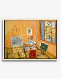
Tela interno d’atelier di Raoul Dufy
Translation missing: it.products.product.sale_price A partire da £55.99£79.99 -

Poster forme organiche neutre
Translation missing: it.products.product.sale_price A partire da £11.95£19.95 -

Tela ritratto astratto in blu intenso
Translation missing: it.products.product.sale_price A partire da £55.99£79.99 -

Poster natura morta con danza di Henri Matisse
Translation missing: it.products.product.sale_price A partire da £11.95£19.95 -

Poster benvenuto in giardino floreale
Translation missing: it.products.product.sale_price A partire da £11.95£19.95


Di più da The Frame

How to Display Typography Prints Without the Cl...
Typography prints break the rules of normal art display. Text demands to be read, not just glanced at, which means the standard gallery wall advice you've absorbed from interiors content...

How to Build a Picasso Gallery Wall That Actual...
Most gallery wall guides tell you to "play around with the layout" and "trust your eye." That advice is useless when you're staring at over a hundred Picasso prints trying...

How to Build a Market-Themed Gallery Wall That ...
A gallery wall of market scenes does something a single print never can: it tells a story across cultures. You're not decorating with one image, you're curating a small museum...