Klimt or William Morris? Choosing Between Two Icons of Botanical Art
One paints gardens like quilts, the other turns leaves into wallpaper. Here's how to choose.

You've narrowed your blank wall down to "something botanical, something proper." Now you're stuck between two of the most beloved names in plant-based art: Gustav Klimt and William Morris. They sound like they should be similar, but choosing between them shapes the entire feel of your room.
Two botanical giants: a quick visual comparison
Morris and Klimt are often filed under the same vague "decorative botanical" heading online, but they're doing wildly different things on the wall. Morris (1834-1896) was an English designer working in the Arts and Crafts movement, creating flat, repeating patterns for wallpaper and textiles. Klimt (1862-1918) was an Austrian painter and a founding figure of the Vienna Secession, painting one-off canvases of gardens and orchards.
Here's the historical surprise most articles miss: the Vienna Secession artists actually leaned toward British Arts and Crafts rather than German Jugendstil. Morris influenced Klimt's circle, not the other way around. Both shared a conviction that decorative art belonged in the home as much as galleries, but they arrived at radically different visual languages.
Morris gives you order, rhythm, and botanical accuracy. Klimt gives you density, texture, and the feeling of standing waist-deep in a meadow at Lake Attersee. Knowing which sensation you want in the room is half the decision.

Pattern vs painting: how each artist approaches plants differently
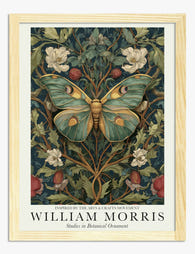
Morris drew plants. He studied them in his garden at Kelmscott, observed how willow branches actually curve, how strawberry leaves overlap, and then stylised them into patterns that could repeat infinitely across a wall. His prints are flat, graphic, and rhythmical. The eye glides across them.
Klimt painted plants. His botanical works, made during summers at Lake Attersee from roughly 1900 onwards, are square canvases packed edge to edge with poppies, sunflowers, fruit trees, and undergrowth. There's no sky, no horizon, just a dense vertical wall of garden. Critics have described the surface as "quilt-like," and it's the right word: thousands of tiny brushstrokes that read as pattern from a distance and as paint up close.
This is the most important difference for your wall. Morris functions as decorative architecture. A single Morris print acts almost like a window of wallpaper, providing a steady, calming background. Klimt functions as a focal point. One of his garden paintings demands attention and rewards close looking, which is why his works print so beautifully at larger sizes where you can see the texture.
If you want the art to support the room, choose Morris. If you want the art to be the room, choose Klimt.
Colour palettes compared and what they demand from your room
Morris worked with natural dyes and botanical accuracy. His palettes lean into sage greens, indigo blues, madder reds, ochre yellows, and walnut browns. The colours are jewel-toned but earthy, never neon. They sit beautifully against warm whites, deep greens, and traditional wood tones. They struggle against cool greys and stark modern white because they were designed for candlelight and dark Victorian interiors.
Klimt's botanical palette is denser and more impressionistic. Red and green dominate his garden works, with bursts of yellow, violet, and pink woven through. The "Flower Garden" of 1907 is essentially a red-and-green field with confetti scattered across it. Because the canvas is so dense and the colours so saturated, Klimt prints actually work surprisingly well on cooler, lighter walls. The art provides the warmth, the wall provides the contrast.
A practical rule we'd suggest: Morris prints want a coloured or textured wall behind them. Klimt prints can handle a plain wall and often look better on one.
If you're working with a small space and don't want to commit your whole wall to one direction, our wider botanical art prints collection sits well alongside either artist without competing.
Morris for traditional interiors, Klimt for everything else?
That's the tempting shortcut, and it's about 70% true. Let's break it down properly.
Where Morris excels
Morris prints look genuinely at home in older properties: Victorian terraces, Edwardian semis, Georgian cottages, anywhere with picture rails, panelling, or original fireplaces. They also work brilliantly in country kitchens, traditional bedrooms with brass beds, and any room with painted woodwork in a heritage colour.
Morris also slots into a specific kind of modern interior that's emerged in the last decade: the "warm minimalist" or "modern traditional" look, with plaster pink walls, unlacquered brass, and rattan. His patterns provide the historical anchor that prevents these rooms from feeling like a showroom.
Where Morris struggles is in genuinely contemporary spaces. A high-gloss kitchen with handleless units and a polished concrete floor will fight a Morris print, not because the print is bad, but because the room is built on different principles.
Where Klimt excels
Klimt is far more flexible than people assume. His botanical works look at home in modern flats, mid-century rooms, eclectic interiors, and even minimalist spaces, because the painting itself contains so much detail and warmth that it doesn't need a "traditional" room to support it.
Klimt plant prints work particularly well in: bedrooms with linen bedding and pale walls, dining rooms where you want a single statement piece, home offices, and hallways where you walk past the art every day and notice something new.
Where Klimt struggles is in very busy rooms. If you already have patterned curtains, a patterned rug, and patterned cushions, adding a Klimt garden is too much. He needs breathing space around him.

Mixing the two: when it works and when it really doesn't
This is the question nobody seems to be answering online, so we'll answer it directly: yes, you can mix Morris and Klimt in the same home, but rarely in the same room, and almost never on the same wall.
When it works
A Morris print in the hallway and a Klimt in the lounge. A Morris-papered downstairs loo and Klimt prints upstairs in the bedroom. The shared botanical theme runs through the house but each room gets its own register.
It can also work in a long open-plan space where the two artists anchor different "zones." A Morris print above a traditional dining table at one end, a Klimt above a modern sofa at the other. The eye reads them as related but distinct.
When it really doesn't
A Morris print next to a Klimt on the same gallery wall is almost guaranteed to look uncomfortable. Morris's flat, ordered repetition fights Klimt's dense, painterly chaos. They're operating on different visual frequencies and your eye doesn't know where to land.
The other failure mode is the "botanical maximalist" instinct: Morris wallpaper, Morris cushions, Morris curtains, and a Klimt framed print on top. At that point you're not styling, you're decorating against yourself. Pick one to lead and let the other rest.
Our verdict: which to choose based on your space and style
Here's how we'd advise, room by room.
Lounge or living room: Klimt for modern flats and houses built after 1950. Morris for Victorian and Edwardian properties with original features. If you have a coloured feature wall (deep green, navy, terracotta), both work, but Morris will sit more naturally.
Bedroom: Klimt wins for most bedrooms because his garden paintings have a calm, immersive quality that suits sleep. Morris works beautifully in a more romantic, traditional bedroom with a brass or wooden bed frame.
Kitchen and dining: Morris was practically designed for kitchens. His Strawberry Thief, Fruit, and Trellis patterns feel right above a dining table or on a kitchen wall. Klimt is harder to place in a kitchen but stunning in a dedicated dining room.
Home office: Klimt. The density rewards the long hours of looking, and the painterly texture is more interesting than a flat pattern when you're sat three feet away.
Hallway and stairs: Either works, but we lean Morris here because the repeating pattern handles the vertical scale of a stairwell better than a single Klimt composition.
Bathroom: Either, but canvas is the safer choice in a steamy room. Our canvas prints are stretched over solid wood and finished with a matte poly-cotton that handles humidity better than glazed framed prints.
For something more flexible across rooms, the broader art nouveau art prints collection includes work from artists who sit between Morris and Klimt stylistically, including Mucha and the Vienna Secession circle.

Top picks from each artist's botanical collection
Morris: three to start with
Strawberry Thief (1883). The one everyone knows for good reason. Indigo background, thrushes among the strawberries, the most recognisable Morris pattern. Works at 50x70cm above a sideboard or 70x100cm as a statement above a sofa. Pairs well with deep green or warm white walls.
Trellis (1862). Morris's first wallpaper design, roses climbing through a wooden lattice with birds. More open and less busy than Strawberry Thief, so it suits smaller rooms where you don't want to overwhelm the wall. Beautiful in a bedroom at 60x80cm.
Acanthus (1875). Large, swirling leaf forms in soft greens and ochres. The most "grown-up" Morris, and the one that bridges most easily into modern interiors. We'd hang this in a hallway or above a fireplace.
You'll find these and others in our full William Morris art prints collection.
Klimt: three to start with
Flower Garden (1907). The classic. A square explosion of red poppies, white daisies, yellow sunflowers, and dense green foliage. Looks extraordinary at large sizes where the texture comes alive. We'd push this as large as your wall allows, ideally 70x70cm framed or larger on canvas.
Poppy Field (1907). Slightly more open than Flower Garden, with a band of orchard trees behind the poppies. Easier to live with day to day if you find Flower Garden too intense. Works in dining rooms and bedrooms.
Farm Garden with Sunflowers (1907). Vertical composition with sunflowers towering over a cottage garden. Excellent for taller walls, narrow alcoves, or beside a doorway. The yellow lifts cooler rooms beautifully.
Klimt's botanical works are square or vertical formats almost exclusively. They suit being framed rather than hung as unframed canvas, because the painterly detail benefits from the polish of a solid wood frame and the protection of a UV acrylic glaze. The acrylic also prevents fading in sunny rooms, which matters if you're hanging in a south-facing space.

A final note before you decide
Don't choose based on which artist sounds more impressive. Choose based on what your room actually needs. If the wall feels cold and empty, you want Klimt's density. If the wall already has a lot going on, you want Morris's order. If the room is traditional, Morris will feel inevitable. If the room is modern, Klimt will earn its place.
And whichever way you go, size up rather than down. Botanical art rewards scale. A 30x40cm Morris print on a large lounge wall looks lost, and a small Klimt loses the texture that makes him Klimt. Measure the wall, then go one size bigger than you think.

Prodotti Fab presentati in questo blog
-

Poster motivo botanico ispirato a William Morris
Translation missing: it.products.product.sale_price A partire da £11.95£19.95 -

Poster vaso botanico William Morris
Translation missing: it.products.product.sale_price A partire da £11.95£19.95 -
Poster floreale in stile William Morris
Translation missing: it.products.product.sale_price A partire da £11.95£19.95 -

Poster fioritura botanica di William Morris
Translation missing: it.products.product.sale_price A partire da £11.95£19.95 -

Poster botanico in stile William Morris
Translation missing: it.products.product.sale_price A partire da £11.95£19.95 -

Poster farfalla con motivi botanici ispirato a William Morris
Translation missing: it.products.product.sale_price A partire da £11.95£19.95 -

Poster floreale ispirato a William Morris
Translation missing: it.products.product.sale_price A partire da £11.95£19.95 -

Poster vaso botanico ispirato a William Morris
Translation missing: it.products.product.sale_price A partire da £11.95£19.95 -
Tela floreale ispirata a William Morris
Translation missing: it.products.product.sale_price A partire da £44.95£74.95 -

Poster foglie botaniche William Morris
Translation missing: it.products.product.sale_price A partire da £11.95£19.95 -

Poster botanico con uccellino in stile William Morris
Translation missing: it.products.product.sale_price A partire da £11.95£19.95 -

Tela vaso botanico in stile William Morris
Translation missing: it.products.product.sale_price A partire da £44.95£74.95 -

Tela fiori botanici ispirata a William Morris
Translation missing: it.products.product.sale_price A partire da £44.95£74.95 -

Tela fiori botanici stile William Morris
Translation missing: it.products.product.sale_price A partire da £44.95£74.95 -

Tela foglie botaniche ispirata a William Morris
Translation missing: it.products.product.sale_price A partire da £44.95£74.95 -

Poster botanico Vine di William Morris
Translation missing: it.products.product.sale_price A partire da £11.95£19.95 -

Poster foglie botaniche in stile William Morris
Translation missing: it.products.product.sale_price A partire da £11.95£19.95 -
Poster botanico con farfalla ispirato a William Morris
Translation missing: it.products.product.sale_price A partire da £11.95£19.95 -

Poster giardino selvatico di Gustav Klimt
Translation missing: it.products.product.sale_price A partire da £11.95£19.95 -

Tela con motivi floreali stile William Morris
Translation missing: it.products.product.sale_price A partire da £44.95£74.95


Di più da The Frame

7 Ways to Style William Morris Tree Prints in Y...
Tree of Life. Woodpecker. The towering, tangled branches that made Morris famous. These prints have a vertical pull and a visual density that other Morris designs don't, which means hanging...

Why Art Prints Make the Most Meaningful Housewa...
Most housewarming gifts get consumed, regifted, or shoved in a cupboard within a month. Art does something different. It hangs on a wall in the new home for years, quietly...

Hosting at Christmas: Three Small Changes That ...
Most Christmas hosting advice asks you to do too much. You don't need a complete seasonal overhaul, you need your rooms to feel finished. The difference between a space that's...