Watercolor Painting Styles Explained: From Botanical to Abstract
From wet-on-wet abstract washes to precise botanical studies, here's how to actually tell watercolour styles apart and pick the right one for your walls.

A quick primer on why watercolour looks the way it does
Watercolour behaves unlike any other medium. Pigment suspended in water, applied to absorbent paper, with the artist controlling roughly 70% of what happens and the water doing the rest. That's the whole appeal.
The transparency is the giveaway. Light passes through each layer of pigment and bounces back off the white paper underneath, which is why even dark watercolours feel luminous rather than heavy. You can see the layers stacking. You can see the paper. You can often see where the artist's brush hesitated or where water pooled and dried into a soft, irregular edge.
Those soft edges are called blooms, and they're the result of wet pigment meeting wet paper. Acrylic and oil don't do this. Digital art mimics it badly. Real watercolour has a quality of restraint and accident built into it, which is what makes it feel calm on a wall even when the subject is bold.

Loose and abstract: the appeal of wet-on-wet watercolour washes
Loose watercolour is the style most people picture first. Big, flowing washes of colour that bleed into each other, with no clear subject and no hard outlines. The technique behind it is called wet-on-wet: the artist soaks the paper with clean water first, then drops pigment in and lets it spread.
The result is almost meditative. Soft blooms of indigo dissolving into pale grey. A wash of terracotta meeting a wash of ochre with a soft, feathered edge where they meet. Nothing in the image is fighting for your attention, which is precisely why it works above a sofa or behind a bed.
Abstract watercolour prints tend to lean cool (ocean blues, soft greys, dusty greens) or warm (rust, ochre, blush pink). We think the cool palettes work best in north-facing rooms where you want to amplify the light, and the warmer ones suit south-facing spaces where you can afford to add a bit of glow.
When loose abstract works best
Large scale is your friend here. A 70x100cm abstract watercolour print has presence. The same image at 30x40cm can look apologetic, because the whole point of the style is the generous breathing room around each wash of colour. If you're hanging an abstract watercolour as your statement piece, go bigger than you think you need.
These prints also forgive a lot. They don't clash with patterned cushions, they don't demand a specific colour scheme, and they don't date the way trend-driven graphic prints can.
Botanical watercolour: precision, detail, and the natural world
At the opposite end of the spectrum is botanical watercolour. This is the tradition of scientific illustration, going back to 18th-century herbariums and the careful field studies of artists like Pierre-Joseph Redouté. Each leaf vein is observed. Each petal is rendered with the patience of someone who actually looked at the plant for a long time.
Modern botanical watercolour prints sit in this lineage but tend to lighten it. Lots of negative space, a single specimen centred on the page, accurate colour without going hyperreal. Ferns, palm leaves, pressed wildflowers, citrus branches, anemones, magnolia stems.
The appeal is twofold. First, there's the calm of something carefully observed. Second, botanical prints carry an almost universal visual vocabulary, which means they slot into nearly any interior without competing with what's already there.
Why detail matters more here
Botanical watercolour is the style where print quality shows up most obviously. If the fine pencil underdrawing isn't visible, if the soft green wash on a leaf turns muddy, if the white of the paper goes grey, the whole illusion collapses. This is where giclée printing on thick matte paper earns its keep, because you get the same tonal range you'd see in the original watercolour, with no glare from the surface to flatten the detail.
A pair or trio of botanical prints in matching frames is a reliably elegant move. We particularly like three vertical 30x40cm prints hung in a row above a console table or sideboard, with around 5cm of breathing space between each frame.

Modern watercolour: how contemporary artists push the medium forward
Modern watercolour is harder to pin down because it's defined by what it isn't. Not pure abstract wash. Not traditional botanical. Somewhere in between, often combining watercolour technique with line work, collage, geometric shapes, or graphic typography.
Think of a watercolour figure outlined in a single confident ink line. Or a series of overlapping circles in dusty pink and sage, like a colour study left intentionally unfinished. Or a face rendered in soft pigment with sharp graphic hair, mixing two visual languages in one image.
This style appeals to people who want something contemporary without going fully minimalist. Modern watercolour art prints feel young without being trend-chasing, and they tend to play well with mid-century furniture, plywood, brass, and the slightly-too-large houseplant that's become standard issue in any 2020s lounge.
Spotting the difference between modern and traditional
The easiest test: does the image have a clear, deliberate edge somewhere? A line drawing element, a geometric block of colour, a typographic detail? That's modern watercolour. If everything dissolves softly into the paper with no hard intervention from the artist, you're looking at something traditional.
Neither is better. But they read very differently on a wall, and they pair with different furniture. Modern watercolour likes clean-lined furniture and a touch of brass or black metal. Traditional watercolour likes wood, linen, and softer silhouettes.
Landscape and coastal watercolour: softness meets scenery
Watercolour was the original landscape medium. Long before photography, travelling artists used it to record mountains, coastlines, and weather, because it was portable and could be worked quickly outdoors. That working-from-life tradition still shapes the genre.
Landscape watercolour prints tend to fall into two camps. The first is misty and atmospheric: rolling hills disappearing into a pale sky, a lake at dawn, the silhouette of pines against fog. The second is coastal: sand, sea, soft horizons, the occasional sailing boat reduced to a single brushstroke.
Both styles share the same trick. They use the white of the paper as light. A patch of unpainted paper becomes sun on water. A pale, untouched horizon becomes distance. This is why watercolour landscapes feel airy even when the palette is muted, and it's why they work so well in rooms that already have a lot going on visually.
Where landscape watercolour belongs
These prints earn their place in rooms where you want the eye to travel somewhere else. Above a desk in a small home office. In a windowless hallway. Behind a dining table where you'd otherwise stare at a blank wall through dinner.
A horizontal landscape format works particularly well above a sofa or bed. We'd suggest something around 100x70cm if your sofa is a standard three-seater, scaling down to 70x50cm for a two-seater or loveseat.

Which watercolour style suits your interior (matching art to room mood)
Style is one thing. Fit is another. Here's how we'd think about matching watercolour styles to rooms.
For calm, minimalist interiors
Loose abstract washes in a single muted palette. One large piece rather than a gallery wall. The image should have lots of negative space so it sits in conversation with the room, not on top of it. Soft greys, dusty blues, off-whites, very pale ochres.
For warm, layered interiors with wood and natural textures
Botanical watercolour, often in pairs or trios. The biological precision plays nicely against the slight roughness of linen, jute, and oak. Greens, soft browns, occasional pops of citrus yellow or terracotta. A solid wood frame in oak or walnut completes the look, and we'd skip the white mount in favour of a flush border for a more contemporary read.
For modern, design-forward spaces
Modern watercolour with graphic elements. Black frames, slimmer profiles, and a willingness to mix styles in the same room. This is also the easiest style to scale into a gallery wall, because the graphic elements give your eye something to grid against.
For traditional or country interiors
Landscape and coastal watercolour, generously sized. The romantic, atmospheric quality of a misty hillside or quiet shoreline suits older houses, painted panelling, and rooms with character. We'd lean into larger frames here, since heavier mouldings echo the period detailing.
For rooms with humidity (bathrooms, kitchens, conservatories)
This is where canvas tends to be the smarter choice. Stretched canvas doesn't warp the way some framed prints can if exposed to steam and temperature swings, and the matte finish handles ambient moisture better. A coastal watercolour on canvas in a bathroom is honestly one of the easier styling wins available.
How giclée printing preserves what makes each watercolour style special
Watercolour is the medium most likely to be ruined by bad printing, because so much of its character lives in subtle tonal shifts. A wash that goes from pale lavender to soft grey across 5cm of paper is easy to flatten into a single muddy colour if your printing process can't handle the gradient.
Giclée printing solves this. It uses pigment-based inks sprayed at very high resolution, which means the printer can lay down dozens of tonal steps in the space where a cheaper process would manage two or three. The blooms stay soft. The white of the paper stays genuinely white. The dark accents in a botanical leaf stay deep without going black.
The paper matters just as much. A thick matte paper has the same tooth and absorbency cues as real watercolour paper, so the print reads as art rather than as a photograph of art. Glare is the enemy here, which is why we use matte rather than gloss, and why our framed prints use a UV-protective acrylic glaze rather than reflective glass. You get the depth of the image without a window reflection bouncing back at you every time you walk past.
And because every print is made to order, we're not pulling stock from a warehouse where colour can drift over time. Print, frame, ship in one box, ready to hang. The frame and the print arrive properly fitted, with no warping or air bubbles, which is the single most common failure mode in cheap wall art and the one that ruins watercolour faster than any other style.

Browse by style: quick links to our watercolour collections
If you've got a sense of which direction suits your space, the easiest next step is to narrow the field before you start scrolling.
For the full range of styles in one place, start with watercolour art prints. For something softer and more atmospheric, go to abstract art prints and filter for muted palettes. For pairs, trios, and observational work, botanical art prints is the right starting point. And for misty hills, coastlines, and wide horizons, head to landscape art prints.
A few practical pointers as you browse. Save anything that stops your scroll, even if you're not sure why. After 15 minutes, look back at what you saved and you'll usually see a clear palette and mood emerging. That pattern, not any single image, is what should guide your final choice.
Measure your wall before you commit to a size. The most common mistake is going too small. As a rough rule, your art should fill roughly two-thirds of the width of the furniture beneath it. So a 180cm sofa wants art around 120cm wide, which usually means one large piece or a pair of medium ones.
And if you're undecided between two styles for the same wall, sleep on it. Watercolour rewards rooms where the art feels chosen rather than defaulted to, and the right print tends to feel obvious in the morning.

Prodotti Fab presentati in questo blog
-

Poster astratto floreale vivace
Translation missing: it.products.product.sale_price A partire da £11.95£19.95 -

Tela astrazione botanica di Stolk
Translation missing: it.products.product.sale_price A partire da £49.95£74.95 -

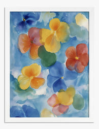
Poster viole del pensiero in acquerello su cielo azzurro
Translation missing: it.products.product.sale_price A partire da £11.95£19.95 -

Tela viole del pensiero fluttuanti
Translation missing: it.products.product.sale_price A partire da £49.95£74.95 -

Poster colori della costa della Normandia
Translation missing: it.products.product.sale_price A partire da £11.95£19.95 -

Poster fiori blu fluttuanti ad acquerello
Translation missing: it.products.product.sale_price A partire da £11.95£19.95 -

Tela pennellate botaniche multicolori
Translation missing: it.products.product.sale_price A partire da £49.95£74.95 -

Poster fiori sospesi ad acquerello
Translation missing: it.products.product.sale_price A partire da £11.95£19.95 -

Tela energia della costa di Normandia
Translation missing: it.products.product.sale_price A partire da £49.95£74.95 -

Tela fiori ad acquerello luminosi
Translation missing: it.products.product.sale_price A partire da £49.95£74.95 -

Tela botanica multicolore dal tratto fluido
Translation missing: it.products.product.sale_price A partire da £49.95£74.95 -

Poster bouquet di fiori ad acquerello
Translation missing: it.products.product.sale_price A partire da £11.95£19.95 -

Tela fiori ad acquerello in toni pastello
Translation missing: it.products.product.sale_price A partire da £49.95£74.95 -

Poster fiori ad acquerello rosa cipria e blu
Translation missing: it.products.product.sale_price A partire da £11.95£19.95 -

Watercolour Bulrushes Study Art Print
Translation missing: it.products.product.sale_price A partire da £19.95£34.95 -

Tela bouquet di fiori vivaci ad acquerello
Translation missing: it.products.product.sale_price A partire da £49.95£74.95 -

Watercolour Bulrushes Study Art Print
Translation missing: it.products.product.sale_price A partire da £11.95£19.95 -

Poster pennellate botaniche colorate
Translation missing: it.products.product.sale_price A partire da £11.95£19.95 -
Poster viole del pensiero in fiore ad acquerello
Translation missing: it.products.product.sale_price A partire da £11.95£19.95 -

Tela fiori sospesi su cielo azzurro
Translation missing: it.products.product.sale_price A partire da £49.95£74.95


Di più da The Frame

Urban Jungle Interiors: Using Wall Art Instead ...
The urban jungle look is having a moment that refuses to end. But most of the people pinning those plant-drenched living rooms will never own 47 monsteras, and that's fine....

Room by Room: How to Hang William Morris Floral...
You've fallen for Morris. The question now is which floral goes where, at what size, in what frame. This guide skips the Arts and Crafts lecture and gets straight to...

Jungle Bedroom Ideas for Adults: Grown-Up Ways ...
Jungle bedrooms have a reputation problem. Search the term and you'll find nursery mood boards, cartoon monkeys, and bright kelly green walls that would keep anyone awake. The grown-up version...