Art for Pink Walls
The shade of pink on your walls changes everything, from frame colour to subject matter to how big you can go.

Pink walls are the most misunderstood backdrop in interiors. People assume they're tricky, twee, or only for nurseries, when in fact pink is one of the most flattering colours you can hang art against. The catch is that not all pinks behave the same way, and the art that sings on a dusty rose wall will look limp on a hot fuchsia one.
Start with your shade of pink
Before you choose a single print, identify what you're actually working with. The four pinks that show up most often in homes each demand a different approach.
Blush pink (think Farrow & Ball Pink Ground, Calamine, or any soft peachy-pink) is gentle, warm and barely-there. It behaves almost like a neutral. You can hang almost anything against it, but it benefits from art with enough contrast to register against the softness.
Dusty rose sits deeper and slightly more muted, with a grey or mauve undertone. It's sophisticated and reads as nearly bookish. It pairs beautifully with moody, painterly work and rich darks.
Millennial pink is the cooler, slightly more saturated pink that dominated the late 2010s and still hangs around. It has a hint of salmon and reads as deliberate rather than romantic. It loves graphic, modern art.
Hot pink and fuchsia are statement colours. They're loud, confident and frankly a bit aggressive. Art on these walls has to hold its own or it disappears. Subtle watercolours will be eaten alive.
If you don't know which camp your wall falls into, hold a sheet of white paper against it in daylight. Blush will look warm and peachy. Dusty rose will look greyed-out. Millennial pink will look cool and almost coral. Hot pink will look like hot pink.

What art goes with pink walls: the colour palettes that actually work
There are four palettes that reliably look brilliant on pink walls. Everything else is a gamble.
Neutrals: black, white, charcoal, cream
This is the safest and arguably the most stylish route. Black and white photography, ink illustrations, charcoal sketches and high-contrast graphic prints all create a crisp counterpoint to pink's softness. The pink reads as the colour, and the art reads as the structure. It's the combination interior stylists default to for editorial shoots, and there's a reason.
On blush and dusty rose walls, lean into warm blacks and creams rather than stark white-and-black. On hot pink, go full contrast. The starker the better.
Jewel tones: emerald, navy, sapphire, burgundy
Pink and green is one of the great underrated pairings in interiors. Emerald and forest green sit opposite pink on the warmth spectrum and create a grown-up, gardeny feel that works particularly well with botanical art. Navy adds depth without competing. Burgundy and oxblood feel cinematic against dusty rose.
If you want one rule to remember: a deep jewel tone in your artwork will make a pink wall look ten times more expensive than it is.
Metallics: brass, gold, copper
Gold and brass tones in artwork (or in the frame) pick up pink's warmth and amplify it. This works especially well in lower-light rooms where pink can flatten out. Copper leans more rustic and pairs naturally with dusty rose. Silver and chrome, on the other hand, tend to fight pink rather than flatter it. Avoid.
Earthy tones: terracotta, ochre, sage, clay
This is the palette for anyone whose pink walls already feel a bit "look at me." Muted earth tones soften the room and make pink feel intentional rather than decorative. Think landscape prints, abstract works in clay and rust, or anything that nods to the natural world. Our abstract art collection has plenty of options in this register.
Subject matter that works (and what to avoid)
Colour palette is half the battle. Subject matter is the other half.
Botanical and floral prints are the obvious choice and they genuinely do work, particularly on blush and dusty rose walls. The trick is choosing botanicals with strong forms and dark backgrounds rather than pastel-on-pastel arrangements, which can look like wallpaper. Our botanical prints tend to feature stronger contrasts that hold up against pink.
Black and white photography is the most consistently flattering category. Architectural shots, portraits, landscape photography, street scenes. The pink wall provides all the colour the room needs, and the photography brings depth and seriousness.
Line art and minimalist illustration suits millennial pink especially well. Single-line figure drawings, abstract pen work, simple geometric studies. It feels current without being trend-driven.
Abstract art is the great wildcard. It can be the best choice or the worst, depending on the palette. Abstracts in jewel tones, blacks and earthy neutrals: brilliant. Abstracts in pastels and pinks: usually a mess.
Vintage posters, travel prints and typography can work on hot pink for a maximalist look, but choose pieces with strong graphic structure rather than busy compositions.
What to avoid: anything overly sweet (pastel cherubs, baby animals, watercolour roses), anything that already contains a lot of pink (you'll create a sickly echo), and anything tiny on a saturated wall (it'll vanish).

Frame colours: the most-asked question
Frame choice on a pink wall matters more than on a white wall, because the contrast (or lack of it) defines whether the art recedes or projects.
Black frames are the most reliable choice across every shade of pink. They give the artwork structure, make the pink read as colour rather than as background mush, and lend a gallery feel. If you only buy one frame colour for a pink room, make it black.
Natural oak or light wood frames soften the look and work particularly well on dusty rose and blush. They feel Scandinavian and unfussy. Less dramatic than black, more forgiving than white.
White frames can work but require commitment. On blush pink they sometimes look chalky and washed out. On hot pink they look crisp and confident. On dusty rose they tend to fall flat. Test before you commit.
Gold or brass frames are the romantic choice. They pick up pink's warmth and feel decorative without being saccharine. Best used sparingly and in rooms with other metallic accents, otherwise they read as orphaned.
A practical note: if you're worried about frames warping, mounts shifting or prints arriving creased (the classic complaint with cheaper framed art), look for prints that ship pre-fitted in one box rather than separately. Our framed prints come ready to hang with the fixtures already attached, which removes the guesswork.
Room by room
Pink bedrooms
The brief here is calm. You want art that settles the room rather than energises it. Black and white photography, soft botanical studies, abstract works in muted tones and earth colours. Hang one large piece above the bed (around two-thirds the width of the headboard) rather than a fussy gallery wall, which can feel busy in a sleeping space.
Dusty rose bedrooms in particular suit moody, almost painterly work. Think landscape prints with dark skies, figurative sketches, or quiet still lifes.
Pink living rooms
This is where you can be bolder. A pink living room is already making a statement, so your art should match the confidence. Large-format abstracts, bold photography, jewel-toned landscapes. Scale up. A 70x100cm print above a sofa will almost always look better than three smaller prints clustered together.
If you've got a hot pink feature wall, treat the art as the focal point and let everything else (furniture, textiles, accessories) stay quiet.
Pink kitchens and dining rooms
Food-adjacent rooms suit food-adjacent art, but skip the literal fruit bowls. Try graphic typography, vintage-style market posters, or still life work with strong contrast. Black frames again do the heavy lifting here.
Pink home offices
A pink office wall behind a desk can become surprisingly distracting if the art competes. Go for something disciplined: architectural photography, line drawings, geometric abstracts. Keep the palette tight and the composition simple.
Pink nurseries and kids' rooms
The temptation is to match pink with pink with pink, which is exactly what to avoid. Pink walls plus pink art plus pink soft furnishings creates visual fatigue and dates fast. Instead, introduce contrast: animal illustrations in black ink, alphabet prints with primary accents, framed vintage children's book illustrations. The room will feel more grown-up and the child will get more out of it.

Should you echo pink in the artwork or avoid it entirely?
This is the question that trips people up most. The short answer: avoid it unless you're doing it deliberately and confidently.
Pink-on-pink only works when there's enough tonal distance between the wall and the art. A blush wall with a print containing magenta or coral can look striking. A blush wall with a print containing more blush is just mushy.
The safer move is to pick out pink's complement (greens, earthy reds, warm neutrals) and let the wall do the pink-work alone. Your eye will read the room as cohesive without it feeling like a theme.
Gallery walls on pink
Gallery walls work brilliantly on pink, but they need a tighter ruleset than on white walls. Three principles:
- Limit your palette to two or three colours across the whole arrangement. Black and white photography mixed with one or two jewel-tone accents, for example. The pink wall is already doing a lot of work.
- Use consistent frames. Mixed frames on a white wall look curated. Mixed frames on a pink wall look chaotic. Pick one frame colour (black is safest) and stick to it.
- Anchor with one larger piece. A gallery wall of all-similar-sized prints on pink reads as wallpaper. One dominant piece with smaller satellites gives the eye somewhere to rest.
Our art print collection lets you order the same series in multiple sizes, which makes building a balanced gallery much easier.
Lighting matters more than you think
Pink walls change dramatically under different light. North-facing rooms make pink read cooler and greyer. South-facing rooms warm it up and can push blush into peach. Artificial light, especially warm bulbs, intensifies pink's warmth and can wash out subtle artwork.
Two practical takeaways. First, choose art with enough contrast to hold up under both natural and artificial light. Second, if you're framing under glazing, opt for non-reflective surfaces. UV-protective acrylic (which we use on all framed prints) keeps colours stable over time and won't fade even in direct sunlight, which matters because pink walls are often chosen for sunlit rooms.

Common mistakes
A quick list of the errors that come up again and again:
- Going too matchy. Pink walls plus pink art plus pink cushions equals a tantrum in colour form.
- Choosing pieces that are too small. Pink walls swallow small art. Size up.
- Ignoring undertones. A cool pink wall with warm-toned art (or vice versa) creates a low-level visual itch that's hard to diagnose.
- Defaulting to pastels. Soft on soft reads as weak. Bring contrast.
- Forgetting the frame. A great print in the wrong frame on a pink wall can look worse than no art at all.
A simple decision framework
If you take nothing else from this: identify your pink (blush, dusty rose, millennial, hot), pick a contrasting palette (neutrals, jewel tones, metallics or earthy tones), choose subject matter with strong structure (photography, botanicals with dark backgrounds, considered abstracts), frame in black or natural wood, and size up rather than down.
Pink walls reward confidence. Pick the piece you actually love, hang it big, and stop trying to make it polite.

Fab-producten in dit blog
-

Poster pastel stadsgezicht
Translation missing: nl.products.product.sale_price Vanaf €16,95€23,95 -
Poster abstracte vormen in roze en oranje
Translation missing: nl.products.product.sale_price Vanaf €16,95€23,95 -

Poster zonnige keuken in Matisse-stijl
Translation missing: nl.products.product.sale_price Vanaf €16,95€23,95 -

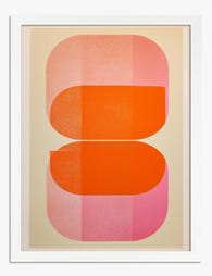
Poster abstracte roze blokken
Translation missing: nl.products.product.sale_price Vanaf €16,95€23,95 -

Poster roze en oranje harmonie
Translation missing: nl.products.product.sale_price Vanaf €16,95€23,95 -
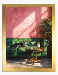
Poster kat in zonlicht met cocktails
Translation missing: nl.products.product.sale_price Vanaf €16,95€23,95 -

Poster roze klokjesbloemen met blauwgroene schaduw
Translation missing: nl.products.product.sale_price Vanaf €16,95€23,95 -

Poster roze bloemen met turquoise schaduw
Translation missing: nl.products.product.sale_price Vanaf €16,95€23,95 -

Canvas roze stadsgevel
Translation missing: nl.products.product.sale_price Vanaf €64,95€92,95 -
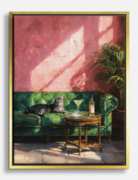
Canvas kat in de zon op groene bank
Translation missing: nl.products.product.sale_price Vanaf €64,95€92,95 -

Poster straatbeeld in pasteltinten
Translation missing: nl.products.product.sale_price Vanaf €16,95€23,95 -

Canvas roze wilde bloemen met turquoise schaduw
Translation missing: nl.products.product.sale_price Vanaf €64,95€92,95 -

Poster pastelkleurige gevels in Barcelona
Translation missing: nl.products.product.sale_price Vanaf €16,95€23,95 -

Canvas roze en oranje abstracte vormen
Translation missing: nl.products.product.sale_price Vanaf €64,95€92,95 -

Poster roze bloementuin geïnspireerd door Klimt
Translation missing: nl.products.product.sale_price Vanaf €13,95€23,95 -

Poster pastelroze herenhuis in Londen
Translation missing: nl.products.product.sale_price Vanaf €16,95€23,95 -

Poster met pastelkleurige vlakken
Translation missing: nl.products.product.sale_price Vanaf €16,95€23,95 -

Poster overlappende vormen in roze en oranje
Translation missing: nl.products.product.sale_price Vanaf €16,95€23,95 -

Poster knalroze en oranje met overlappende vormen
Translation missing: nl.products.product.sale_price Vanaf €16,95€23,95


Meer van The Frame

Art for Blue Walls: Sage, Navy, and Powder
Blue walls are one of the most rewarding paint decisions you can make, and one of the trickiest to style. Navy swallows light, powder blue can wash out, and sage...

Art for Dark Walls: Going Bolder or Quieter
Dark walls are not a problem to solve. They are an opportunity that most people approach with one tired piece of advice: just add contrast. The truth is there are...

Art for Cool Neutral Walls: Greys and Off-Whites
Cool neutrals aren't a design problem to solve. They're a deliberate, considered backdrop that deserves art chosen with the same care that went into picking the paint. Most advice treats...