Art for White Walls: The Hardest Wall to Dress
Why the "blank canvas" is actually the trickiest surface in your home, and how to dress it properly.

Everyone tells you white walls are easy. They're not. A white wall hides nothing: every proportion mistake, every cheap frame, every clashing undertone gets magnified because there's no colour to soften the blow.
This guide is for anyone who has stood in front of a blank white wall, scrolled through hundreds of prints, and closed the tab. We'll work through why white walls are genuinely difficult, then give you a framework for getting it right.
Why white walls are the hardest wall to dress
Colour on a wall does a lot of heavy lifting. A deep navy or warm terracotta sets the temperature of a room, dictates the palette, and forgives a multitude of sins. Hang a slightly-too-small print on a navy wall and it reads as intentional. Hang the same print on white and it looks lost.
White walls offer infinite options, which is the problem. Psychologists call it choice paralysis: the more possibilities you have, the harder it becomes to commit to one. Most people respond by either doing nothing for years or buying something safe and beige that disappears against the wall.
There's also the commitment paradox. Art is, in practice, temporary. You can take it down. But because white walls feel like a "fresh slate," people treat the decision as more permanent than it is and freeze.

The undertone problem nobody mentions
"White" is not one colour. The white on your walls has an undertone, and it's almost certainly one of these four:
- Warm white (creamy, slight yellow or peach undertone)
- Cool white (slight blue or grey undertone)
- True white (rare in real homes, mostly found in galleries)
- Greige white (warm grey, very common in new builds)
This matters because art with the wrong undertone will fight your wall. A cool, blue-leaning print on a warm cream wall makes both look dirty. A warm, ochre-heavy print on a cool grey-white wall can look jaundiced.
Hold a sheet of printer paper against your wall in daylight. If the wall looks yellow next to it, you have a warm white. If it looks blue or grey, you have a cool white. Now you know which direction to lean when choosing art.
How light changes everything
White walls are mirrors for whatever light hits them. North-facing rooms make whites read cooler and slightly gloomy. South-facing rooms warm everything up. East-facing walls shift from cool morning to warm evening. West-facing walls do the opposite.
Artificial light is just as important. Warm 2700K bulbs (the standard in most UK homes) will pull yellow into everything. Cooler 4000K bulbs, common in kitchens and offices, will sharpen contrast and emphasise blues.
The practical takeaway: look at art in the same light conditions where it will hang. A print that looks crisp under your phone screen at 11pm may look completely different on a sunlit wall at 2pm. This is one reason we use UV-protective acrylic glaze on our framed prints rather than glass: no glare, no colour shift, and the inks themselves are rated to last for hundreds of years without fading.
The sizing rule that solves 80% of mistakes
The single biggest mistake on white walls is art that's too small. On a coloured wall, an undersized print can still feel intentional. On white, it looks like a postage stamp on a duvet.
The professional consensus is that art should fill 60 to 75% of the available wall space above a piece of furniture, or 60-75% of the visual zone if it's a standalone wall.
Run the maths properly:
- Sofa that's 200cm wide? Your art should be 120-150cm wide. That's a 100x150cm canvas, or two 60x80cm framed prints hung side by side.
- Bed that's 150cm wide (a UK king)? Aim for 90-115cm of art width. A single 70x100cm framed print works, or a pair of 50x70cm prints.
- Console table at 120cm? You want 70-90cm of art. A 60x80cm print is the sweet spot.
When in doubt, size up. A print that's slightly too big has presence. A print that's slightly too small looks like a mistake.
Hanging height: the other 15%
Most people hang art too high. The centre of your artwork should sit at roughly 145-150cm from the floor, which is standard gallery eye level for the average adult.
Above a sofa, leave 15-25cm between the top of the sofa back and the bottom of the frame. Any more and the art "floats." Any less and it looks crowded.
White walls expose hanging height errors more than any other surface because there's nothing to distract the eye. If your art looks wrong, it's probably 10cm too high.

What colour art actually goes with white walls
Here's where most guides go wrong by telling you "anything works." It doesn't. Some choices are objectively stronger than others.
High contrast: the safest powerful choice
Bold, saturated colours with strong dark elements (deep charcoal, navy, burgundy, forest green, mustard) read beautifully against white. The contrast ratio is high, so the art holds its own and doesn't get bleached out.
This is why botanical prints, vintage travel posters, and graphic abstracts perform so well on white walls. They have built-in contrast.
Tonal: harder but elegant when right
A soft, low-contrast print (think pale blush, sage, oat, dusty blue) on a white wall can look exquisite, but only if you nail the undertones and lean into the quiet. One large piece works better than a cluster of small ones. The risk is that it disappears.
Black and white: nearly foolproof
Black and white photography or line art prints are the most reliable choice for white walls, particularly if you're nervous about committing. The contrast is automatic, the palette can't clash, and the look reads as considered rather than safe. Have a look through our black and white prints if this feels like your direction.
Earthy and warm: best for warm whites
Terracotta, ochre, sienna, burnt umber, sage. These pair beautifully with cream and warm-white walls. They feel grounded rather than precious. Our botanical prints and landscape work tends to sit in this register.
What to avoid
- Pure white art on white walls. It can work in very specific minimalist contexts, but for most homes it reads as a missing print rather than a deliberate choice.
- Beige-on-beige. Soft prints with warm beige tones on warm white walls disappear entirely.
- Anything with a fluorescent or neon palette unless you have a very modern, gallery-style interior to support it.
Gallery wall or single statement piece?
The decision framework comes down to two questions: how big is the wall, and how busy is the rest of the room?
Go single statement piece if:
- The wall is the main focal point of the room
- The rest of your space has a lot going on (patterned rugs, layered textures, full bookshelves)
- You want the room to feel calm
- You have a beautiful piece of furniture beneath it that deserves a clean frame above
Go gallery wall if:
- The wall is wide but visually fragmented (broken up by doors, switches, radiators)
- The rest of the room is minimal and could take more visual weight
- You want to layer in personality over time
- You have a collection of smaller prints that share a palette or theme
A single large framed print is generally the more sophisticated choice on white walls because it commands the space without competing with itself. Gallery walls are harder to get right: the spacing, alignment, and frame consistency all show on white. If you're going to try one, keep frames consistent (all black, all oak, all white) and use a paper template on the wall before you put a single nail in.
The room context that changes the rules
Living rooms and lounges
This is your highest-traffic art. It needs to hold up across morning coffee and evening dinner parties. Lean towards larger pieces with strong contrast. A single 70x100cm framed print above a sofa, or a 100x150cm canvas, will read as deliberate. Take a look at our living room art collection for sized examples.
Bedrooms
White walls in bedrooms benefit from softer, more tonal work. The room is for winding down, not making a statement. Pairs of matching prints above a bed (one each side of centre, or a stacked pair) work beautifully and solve the symmetry problem that white walls expose. Browse bedroom prints if you want to see what we mean.
Hallways and stairwells
White hallways need vertical art because the walls themselves are vertical. A portrait-orientation print (50x70cm or 70x100cm) at proper eye level transforms a transitional space without crowding it.
Home offices
You'll be looking at this wall for hours at a time. Avoid anything overstimulating. Architectural prints, abstract line work, and quiet landscapes all hold up to long viewing without becoming irritating.

The common mistakes that white walls expose
White walls are unforgiving. Here's what they reveal that coloured walls hide:
Cheap frames. A flimsy frame on a coloured wall is bad. On a white wall it screams. Solid wood frames read as quality even from across the room. MDF and veneer frames don't.
Warped prints. When canvas isn't properly stretched or framed prints aren't fitted correctly, white walls highlight every ripple and bubble. This is the most common failure in the category: art turning up with the print and frame in separate boxes for you to assemble, the canvas warping in transit, the corners not aligned. Buying art that ships fully assembled in one box with the print properly fitted solves this.
Wrong undertones. A cool-toned print on a warm wall will look slightly off and you won't know why. Now you know why.
Hanging too high. Already covered, but worth repeating. Lower your art by 10cm. It will look better.
Wall texture and sheen. High-sheen white paint (common in rented flats) bounces light and can clash with glossy art surfaces. Matte prints on matte walls always look more expensive than gloss on gloss.
Cost vs impact: when to invest
White walls expose cheap art faster than coloured walls do. Print quality, paper weight, frame construction, and colour accuracy all show. A poster on flimsy paper in a plastic frame looks like a poster. The same image printed on thick matte paper with proper giclée inks and a solid wood frame reads as art.
If you're going to invest in one piece, invest in the biggest piece on your most-visible wall. The sofa wall, the bed wall, the wall you see from the front door. Everything else can scale down in cost. A single excellent statement print does more for a room than five mediocre ones.

Do white walls make a room look bigger?
Yes, but not by as much as people think, and not without help. White walls reflect light, which expands perceived space. But a white room without art reads as empty rather than spacious. The art is what turns "blank" into "considered."
Counterintuitively, large pieces of art make small white rooms feel bigger, not smaller. The eye reads scale and depth. A tiny print on a vast white wall draws attention to how empty the wall is.
A simple decision-making framework
If you're stuck, work through this in order:
- Identify your wall's undertone. Warm, cool, or neutral?
- Measure the available wall zone. Aim for art that fills 60-75% of the width.
- Decide single or gallery. Single is safer and more sophisticated for most rooms.
- Pick contrast first, then palette. High contrast or black and white if you're nervous. Tonal if you're confident.
- Match undertones. Warm art for warm whites, cool art for cool whites.
- Hang at 145-150cm centre height, with 15-25cm above any furniture.
Stop scrolling after you've chosen. White walls reward decisions more than they reward deliberation. The wall has been blank for months. Putting something good on it today is better than putting something perfect on it next year.

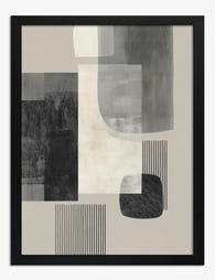
Fab-producten in dit blog
-

Poster witte kliffen van Dover
Translation missing: nl.products.product.sale_price Vanaf €16,95€23,95 -
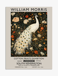
Poster pauw met bloemmotief – geïnspireerd op William Morris
Translation missing: nl.products.product.sale_price Vanaf €16,95€23,95 -
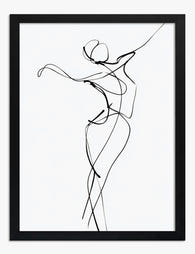
Dancer in One Line Art Print
Translation missing: nl.products.product.sale_price Vanaf €16,95€23,95 -

Poster vrouwelijke silhouet in zwart-wit
Translation missing: nl.products.product.sale_price Vanaf €16,95€23,95 -

Poster expressief gezichtsportret met kleurvlakken
Translation missing: nl.products.product.sale_price Vanaf €16,95€23,95 -

Poster Italiaans café in pasteltinten
Translation missing: nl.products.product.sale_price Vanaf €16,95€23,95 -
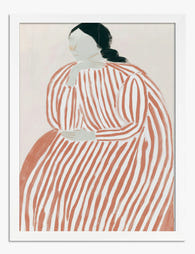
Poster rustig gestreept portret in zachte tinten
Translation missing: nl.products.product.sale_price Vanaf €16,95€23,95 -

Poster haar verhaal, haar regels – zwart-wit typografie
Translation missing: nl.products.product.sale_price Vanaf €16,95€23,95 -
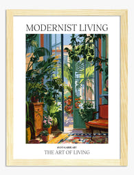
Poster botanische oase in moderne serre
Translation missing: nl.products.product.sale_price Vanaf €16,95€23,95 -

Canvas William Morris pauwenmotief
Translation missing: nl.products.product.sale_price Vanaf €64,95€92,95 -

Poster altaarstuk nr. 1 van Hilma af Klint
Translation missing: nl.products.product.sale_price Vanaf €16,95€23,95 -

Poster witte tulp op groene achtergrond
Translation missing: nl.products.product.sale_price Vanaf €16,95€23,95 -

Poster verstilde reflectie
Translation missing: nl.products.product.sale_price Vanaf €16,95€23,95 -
Poster stedelijke geometrie in zwart, grijs en beige
Translation missing: nl.products.product.sale_price Vanaf €16,95€23,95 -

Poster witte pompoenen in zacht beige
Translation missing: nl.products.product.sale_price Vanaf €16,95€23,95 -

Poster witte klaprozen in roze tas
Translation missing: nl.products.product.sale_price Vanaf €16,95€23,95 -

Poster de tien grootste – Hilma af Klint
Translation missing: nl.products.product.sale_price Vanaf €16,95€23,95 -

Poster slenteren over de greens
Translation missing: nl.products.product.sale_price Vanaf €16,95€23,95 -
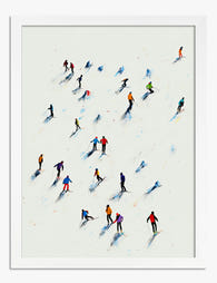
Poster skiërs in de sneeuw
Translation missing: nl.products.product.sale_price Vanaf €16,95€23,95 -

Poster abstracte, kleurrijke spatten
Translation missing: nl.products.product.sale_price Vanaf €16,95€23,95


Meer van The Frame

Kitchen Art: What Works, What Fades
Kitchens are the worst room in your home for art. Heat cycles, steam plumes, airborne grease, and direct overhead lighting will quietly destroy anything you hang without thinking. This guide...

The Bedroom Finishing Guide: Art, Scale, and Light
Most bedrooms get decorated, but very few get finished. The difference is not how much you put on the walls, it is whether the art, the scale of your furniture,...

One Statement Piece Is All Your Living Room Needs
Most blank walls stay blank because the brief feels enormous. You don't actually need a gallery, a grid, or a curated grouping you'll second-guess for six months. You need one...