
 Bestel vandaag, levering vóór
 Botanical Bedroom Ideas: How to Use Plant Prints for a Calmer, More Beautiful Space
The tactical guide to using plant prints for a bedroom that actually feels restful, not just Pinterest-pretty.


Botanical prints belong in bedrooms more than any other room in the house. The trick is choosing the right subjects, sizing them properly, and understanding how a printed leaf on the wall behaves very differently from a bright tropical explosion. This guide is about the details competitors skip: exact dimensions above the headboard, why matte paper matters when you're trying to sleep, and how to match a fern to your linen bedding without it looking like a coincidence.
Why botanical prints work so well in bedrooms
There's a reason hospital wards, spas, and hotel suites lean on plant imagery. It's called biophilic design, and the professional consensus is that exposure to natural forms lowers physiological stress markers even when the forms are represented rather than real. A printed fern won't purify your air, but your nervous system doesn't entirely know the difference when your eyes land on it before sleep.
The bedroom is the one room where you're horizontal, still, and looking at your walls for extended periods. That makes wall art disproportionately important here compared to a hallway or kitchen. Whatever you hang is what your brain processes in the last five minutes before sleep and the first five minutes of the day.
Botanical subjects also happen to be visually forgiving. They're organic, asymmetric, and low-contrast in a way that geometric art or portraiture isn't. Your eye can rest on them without being pulled to a focal point, which is exactly what you want in a room designed for switching off.
Subjects to choose: ferns, grasses, and softer florals
Not all plant art is calming. A bird of paradise print in electric orange and jungle green will energise a room, which is wonderful in a lounge and counterproductive in a bedroom. The best botanical prints for a bedroom share three qualities: muted palette, delicate line work, and negative space.
Ferns are the strongest single category. Their fronds are symmetrical, the greens tend toward soft sage or dusty olive, and they sit beautifully against a pale background. Vintage fern lithographs and modern pressed-fern photography both work.
Grasses and cereals (wheat, oats, wild meadow grasses) bring a warm, autumnal calm that works especially well in bedrooms with cream, oatmeal, or camel textiles. They read as pastoral rather than exotic.
Soft florals like pressed wildflowers, single-stem studies, or muted peonies are the safest floral choice. Avoid anything bright red, hot pink, or high-saturation yellow. What you want is a botanical illustration that could plausibly have been drawn 150 years ago in a naturalist's field notebook.
What to skip in a bedroom: monstera, palm, banana leaf, protea, and anything described as "tropical." These are gorgeous prints. They just belong somewhere you want energy rather than calm. Save them for the living room or a home office.

Above the headboard: the symmetrical pair layout
The single most effective botanical arrangement in a bedroom is a matched pair, hung symmetrically above the headboard. It frames the bed, reinforces the room's central axis, and reads as intentional rather than decorative.
Here's the formula. Measure the width of your headboard. Your two prints together (including a gap between them) should span roughly two-thirds of that width. For a standard UK double (135cm headboard), that means two 40x50cm prints with a 5 to 10cm gap between them. For a king (150cm), step up to 50x70cm prints. For a super king or a wide upholstered headboard, a pair of 60x80cm prints looks properly considered.
The bottom edge of each frame should sit 15 to 20cm above the top of the headboard. Any closer and it looks cramped. Any further and the prints float, disconnected from the bed.
For the pair itself, choose two prints from the same series or artist. Two different ferns from the same botanical study. Two grasses in the same palette. What you're aiming for is variation within unity, not two random plant prints that both happen to be green.
If you want a genuinely period feel, the Kew Gardens botanical prints collection is designed for exactly this kind of pairing, with matched subjects from the same historical archive.
A quick test before you commit
Cut two pieces of newspaper or brown paper to your chosen print size and tape them to the wall with masking tape. Live with them for 48 hours. You'll know immediately if they're too small, too high, or too close together. This costs nothing and saves you drilling holes you'll regret.
The single statement print
If your bed sits against your main wall and there's no room for a pair, or if you simply want something quieter, a single statement print is often the stronger choice. One large botanical, well-chosen and well-hung, creates more calm than three medium prints fighting for attention.
Size it generously. The print should span at least 50 to 60 percent of the headboard width. For a king, that's a 70x100cm print. Anything smaller looks like an afterthought floating above the bed.
Centre it precisely on the headboard, not on the wall. If your bed isn't centred on the wall (common in bedrooms with awkward doors or radiators), align the print with the bed. The eye reads the bed as the anchor.
Single statement prints work particularly well with subjects that have vertical composition: a tall grass study, a single stem, an elongated fern frond. Vertical prints reinforce the sense of height in the room and echo the standing form of a real plant.

Colour matching to bedding and textiles
The mistake most people make is treating botanical prints as neutral. They're not. A print with warm ochre grasses will fight with cool grey bedding, and a print with cool sage foliage will look out of place above a mustard throw.
Start with your existing bedding and identify its undertone. Warm undertones include cream, oatmeal, camel, terracotta, and warm greys. Cool undertones include crisp white, dove grey, soft blue, and sage.
For warm bedding, choose botanical prints with amber, ochre, russet, or warm brown tones. Dried grasses, autumn ferns, and pressed wildflower studies with earthy backgrounds work beautifully.
For cool bedding, look for prints with soft greens, blue-greens, and cool greys. Fresh ferns on off-white backgrounds, eucalyptus studies, and cool botanical line drawings all sit naturally here.
The background colour of the print matters as much as the plant itself. A cream or aged-paper background reads warm. A pure white or pale grey background reads cool. This is the detail most people miss when decorating with botanical prints, and it's why some rooms feel cohesive and others feel like the art was chosen in isolation.
One more rule: limit your palette to two greens maximum across all your bedroom art. Three or more greens starts to feel like a garden centre.
Matte paper and zero glare
This is the detail nobody talks about, and it's the one that matters most in a bedroom. Bedrooms have highly variable lighting. Bright morning sun through curtains, warm bedside lamps, harsh overhead lights, moonlight through a gap in the blinds. Any glossy surface on your wall will pick up all of it and throw it back at you.
Glossy prints and glass-fronted frames create reflections that flatten the artwork and, more practically, catch your eye when you're trying to wind down. Matte paper absorbs light rather than bouncing it, which keeps the colours true throughout the day and the print visually quiet at night.
Fab's art prints are printed on thick matte paper using museum-grade giclée printing, and the framed versions use UV-protective acrylic glaze rather than glass. The acrylic is anti-glare and considerably lighter, which matters when you're hanging something above where your head rests. Framed prints arrive ready to hang with fixtures already fitted, so you're not assembling anything above a bed.
The other reason matte matters: colour accuracy. Botanical prints rely on subtle tonal shifts (the difference between sage and moss, between cream and oat) that get lost on a reflective surface. Matte paper preserves those gradients, which is why the print looks like the artwork rather than like a printout.
Vintage botanical prints vs modern botanical art
Both work in bedrooms. The choice is really about your house, not your preference.
Vintage botanical prints (Victorian lithographs, Kew-style scientific illustrations, aged pressed-flower studies) suit period homes: anywhere with cornicing, picture rails, sash windows, or original floorboards. The aged cream backgrounds and hand-drawn line work echo the age of the architecture. In a Victorian terrace, a set of vintage fern lithographs feels inevitable.
Modern botanical art (minimalist line drawings, black-and-white photography, abstract plant studies) suits contemporary spaces: new-builds, converted flats, anywhere with clean plaster walls and simple architecture. A modern single-line fern in a thin black frame looks appropriate here where a Victorian lithograph would look like set dressing.
You can mix, but do it deliberately. One vintage botanical in a modern room can work as a considered accent. A modern botanical in a period room can feel refreshing rather than jarring. What doesn't work is a random blend of both styles across a single wall.
For bedroom wall art specifically, err toward whichever style feels quieter to your eye. That's usually the one that matches your architecture.

Completing the look
Botanical prints don't work in isolation. They work when they're part of a room that feels like it belongs to the same world.
Layer with real plants, sparingly. One or two real plants (a trailing pothos on a shelf, a snake plant in the corner) reinforce the botanical theme without competing with the art. Avoid clustering plants near the prints themselves. Give the artwork visual breathing room.
Use natural materials elsewhere. Linen bedding, a wool throw, a rattan pendant, an oak side table. These materials share the same natural, organic quality as the botanical subjects and make the whole room feel considered.
Get the lighting right. Warm bulbs (2700K or lower) flatter botanical prints and support sleep. Cool white bulbs (4000K+) drain the warmth from cream backgrounds and make sage greens look grey. If you have a bedside lamp near a print, angle it so the light washes across the wall rather than hitting the print head-on.
Rotate seasonally if you want. One of the quiet pleasures of having a small collection of botanical art is swapping prints with the seasons: fresh greens in spring, meadow grasses in late summer, dried seed heads in autumn. Because framed prints arrive ready to hang and go back into their boxes cleanly, this is a genuine option rather than a hypothetical one.
Keep the rest of the walls quiet. Botanical prints look their best on plain walls in soft, muted colours: chalk white, warm off-white, pale sage, soft clay, dusty pink, mushroom. Patterned wallpaper behind a botanical print is almost always a mistake in a bedroom. One or the other, not both.

The final word
The best botanical bedroom isn't the one with the most plant prints. It's the one where two or three carefully chosen prints, sized properly, hung symmetrically, and matched to the room's palette, do more work than a wall full of average ones. Pick soft subjects, choose matte paper, measure twice before you drill, and let the room breathe. That's the whole method.

Fab-producten in dit blog
-

Poster wilde veldbloemen
Aanbiedingsprijs Vanaf €16,95€23,95 -
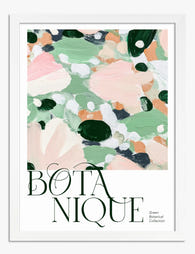
Poster botanisch groen met speelse roze spatten
Aanbiedingsprijs Vanaf €16,95€23,95 -

Poster botanische harmonie in groen
Aanbiedingsprijs Vanaf €16,95€23,95 -

Poster schets van wilde bloemen in bloei
Aanbiedingsprijs Vanaf €16,95€23,95 -

Canvas wilde veldbloemen
Aanbiedingsprijs Vanaf €65,95€93,95 -

Canvas abstract in zachte botanische kleuren
Aanbiedingsprijs Vanaf €65,95€93,95 -

Blue Cyanotype Botanical Study Art Print
Aanbiedingsprijs Vanaf €16,95€23,95 -

Canvas abstracte botanische harmonie in pastel
Aanbiedingsprijs Vanaf €65,95€93,95 -

Blue Cyanotype Botanical Study Canvas Print
Aanbiedingsprijs Vanaf €65,95€93,95 -

Canvas botanische bloemen in lijntekening
Aanbiedingsprijs Vanaf €65,95€93,95 -

Poster botanische schets, speels en modern
Aanbiedingsprijs Vanaf €16,95€23,95 -

Poster botanische bladeren van William Morris
Aanbiedingsprijs Vanaf €16,95€23,95 -

Poster botanische lijntekening van plant in pot
Aanbiedingsprijs Vanaf €16,95€23,95 -

Blue Cyanotype Botanical II Art Print
Aanbiedingsprijs Vanaf €16,95€23,95 -

Poster wilde bloemenweide
Aanbiedingsprijs Vanaf €16,95€23,95 -

Poster groene botanische vormen
Aanbiedingsprijs Vanaf €16,95€23,95 -

Poster boho bloemen in mauve en vergrijsd blauw
Aanbiedingsprijs Vanaf €16,95€23,95 -
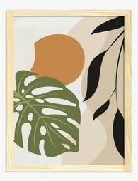
Poster boho botanisch in terracotta en groen met zonnig accent
Aanbiedingsprijs Vanaf €16,95€23,95 -

Canvas speelse botanische tekening
Aanbiedingsprijs Vanaf €65,95€93,95 -
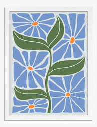
Poster blauwe boho bloemen
Aanbiedingsprijs Vanaf €16,95€23,95


Meer van The Frame

Why Kew Gardens Became the World's Most Famous ...
Kew Gardens holds around 200,000 botanical illustrations, the largest collection of its kind anywhere. Behind that number is a story of royal ambition, global exploration, and artists sent to the...

Are Botanical Prints Still in Style? Why They W...
Yes, botanical prints are still in style. But the version of botanical art that feels current in 2025 looks very little like the pastel rose bouquets in gilt frames you...

What Peacock Feathers Symbolise in Art: From An...
Few motifs have travelled as far or meant as many things as the peacock feather. It has been carved into Persian palaces, embroidered onto Mughal thrones, painted by Art Nouveau...