Botanical Prints vs. Floral Art: What's the Difference and Which Should You Choose?
One is a scientific specimen, the other a feast for the senses. Here's how to tell them apart and pick the right one.

If you've searched for "botanical art prints" and ended up scrolling through everything from Victorian fern studies to neon abstract peonies, you're not imagining the chaos. The two categories get used interchangeably, but they're genuinely different things with different histories, different aesthetics, and different jobs to do on your wall.
A quick history: from 18th-century plant catalogues to modern wall art
Botanical illustration started as science, not decoration. During the Age of Exploration in the 17th and 18th centuries, European naturalists were collecting plant specimens from every corner of the world and needed a way to record them before photography existed. Artists like Maria Sibylla Merian, who documented the insects and plants of Suriname, and Pierre-Joseph Redouté, who painted roses for Empress Joséphine at Malmaison, produced work that was meant to be accurate first and beautiful second.
These plates were published in catalogues like Curtis's Botanical Magazine (first issued in 1787) and Basilius Besler's Hortus Eystettensis. They sat in libraries and herbariums, used by botanists to identify species. The fact that they're now hanging in living rooms across the country is a recent twist.
Floral art, by contrast, never had a job beyond being looked at. The Dutch Golden Age painters of the 1600s, Rachel Ruysch and Jan van Huysum among them, painted dense, dramatic bouquets that often combined flowers that wouldn't bloom in the same season. Accuracy wasn't the point. Mood, opulence, and the quiet symbolism of vanitas were. That tradition has flowed forward through the Impressionists, the Art Nouveau movement, and into the contemporary abstract florals you see on Instagram today.

Botanical prints: the hallmarks of the scientific style
You can spot a proper botanical print in about three seconds once you know what to look for.
The plant sits alone on a plain, usually cream or off-white background. There's no vase, no styling, no atmosphere. The composition feels like a specimen pinned to a page, which is exactly what it was meant to evoke. You'll often see the root structure and the flowering parts shown together, which doesn't happen in real life but does happen on a botanist's desk.
Other tells: Latin nomenclature printed at the bottom (Rosa gallica, Digitalis purpurea), occasionally hand-lettered. Sometimes a numbered figure caption or a fold-out anatomical detail showing the seed pod or stamen up close. The palette is restrained, leaning on muted greens, browns, soft pinks, and cream. Nothing screams.
The mood is scholarly and calm. It's the difference between looking at a flower and studying one. If you're drawn to that quiet, almost reverent feel, you'll find plenty of it in the botanical art prints collection.
Floral art: everything from Dutch masters to contemporary abstraction
Floral art is the much wider category, and that's both its strength and the reason it's harder to shop for.
Under this umbrella you'll find the lush, shadowy bouquets of the Dutch tradition. You'll find Georgia O'Keeffe's enormous, almost confrontational close-ups. You'll find Japanese ukiyo-e flower prints with their flat planes of colour and elegant linework. You'll find Art Nouveau posters where flowers dissolve into pattern, and you'll find loose, modern watercolours where a peony is more a suggestion than a portrait.
The unifying thread is that floral art is about feeling, not fact. Colours are heightened. Compositions are arranged. Flowers might be paired with fruit, birds, ribbons, or pure abstract shapes. The artist's hand is visible in a way it deliberately isn't in botanical illustration.
This is where you go if you want drama, romance, or a strong colour story. Browse the full flowers art prints collection and you'll see how much range lives inside this single category.
Where they overlap and where they diverge
There's a grey zone, and it's worth naming it. A 19th-century rose plate by Redouté is technically botanical illustration, but it's also undeniably beautiful in a romantic, decorative way. Plenty of contemporary artists work in a "botanical style", painting single specimens on plain backgrounds but without any scientific rigour behind them.
The honest distinction comes down to intent. Botanical illustration was made to teach. Floral art was made to move you. When you're shopping, ask yourself which one you actually want on the wall.
A second useful test: would a botanist recognise the species? If the answer is yes, you're in botanical territory. If the flower has been simplified, stylised, or arranged into a composition, you're firmly in floral art.

Which style suits which room and interior
This is where most guides get vague, so we'll be specific.
Studies, libraries, and home offices
Botanical prints are made for these rooms. The scholarly mood reinforces focus, the muted palette doesn't compete with bookshelves, and there's a long visual tradition linking framed plant studies with serious thinking. A grid of four 30x40cm botanicals in slim black frames above a desk looks intentional and grown-up.
Kitchens and dining rooms
Both styles work here, but for different reasons. Botanical prints of herbs, vegetables, and citrus fruits feel right in a kitchen because they nod to what's happening on the worktop. Floral art works better in a dining room, where you want a bit of mood and theatre over dinner.
Bedrooms
Floral art tends to win here. The bedroom is one of the few rooms where you can lean into softness, romance, and a bit of sentimentality without it feeling overdone. A single large floral above the bed (60x80cm or larger) does more work than several smaller pieces.
Living rooms
Depends entirely on the rest of the room. A modern, minimal living room often looks best with one bold floral, abstract or otherwise, treated like a statement painting. A traditional or layered living room can carry a gallery wall mixing botanicals and florals if you commit to a unifying frame style.
Bathrooms, mudrooms, and hallways
Wildflower prints (more on these in a moment) come into their own in these smaller, more casual spaces. Canvas works particularly well in bathrooms because there's no glass to fog up and the poly-cotton handles humidity better than paper behind glass.
Vintage botanical prints: why they're having a moment
Search volume for "vintage flower art prints" has climbed steadily for several years now, and there are a few real reasons behind it.
The first is cottagecore and Grandmillennial style, both of which lean heavily on the visual language of old books, pressed flowers, and inherited objects. A vintage-style botanical instantly suggests a house with a history, even if you moved in last month.
The second is biophilic design, the broader trend toward bringing natural imagery and materials into interiors to support calm and focus. Botanical prints scratch this itch without the upkeep of actual houseplants.
The third is a quieter craving for authenticity. After a decade of slick digital aesthetics, the slightly faded, hand-drawn quality of an 18th-century plate feels grounded and human.
A practical note worth making: almost everything sold as "vintage botanical" today is a modern reproduction of a historical plate, not an antique original. That's not a bad thing. A good giclée print on thick matte paper, like the ones in our vintage art prints collection, captures the detail and colour of the original far more reliably than a 200-year-old piece of paper that's been sitting in a damp drawer. You get the look without the foxing, the fading, or the eye-watering auction price.
What to look for if you want the real vintage feel: accurate plant morphology, Latin names, a numbered plate or figure caption, a cream or aged-paper background, and ideally attribution to a recognisable historical source.

Wildflower prints: the casual middle ground
If formal botanical prints feel a bit too museum and floral art feels a bit too precious, wildflower prints are the answer.
Wildflower prints sit in the middle. They're often loosely painted or sketched, showing meadow flowers, grasses, and seed heads in a more naturalistic arrangement than a specimen page but without the styled drama of a bouquet painting. Think poppies, cornflowers, foxgloves, cow parsley, daisies, lavender.
This is the right register for cottagecore interiors, farmhouse kitchens, bohemian bedrooms, and any room where you want a hint of the outdoors without it feeling formal. They're also genuinely personal in a way the other two styles aren't. If you grew up in Cornwall, a print of sea pinks and gorse means something different than a print of generic roses. Regional and seasonal wildflowers turn a print into something with a story behind it.
Wildflower prints are also forgiving in a gallery wall. They sit happily next to a strict botanical, next to a more painterly floral, or next to landscapes from the wider nature art prints range. The looseness gives you room to play.
How to choose between them (or mix both)
A few honest principles to land this.
Match the style to the room's job
Quiet rooms (studies, bedrooms read in, snugs) reward quiet art. Sociable rooms (dining rooms, living rooms) can take more drama. Match the volume of the art to the volume of the room.
Use frames to set the tone
Botanical prints look best in slim, simple frames: black, white, or natural FSC oak. The frame should disappear and let the specimen do the work. Floral art can carry a heavier or more decorative frame, though we'd still lean toward simplicity unless the room genuinely needs ornament. If the print is going somewhere bright, the UV-protective acrylic glaze on our framed prints keeps colours from fading in direct sunlight, which matters more than people realise.
Canvas or framed paper?
Botanical prints almost always look better as framed paper prints. The crisp white margin and slim frame echo the specimen-on-a-page tradition. Floral art, especially looser or more painterly work, can look beautiful on canvas, where the matte poly-cotton surface adds to the hand-painted feel. Mirrored edge wrapping means you don't lose any of the image around the sides.
Mixing the two on a gallery wall
It works, but you need at least one unifying element. The easiest is a shared frame style across every piece (all slim black, all natural oak). The second easiest is a shared palette, for instance keeping everything in muted greens, creams, and soft pinks even if some pieces are scientific and others are loose. Vary the scale so your eye has somewhere to land. A typical layout might be one large piece at 60x80cm anchoring four smaller 30x40cm pieces around it.
Buy what you'd actually want to look at every day
The most useful test we know: imagine the print on the wall opposite your sofa. You'll see it thousands of times. Do you want to live with a quiet specimen plate or a vivid bouquet? Both are valid. The wrong answer is the one chosen because it seemed like the safe thing.

If you're still on the fence, start with one piece in the style you're least sure about and live with it for a few weeks. The 99-day returns window exists for exactly this reason. Trust your eye, not the trend feed.

Fab-producten in dit blog
-

Poster vintage botanische studieplaat
Translation missing: nl.products.product.sale_price Vanaf €16,95€23,95 -

Poster paarse botanische vintage bloemen
Translation missing: nl.products.product.sale_price Vanaf €16,95€23,95 -

Poster botanisch abstract in pasteltinten groen en roze
Translation missing: nl.products.product.sale_price Vanaf €16,95€23,95 -
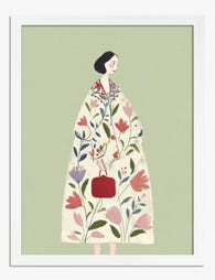
Poster botanische muze, vrouw in bloemenjas
Translation missing: nl.products.product.sale_price Vanaf €16,95€23,95 -

Poster abstracte botanische vormen
Translation missing: nl.products.product.sale_price Vanaf €16,95€23,95 -

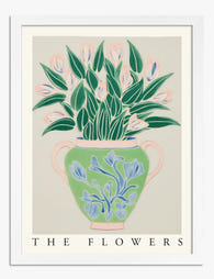
Poster botanische vazen met bloemen
Translation missing: nl.products.product.sale_price Vanaf €16,95€23,95 -

Poster donkere botanische bloemen
Translation missing: nl.products.product.sale_price Vanaf €16,95€23,95 -

Poster botanische bloem in modern groen en wit
Translation missing: nl.products.product.sale_price Vanaf €16,95€23,95 -

Poster botanische potplanten op plank, gele achtergrond
Translation missing: nl.products.product.sale_price Vanaf €16,95€23,95 -

Poster botanische lijntekening collectie
Translation missing: nl.products.product.sale_price Vanaf €16,95€23,95 -

Poster moderne botanische tekening
Translation missing: nl.products.product.sale_price Vanaf €16,95€23,95 -

Poster wilde kruidentuin in bloei – botanisch
Translation missing: nl.products.product.sale_price Vanaf €16,95€23,95 -
Poster botanische vaas met bloemen
Translation missing: nl.products.product.sale_price Vanaf €16,95€23,95 -
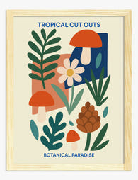
Poster botanische collage in tropische stijl
Translation missing: nl.products.product.sale_price Vanaf €16,95€23,95 -

Poster botanische collage met groene bladeren en witte bloemen
Translation missing: nl.products.product.sale_price Vanaf €16,95€23,95 -

Poster botanische basilicumillustratie in zwart-wit
Translation missing: nl.products.product.sale_price Vanaf €16,95€23,95 -

Poster botanische elegantie
Translation missing: nl.products.product.sale_price Vanaf €16,95€23,95


Meer van The Frame

Boho Prints in Every Room or Just the Bedroom? ...
Boho prints have a reputation for living almost exclusively above beds, which is a waste. They work in most rooms if you size them properly and pick the right frame....

Art Nouveau Botanical Prints: Modern Styling or...
Art nouveau plant prints are everywhere again, and most people are styling them wrong. The line between elegant and costume-y is thinner than the search results suggest, and the difference...

The Best Rooms for Whimsical Botanical Prints (...
Whimsical botanical prints get treated like a personality trait rather than a design choice. You either go all in on smiling mushrooms and dancing ferns, or you avoid them entirely....