How to Build a Greek Island Gallery Wall That Actually Looks Intentional
The tactical playbook for combining Santorini sunsets, Mykonos streets, and Aegean blues into a wall that looks curated, not cluttered.

You've collected a handful of Greek island prints and now you're staring at a blank wall, wondering how to arrange them without it looking like a holiday scrapbook exploded. The difference between chaotic and curated comes down to a few rules: a unifying thread, consistent framing, and a layout you've actually planned. Here's how to do all three.
Why Greek islands are perfect gallery wall material
Greek island imagery has a built-in colour palette doing half the work for you. White-washed walls, cobalt domes, terracotta rooftops, bougainvillea pink, deep Aegean blue. Even when subjects vary wildly, from Santorini's caldera to a fishing boat in Naxos, the colour story stays cohesive.
The other advantage is repetition of motifs: arches, steps, doorways, sea horizons. Your eye reads these as a series, even when the photographs were taken on different islands. That's why a Greek gallery wall is more forgiving than, say, a mixed European cities wall, where Paris and Prague rarely speak the same visual language.
The risk is volume. With so much striking imagery available, the temptation is to include everything. Resist it.
Picking a unifying thread: colour palette, style, or location
Before you buy a single additional print, pick one of these three threads and commit to it. This is the single most important decision you'll make.
Thread one: colour palette
The classic choice. Lock yourself into blues and whites with occasional warm neutrals (sandstone, terracotta, faded ochre). This lets you mix Santorini, Mykonos, Crete, and Paros freely, because the colour story holds them together. Reject anything that strays into heavy greens, purples, or saturated sunset oranges unless you're using it as a deliberate accent.
Thread two: location
Pick one island and go deep. An all-Santorini wall featuring Oia at sunset, the blue domes, the caldera, and a whitewashed alleyway will always feel more intentional than a "best of Greece" mix. This is the easiest path for beginners.
Thread three: style
Commit to one visual treatment. All photography, or all illustration, or all vintage travel poster. Mixing styles is the fastest way to make a wall look unplanned, which we'll come back to later.
You only need one of these threads. Two is a bonus. Three is overkill and usually leads to a wall so matched it feels like wallpaper.

The 3-print, 5-print, and 7-print layouts
Here are three layouts that work every time. Measurements assume standard print sizes and a 5cm gap between frames (the gallery standard).
The 3-print horizontal line
Best above a sofa, sideboard, or bed. Use three prints of identical size, ideally 40x50cm or 50x70cm, hung in a horizontal row with 5cm between each frame.
Centre the middle frame on the wall (or on the centre of the furniture below it). Total width for three 50x70cm frames with 5cm gaps is 160cm, which fits comfortably above a 180cm sofa. Hang the centre point of the prints 145cm from the floor, or roughly 20cm above the back of the sofa.
This is the foolproof option. If you've never hung a gallery wall before, start here.
The 5-print asymmetrical cluster
The most flexible layout, and the one that looks most "designed" when done well. You'll need:
- One large anchor print (60x80cm or 70x100cm)
- Two medium prints (40x50cm)
- Two smaller prints (30x40cm)
Place the anchor slightly off-centre, left or right. Cluster the remaining four around it, keeping the same 5cm spacing throughout. The trick: imagine an invisible rectangle around the entire arrangement. The outer edges of your prints should roughly hit the edges of that rectangle, with no single piece sticking out awkwardly.
Mix orientations here. A vertical Mykonos street scene next to a horizontal Aegean horizon creates rhythm. Two horizontals stacked on top of each other will balance one large vertical.
The 7-print grid
Strict, formal, hotel-corridor energy in the best way. Seven prints of identical size (we'd suggest 30x40cm) in a 4-3 or staggered grid.
For a 4-on-top, 3-on-bottom arrangement: total width with 5cm gaps is 175cm, total height is 85cm. The key is that every gap is exactly the same. Inconsistent spacing is what makes grids look amateur.
Grids work best with a single thread: all photography, all in the same colour temperature, all the same orientation. They are unforgiving of style mixing.
Mixing Santorini, Mykonos, and Aegean coastal scenes without clashing
If you want to mix locations (and most people do), you need a visual anchor. This is one print that's noticeably larger than the others and sets the tone.
Choose your anchor first. A wide-format Santorini caldera at sunset, for example. Then build outward by selecting prints that share at least one feature with the anchor: the same blue tone, the same time of day, the same level of contrast.
Reject prints that fight the anchor. A high-contrast black-and-white Mykonos street scene next to a soft pastel Oia sunset will look like two different walls. Either dial the Mykonos print down to a softer treatment, or swap the Santorini print for something with more punch.
The biggest mistake is treating each print as a separate decision. Every print needs to earn its place by relating to the anchor. If you can't articulate why a print belongs, it doesn't.
For inspiration on what plays well together, browse the Greece art prints collection and notice which images share light, palette, and mood.

Photography vs. illustration vs. travel poster styles: pick one lane
This is the rule competitors won't tell you: don't mix style categories.
Photography
Realistic, often atmospheric. Crisp shadows, real skies, actual textures of stone and sea. Photography reads as sophisticated and editorial. It pairs beautifully with modern, minimal interiors. The risk is that two photographs from different photographers can have wildly different colour grading, which is jarring up close.
Illustration
Hand-drawn or digitally illustrated scenes, often with simplified shapes and stylised colour. Illustration feels warmer and more playful. It works well in family rooms, kitchens, and bedrooms where you want softness rather than realism.
Travel poster
Bold typography, flat colour, retro-modern composition. Travel posters bring graphic energy and personality. They suit hallways, home offices, and bar carts. They almost never play well with photography, because the visual languages are too different.
Pick one lane. If you must mix, pair photography with minimalist line illustration only, never with bold travel poster graphics. And keep it to a 4-to-1 ratio: four photographs to one illustration as an accent, never half and half.
For travel poster aesthetics specifically, our travel art prints collection has options that work as full sets.
Frame consistency: the single easiest way to make a gallery wall look curated
Here's the unglamorous truth: frame choice matters more than print choice. A great selection of prints in mismatched, badly proportioned frames will always look worse than average prints in beautiful, matching frames.
When to match frames
Always, if you're a beginner. Pick one frame finish and use it for every print on the wall. This single decision does more to create the "intentional" look than anything else.
For Greek island prints specifically:
- Oak or natural wood: warm, casual, leans Mediterranean. Best with photography and illustration.
- White: crisp, gallery-like, makes blues and whites pop. Best in modern or coastal interiors.
- Black: dramatic, graphic, anchors high-contrast images. Best with travel posters and bold photography.
Our framed prints are made from solid FSC-certified wood (no MDF or veneers) and ship with the print already fitted, glazed with UV-protective acrylic rather than glass. That last point matters more than people realise: glass cracks in transit, glares under spotlights, and is heavy enough to make hanging a multi-print wall genuinely annoying.
When to mix frames
Only when you've done it before and you're confident. Mixing frames works if you stick to one finish family (all warm woods, for example, but in different tones) and keep the proportions consistent. Don't mix a chunky 4cm oak frame with a slim 1cm black frame. The eye reads inconsistency before it reads anything else.
The mat secret
If you're working with mismatched print sizes but want a unified look, white mats inside identical frames will rescue you. A 30x40cm print with a wide white mat inside a 40x50cm frame, hung next to a 40x50cm print with a narrow mat in the same frame, will read as a coherent set.
How to hang it straight without losing your mind
Don't freehand it. Use the kraft paper method.
- Lay your prints out on the floor first. Photograph the arrangement from above on your phone so you don't forget it.
- Trace each frame onto kraft paper or newspaper. Cut out the templates and mark where the hanging point sits on the back of each frame.
- Tape the templates to the wall with painter's tape, replicating your floor layout. Step back. Adjust until you're happy.
- Mark the hanging point through the paper directly onto the wall with a pencil.
- Tear away the paper and hammer in your fixings.
For the centre point of the entire arrangement, aim for 145-150cm from the floor (roughly eye level for the average person). The exception: if you're hanging above furniture, the bottom of the lowest frame should sit 15-25cm above the furniture, not at a fixed eye-level height. Furniture changes the visual baseline.
Spacing is non-negotiable. Use a ruler or a pre-cut piece of card at exactly 5cm to check every gap. Inconsistent spacing is the single biggest reason a gallery wall looks amateur.
Our framed prints arrive with fixtures already attached, which removes one variable from a process that already has too many.

Recommended Greece print combinations from our collection
Here are four combinations that work without further engineering.
The classic Santorini set (3 prints, 50x70cm)
Oia sunset, blue domes, whitewashed steps. All photography, all in the same blue-and-white palette. Hang in a horizontal line above a sofa or bed. The most beginner-friendly Greek wall you can build.
The Aegean coastal mix (5 prints, mixed sizes)
One large 70x100cm anchor of an Aegean horizon at golden hour, four 40x50cm supporting prints featuring fishing boats, a stone harbour, a single white church, and a calm beach scene. Use oak frames throughout for warmth. Best in a coastal-styled lounge.
The mixed-island travel poster wall (7 prints, 30x40cm)
Santorini, Mykonos, Crete, Rhodes, Corfu, Paros, Naxos. All in the same illustrated travel poster style, all in black frames, hung in a 4-3 grid. Ideal for hallways or home offices where you want graphic punch.
The bedroom calm set (3 prints, 40x50cm)
Three soft, low-contrast Aegean sea horizons or pale Santorini scenes in different framings of the same colour palette. White frames, horizontal line, hung above the headboard. Calming rather than energetic, which is what bedrooms need.
If building from scratch feels overwhelming, pre-curated wall art sets take the matching decisions off your plate entirely.

A few last things
Don't overcrowd. A gallery wall needs breathing room around it, ideally 20-30cm of empty wall on each side before any other furniture or feature begins.
Don't choose all horizontal orientations. A wall of nothing but landscape-oriented prints reads as flat and repetitive. At least one vertical print breaks the rhythm.
Don't mix warm and cool colour temperatures without intent. A golden-hour Santorini sunset (warm) next to a midday cobalt Mykonos scene (cool) will fight unless you've chosen frames that bridge them.
The best Greek island gallery walls aren't the ones with the most prints or the most expensive pieces. They're the ones where every print earns its place, every frame matches, and every gap is exactly 5cm. Get those three things right and the wall will look intentional, regardless of which islands you've chosen.

Fab-producten in dit blog
-

Poster zonovergoten trappen op Santorini
Translation missing: nl.products.product.sale_price Vanaf €16,95€23,95 -

Canvas modern Grieks stilleven
Translation missing: nl.products.product.sale_price Vanaf €64,95€92,95 -

Poster zonovergoten trappen in Santorini
Translation missing: nl.products.product.sale_price Vanaf €16,95€23,95 -

Poster zonovergoten trappen op Santorini
Translation missing: nl.products.product.sale_price Vanaf €16,95€23,95 -

Poster grieks stilleven met moderne draai
Translation missing: nl.products.product.sale_price Vanaf €16,95€23,95 -

Canvas zonovergoten steegje in Santorini
Translation missing: nl.products.product.sale_price Vanaf €64,95€92,95 -

Poster dromerige schets van Santorini
Translation missing: nl.products.product.sale_price Vanaf €16,95€23,95 -

Canvas trappen op Santorini bij schemering
Translation missing: nl.products.product.sale_price Vanaf €64,95€92,95 -

Canvas Grieks stilleven in mediterrane tinten
Translation missing: nl.products.product.sale_price Vanaf €64,95€92,95 -

Canvas zonovergoten straten van Santorini
Translation missing: nl.products.product.sale_price Vanaf €64,95€92,95 -

Poster mediterrane kuststraat met zeilboot
Translation missing: nl.products.product.sale_price Vanaf €16,95€23,95 -

Poster zonnige steeg in Santorini
Translation missing: nl.products.product.sale_price Vanaf €16,95€23,95 -

Canvas Griekse botanische harmonie met rode vaas
Translation missing: nl.products.product.sale_price Vanaf €64,95€92,95 -
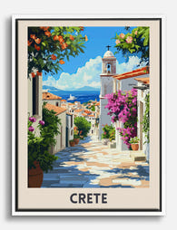
Canvas zonovergoten straatjes op Kreta
Translation missing: nl.products.product.sale_price Vanaf €64,95€92,95 -

Poster Santorini in blauwe tinten
Translation missing: nl.products.product.sale_price Vanaf €16,95€23,95 -

Canvas zonovergoten steegje naar zee op Kreta
Translation missing: nl.products.product.sale_price Vanaf €64,95€92,95 -

Canvas zonsondergang op Santorini
Translation missing: nl.products.product.sale_price Vanaf €64,95€92,95 -
Poster Santorini met blauwe koepels
Translation missing: nl.products.product.sale_price Vanaf €16,95€23,95 -

Canvas Santorini in serene blauwtinten
Translation missing: nl.products.product.sale_price Vanaf €64,95€92,95 -

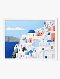
Canvas Santorini - blauw-witte architectuur in aquarel
Translation missing: nl.products.product.sale_price Vanaf €64,95€92,95


Meer van The Frame

How to Style Frida Kahlo Art Prints: Room-by-Ro...
You've decided on Kahlo. Now comes the harder part: choosing which works, what size, what frame, and where to hang them so the result feels considered rather than chaotic. This...

Above the Bed: 7 Modern Art Arrangements That A...
Most advice on what to hang above your bed falls into two camps: 47 random Pinterest ideas, or a single rule about two-thirds widths that leaves you no closer to...

How to Build a Gallery Wall Around a Bicycle Pr...
A gallery wall built around a bicycle print should feel like a well-edited bookshelf, not a clubhouse. The trick is restraint: one strong cycling piece, a thoughtful supporting cast, and...