Matisse vs. Klimt: Two Masters of Pattern and Which One Suits Your Space
One painted with scissors and sunlight, the other with gold leaf and obsession. Here's how to choose.

Both Matisse and Klimt built their reputations on pattern, but they pulled in opposite directions. One stripped colour and shape back to their happiest essentials. The other piled on gold leaf, mosaic, and ornament until the surface shimmered. Choosing between them is really a question about how you want your room to feel.
Two artists obsessed with pattern, two completely different results
Matisse and Klimt were near contemporaries working at the turn of the 20th century, and both spent their careers fascinated by decorative surface. The similarity ends there.
Klimt's pattern obsession came from Byzantine mosaics, Japanese woodblock prints, and the gilded religious art he saw in Ravenna. Matisse's came from North African textiles, Polynesian colour, and the cut paper he turned to late in life when illness kept him from the easel. Klimt added until the canvas was full. Matisse subtracted until only the essential remained.
The Belvedere in Vienna ran a major exhibition exploring how the two artists circled each other intellectually, and the takeaway for anyone hanging their work at home is this: they answer different questions. Klimt asks how rich a surface can become. Matisse asks how much joy you can pack into the fewest possible shapes.

Colour and mood: Mediterranean warmth vs. Viennese gold
The fastest way to feel the difference is to look at the palettes side by side.
Matisse works in sun-bleached blues, coral, leaf green, deep cobalt, and the kind of warm white you see on a Nice balcony in July. His colours are flat, confident, and unmixed. They don't try to imitate nature, they try to feel like nature. A Matisse print on your wall reads as fresh air, citrus, and afternoon light.
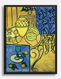
Klimt sits at the opposite end. His golden period paintings, the ones most reproduced as prints, layer metallic ochre, oxblood, forest green, ivory, and black against gold leaf backgrounds. The mood is opulent, slightly melancholic, candle-lit even in the daytime. A Klimt print reads as velvet, incense, and a long winter dinner.
This is the central question to ask yourself before buying either. Do you want your wall to brighten the room, or deepen it? Matisse brightens. Klimt deepens. Neither is better. They just do different work.
Organic simplicity vs. ornamental complexity
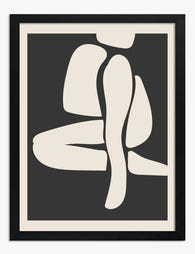
The Matisse pattern style is built from organic shapes: leaves, seaweed, dancing bodies, coral, stars. Even his most complex compositions read as a handful of bold forms floating on a coloured ground. Stand back five metres and a Matisse print still makes sense. The composition is legible at any distance.
Klimt builds the opposite way. His patterns are dense, geometric, and often microscopic in detail. Spirals, eyes, rectangles, triangles, gold dots, and stylised flowers nest inside one another. You can stand in front of The Kiss for ten minutes and still find something new. The reward is in the proximity.
This matters more than people realise when choosing where to hang a print. A piece of Matisse abstract pattern art carries a long sightline, which is why it works above a sofa or at the end of a hallway. Klimt rewards close looking, which is why it belongs somewhere you actually sit still: beside the bed, opposite the dining table, in a reading corner.
There's also a scale effect. Matisse's simplicity makes a small print feel generous because the shapes have room to breathe. Klimt's density makes a small print feel cramped, because the eye can't process the detail. If you're buying Klimt, go bigger. 50x70cm is the sensible minimum. For Matisse, you can drop to 30x40cm and the composition still sings.
Which rooms suit Matisse patterns and which suit Klimt
This is where most buying guides stay vague. We're going to commit to recommendations.
Where Matisse works best
Kitchens and bathrooms. Matisse's flat colour and leaf forms feel like the visual equivalent of a window thrown open. The cut-out works in particular suit splash-prone rooms because the imagery already references water, plants, and air. Canvas prints handle humid bathrooms better than framed prints with glass, though our framed prints use UV-protective acrylic rather than glass, which means they tolerate steamy rooms without fogging or condensation pooling on the surface.
Children's rooms and family spaces. The colour is cheerful without being saccharine, and the shapes are forgiving of mess and movement around them. Matisse decorative art prints sit happily next to toys, books, and the chaos of actual life.
Small lounges and rentals. Because the compositions are simple, they don't fight with patterned sofas, rugs, or curtains. If your living room is already busy, Matisse adds to it without compounding the visual noise.
North-facing rooms. His warm coral and cobalt actively compensate for cool, grey light. This is the move if your flat doesn't get much sun.
Where Klimt works best
Bedrooms. Klimt's intimacy, particularly the embracing figures of The Kiss and Adele Bloch-Bauer, is genuinely romantic without tipping into cliché. The gold tones flatter the warm low light of a bedside lamp.
Dining rooms. Long evenings, candles, conversation. Klimt's ornament rewards the slow looking that happens at a dinner that runs to midnight.
Studies and reading rooms. Anywhere you sit still with a book. The density of pattern gives the eye somewhere to wander when you look up from the page.
Hallways with strong lighting. A single large Klimt opposite a picture light can carry an entire corridor.
Avoid Klimt in small bathrooms (the density feels claustrophobic), bright minimalist kitchens (the ornament clashes with clean lines), and anywhere with cool grey walls (the gold goes muddy).

Mixing both on one wall: can it work?
Yes, but only if you follow a formula. The honest answer is that most people who try to mix Matisse and Klimt end up with a wall that looks confused, because the two aesthetics pull the room in opposite directions. Done with intention, though, the contrast can be brilliant.
Here's the rule we use. Pick one artist as the dominant voice, at roughly 70% of the wall, and use the other as a single accent at 30%. A gallery wall of five or six Matisse prints with a single small Klimt as a focal point works beautifully. So does the reverse: a large central Klimt flanked by two smaller Matisse line drawings or leaf studies.
What doesn't work is a 50/50 split. The two artists are too tonally different to share equal billing. The wall ends up reading as indecisive.
A few practical tips for the mix:
- Unify the frames. This is non-negotiable. If you're mixing artists, the frames must match exactly. Same wood, same width, same finish. Different frames plus different artists is two layers of chaos.
- Find a colour bridge. Both artists used deep blue and ochre. Pick prints from each that share a colour, even subtly, and the wall will feel composed rather than collaged.
- Mind the line weight. Klimt's intricate detail next to Matisse's bold shape can feel jarring. Use a Matisse cut-out (which has more visual weight) rather than a delicate line drawing to balance against Klimt's density.
If you want to widen the mix, both artists pair well with adjacent movements. Matisse sits comfortably alongside Bonnard, Picasso line drawings, and Mediterranean modernists. Klimt belongs in conversation with the rest of the Art Nouveau world: Mucha, Schiele, Hodler.
Print and frame options: how finish affects the final look
Pattern-heavy art is unusually sensitive to finish. The wrong frame or paper can flatten work that should sing.
For Matisse
Matisse needs to stay flat and matte. His colour blocks are designed to be read as pure colour, not as texture. Glossy paper or canvas with a heavy weave will compete with the flatness he was after. Our museum-grade giclée prints on thick matte paper are exactly the right call here, because the surface gives nothing back to the light. The colour stays clean.
For frames, go light. Natural oak, white-painted wood, or a slim black frame all work. Avoid anything ornate. Gold frames around Matisse look like you've made a category error. Wide mounts in soft white add space around the composition and let the shapes breathe.
Canvas is also a strong option for Matisse, particularly the cut-outs, because the lack of frame and the slight texture lean into the handmade, papery feel of his original technique. Hand-stretched canvas with mirrored edge wrapping keeps the full composition intact, which matters when his shapes often run to the very edge of the image.
For Klimt
Klimt is the opposite problem. His paintings already contain gold leaf, ornament, and depth, so the frame has to either match that opulence or get out of the way completely. Two strategies work.
The first is to match the energy with a warm wood frame, walnut or dark oak, with a slight profile. This frames the work the way a Viennese collector might have hung it in 1908.
The second, more contemporary move is to use an extremely slim black or natural oak frame that does almost nothing, letting the painting carry all the visual weight itself. This is the better choice for modern interiors.
What you should not do is put Klimt in a thin white frame against a white wall. The gold tones go yellow and tired, and the composition loses its punch.
Matte paper is again the right call. Klimt's gold reads as colour, not metal, so anything reflective in the print surface (glossy paper, glass glazing) creates a competing shine that fights the painted gold. The UV-protective acrylic glaze on our framed prints is non-reflective enough to let the gold sit where it should.

Our picks from each collection
A few specific recommendations to anchor the decision.
If you're going Matisse
Start with the cut-outs. La Gerbe, The Snail, and the Blue Nudes series are his most recognisable and the easiest to live with. They scale beautifully, so you can buy a 30x40cm for a hallway or a 70x100cm to anchor a sofa.
Then add a line drawing. His ink portraits and floral studies bring a quieter register to a Matisse wall. A single line drawing among three or four colour cut-outs gives the eye somewhere to rest.
Browse the full range of Matisse pattern art prints if you're building a wall from scratch.
If you're going Klimt
The flagship pieces. The Kiss, Portrait of Adele Bloch-Bauer I, and Tree of Life are the three you'll see most often, and they're popular for good reason. The composition holds up at any scale above 50x70cm.
Then the landscapes. Klimt's landscape paintings (the birch forests, the poppy fields, the lake at Attersee) are vastly underrated and bring the same pattern obsession without the figurative weight. They work in rooms where a portrait might feel too intense.
The full collection of Gustav Klimt prints covers both his golden period and the lesser-known later landscapes.

A final thought
Don't choose by reputation. Both artists are giants, both are heavily reproduced, both will look good in the right room. Choose by the feeling you want when you walk in. If the answer is open windows and Mediterranean light, you're a Matisse household. If it's candlelight, long dinners, and gold catching the lamp at 11pm, you're a Klimt one. The wall will tell you which it wants to be if you stop and ask.

Fab-producten in dit blog
-

Poster botanische vormen in Matisse-stijl, groen & beige
Translation missing: nl.products.product.sale_price Vanaf €16,95€22,95 -
Poster Matisse-geïnspireerde abstracte elegantie
Translation missing: nl.products.product.sale_price Vanaf €16,95€22,95 -

Poster Matisse kleurrijk landschap
Translation missing: nl.products.product.sale_price Vanaf €16,95€22,95 -

Canvas Matisse-geïnspireerde abstracte figuur in zwart-wit
Translation missing: nl.products.product.sale_price Vanaf €64,95€91,95 -

Poster gestreepte elegantie van Matisse
Translation missing: nl.products.product.sale_price Vanaf €16,95€22,95 -

Canvas levendige muze van Henri Matisse
Translation missing: nl.products.product.sale_price Vanaf €64,95€91,95 -

Canvas gedurfde elegantie van Matisse
Translation missing: nl.products.product.sale_price Vanaf €64,95€91,95 -

Canvas lijnportret in Matisse-stijl
Translation missing: nl.products.product.sale_price Vanaf €64,95€91,95 -

Canvas Matisse-geïnspireerde papierknipsels in neutrale tinten
Translation missing: nl.products.product.sale_price Vanaf €64,95€91,95 -

Canvas gele abstracte kunst geïnspireerd door Matisse
Translation missing: nl.products.product.sale_price Vanaf €64,95€91,95 -

Poster vrouw met kat in Matisse-stijl
Translation missing: nl.products.product.sale_price Vanaf €16,95€22,95 -

Canvas Matisse-geïnspireerd botanisch interieur
Translation missing: nl.products.product.sale_price Vanaf €64,95€91,95 -

Canvas blauwe elegantie van Matisse
Translation missing: nl.products.product.sale_price Vanaf €64,95€91,95 -

Poster kleurrijke papierknipsels in Matisse-stijl
Translation missing: nl.products.product.sale_price Vanaf €16,95€22,95 -

Poster papierknipsels geïnspireerd op Matisse
Translation missing: nl.products.product.sale_price Vanaf €16,95€22,95 -

Poster levendige muze van Henri Matisse
Translation missing: nl.products.product.sale_price Vanaf €16,95€22,95 -
Canvas interieur in geel geïnspireerd door Matisse
Translation missing: nl.products.product.sale_price Vanaf €64,95€91,95 -

Poster abstracte kunst in Matisse-stijl
Translation missing: nl.products.product.sale_price Vanaf €16,95€22,95


Meer van The Frame

Every Klimt Garden Painting Worth Knowing (and ...
Most people know Klimt for the gold leaf and the kiss. But spend a summer at Lake Attersee, as he did almost every year from 1900 onwards, and you'd come...

Klimt Landscape Prints: Classic or Contemporary...
Gustav Klimt is famous for gold leaf and gilded portraits, but his landscapes are the quieter, weirder, more wearable half of his output. Painted mostly during summers at Lake Attersee...

Beyond the Tree of Life: Klimt's Most Beautiful...
You've seen the Tree of Life everywhere. Spiralled gold branches, swirling roots, the whole thing reproduced on cushions, mugs and yoga mats. But Klimt painted dozens of actual trees, and...