Vintage vs Modern Botanical Prints: A Honest Comparison for Your Walls
One is a 200-year-old scientific specimen, the other a confident contemporary statement. Here's how to choose.

Botanical prints have been a decorating mainstay for over two centuries, and they're having another major moment in 2026. But "botanical" covers two very different aesthetic worlds, and choosing the wrong one for your space is the difference between a room that feels considered and a room that feels confused.
A quick history of botanical illustration (and why it still matters)
Botanical illustration started as science. From the 1700s through the late 1800s, artists like Pierre-Joseph Redouté, Maria Sibylla Merian, and the contributors to Curtis's Botanical Magazine produced meticulous studies of plants for taxonomists, herbalists, and explorers documenting newly discovered species. These weren't decorative objects. They were data, rendered in watercolour and engraved onto copper plates, with Latin names, root systems, and cross sections of seeds.
The reason they still hang on walls today is twofold. First, the craftsmanship survives translation: a well-printed reproduction of a Redouté rose still rewards close looking. Second, the visual language of the botanical plate, neutral background, precise linework, generous negative space, has become shorthand for "tasteful" in interior design.
Modern botanical art borrows that visual heritage but throws out most of the rules. It's looser, often bigger, frequently in colour palettes the Victorians would have found alarming. Both styles trade on our love of plants. They just answer different questions about what a plant on a wall is meant to do.
What makes a botanical print 'vintage' vs 'modern'
A quick decoder before we go deeper.
You're probably a vintage person if you like: cream and sepia palettes, visible plate marks, Latin nomenclature, the look of an old library, ornate or simple wood frames, layered traditional interiors, the sense that an object has history.
You're probably a modern person if you like: bold colour, generous scale, abstract or stylised plant forms, painterly brushwork, clean walls, minimal frames or no frame at all, art that feels like a statement rather than a study.
Vintage botanicals, defined
The classic vintage botanical is a scientific illustration: a single specimen on a neutral ground, often with the plant's name typeset below in serif lettering. Palettes are subdued — aged paper cream, sage, dusty blue, ochre, sepia. Techniques are watercolour, gouache, pen and ink, or hand-coloured engraving. The mood is studious, calm, slightly nostalgic.
Crucially, "vintage" today almost always means a quality reproduction. True antique plates exist but are expensive, fragile, and inconsistent in condition. A well-printed reproduction on good paper gives you the aesthetic without the auction house anxiety.
Modern botanicals, defined
Modern botanical art is interpretive rather than documentary. Think confident brushstrokes of a single monstera leaf, abstracted floral forms in emerald and terracotta, photographic close-ups of pressed flowers, or graphic line drawings reduced to their essentials. The subject is still a plant, but the artist isn't trying to identify it for a botanist. They're using it to create a feeling.
Palettes range from moody (deep green, navy, charcoal) to saturated (mustard, rust, cobalt) to barely-there (single-line drawings on white). Scale tends to be larger. Frames are minimal when present at all.

Vintage botanical prints: best rooms, colour palettes, and interior styles
Vintage botanicals are at their best where there's already some warmth, layering, or sense of history in the room. They reward decorative complexity rather than fighting it.
Interiors that love vintage botanicals:
- English country and cottagecore (the obvious home for them)
- Traditional and transitional rooms with classic furniture
- French country with limewashed walls and antique linens
- Library and study aesthetics with dark wood and leather
- Maximalist traditional with patterned wallpaper
- Eclectic interiors with collected, layered objects
The best rooms for them tend to be ones where you want to slow down: studies, reading nooks, dining rooms, bedrooms, downstairs loos. Hallways too, especially long ones where a series of plates can build a rhythm as you walk past.
Palette compatibility: vintage botanicals sit comfortably alongside warm neutrals, sage and olive greens, dusty blues, terracotta, ochre, and the full range of taupes and creams. They struggle in cold, glossy, ultra-white rooms where they can look orphaned.
Frame guidance: thin black, dark walnut, or natural oak frames lean classic without going overwrought. Ornate gilt frames work in genuinely traditional spaces but can tip into pastiche elsewhere. A solid wood frame matters here — anything that looks like printed plastic will undermine the whole "antique provenance" effect you're going for. The framed art prints we make use FSC-certified solid wood for exactly this reason, with UV-protective acrylic that keeps the colours from shifting over time.
A series of three to six smaller prints (something like 30x40cm) hung in a tight grid usually beats one large print for vintage. It mimics the way these illustrations originally appeared in scientific volumes.
Modern botanical prints: where they shine and who they're for
Modern botanicals are made for confident, current interiors. They want walls with space around them, not patterned wallpaper competing for attention.
Interiors that love modern botanicals:
- Scandinavian and Scandi-influenced spaces
- Mid-century modern (especially with leafy, graphic prints)
- Minimalist and contemporary rooms
- Japandi, where a single restrained leaf print does a lot of work
- Bohemian contemporary with woven textures and warm woods
- Urban rentals with white walls that need personality fast
Modern botanicals can carry a wall on their own. A single 70x100cm print of an abstract palm or a moody floral in a clean frame anchors a room in a way that a small vintage plate simply can't. Living rooms, bedrooms above the bed, and dining rooms behind the table are natural homes.
Palette compatibility: modern botanicals are more flexible because they're designed for contemporary palettes. They sit well with whites, warm greys, blacks, blush, sage, mustard, navy, and almost any saturated accent colour. They can introduce colour to a neutral room or echo an existing accent.
Frame guidance: thin black, white, or natural oak. Or no frame at all. A canvas print works beautifully here because the mirrored edge wrap gives you a clean object on the wall without the formality of glass and matting. Canvas also handles humidity better, which matters in kitchens and bathrooms.
For a deeper browse, our modern art prints collection includes a strong run of contemporary botanicals if you want to see the range in one place.

Can you mix both styles in the same room?
Yes, but with rules. Mixing without rules is where botanical decorating goes wrong most often.
The lead style principle. Pick one as your dominant voice and use the other as an accent. A traditional sitting room with eight vintage botanical plates above the sofa and one large modern leaf print on the opposite wall works because the vintage is clearly the lead. The reverse, one ornate gold-framed Redouté rose in an otherwise minimalist Scandi room, works as deliberate contrast. What doesn't work is a 50/50 split that leaves the room unsure of itself.
The colour bridge. Mixing reads as intentional when there's a shared colour family. A sepia-toned vintage fern and a moody modern olive-green palm can hang in the same sightline because the greens are talking to each other. The same fern next to a hot pink abstract floral will look like two unrelated decisions.
Vary the frames thoughtfully. Same frame across mixed styles can flatten the personality of both. Slightly different frames (a thin black on the modern, a thin walnut on the vintage) signal "curated collection" rather than "matching set."
Separate rooms in open-plan spaces. If you have an open-plan kitchen-diner-lounge, you can give different zones different botanical moods as long as the palette stays related. Vintage in the dining zone, modern in the lounge zone, with a shared green-and-cream palette running through both.
Common mistakes to avoid
- Hanging an ornate gilt-framed antique plate in the direct sightline of a minimalist modern print. Pick a lane in any single view.
- Choosing prints too small for the wall. A 30x40cm print above a three-seater sofa looks like a postage stamp. Go 70x100cm or build a multi-print arrangement.
- Mixing botanicals with too many other framed art styles. Botanicals are a category in themselves; if you also have portraits, abstracts, and landscapes competing, the botanical thread gets lost.
- Treating "vintage-inspired modern" prints as actually vintage. They're a third category, and stacking them next to genuine vintage reproductions tends to make the real ones look worse.
How to spot quality in botanical prints (paper, printing, and framing)
This is where most online shoppers get burned, because price doesn't reliably signal quality.
What to check on vintage reproductions
Paper. A vintage botanical wants a thick matte paper with some weight to it. Glossy paper kills the antique effect instantly. Look for "giclée" printing on archival matte paper, ideally 200gsm or heavier.
Colour fidelity. Good reproductions preserve the slightly muted, aged palette of the original. Cheap reproductions tend to oversaturate, making the sepia look orange and the greens look fluorescent. If a preview image looks suspiciously vivid, it probably is.
Printing method. Giclée (fine inkjet) is the current standard for quality reproductions and gives you the detail and tonal range that scientific illustration depends on. Cheap offset prints lose the linework.
Inks. Pigment-based inks resist fading for centuries. Dye-based inks shift colour within a few years, especially in any room that gets afternoon sun.
What to check on modern prints
Resolution and detail. A modern botanical often relies on confident brushwork or photographic detail. At a quality print size of 70x100cm, you need a high-resolution source file and a printer that can hold the detail. Look at close-up product imagery before buying.
Paper or canvas weight. Thin paper warps and curls. A proper matte paper has body to it. Canvas should feel taut and substantial, not loose or rubbery.
Frame construction. This is where the worst surprises happen with online prints. Frames shipped separately from prints almost always arrive misaligned. MDF and veneer frames warp in humid rooms and dent if you breathe on them. Solid wood frames with the print already fitted and ready to hang is the standard you want.
Glazing. Glass is heavier, breaks in transit, and reflects light badly. UV-protective acrylic is lighter, doesn't shatter, and actually protects the print from fading. We use acrylic for all of these reasons.
A short test: if a print listing doesn't tell you the paper weight, the frame material, or the printing method, assume the answers are "thin," "MDF," and "offset." Brands that get quality right tend to say so.

Our picks: the best of both styles at Fab
A few specific directions if you want a starting point rather than browsing the full catalogue.
If you're going vintage
Look for ferns, single-stem wildflowers, and classic rose studies in sepia or muted green palettes. A trio of 40x50cm framed fern plates above a console table is one of the most reliably good-looking arrangements you can do. The vintage art prints collection is the easiest place to start, and the broader botanical art prints selection has plenty of scientific-style illustration in there too.
For a dining room, six small botanical plates in matching thin black frames hung in a 3x2 grid above a sideboard reads instantly as "considered."
If you're going modern
A single large statement print does more work than three medium ones. A 70x100cm framed print of a moody dark-green palm or an abstract floral in terracotta tones above a sofa or bed becomes the anchor of the room. Canvas at 100x150cm is the next step up if you have the wall for it.
For an entryway or narrow hallway, a vertical 50x70cm single-leaf print in a thin oak frame is a clean, low-commitment way to bring botanical energy into a small space.
If you're mixing
Choose a lead style first. Add one or two accent prints from the other style only after the lead is fully committed. Share a colour across both. Vary the frames slightly. Stand back from the wall and ask yourself which style the room is in before you add anything else.

The right botanical print is the one that agrees with the room you actually have, not the room you wish you had. Look honestly at your existing furniture, walls, and palette, pick the style that already fits, and commit to it at proper scale. That's the whole game.

Fab-producten in dit blog
-

Poster vintage botanische studieplaat
Aanbiedingsprijs Vanaf €16,95€23,95 -
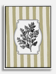
Canvas vintage kruidentak op warme strepen
Aanbiedingsprijs Vanaf €65,95€94,95 -

Poster moderne botanische tekening
Aanbiedingsprijs Vanaf €16,95€23,95 -

Poster vintage botanische bladeren, weelderig groen
Aanbiedingsprijs Vanaf €16,95€23,95 -

Canvas botanische oase in vintage stijl
Aanbiedingsprijs Vanaf €65,95€94,95 -

Canvas botanische muntbladeren vintage zwart-wit
Aanbiedingsprijs Vanaf €65,95€94,95 -

Poster botanische illustratie Artemisia - vintage
Aanbiedingsprijs Vanaf €16,95€23,95 -

Poster moderne botanische vorm in neutrale tinten
Aanbiedingsprijs Vanaf €16,95€23,95 -

Poster boho vazen met kamerplanten
Aanbiedingsprijs Vanaf €16,95€23,95 -

Poster moderne botanische bloem op groen
Aanbiedingsprijs Vanaf €16,95€23,95 -

Poster paarse botanische vintage bloemen
Aanbiedingsprijs Vanaf €16,95€23,95 -

Poster botanische bloem in modern groen en wit
Aanbiedingsprijs Vanaf €16,95€23,95 -

Poster donkere botanische bloemen
Aanbiedingsprijs Vanaf €16,95€23,95 -

Poster abstracte botanische vormen
Aanbiedingsprijs Vanaf €16,95€23,95 -

Poster botanisch stilleven met terracotta vaas
Aanbiedingsprijs Vanaf €16,95€23,95 -

Poster botanische studie van munt in zwart-wit
Aanbiedingsprijs Vanaf €16,95€23,95 -

Poster moderne botanische popart
Aanbiedingsprijs Vanaf €16,95€23,95 -

Poster moderne botanische bladeren in groen
Aanbiedingsprijs Vanaf €16,95€23,95


Meer van The Frame

Vintage Botanical Prints in Modern Homes: How t...
Botanical prints have a reputation problem. Done badly, they read as chintzy, twee, or straight out of a 1980s guest bedroom. Done well, they're one of the most timeless things...

The Complete Guide to Decorating with Botanical...
Botanical prints are the closest thing interior design has to a universal donor. They work with almost any style, palette, and period. Almost. This is a room-by-room guide with specific...

Botanical vs Floral Prints: Which Style Actuall...
Botanical and floral prints get lumped together constantly, and it's costing people the chance to get their walls right. They're not the same thing, they don't behave the same way...