
 Bestel vandaag, levering vóór
 You're Overthinking Art Above Your Sofa
A confident, curated guide to choosing art that actually suits your sofa, your room, and your life.


The blank wall above your sofa isn't a maths problem. It's a mood decision, a colour decision, and a "what do I actually want to look at every evening" decision. Get those right first, and the measurements sort themselves out.
Start with your sofa: how upholstery colour shapes your art choice
Your sofa is the biggest, loudest thing in the room. It's also the anchor for whatever goes above it, so any decision about art starts there.
A pale grey or oatmeal sofa gives you the widest lane. It reads as neutral, which means you can go bold (deep burgundy, cobalt, emerald), soft (muted botanicals, cream abstracts), or graphic (black and white line drawings) without much risk. If your sofa is doing the quiet work, your art can afford to have a personality.
A dark sofa (navy, forest green, charcoal, chocolate) needs art with enough brightness or contrast to hold its own. Skip anything too moody or low-contrast, because it'll get swallowed. Warm cream backgrounds, soft ochre, pale terracotta, and off-white abstracts all lift a dark sofa beautifully.
A coloured or patterned sofa is the trickiest. Mustard, teal, rust, floral, boucle in blush pink. The instinct is to match, and that's almost always wrong. Instead, pick one tone from the sofa and echo it in the art, then let everything else in the piece be quiet. A rust sofa with a print that has a small rust accent against a cream background will feel curated. A rust sofa with a rust-heavy print will feel like a shop display.

The 2/3 rule, quickly
Art above a sofa should span roughly two-thirds the width of the sofa. For a standard 200cm three-seater, that's around 130-140cm of art. A single 70x100cm piece works. A pair of 50x70cm prints hung side by side works. A 60x80cm print floating alone in the middle of a big sofa will look lost.
Hang the bottom edge 15-25cm above the sofa back. Any higher and the art starts floating off into its own weather system, disconnected from the furniture below it.
Warm neutrals and abstracts for modern living rooms
Modern neutral living rooms (think oatmeal sofa, oak coffee table, boucle armchair, curved lines) tend to fall flat when the art gets too safe. Beige on beige on beige is a nap, not a room.
The move here is a warm-toned abstract with enough tonal variation to add depth without shouting. Look for prints in the sand, terracotta, ochre, and rust family, with soft brush strokes or organic shapes rather than sharp geometry. Muted, chalky palettes work better than saturated ones. A hint of black or deep brown somewhere in the composition anchors the whole piece.
Scale matters here. Modern neutral rooms often have generous wall space, so one large statement print (70x100cm or bigger on canvas) usually beats a small gallery wall. The single-piece approach reinforces the calm, considered feeling of the room.
Frame choice: natural oak or a warm wood tone for softness, or go frameless on canvas for a gallery-adjacent minimal look. Black frames can work but they push the room toward "designed" rather than "lived-in", which may or may not be what you want. Our abstract art prints collection is a good starting point if this is your aesthetic.
Botanical and landscape prints for natural, textured spaces
If your living room leans into natural materials (linen sofa, rattan chairs, sisal rug, terracotta pots, dried grasses), you already have a lot of texture and organic shape working. The art needs to complement that, not compete with it.
Botanical prints are the obvious choice, but there's a right and wrong way to do them. Skip the bright, illustrative botanicals that look like they belong in a Victorian pharmacy. Instead, look for prints with muted greens, soft ink washes, single-stem compositions with lots of negative space, or vintage-inspired pressed plant studies in cream and sage. The mood should feel foraged, not floral.

Landscape prints work brilliantly in these spaces too, especially wide, horizontal compositions. Think misty coastlines, soft desert plains, mountain silhouettes at dawn. A single wide landscape print above the sofa mimics a window view and pulls the eye outward, which makes small rooms feel bigger. Our landscape art prints tend to lean cinematic and calm, which suits this style.
For natural rooms, a triptych (three prints in a row) can be lovely, particularly with botanical subjects, one plant per panel. Keep the frames identical and slim. Natural oak or off-white works best. Skip anything ornate.
Have a browse through our botanical art prints if you want to see how muted botanicals look at real scale.
Bold colour and graphic art for rooms that need energy
Some rooms are begging for something loud. Small flats with a lot of white. Rentals with beige carpet you can't change. Rooms that get grey afternoon light and need a jolt. This is where bold, graphic art earns its keep.
The rule for going bold: pick one colour to lead, and make it a colour that's already whispering somewhere in the room. A cobalt blue print above the sofa works if you've got a single cobalt vase, a stack of blue books, or a rug with blue in it. It doesn't work if the blue arrives out of nowhere with no friends.
Graphic art (thick line drawings, geometric shapes, colour-blocked compositions, retro-inspired prints) reads as intentional and confident. It's especially good for warm maximalist rooms with lots of pattern, because a graphic print holds its own against a busy sofa or patterned rug where a delicate botanical would get overwhelmed.
Go bigger than feels comfortable. Bold art at small scale looks tentative, like you weren't sure. A 70x100cm graphic print above a two-seater sofa will look brilliant. A 40x50cm graphic print in the same spot will look like a postage stamp having second thoughts.
Frame choice with graphic art: black frames sharpen the edges and lean into the modernity. If you want to soften it, go frameless canvas or a slim white frame. Avoid ornate or heavily grained wood, which fights the clean lines.
Photography prints above the sofa: when they work (and when they don't)
Photography prints are underused above sofas, and that's partly because they're easy to get wrong.
They work brilliantly when:
- The photograph is atmospheric rather than documentary (think fog, silhouettes, architectural detail, abstract close-ups of nature)
- It's black and white or heavily muted in tone
- It's printed large enough to feel like a window or a moment, not a snapshot
- The subject relates loosely to the room's mood (a moody coastal photograph in a natural, textured room feels right; a bright travel photograph in a serene minimal room feels off)
They fall flat when:
- The image is too literal (a sharp, colourful photo of a specific tourist landmark tends to look like a screensaver)
- The scale is too small (photography needs presence, and small photographic prints often read as personal photos rather than art)
- The composition is busy (photography with too many focal points competes with everything else in the room)
If you're going the photography route, museum-grade giclée printing on matte paper makes a real difference. Glossy finishes and thin paper are what make photography prints look cheap. Thick matte paper with proper tonal depth is what makes them look like art. It's also worth choosing a print with UV-protective glazing if the sofa wall gets afternoon sun, because photographic prints show fading faster than paintings or illustrations.

Colour matching 101: pulling tones from cushions, rugs, and throws
Here's the thing nobody explains properly: you don't match art to your sofa. You match it to the smaller textiles.
Your sofa is the anchor. Your rug, cushions, and throws are the accent voices. Art works best when it echoes one of those accent voices, not the anchor itself.
Practical version: stand in your living room and identify the three smallest colour accents. Maybe it's the terracotta cushion, the mustard throw, and the tiny burgundy detail in the rug. Now pick art that features one of those colours, ideally the one you want more of in the room. If the space feels too cool, echo the mustard. If it feels too warm, pull the burgundy. If it feels flat, echo the terracotta.
This is a version of the 60-30-10 rule that interior designers use: 60% dominant colour (walls, sofa), 30% secondary (rug, curtains), 10% accent (cushions, art, small objects). Your art belongs in that 10% accent slot most of the time, which means it should be doing the job of adding a specific note, not repeating what's already loudest.
One rule that saves a lot of grief: never match the art to the sofa exactly. A blue sofa with a blue-dominant print reads as trying too hard. A blue sofa with a print that has cream, black, and a small blue element reads as considered.
One large piece, gallery wall, or diptych?
Quick guide, no waffle:
One large piece works best in rooms with tall ceilings, generous wall space, and a calm aesthetic. It's the most confident option and the easiest to get right. Go for 70x100cm framed or up to 100x150cm on canvas above a three-seater.
A diptych or triptych (two or three prints in a row) suits long, low sofas and rooms with medium ceiling heights. It also works well when you want a horizontal composition but can't find a single wide print you love. Keep the frames identical.
A gallery wall works in maximalist, layered rooms with lots of other pattern and colour. It doesn't work in minimal rooms, where it just looks busy. If you go gallery, mix sizes and orientations but keep either the frames or the palette consistent, not both loose.
Low ceilings (under 2.4m) generally suit one horizontal piece or a diptych. Tall ceilings can handle a stacked pair or a taller portrait-orientation print.
Common mistakes to avoid
Art too small. Everyone underestimates the size they need. When in doubt, size up.
Art hung too high. If there's more than 25cm between the top of the sofa and the bottom of the frame, the art disconnects from the furniture and floats. Bring it down.
Frames that fight the room. Ornate gold frames in a minimal Scandi space. Sleek black frames in a cottagey, layered room. The frame is part of the decision, not an afterthought. Solid wood frames in natural finishes are the most forgiving. Black works for modern and graphic, white works for coastal and minimal, warm oak works for almost everything.
Buying art before you've lived in the room. Give yourself a few weeks to notice what the light does, where your eye lands, and what the room actually feels like at 8pm on a Tuesday. Then choose.
Our top picks for above-the-couch art prints right now
If you're overwhelmed and just want a starting point, here's what we'd recommend depending on your room:
For modern neutral rooms: a large warm-toned abstract in soft terracotta, cream, and black, framed in natural oak. One piece, 70x100cm, hung centrally.
For natural textured rooms: a botanical triptych in muted greens and creams, or a wide landscape print in a slim frame. Both work.
For rooms that need energy: a bold graphic print in one strong accent colour that already appears somewhere in the room, sized generously.
For layered maximalist rooms: a gallery wall of five or six pieces mixing abstract, botanical, and photographic, unified by a consistent frame colour.

Our couch art prints collection is organised specifically around what works above sofas, so it's a shortcut if you want the decisions narrowed down before you start scrolling.
The point of all this: the wall above your sofa is the most-looked-at wall in your home. It deserves a real decision, not a panic buy. Pick a mood, pick a colour that echoes something already in the room, size it generously, and hang it low enough to feel part of the furniture. That's the whole game.

Fab-producten in dit blog
-

Poster gezellige thuisbibliotheek met gele bank
Aanbiedingsprijs Vanaf €16,95€23,95 -

Poster Miami modern interieur
Aanbiedingsprijs Vanaf €16,95€23,95 -

Poster kleurrijke moderne kunst
Aanbiedingsprijs Vanaf €16,95€23,95 -

Canvas modernistische oase in krachtige kleuren
Aanbiedingsprijs Vanaf €65,95€93,95 -

Poster knusse leeshoek voor boekenliefhebbers
Aanbiedingsprijs Vanaf €16,95€23,95 -
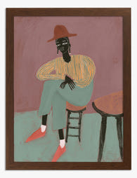
Poster stijlvol zittend portret met roestbruine hoed
Aanbiedingsprijs Vanaf €16,95€23,95 -
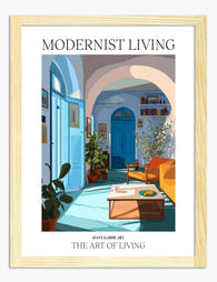
Poster zonnige mediterrane woonkamer in modernistische stijl
Aanbiedingsprijs Vanaf €16,95€23,95 -

Canvas gezellige bibliotheek
Aanbiedingsprijs Vanaf €65,95€93,95 -

Poster modern interieur in zonlicht
Aanbiedingsprijs Vanaf €16,95€23,95 -

Canvas Miami modern woonkamer
Aanbiedingsprijs Vanaf €65,95€93,95 -
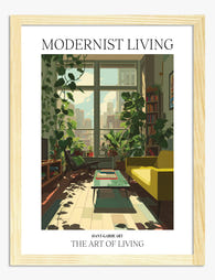
Poster stedelijke oase
Aanbiedingsprijs Vanaf €16,95€23,95 -
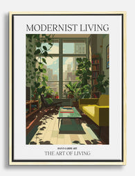
Canvas stedelijke oase met planten en geel accent
Aanbiedingsprijs Vanaf €65,95€93,95 -

Poster mediterrane modernistische sfeer
Aanbiedingsprijs Vanaf €16,95€23,95 -
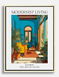
Canvas mediterrane sfeer in moderne stijl met turquoise
Aanbiedingsprijs Vanaf €65,95€93,95 -
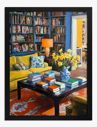
Poster knusse leeshoek
Aanbiedingsprijs Vanaf €16,95€23,95 -

Canvas modernistische oase in de zon
Aanbiedingsprijs Vanaf €65,95€93,95 -

Poster zonovergoten modernistische oase
Aanbiedingsprijs Vanaf €16,95€23,95 -

Poster knusse leeshoek
Aanbiedingsprijs Vanaf €16,95€23,95 -

Canvas portret met hoed - stijlvolle rust
Aanbiedingsprijs Vanaf €65,95€93,95 -

Canvas modern wonen met zonlicht
Aanbiedingsprijs Vanaf €65,95€93,95


Meer van The Frame

Our Favourite Art Prints for Bedrooms That Help...
Bedroom art is the one place in your home where a "statement piece" is usually the wrong instinct. The job here is quieter, and getting it right means unlearning most...

Vintage Rose Prints: From Botanical Illustratio...
Vintage rose prints are having a proper moment. Not the dusty, chintzy kind your nan had over the settee, but the considered, well-framed kind that anchor a modern room and...

Why Rose Print Decor Works Better Without the C...
Why Roses Are the One Floral That Never Truly Goes Out of Style Roses have been painted, printed and photographed for centuries, and they still turn up in the work...